Website + Branding (in Progress)
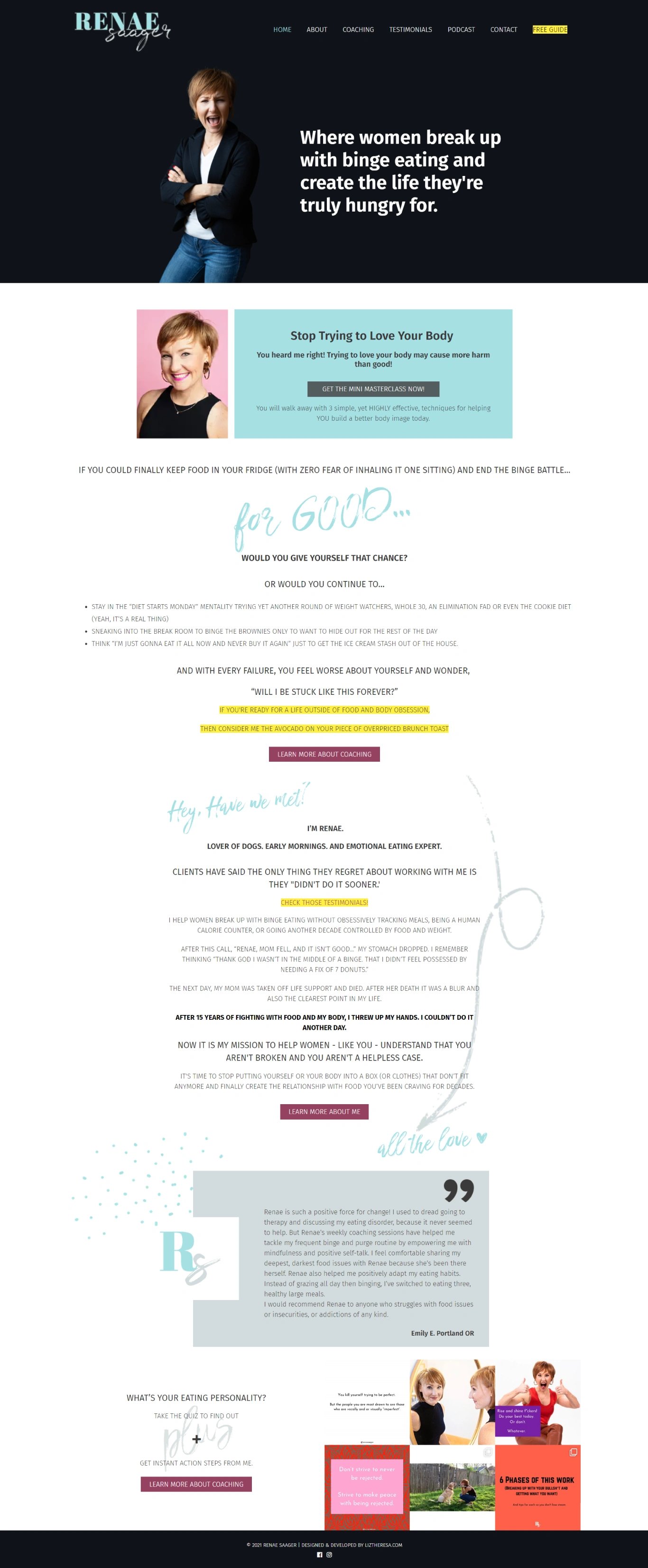
("Before" image above)
Renae came to me about her website and branding for RenaeSaager.Com. Although she still very much so loved what she had, it wasn't fully capturing her as a person anymore and she needed to have more expression and flexibility in her brand.
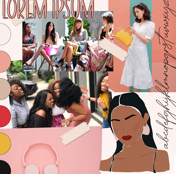
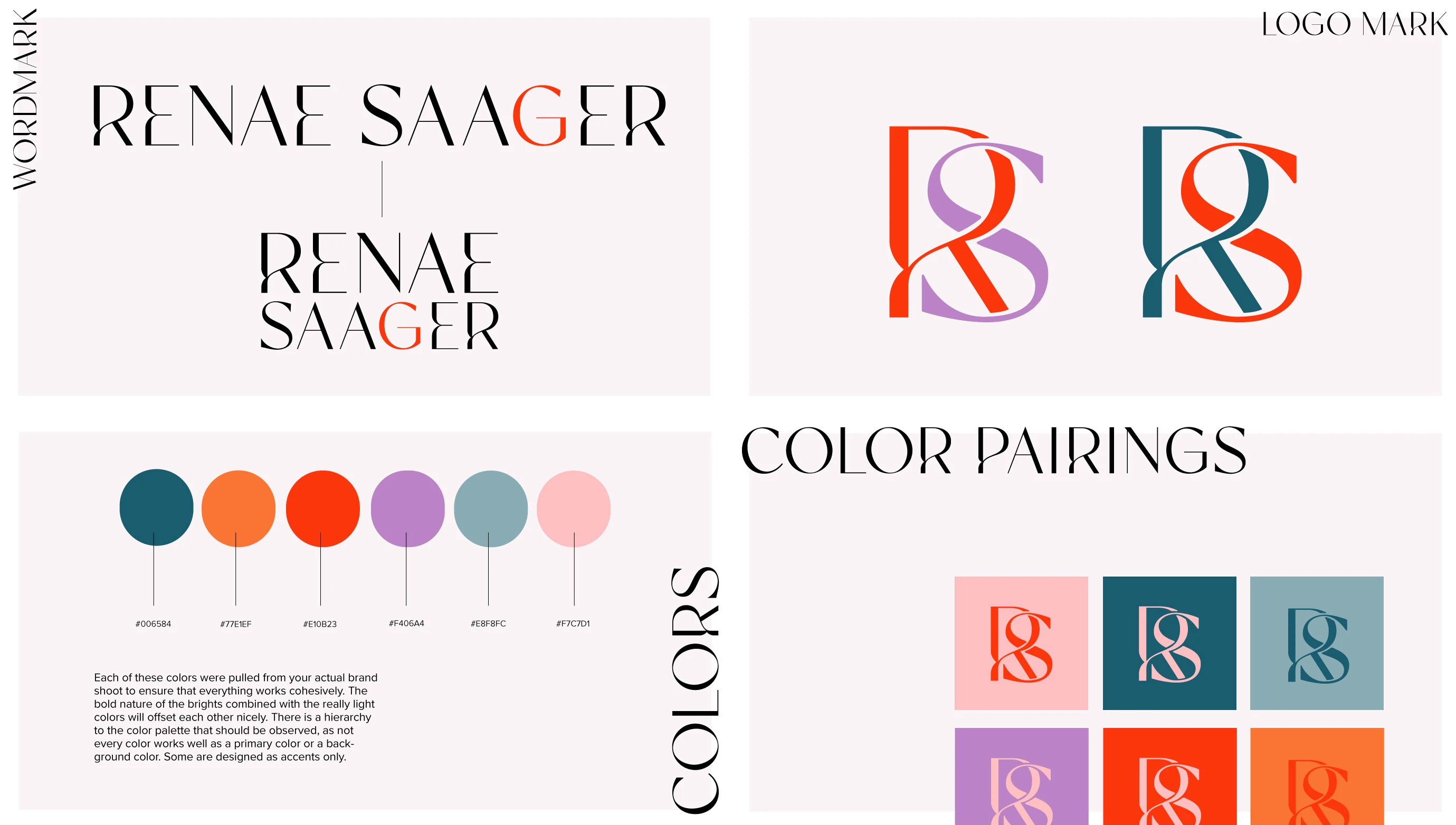
The initial concept was red and pink primarily. We still kept the concept, but we ended up going with a different color scheme. Renae's bold attitude needed bold colors, bold text, and a vibe that was unafraid to be in your face.
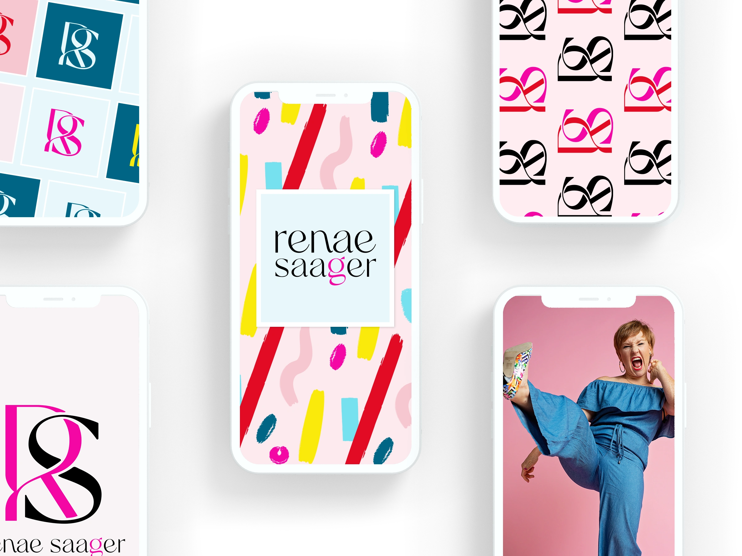
Although we didn't end up using this pink, the contrasting color concept was maintained, as you can see in the next mockup with purple and orange.
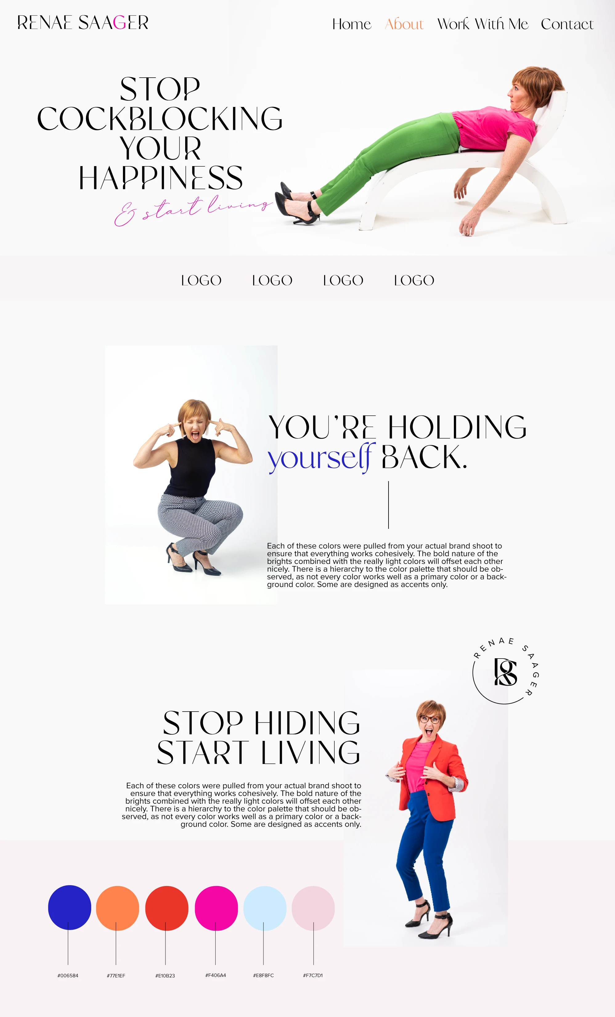
Her website is still currently under construction, but this is the concept sent to her. We'll be building it out on Showit as a one-page website.
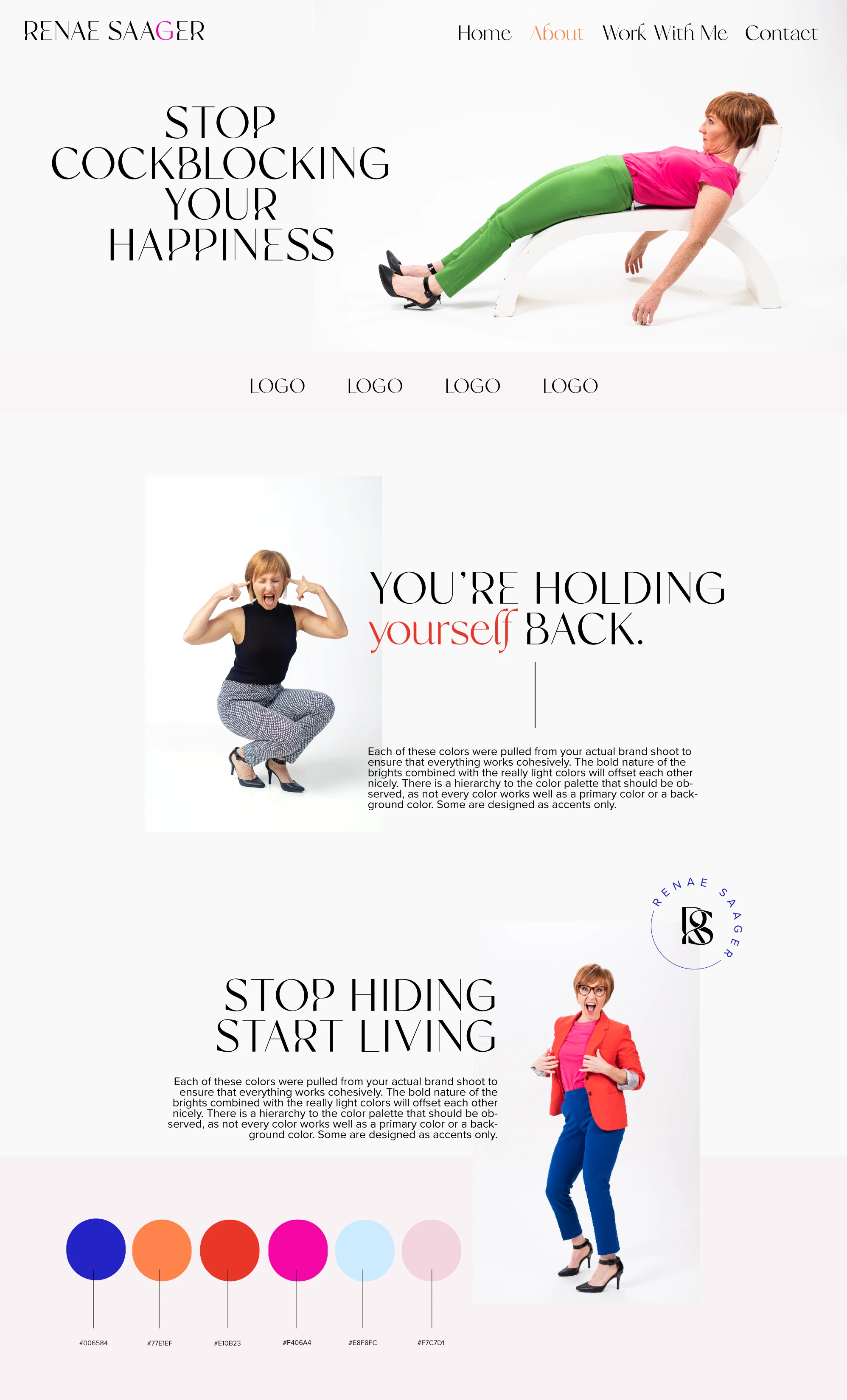
And the last concept:
Like this project
Posted Jun 8, 2021
