SETLIST — SaaS Plan Selection & UI States

Charles

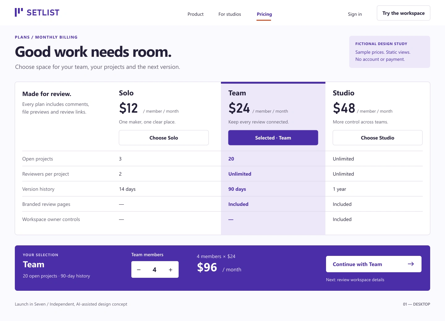
SETLIST — SaaS plan selection, carried through
Finishing a SaaS website means making the decisions clear across the page, its components and smaller screens. SETLIST is an original fictional design study in doing that consistently.
One comparison surface
The desktop view aligns each feature across three plans. A continuous violet column identifies the selected plan, and the summary connects that choice to four members at $24 each: $96 per month. Prices and product details are fictional.
Designed for the smaller screen
The phone composition replaces the wide matrix with a compact plan selector and details for the selected plan. It retains the billing period, the Studio-only owner-controls distinction and the same member count and monthly total.
Complete the component, including the error
The state study keeps the same editable stepper and selected-plan identity. An invalid count of zero stays visible alongside a specific correction; continuation is depicted as unavailable until corrected.
What this proves
Three original rendered views: desktop comparison, phone composition and selected/error states. These are static concepts, not a working subscription or payment flow. No conversion, live validation or accessibility-compliance results are claimed.
Charles directs the work; AI assisted design and production. Built from original editable SVG and inspected at native size, with an independent visual review. Public proof contains rendered images; working source stays private.
Need an existing interface finished? I can review the current page, refine its components and agree a bounded first milestone.
Mobile design study
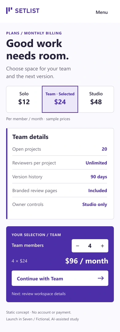
Native 390px phone composition · fictional static design
Selected and error states
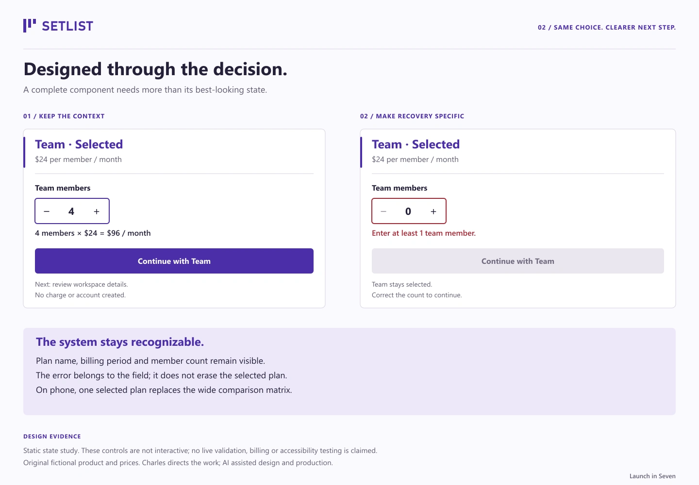
Matching selected and error states · static design, not live validation
Like this project
Posted Sep 18, 2026
Original fictional SaaS design: clear plan comparisons, a phone adaptation and matching selected/error states. Static, AI-assisted proof.
Likes
0
Views
5