Humanist-Centered Icon Design for Duoplane

Amirul Hakim


Humanist-Centered Icon Design for Duoplane
DuoPlane provides ecommerce automation software specifically designed to streamline multi-channel dropshipping operations. It saves businesses time by automatically routing orders to the correct vendors, syncing inventory feeds, and managing accounting tasks.


The Problem
Duoplane had no feature icons at all. For a platform with dozens of features (order routing, inventory sync, vendor management, accounting automation), this created a real usability issue: users couldn't visually distinguish one feature from another. Similar-sounding features blurred together, making navigation slower and the product harder to learn.
Without a visual shorthand for each feature, the interface relied entirely on text labels. For e-commerce retailers and resellers managing high-volume operations, that friction adds up fast.
The Users
Two primary groups:
E-commerce retailers managing multi-channel storefronts who rely on Duoplane to automate their dropshipping workflows
Resellers coordinating with multiple vendors and needing to navigate complex order routing and inventory features quickly
Both groups share the same need: identify the right feature at a glance without reading every label.
The Process
Step 1: Learn every feature. Before sketching anything, I studied the full Duoplane platform to understand what each feature does and how users interact with it. You can't design a visual shorthand for something you don't understand.
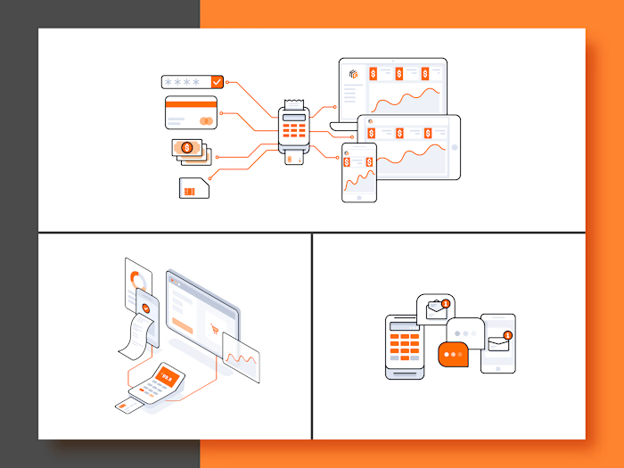
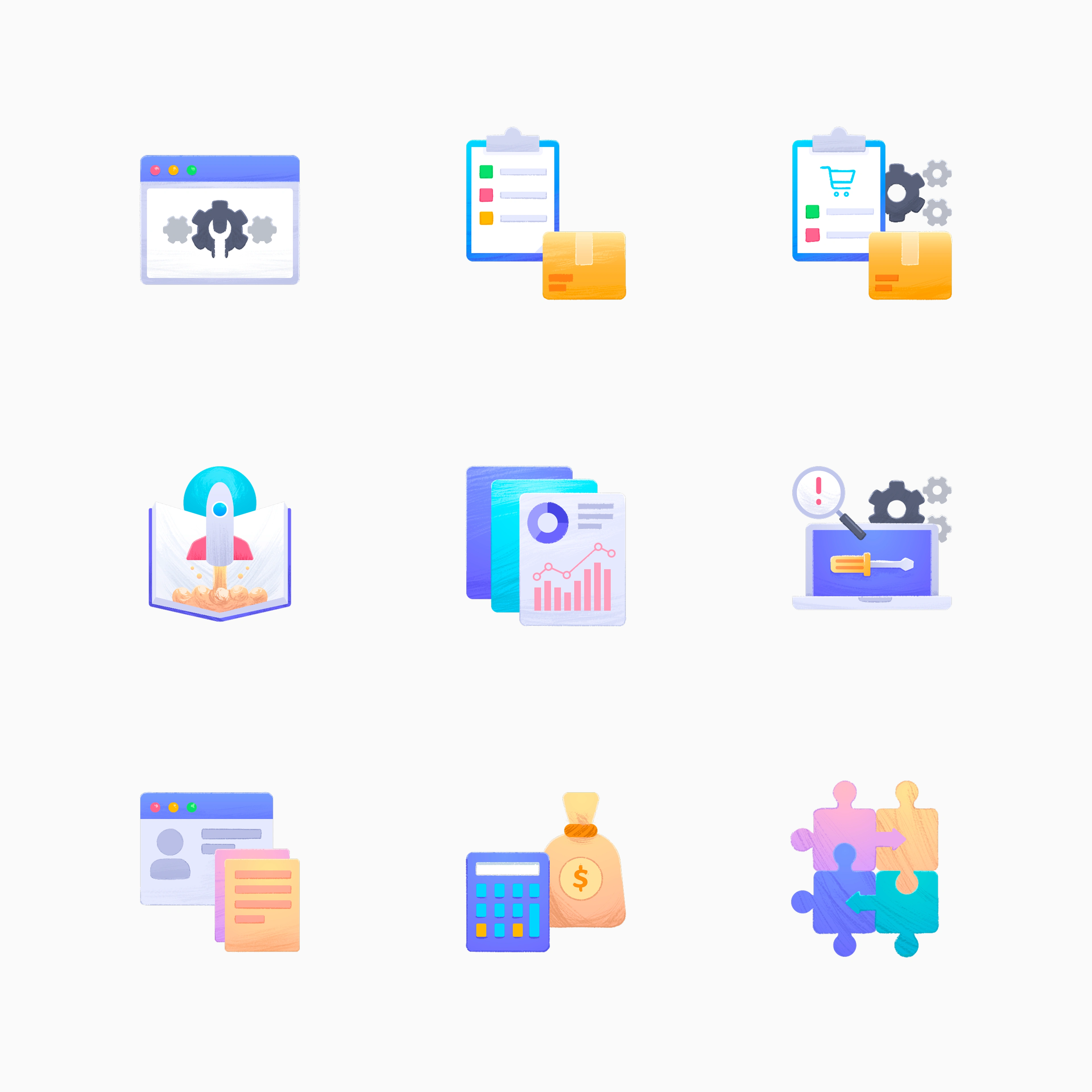
Step 2: Develop the visual approach. Miranda (the client) requested an approach that felt as human as possible. I developed a hybrid technique combining bitmap textures with vector construction. Each icon is built on a vector framework for scalability, then layered with hand-drawn bitmap strokes that give every piece an organic, handmade quality.
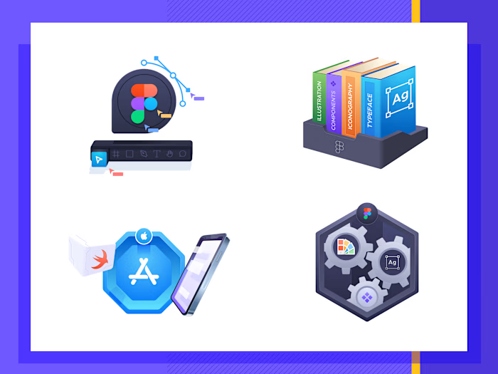
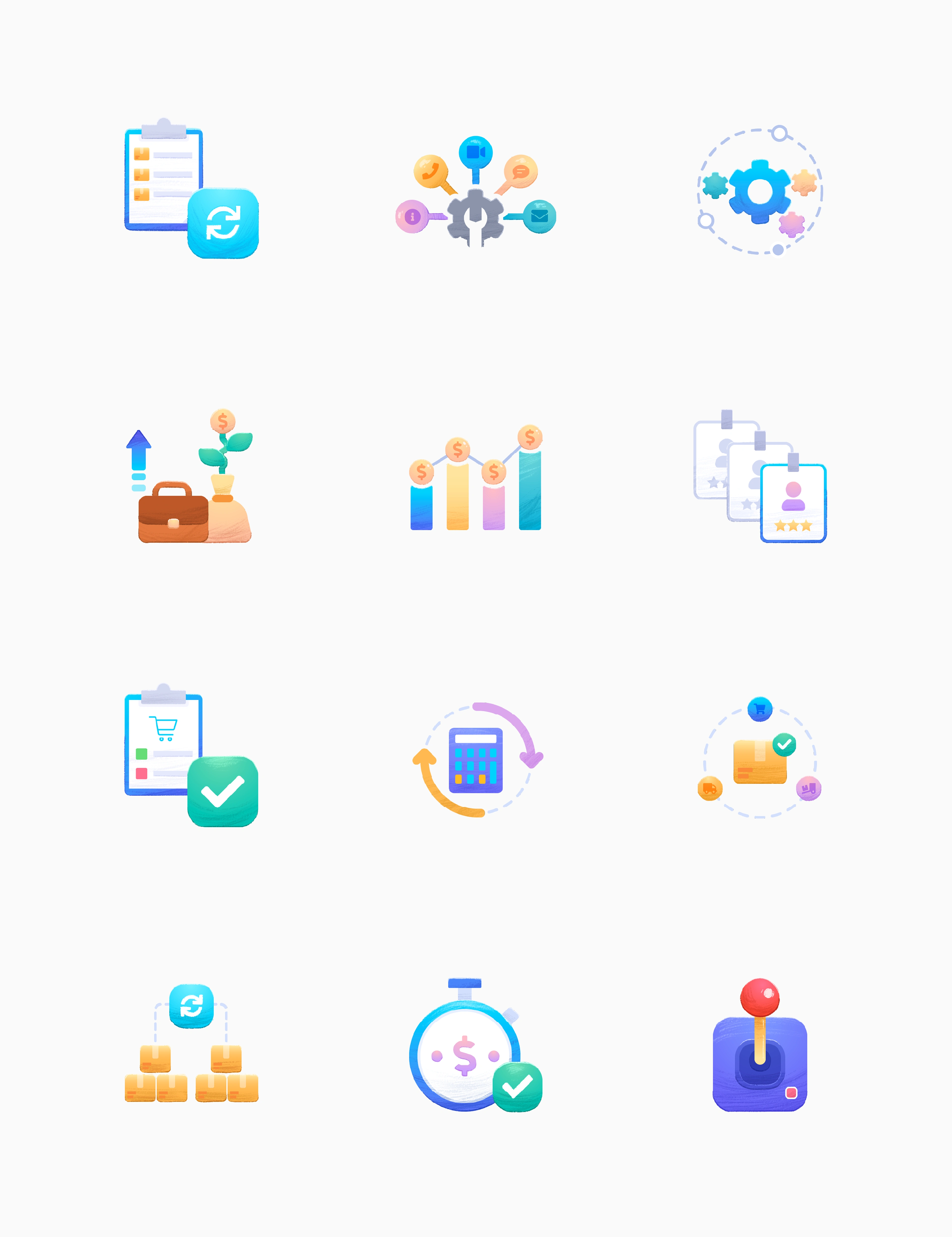
Step 3: Design and deliver in batches. I produced 64 icons across 3 batches. Each batch was reviewed, refined, and approved before moving to the next. The icons shown in this case study are a curated selection of the strongest pieces from all three batches.
The Key Design Decision
The most important decision was the bitmap-vector hybrid technique.
Standard SaaS icons are geometric and clean. They're functional, but they all look the same. For Duoplane, Miranda wanted something that felt distinctly human in a space dominated by sterile, machine-perfect visuals.
I built each icon on a precise vector grid (ensuring consistent sizing, alignment, and scalability), then applied hand-drawn bitmap strokes on top. The result: icons that feel like they were sketched by hand, but hold up perfectly at any size and across any screen.
This hybrid approach became Duoplane's visual signature. The warmth of hand-drawn illustration, combined with the precision of vector construction, reinforces the brand's human-first identity in a product category that often feels cold and automated.
The Outcome
Miranda was satisfied with the results across all three batches, re-ordering additional batches after the first delivery. The final set of 64 icons now covers Duoplane's complete feature library, giving every function a distinct, instantly recognizable visual identity.
The icons are live across the Duoplane platform and website, replacing what was previously a text-only navigation experience.
Like this project
Posted Jul 31, 2026
Designed 64 humanist feature icons for Duoplane, combining scalable vector construction with hand-drawn bitmap textures for its ecommerce automation platform.
Likes
1
Views
4
Clients
Duoplane