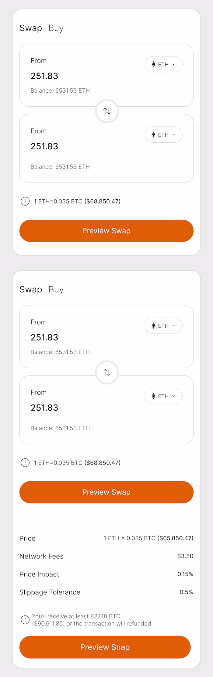
🚀 LuxMint NFT Marketplace — Landing Page UI/UX I designed t...
Cipher UI
🚀 LuxMint NFT Marketplace — Landing Page UI/UX
I designed this landing page to solve one major problem I keep seeing in NFT marketplaces:
Too many platforms overwhelm users with clutter, poor hierarchy, and confusing navigation.
With LuxMint, I focused on:
A clean hero section that instantly explains the value
Clear CTAs (“Explore More” + “How It Works”)
A structured “Top Trending” area to highlight valuable NFTs
Organized categories that make browsing effortless
Visual storytelling sections to give the brand personality
A minimal, Web3-friendly look that feels premium and trustworthy
The goal?
Create a landing page where collectors understand the platform in seconds — not after digging around.
If you were building your own NFT platform, what’s the FIRST thing you’d want users to notice?
Like this project
Posted Dec 9, 2025
🚀 LuxMint NFT Marketplace — Landing Page UI/UX I designed this landing page to solve one major problem I keep seeing in NFT marketplaces: Too many platforms...
Likes
0
Views
1
Tags