Website redesign - UzziPay Digital Bank
Role
UX Design Intern
Duration
2023

Redesign of four landpages to offer users an experience that is intuitive, informative, and engaging to increase comercial success of the digital bank's website.
UzziPay is an Amazon Fintech that believes that financial health is necessary for people to achieve full success. They provide a digital account that empowers people to manage their financial life in a simple and safe way.
For the companies the digital bank offer a series of resource management tools. Besides the preservation of patrimonies, they take care of nature, replacing what was withdrawn of it. Their cause is to awaken the conscience that the individual is responsible for his financial health and built a sustainable environment that guides the collective and individual choices.
During 3 semesters of college, I joined the UzziPay team as an intern UX Designer.
Overview
During the pages development, I collaborated closely with the marketing and programming team to define, develop, and deliver visual designs in a consumer-facing environment. The task was to create four updated and responsive landpages to keep up with the new brand identity as well as redesign the interfaces to make it more usable, inclusive and close to the clients needs.
My Role
As the solo designer, I was responsible for designing the UI, UX, rendering layouts, and selecting photography. I created frameworks and prototypes to share the vision, design principles, and content strategy with the marketing team as well as with stakeholders. This helped to conceptualize ideas, gain alignment, and drive decision making.
Timeline
The pages were designed and developed during 2023, being prioritized between other tasks. The first redesign was the "Homepage", followed by "Pessoa Física", "Pessoa Jurídica" and "API Pix Condomínios" as a brand new page. In general, the entire design of each page, including research, wireframes and prototypes took less than two weeks.
Research
Since the visual identity of the brand went trought changes during 2022, a design and content update was needed to keep up with marketing and comercial plans. A qualitative user research with UzziPay clients has been realized and the answers were divided by theme on a empathy map so that two personas could be created for a better use of the discovered needs and pains on the website.

Design System
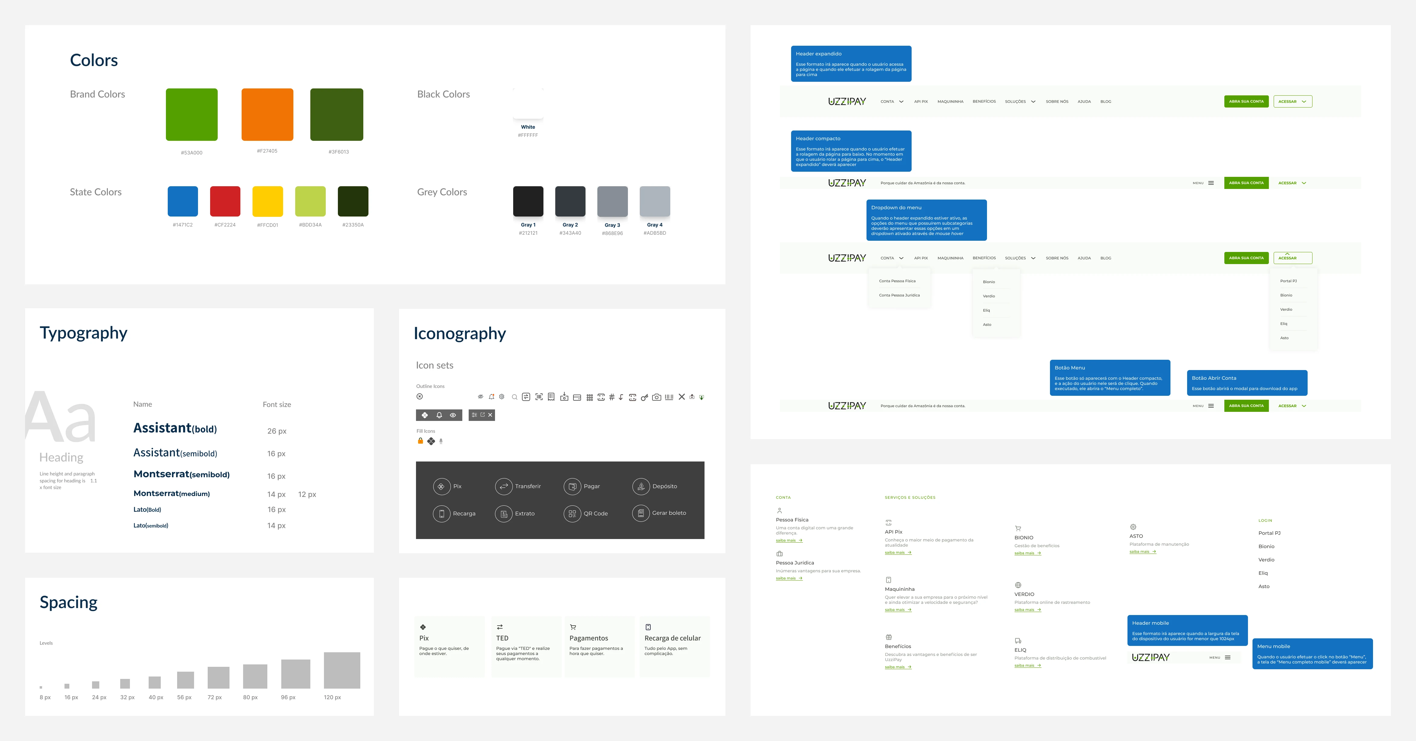
The use of UzziPay's design library on Figma contributed to find the most optimal components and assets to ensure an ideal page length and a responsive design. According to the new look of the brand, new elements were added to the styleguide.

Designing sections and mockup arts
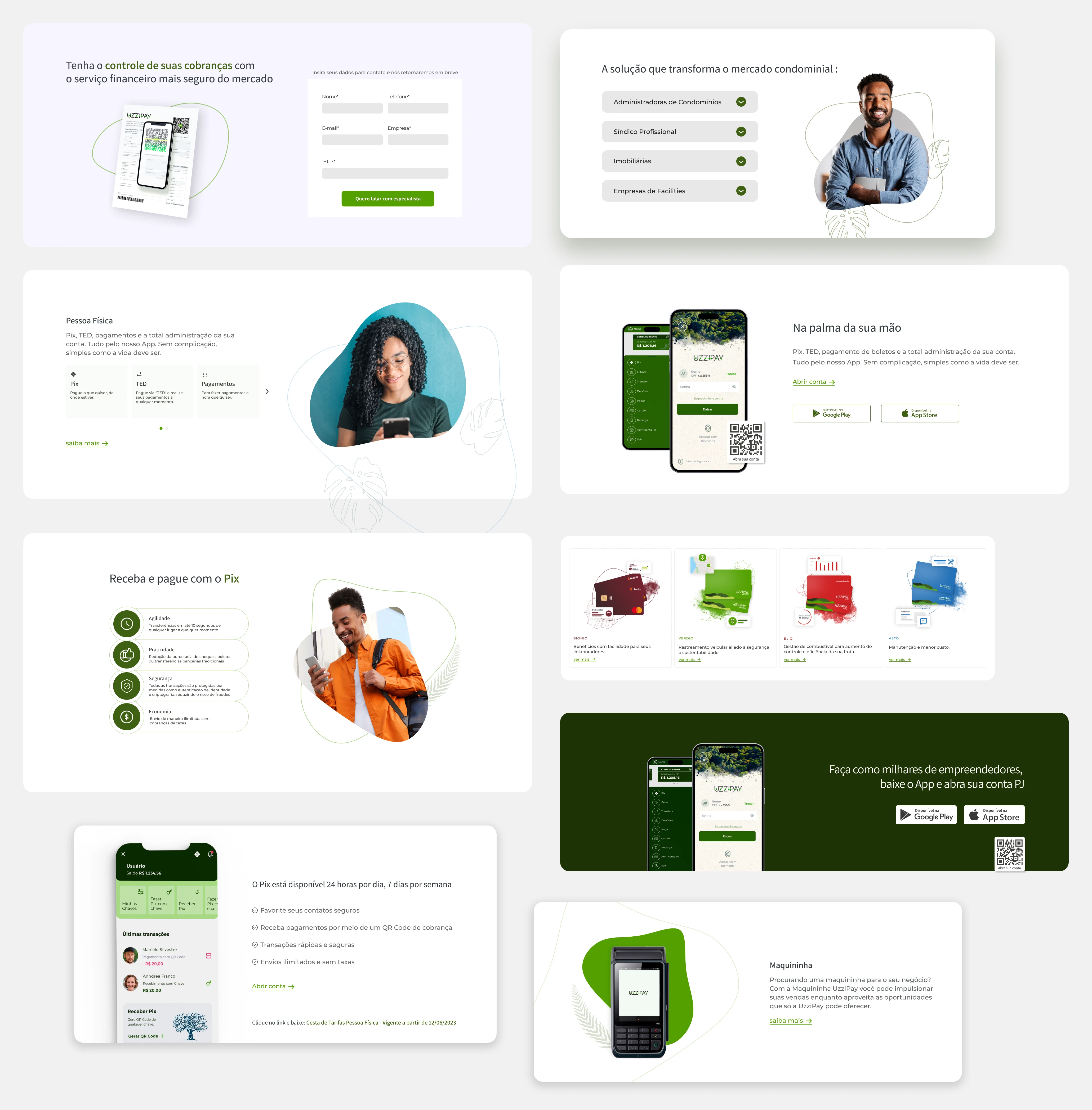
I also designed mockups to illustrate the information inside different sections and subjects of the landpages. There were many services, infos and benefits to list through the 4 pages, to make it less tiresome the human and devices images were used along the interfaces.
These images needed to be visually engaging while not reusing the same mockup style, which required exploring new layouts while maintaining brand consistency. I accomplished this by isolating screen sections to highlight specific information or placing entire screens within computer or phone mockups and realistic photo renderings.

Results "Homepage"
The final interface turned out as informative and intuitive, the product services were divided in sections that redirect to other especific pages. Were also developed responsive versions across desktop, tablet, and mobile. Accessible navigation allows users to jump between sections of the page efficiently, carousels make information digestible, and multiple CTAs guide users to find more relevant details. The website can, now, help users to easily find services information as well as upgrade the comercial and marketing areas.
View here: https://uzzipay.com/
Takeaways
Executing Research, Design and Prototype for Handoff
During this project, I had the opportunity to improve my prototyping skills as well as develop a precise and usefull method to detail the component types and usage. Buttons, elements and transitions were all passed along in a informative Figma archive that also includes the prototype. This guide helped the developers quickly localize the page for the global market and launch the page as fast as possible.

Results "Pessoa Física"
This page, developed to introduce users into the services and benefits for a "natural person" (bank term for human being), includes infos about the App and payment services as well as call to actions for the download and openinf of an account. For this interface the responsive design has also been estructured to make easier the navigation and usability.
View here: https://uzzipay.com/pessoa-fisica/

Results "Pessoa Jurídica"
This page, developed to introduce users into the services and benefits for a "legal entity" (bank term for a corporation or labor union), includes infos about benefits and opportunities for businesspeople and companies as well as call to actions for the download and openinf of an account. For this interface the responsive design has also been estructured to make easier the navigation and usability.
View here: https://uzzipay.com/pessoa-juridica/

Results "API Pix Condomínios"
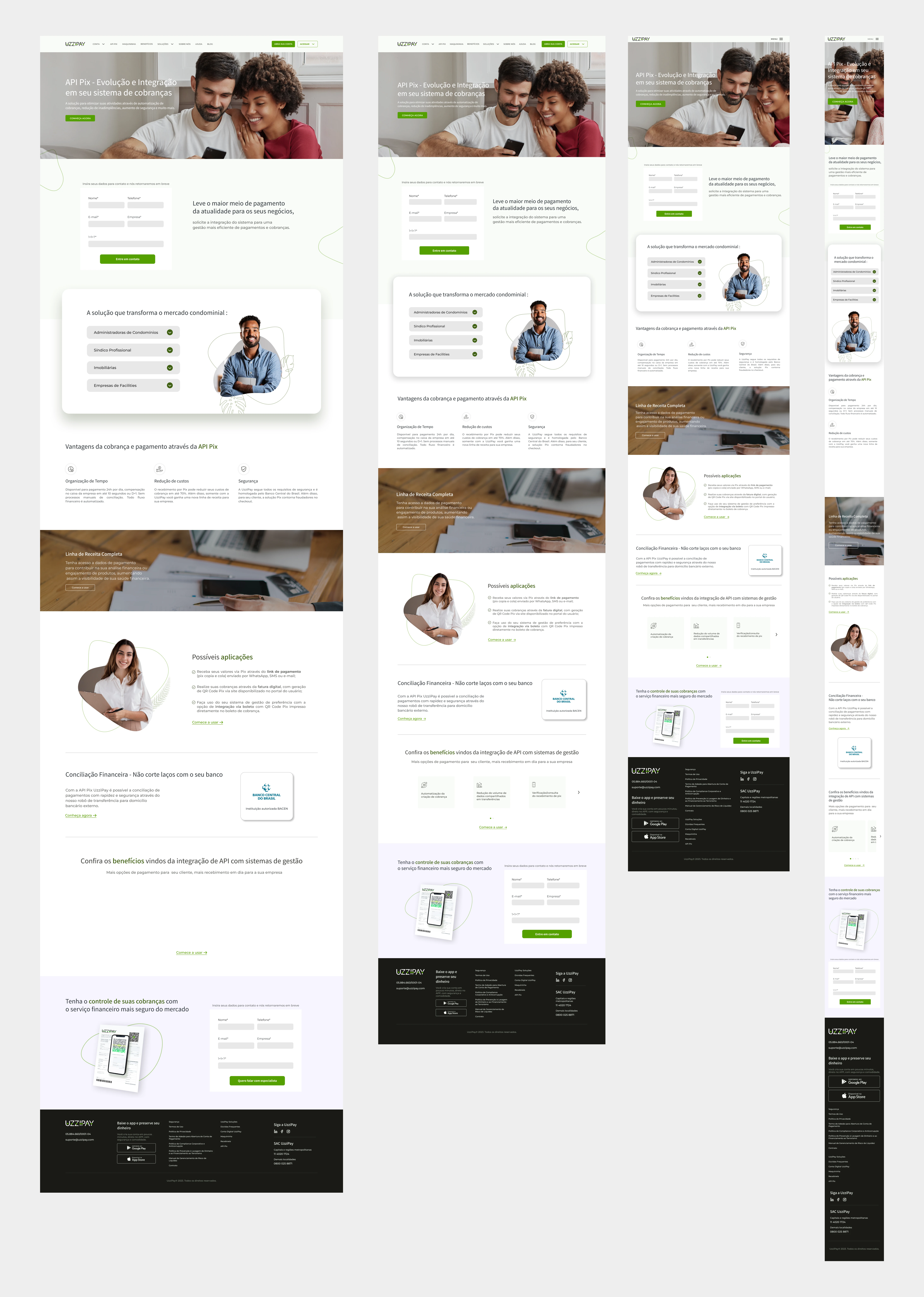
The fourth page, developed to be an extension of another page, introduce users into the services and benefits of the service "API Pix" (application programming interface: a set of rules that defines how a software program can request and receive information from other software). The content includes infos about benefits and opportunities for companies as well as call to actions for contact. For this interface the responsive design has also been estructured to make easier the navigation and usability.
View here: https://uzzipay.com/api-pix-condominios/

Thanks for stopping by, let's chat!
Contact me
juliapelosocambraia@gmail.com
Let's conect
Like this project
Posted Jan 11, 2024
Website redesign, design system and acessibility.


