Craft 03: Vlippr Mobile Design Project
Subrata Dhar
Craft 03
Scaling a Creative Studio from Desktop to Pocket.
Context
Reducing Screen Size Without Reducing the Product’s Power
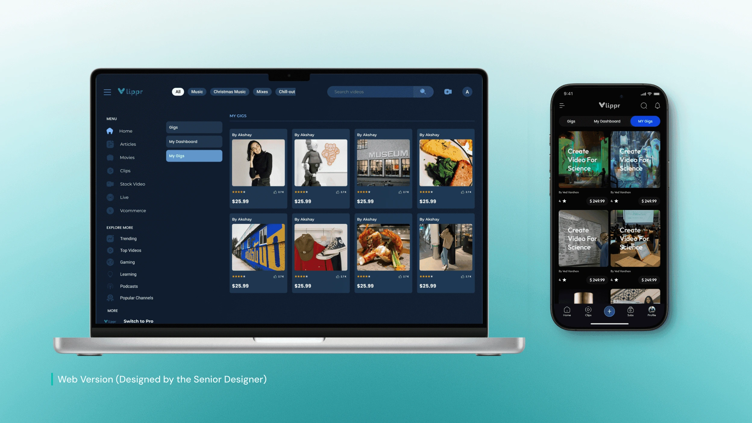
Vlippr is a feature-rich web-based video creation platform designed around wide layouts, dense controls, and precision-driven workflows. While this worked well on desktop, translating the same level of functionality to mobile introduced a fundamental challenge: limited screen space without sacrificing capability.
Rather than simplifying features, the focus was on restructuring workflows for mobile contexts. Working alongside the Senior Designer, I contributed to designing a Mobile Design System that broke complex desktop interactions into focused, step-by-step mobile flows. This approach preserved core functionality while adapting layouts, interactions, and hierarchy to be touch-friendly, readable, and usable on smaller screens.
My Role
UI/UX [Contract] → Senior Designer
Industry
Entertainment SaaS
Platforms
Desktop → iOS/Android
Timeline
January 2024- March 2024
Problem Statement
Trying to Fit a Cockpit Dashboard onto a Six-Inch Screen.
No Mouse, No Hovers
Desktop interactions like "Hover" and "Right-Click" don't exist on mobile. We had to reinvent core workflows for thumbs, not mouse pointers.
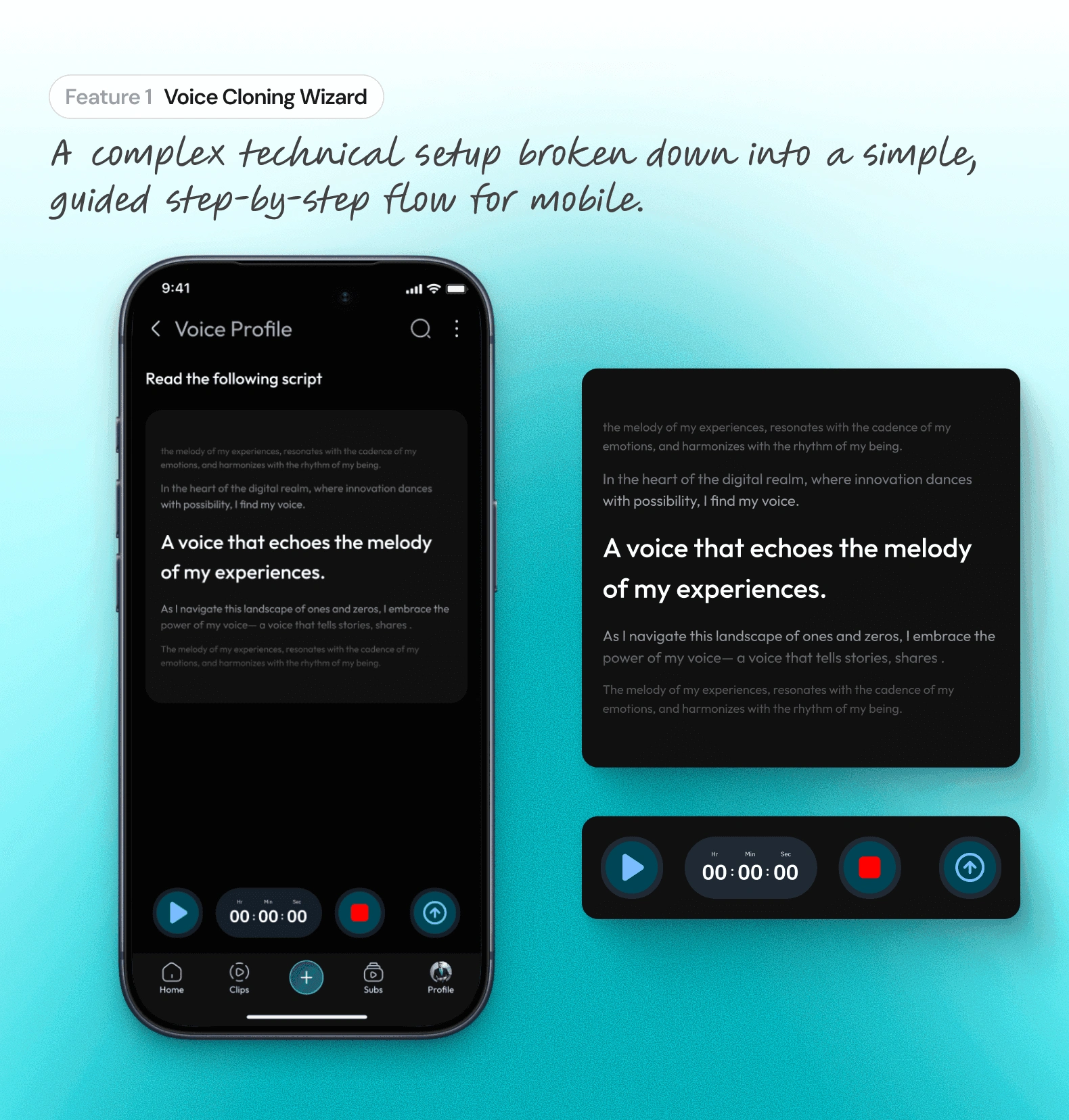
Information Density
Complex features like Voice Cloning demanded screen space we didn't have. Simply scaling them down created cluttered, unusable interfaces for users.
The "Web-Drift" Risk
Translating a massive web platform without a strict mobile component library risked creating a fragmented, "Frankenstein" UI that felt inconsistent.
Business Goal
Enabling Creation Beyond the Desktop
Vlippr dominated the desktop workflow, but modern creators don't live at their desks. The business needed to expand into the mobile market to prevent users from switching to mobile-first competitors. The objective was clear: translate the full power of the web platform into a native app without stripping away the "Pro" features that defined our brand.
Strategic Direction
Building the Foundation Before the Interface
We avoided the trap of designing screens in isolation. My strategy, under the Lead Designer, was to establish a strict Mobile Design System first. By defining typography scales, touch targets, and component states upfront, we created a "Translation Layer" that allowed us to port complex web features to mobile rapidly while ensuring 100% visual consistency.
Design Solution
The "Thumb-First" Transformation.
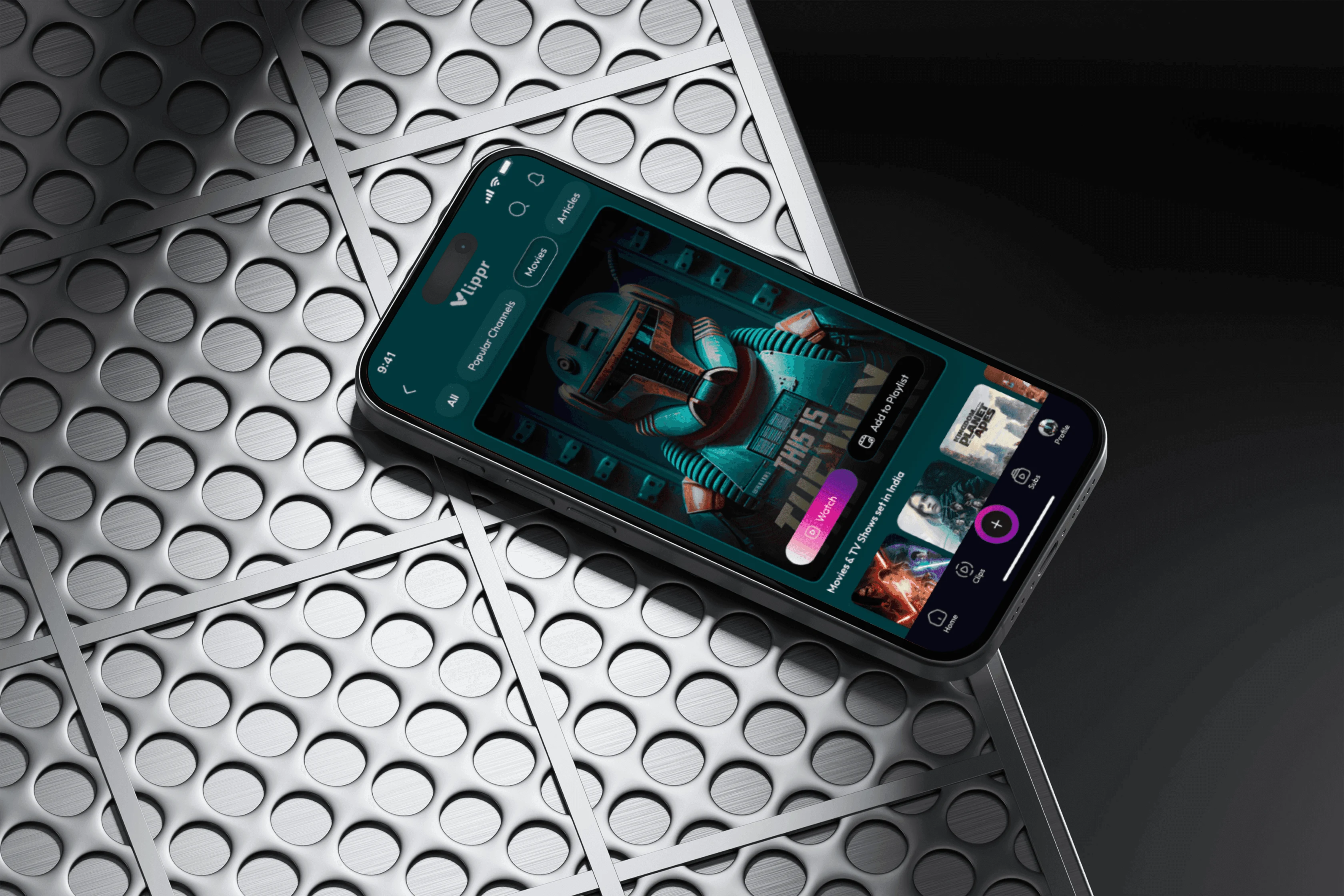
We realized that shrinking a dashboard frustrates users; they need room to breathe. My solution focused on "Interaction Translation"—converting precise mouse clicks into comfortable touch gestures. By introducing bottom sheets for complex settings and simplifying navigation, we preserved the power of the web tool without forcing the user to pinch-and-zoom to get work done.
Interaction Designs
Pro Tools, Pocket Sized.
Simplifying Complex Inputs
Voice cloning is technically heavy. I adapted this professional tool for mobile by breaking the complex setup into a guided, step-by-step wizard, ensuring users could train their AI voice model without feeling overwhelmed by technical settings.
Consistency Across Breakpoints
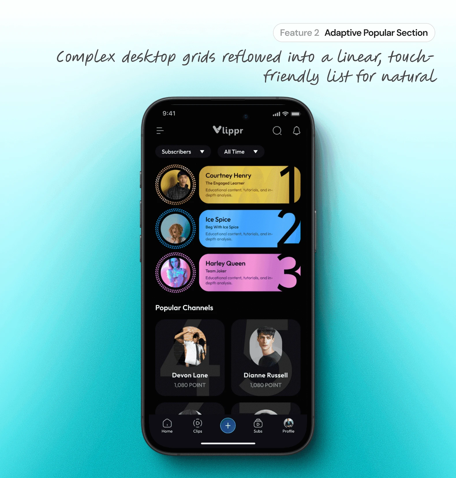
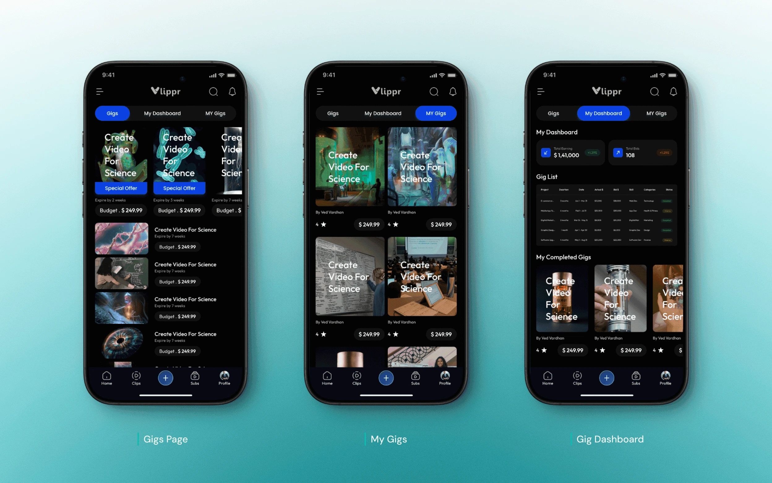
I helped build a responsive component system. This ensured that features like the Popular Section and video grids adapted fluidly from large tablets to small phones, maintaining 100% visual parity with the web brand.
Role & Impact
Bridging the Gap Between Vision and Pixel.
Strategic Role
Adapting Identity for Scale
Translated Vlippr’s established web identity into a flexible mobile framework.
Defined the "Mobile-First" adaptation strategy, ensuring complex features like Voice Cloning remained usable on small screens.
Ensured the app felt like a premium extension of the desktop brand, not just a "lite" version.
Ownership
Architecting the Foundation
Owned the execution of the Mobile Design System, defining typography scales and color tokens.
Built the responsive component library that allowed features to adapt across different mobile screen sizes.
Created the final high-fidelity assets for the "Popular Section" and video grids, ensuring pixel-perfect consistency.
Collaboration
Syncing with Leadership
Partnered closely with the Lead Designer to rapidly prototype concepts and incorporate feedback instantly.
Facilitated the "Design-to-Dev" handoff by documenting interaction guidelines and component states.
Acted as the bridge between the high-level creative vision and the granular production details needed for launch.
Outcomes
Measuring Success in "Dev Hours" Saved.
Engineering Velocity
By establishing a strict component library before development began, we significantly reduced engineering friction, allowing the team to assemble screens like Lego blocks rather than coding from scratch.
100% Desktop Power
We successfully translated 100% of the core web features—including complex Voice Cloning—to mobile, ensuring the app was a true professional tool, not just a "lite" companion.
Zero "Design Debt"
The unified design system ensured that every button, input, and modal remained consistent across Android and iOS, preventing the visual fragmentation that often plagues early-stage startups.
Learnings
The System Is the Product.
Beyond the Single Screen
I learned that designing a single screen is easy, but designing a system that works for every screen is hard. A robust library is the only defense against chaos.
Respecting the Thumb
Porting a desktop tool taught me that "Screen Real Estate" is the most expensive currency in mobile design. You cannot just shrink a feature; you must reimagine it for touch.
Documentation is Design
I discovered that a designer's job isn't done until the developer understands it. Clear documentation and component states are just as important as the final visual polish.
Like this project
Posted May 25, 2026
Designed a Mobile Design System for Vlippr to enhance usability on smaller screens.
Likes
0
Views
0
Tags