Craft 02
Subrata Dhar
Craft 02
Streamlining Hotel Operations with a "Problem-First" Dashboard.
Context
Bridging the gap between massive IoT data and daily operational usability.
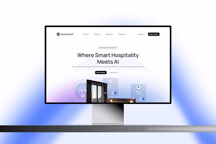
devicethread is an IoT-based SaaS platform that unifies hotel operations by connecting smart locks, thermostats, and sensors into a single cloud ecosystem. While the backend ( SmartCloud) successfully processed millions of data points, the frontend ( SmartOperation) suffered from usability issues that slowed down daily operations. My role was to transform this complex technical architecture into an intuitive "Command Center" for property managers and a seamless mobile experience for staff.
My Role
UX Designer → Design Lead
Industry
SaaS, b2b
Platforms
Desktop and Android
Timeline
January 2025 - Ongoing
Problem Statement
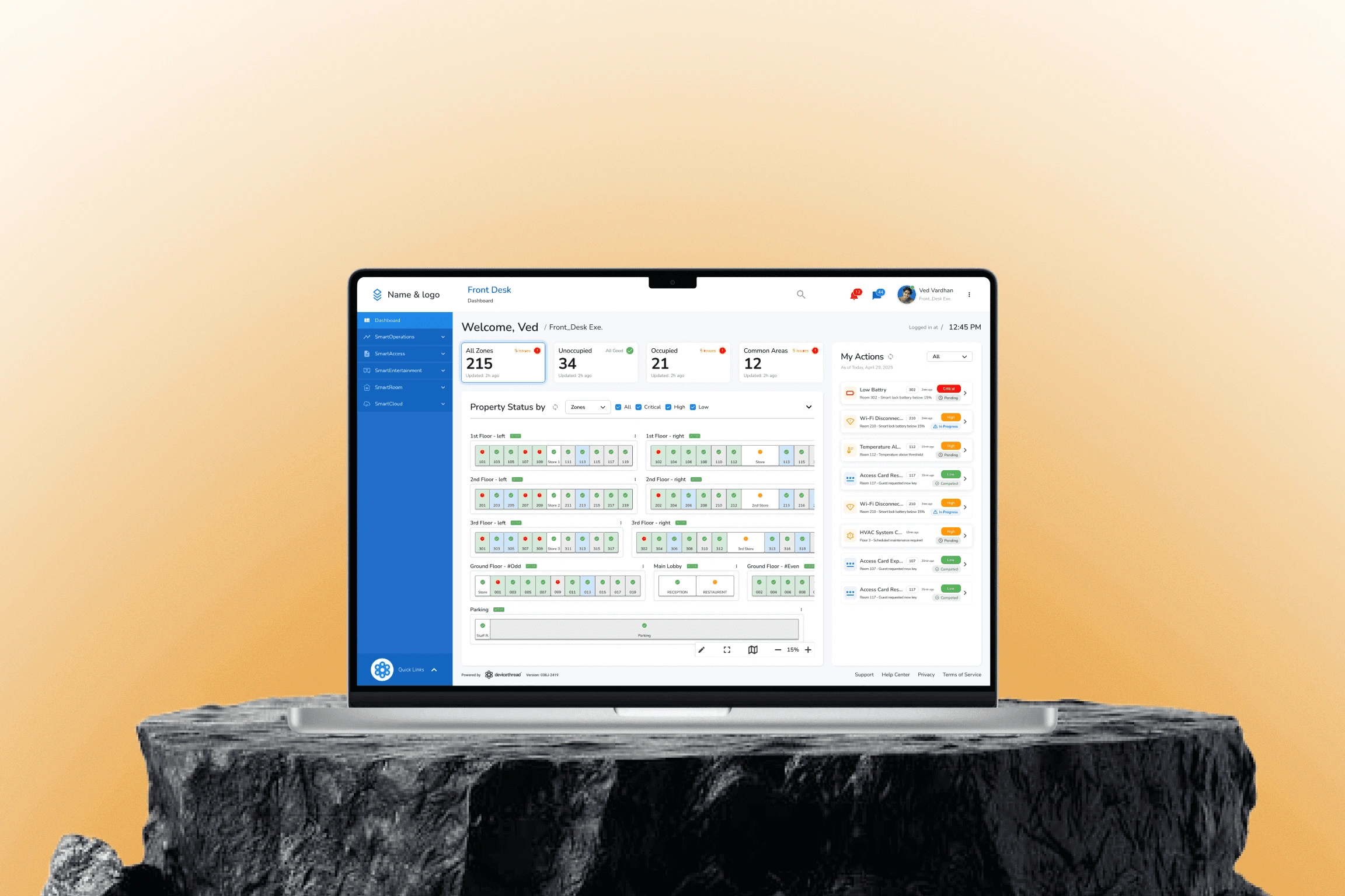
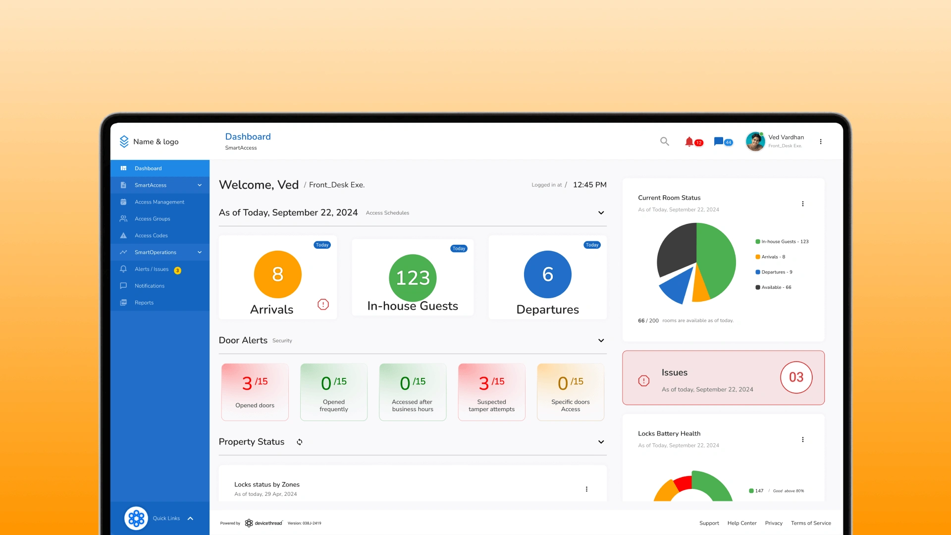
Managing 150 Rooms Without Seeing Them.
Data Blind Spots
Critical hardware issues were hidden inside paginated spreadsheets, making them physically impossible to visualize quickly.
Operational Friction
Resolving even a single alert meant jumping across four different screens and tabs, wasting valuable time during live incidents.
No Clear Prioritization
Without spatial/contextual cues, staff couldn't quickly distinguish critical failures from minor warnings, causing delayed responses and stress.
Business Goal
Making "Millions of Data Points" Actually Useful.
The company faced a critical "Utilization Gap." Although our engineering was world-class—capturing real-time signals from thousands of devices—our clients couldn't unlock that value because the interface was too rigid. The business objective was clear: shift from a "Developer-Centric" database to a "User-Centric" operational tool, ensuring that the complexity of IoT didn't result in customer churn or high support costs.
Strategic Direction
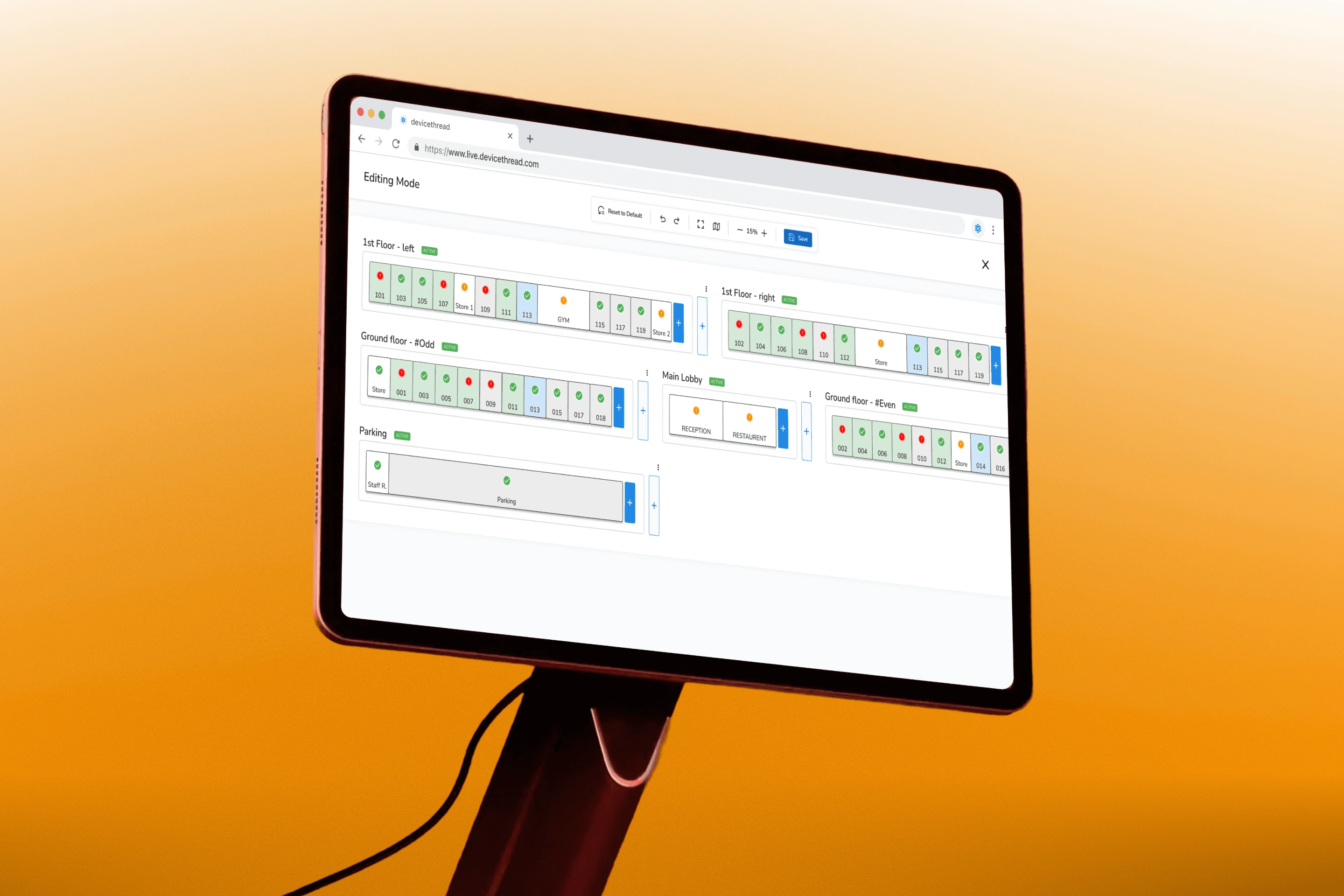
Turning a Database into a Radar.
Lists are for reading; hotels are for living. A spreadsheet cannot tell you that the leak in Room 304 is next to the electrical failure in Room 305. We moved away from the industry-standard list view to a Spatial-First Architecture. By mapping digital alerts to physical floor plans, we gave staff instant "situational awareness," drastically reducing the cognitive load required to diagnose hardware problems.
Design Solution
A Map That Actually Fixes Things.
Most dashboards are passive; they inform you that something is wrong, but direct you elsewhere to resolve the issue. We integrated direct controls into the visualization, turning the map into a live switchboard where a click doesn't just open a log, it unlocks the door and resolves the ticket.
Interaction Designs
Solving Problems Without Leaving the Map.
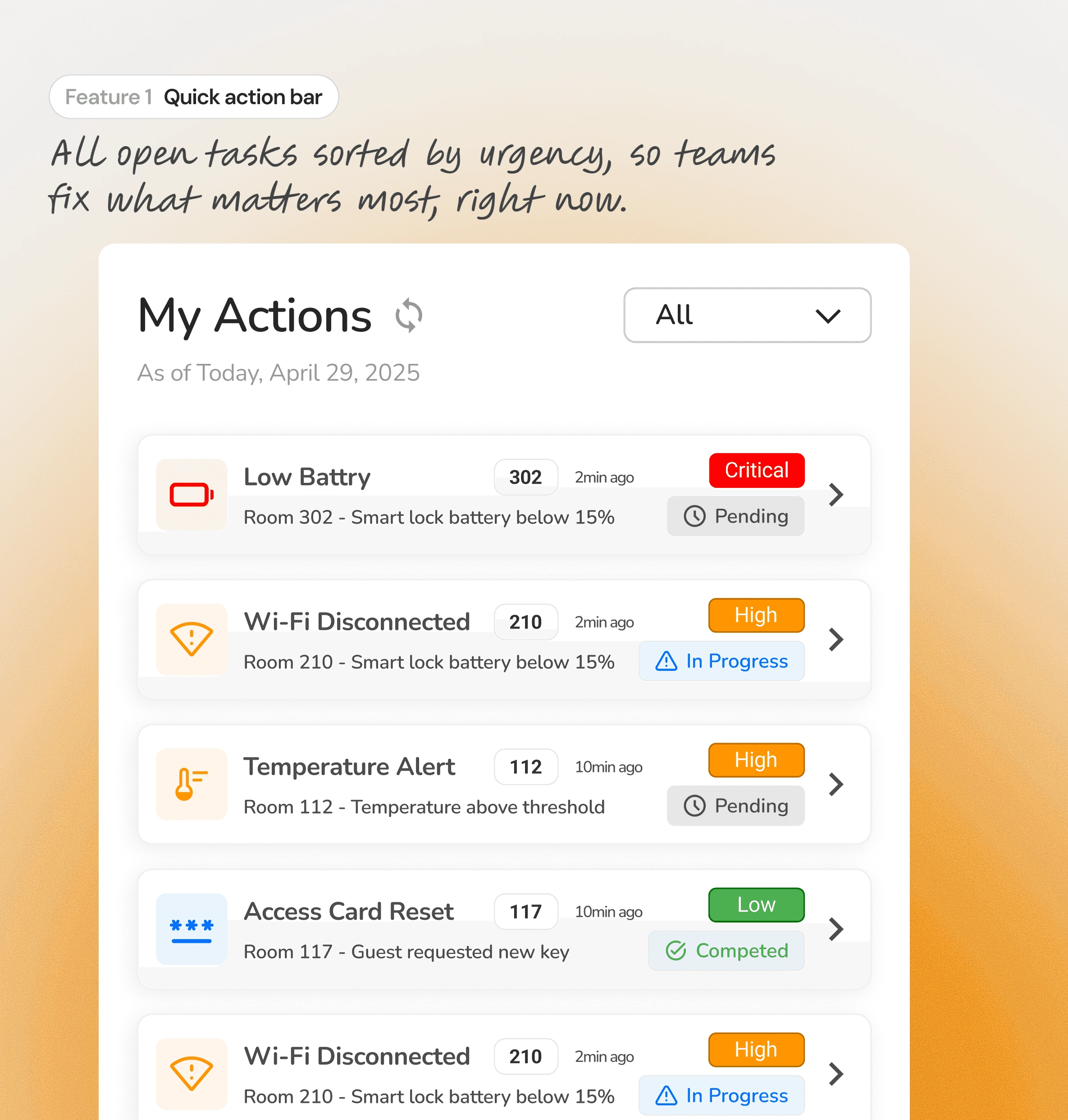
A "To-Do" List That Writes Itself.
Scanning a map for red dots creates cognitive load. The Quick Action Bar removes this effort by auto-aggregating every active failure into a single, prioritized queue. Staff no longer hunt for problems; the system serves them up on a silver platter, sorted by urgency.
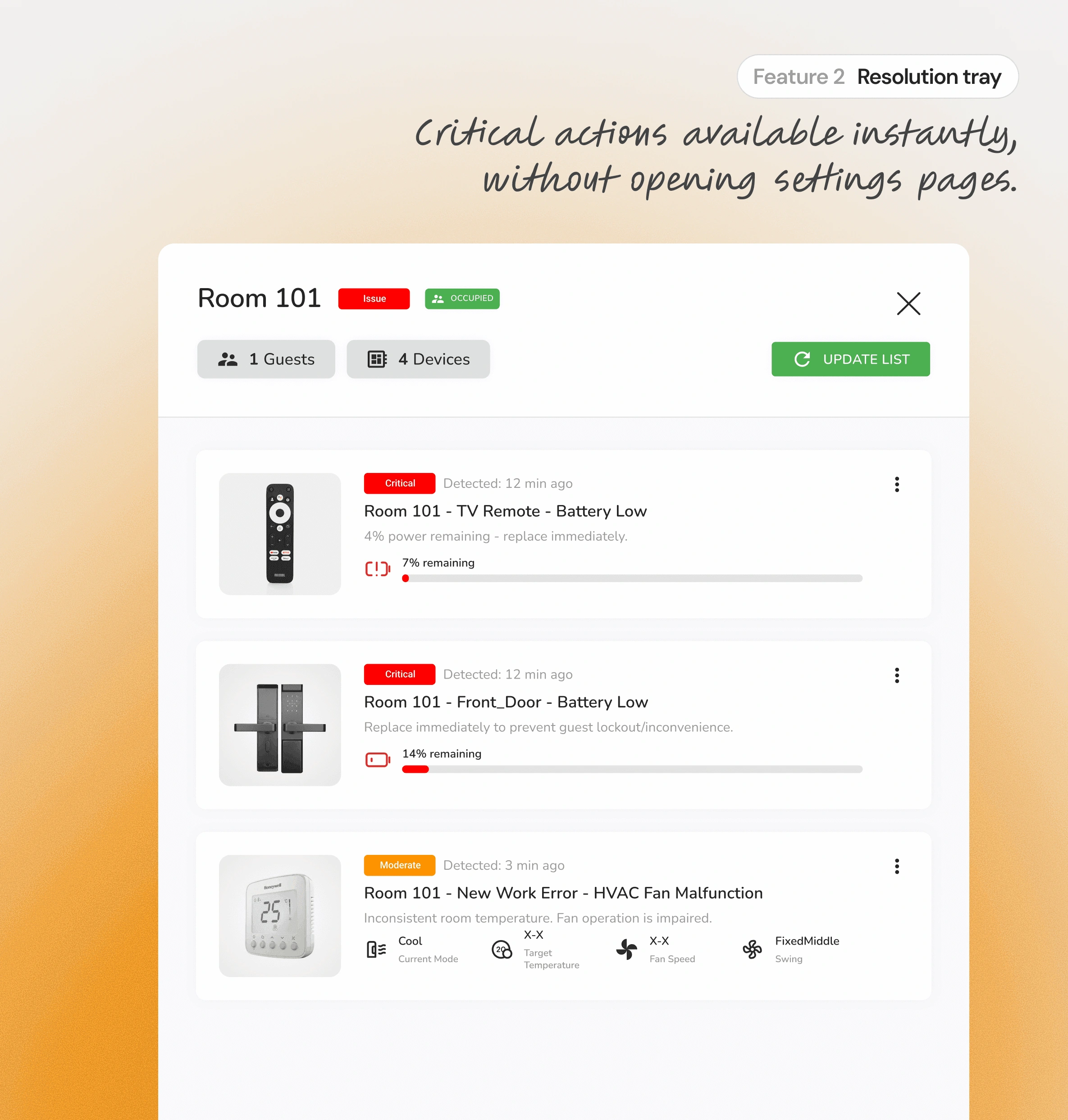
Closing Tickets Without Opening Tabs.
Traditional dashboards force users to navigate away to a "Settings Page" to fix an issue. I designed the Resolution Tray to slide over the map, bringing the controls (like Lock Override or Reboot) directly to the user. This allows them to fix the hardware without ever losing their visual context.
Role & Impact
Turning a Rough Concept into a Rigorous System.
Strategic Role
Translating Strategy into Interface
Joined the project during the definition phase to lead the High-Fidelity Execution.
My primary focus was translating abstract operational requirements into concrete UI patterns that were ready for engineering handoff.
Bridged the gap between the Lead Designer’s vision and the final production-ready assets.
Ownership
Architecting the Core Features
Owned the end-to-end design of the Interactive Property Map, defining how issues are visualized spatially.
Conceptualized the Quick Actions Panel, creating the logic for how list-based issues interact with the map view.
Defined the "Hover & Click" interaction models that allow users to resolve tickets without navigating away.
Collaboration
Aligning Design with Hardware
Collaborated closely with the Design Lead, building on earlier low-fidelity concepts and refining them into production-ready designs.
Worked with product and engineering teams to align design decisions with system and hardware constraints.
Iterated on designs based on internal feedback and real operational scenarios.
Outcomes
Measuring Success in Seconds Saved.
90% Faster Error Detection
By replacing paginated lists with a spatial map, we reduced the time required to identify critical hardware failures from minutes to seconds.
Killing the Learning Curve
The consumer-grade mobile UI allowed non-technical maintenance staff to master the system in their first shift, eliminating the need for lengthy training workshops.
100% Remote Resolution
Equipping staff with mobile admin tools reduced operational bottlenecks, as team members could resolve physical issues independently without radioing the front desk.
Learnings
The Screen is Only Half the Story.
Prioritizing the Exception
I learned that displaying every data point creates noise. Effective dashboards must suppress the "normal" to make the "critical" instantly visible.
Designing for Latency
IoT devices are slower than servers. I learned to use optimistic UI patterns to ensure sluggish hardware interactions feel instant to users.
Context Dictates Function
A feature useful at a desk is often useless in a hallway. The physical environment is as important as the digital interface.
Like this project
Posted May 25, 2026
Redesigned hotel operations dashboard to improve usability and reduce response times.
Likes
0
Views
0