Vélo | Brand & Logo Design

Siddharth G

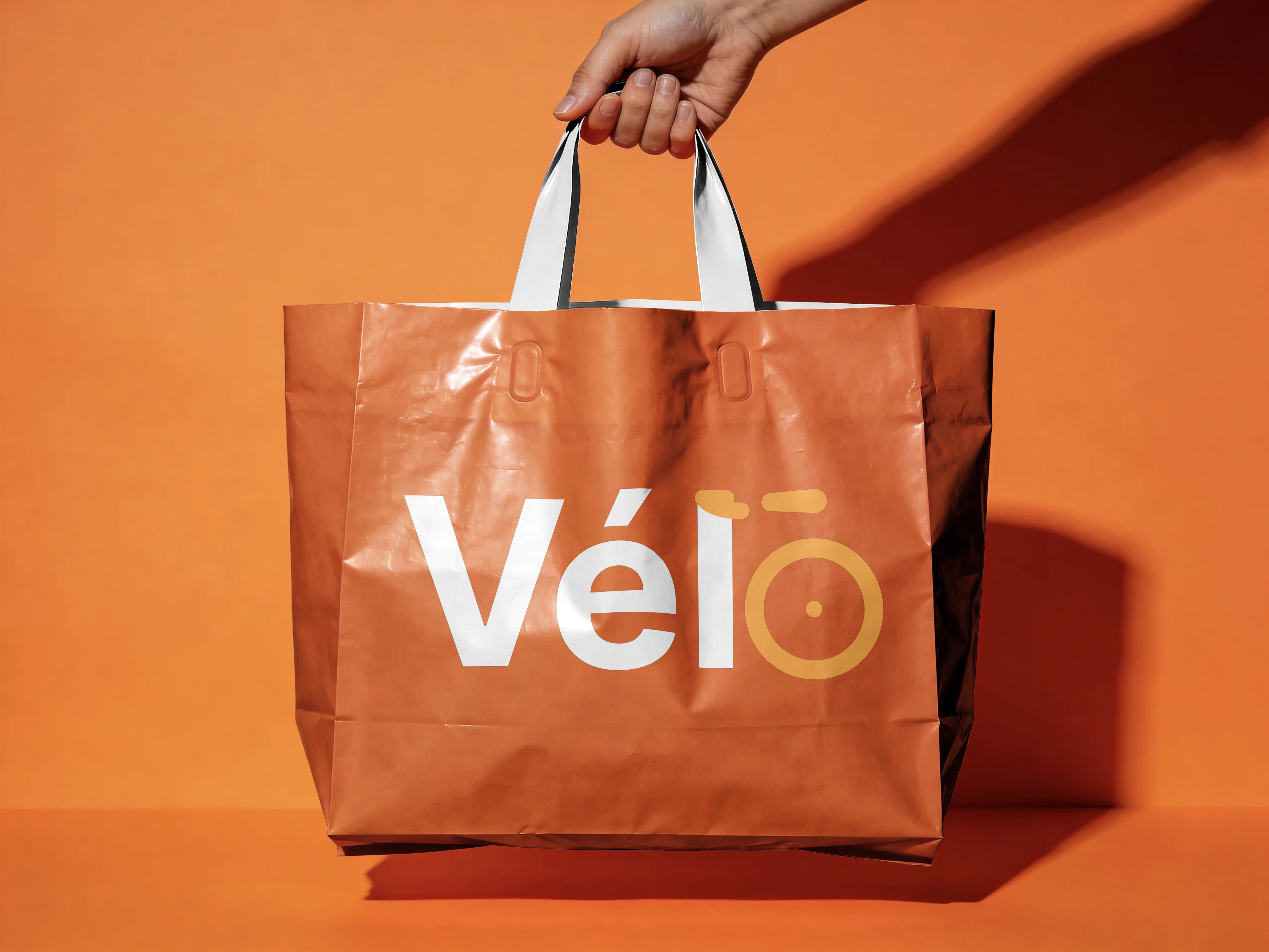
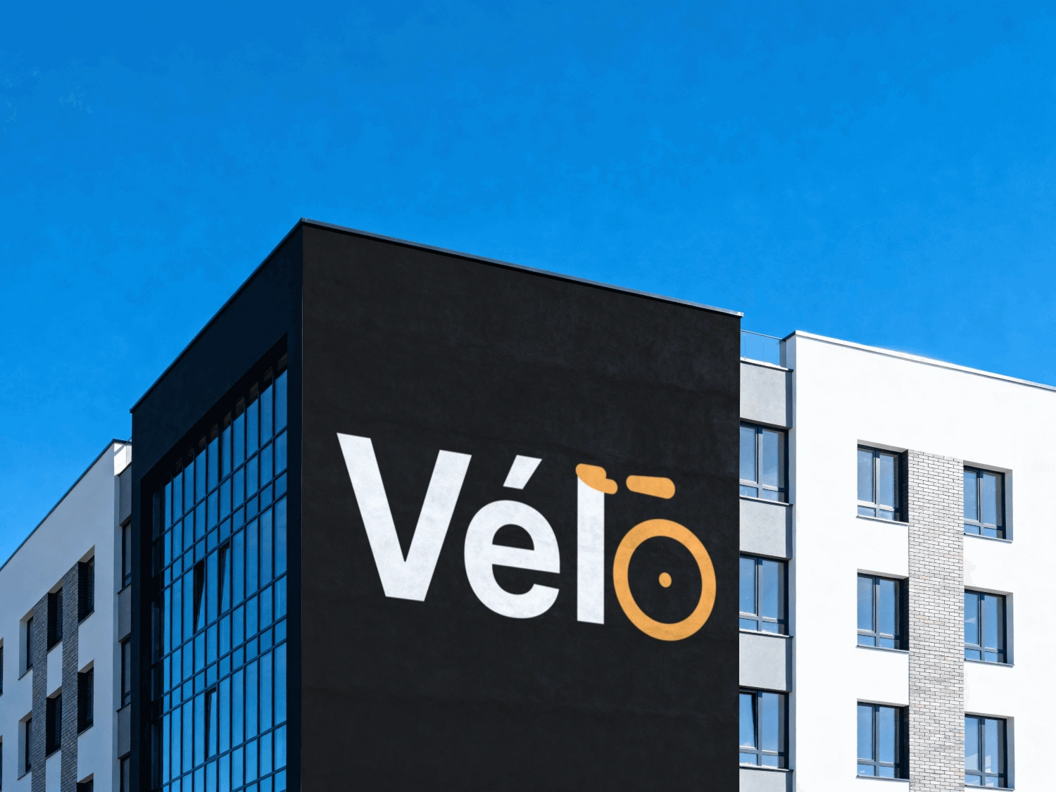
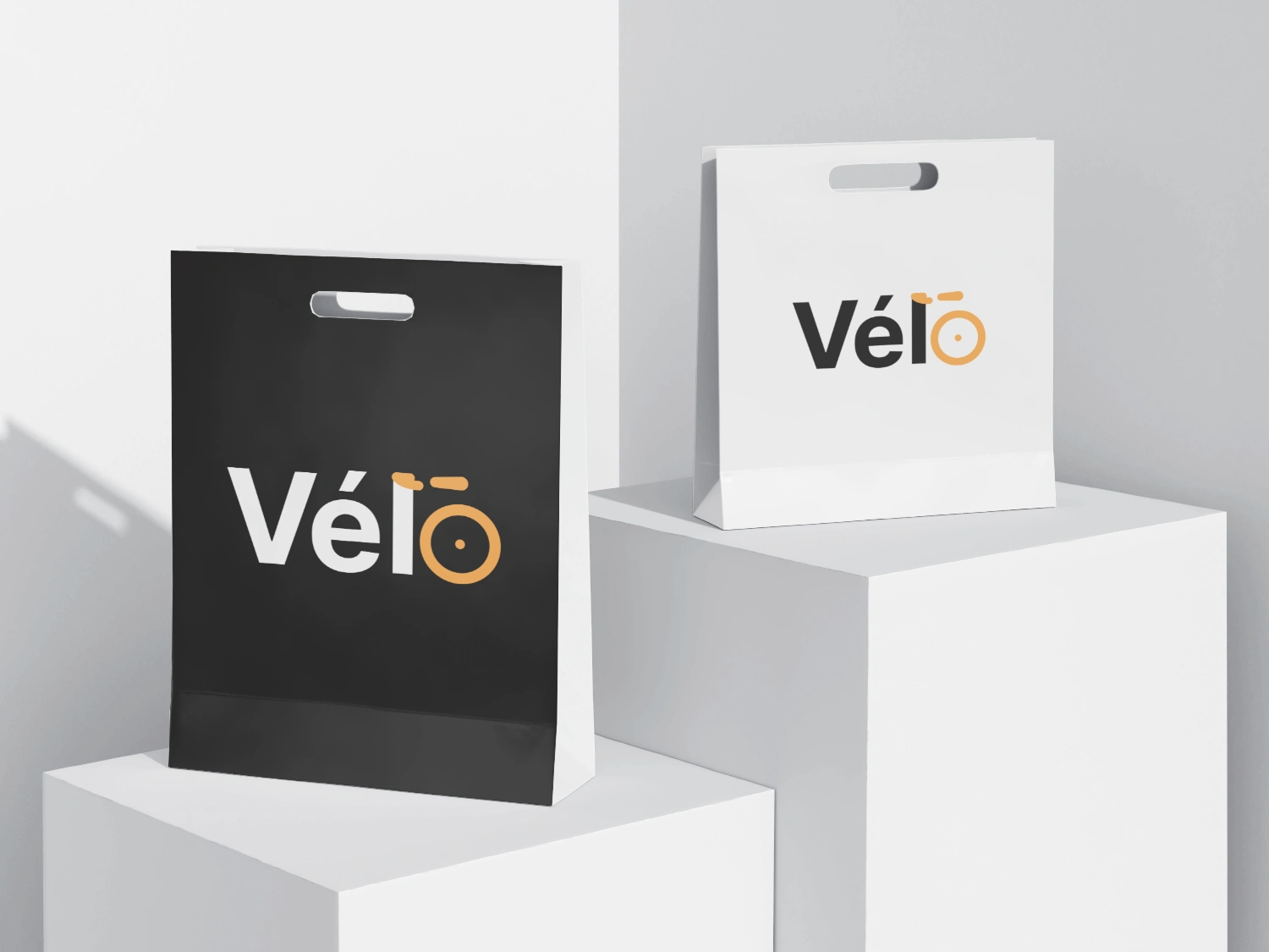
The identity behind the Vélo courier concept: a cycling brand mark that has to hold up on a courier bag, a coffee cup, a snack pouch, and the side of a building, without ever leaning on a bike icon to prove what it’s about.
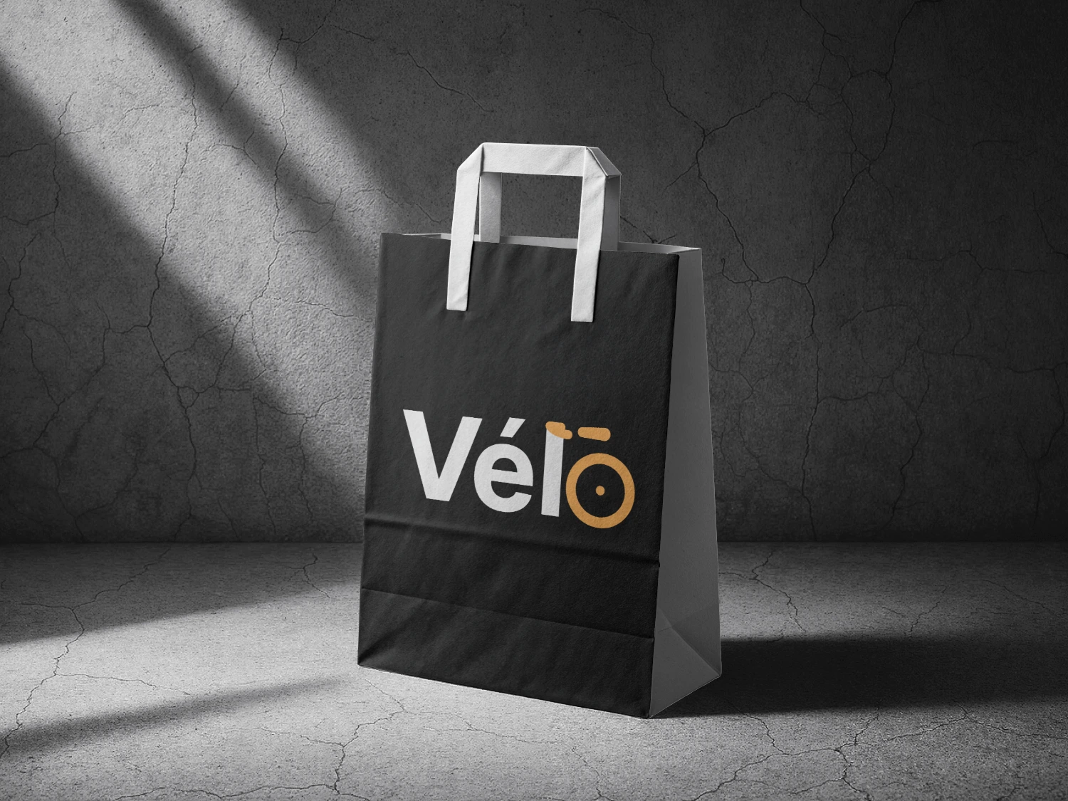
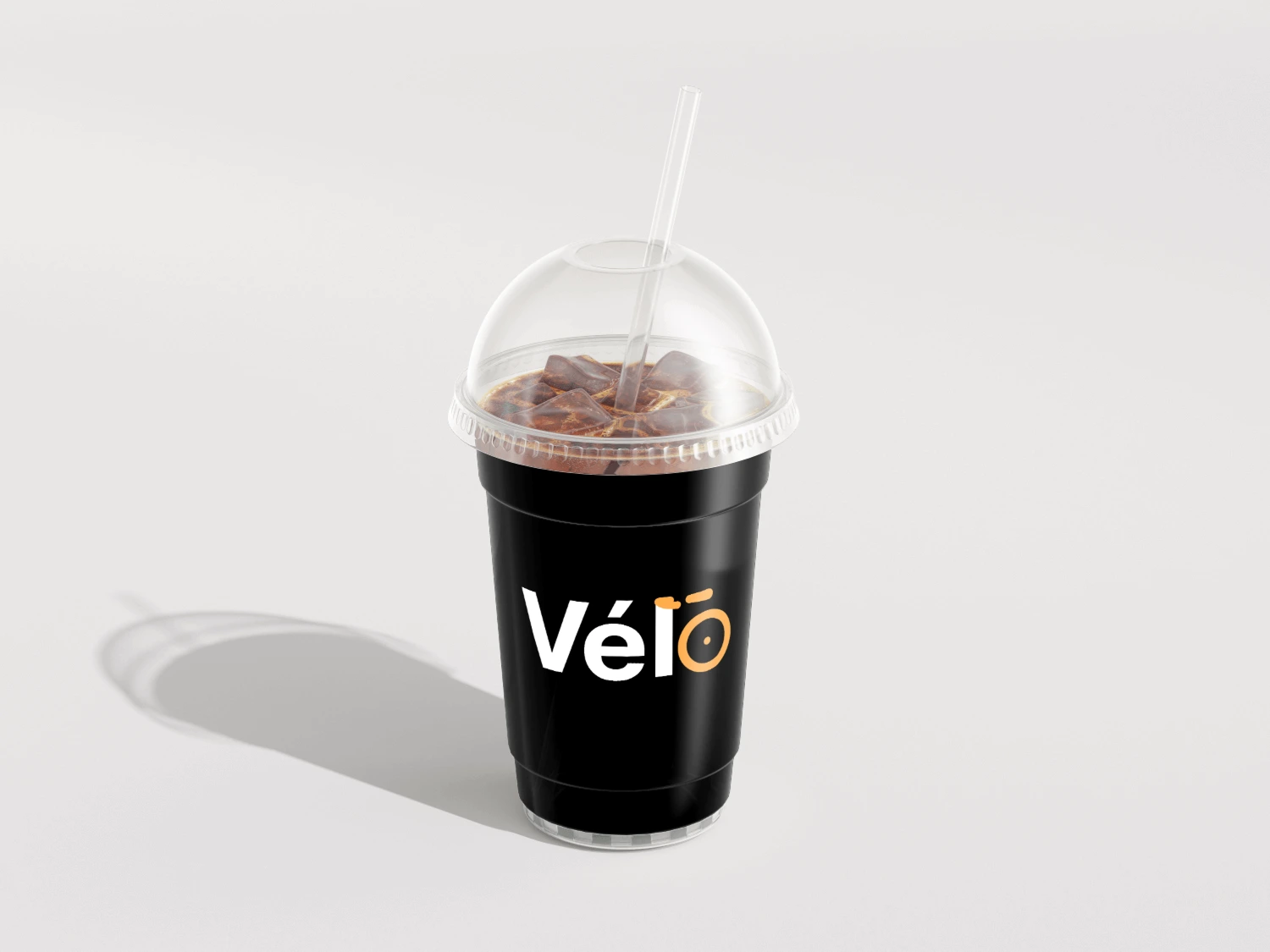
Build the bicycle reference straight into the letters instead of bolting an icon on next to them. The lowercase “l” doubles as a handlebar and seat post; the “o” closes itself off as a wheel.
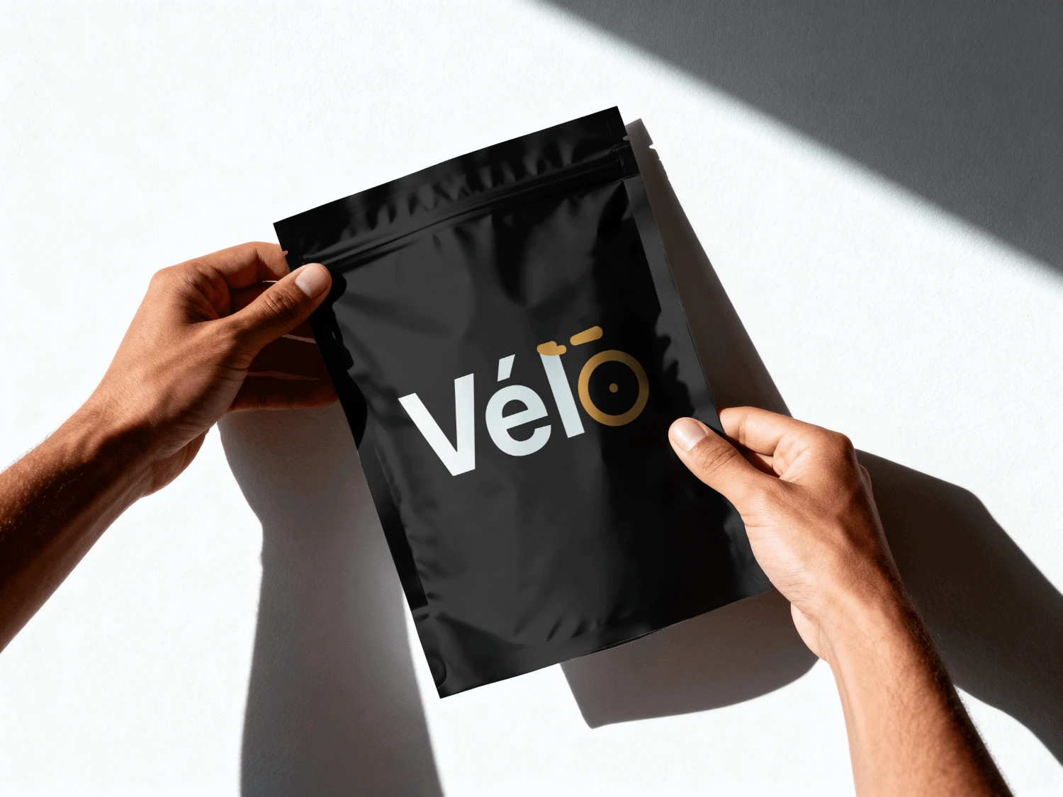
Orange, over the eco-green nearly every delivery brand defaults to, because a courier bag crossing traffic should read like a hazard vest, not a leaf.
Like this project
Posted Oct 10, 2026
Designed a unique cycling brand mark a campus delivery app concept that brings food, groceries, and laundry into one seamless experience.