Modern SaaS Analytics Dashboard Design

Cansaas Agency


Overview
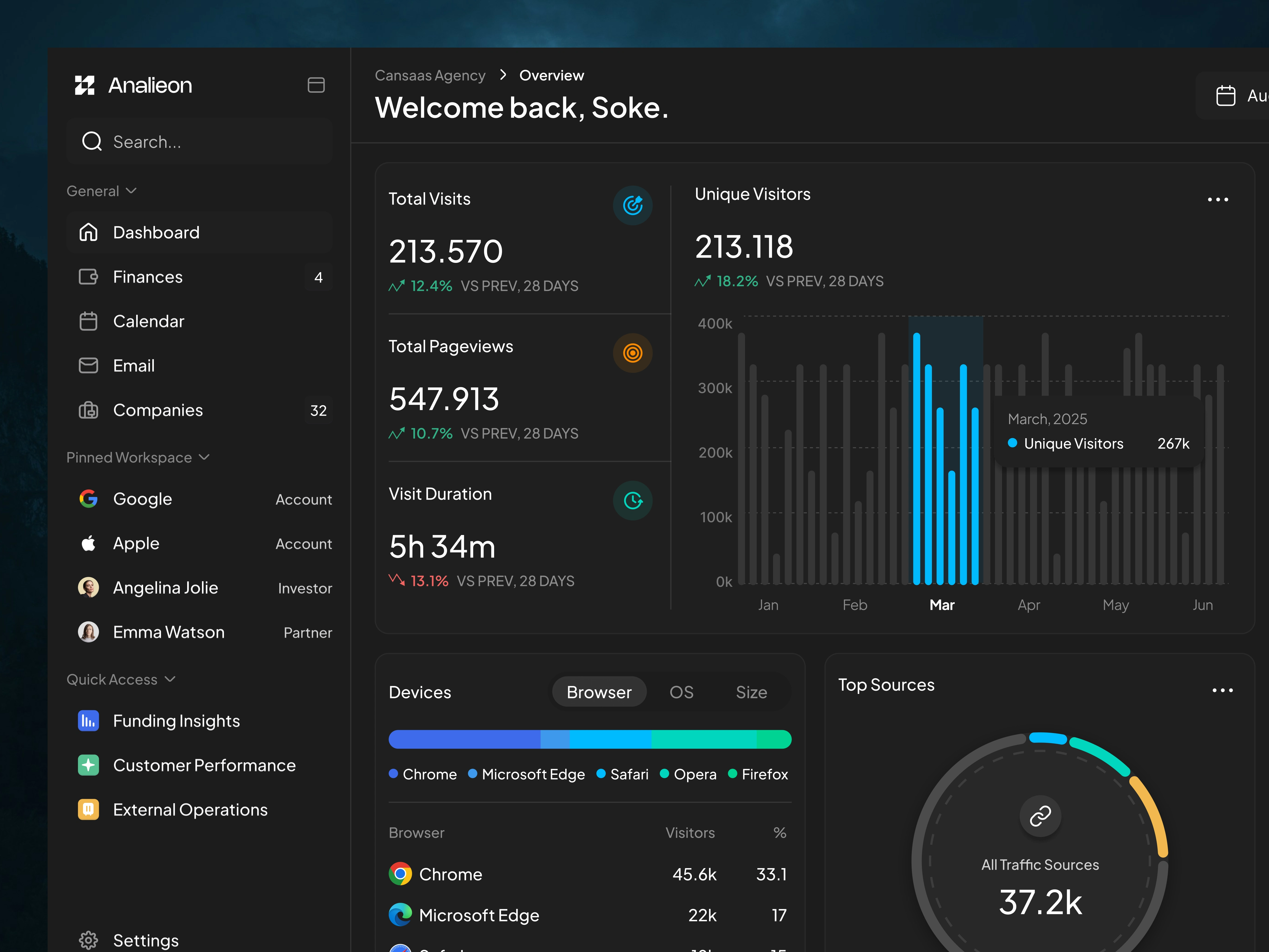
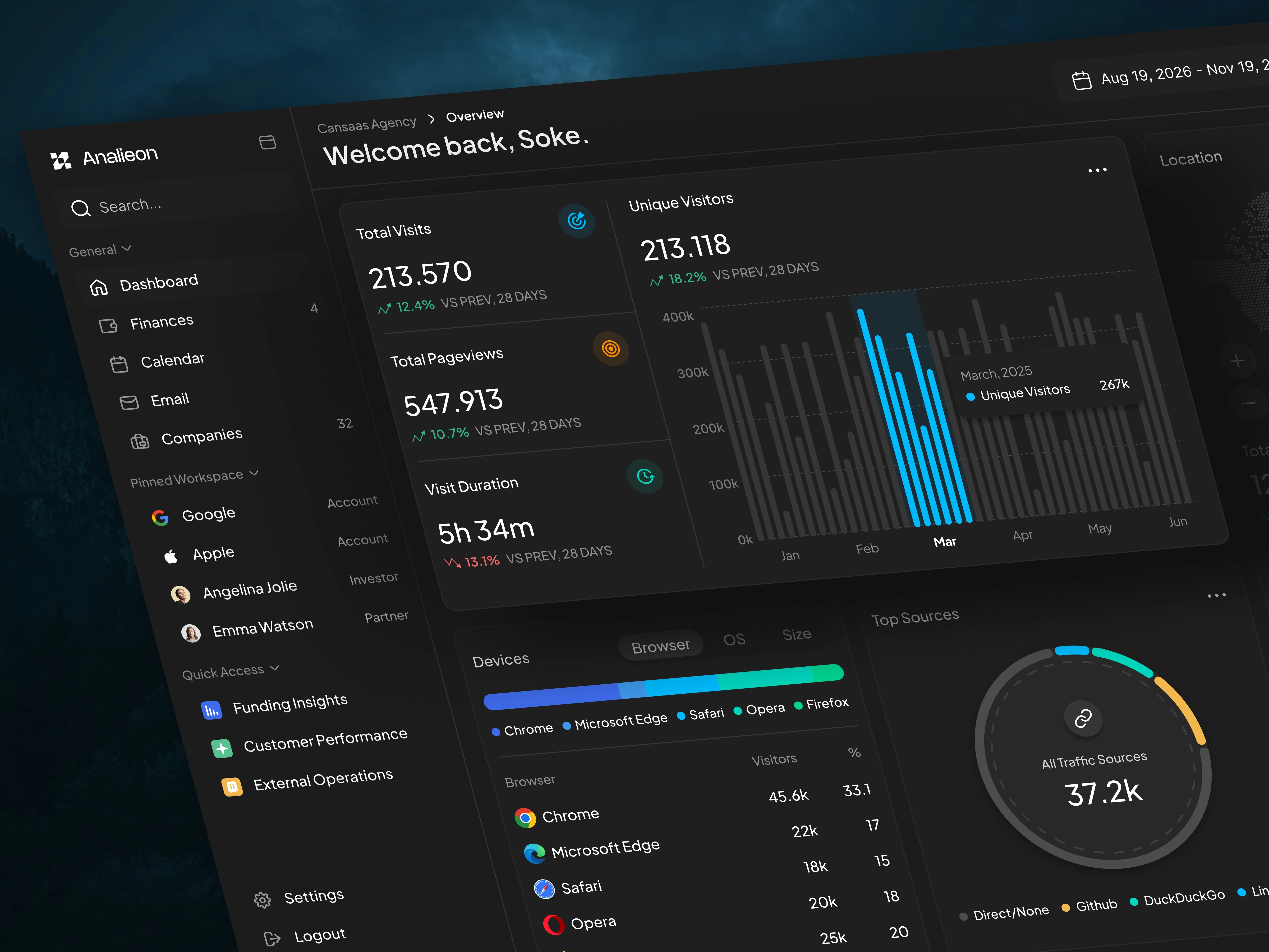
This project explores the design of a modern analytics dashboard for SaaS platforms, built to help teams monitor performance metrics, analyze user behavior, and understand traffic insights in one unified interface. The dashboard focuses on clear data hierarchy, intuitive navigation, and modern data visualization, enabling users to quickly interpret analytics without feeling overwhelmed by complex datasets.
The interface combines metric cards, interactive charts, device analytics, and traffic source visualizations to create a comprehensive overview of product performance. By organizing critical insights into modular dashboard components, users can easily track growth trends, engagement metrics, and conversion performance in real time.
The Challenge
Analytics dashboards often present large volumes of data, which can easily become visually overwhelming or difficult to interpret. Many traditional dashboards suffer from poor information hierarchy, cluttered layouts, and confusing visualizations, making it harder for teams to extract meaningful insights quickly.
The challenge of this project was to design a SaaS analytics dashboard UI that balances data density with visual clarity, allowing users to monitor key metrics efficiently while maintaining a clean and modern interface.
Design Approach
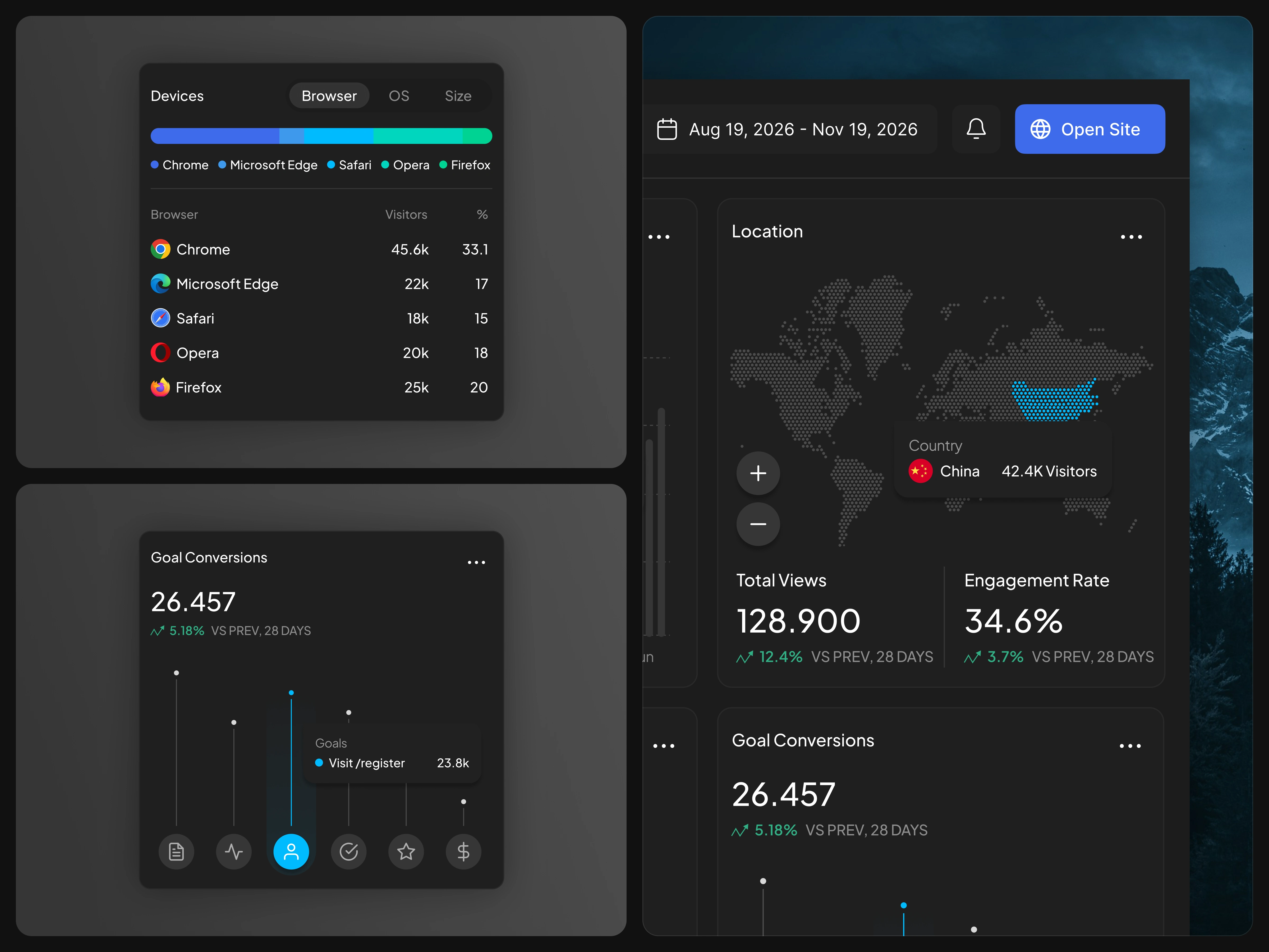
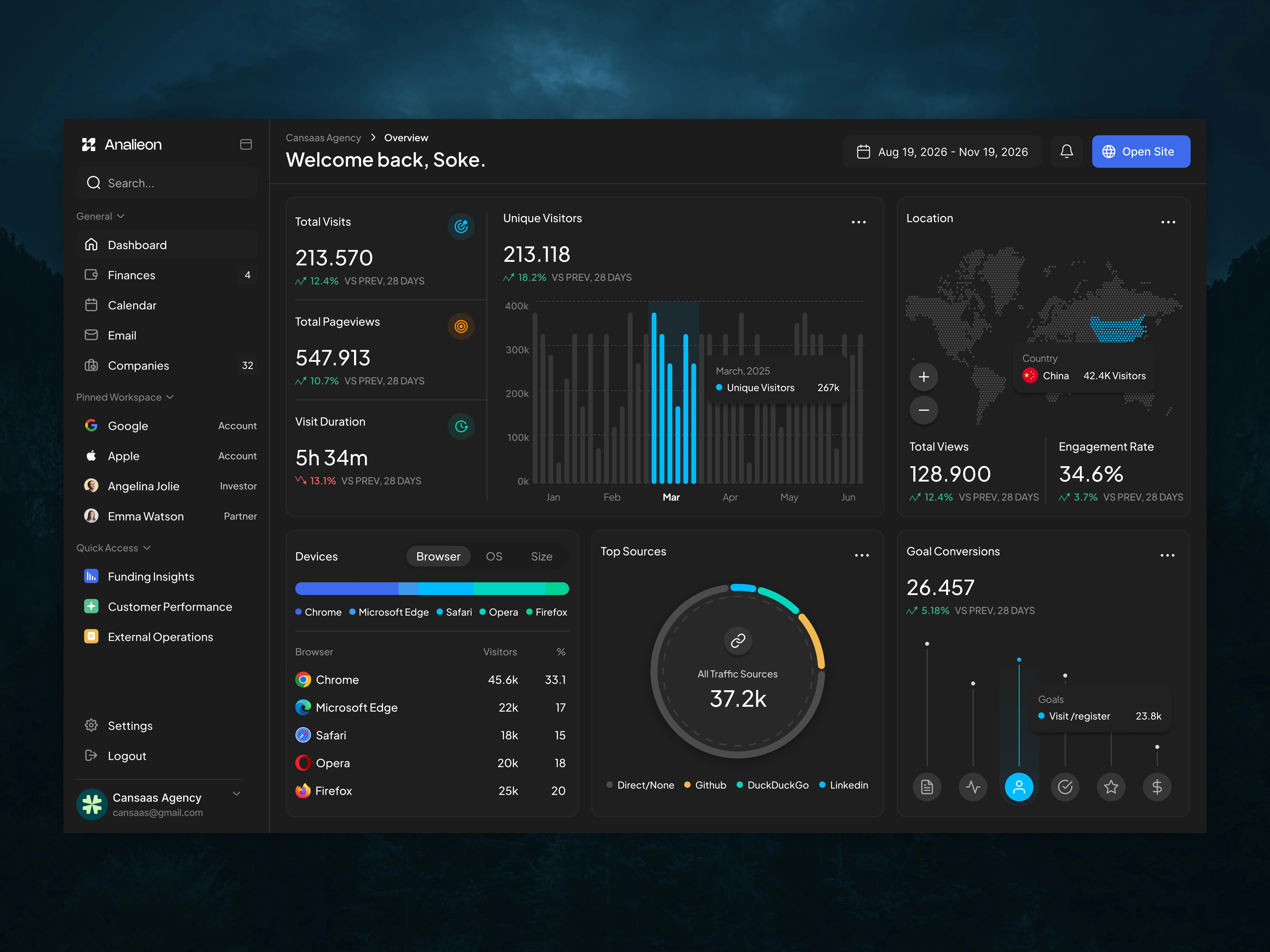
To address this challenge, the design focuses on structured layout systems and modular analytics cards. Key performance indicators such as Total Visits, Pageviews, Unique Visitors, and Visit Duration are displayed in clear metric cards, allowing users to understand performance trends instantly.
The dashboard also integrates interactive charts and visual indicators to highlight growth patterns and user activity. Components like device analytics distribution, goal conversion tracking, and traffic source visualization provide deeper insights into how users interact with the platform.
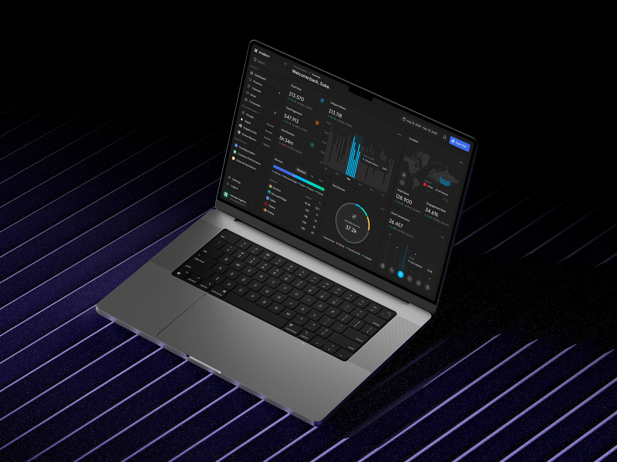
A dark UI theme was intentionally used to enhance data readability and visual contrast, allowing charts and metrics to stand out while maintaining a professional SaaS product aesthetic.
Key Features
The dashboard includes several important analytics modules designed to improve usability and insight discovery:
Performance Metrics Overview – Quick access to key indicators such as visits, pageviews, and engagement.
User Traffic Visualization – Interactive charts displaying visitor trends over time.
Device Analytics Insights – Clear distribution of traffic sources by browser and device type.
Conversion Tracking – Goal conversion analytics to monitor user actions and product engagement.
Traffic Source Analysis – Circular visualization for understanding acquisition channels.
These components work together to create a scalable analytics interface suitable for SaaS products, product management tools, and marketing platforms.
Design Impact
The final result is a clean and modern analytics dashboard UI that prioritizes usability and clarity. By simplifying complex datasets into intuitive visual components, the dashboard enables teams to make faster, data-driven decisions.
This concept demonstrates how thoughtful UI design, UX strategy, and data visualization principles can transform complex analytics into an accessible and actionable product experience.
Like this project
Posted Mar 10, 2026
Designed a modern, intuitive analytics dashboard UI for SaaS platforms.