Lazy Girl Job Program | Bulletso

The job market is becoming increasingly competitive, and job seekers need all the help they can get to find a job. The Lazy Job Girl Program aims to provide job seekers with the resources and guidance they need to succeed in their job search.
Problem
the program's Notion workspace lacked proper structure and navigation, leading to reduced productivity and engagement. Our team was tasked with redesigning the workspace to increase its value, potential revenue line, and effectiveness.
Goal
Our aim is to elevate the experience through a refined layout, potentially increasing product retail by 10%. Simultaneously, we're exploring long-term additions for recurring revenue. Additionally, we seek feedback to enhance information delivery and elevate customer satisfaction levels.
My Role:
UX Designer
Project Duration:
2-Week Sprint
Tools:
Figma, Figjam, Chatgpt, Google Bard, Notion, Bullet.so
Discover & Define
Week 1 - Exploring the Notion workspace of the Lazy Girl Job Program
During the first week of the sprint, we performed a heuristic evaluation to pinpoint usability issues within the Notion workspace. This involves assessing the user interface against a set of usability guidelines or heuristics.
We also leveraged AI, employing ChatGPT and Google Bard as our UX research interns. Their contributions provided diverse insights. We then compared their findings with our own judgments to create the research summary.
Heuristic Evaluation
Let's begin the heuristic evaluation.
1. Visibility of System Status
Emojis make it difficult to know what exactly needs to be looked at or clicked on.
Some of the clickable items don’t have a hover state.
The lack of clear structure and hierarchical organization makes it difficult for users to understand their current location within the workspace and navigate effectively.
2. Match Between System and the Real World
There's no menu or sub-menu structure, making it extremely challenging to navigate between pages within the workspace.
3. User Control and Freedom
Although Notion supports interactive elements like checkboxes and databases, the workspace appears to underutilize these capabilities. Incorporating more interactive features such as filters, linked databases, or embedded calendars could boost productivity and create a more engaging user experience.
4. Consistency and standards
Inconsistent visual hierarchy, formatting, and naming conventions across the workspace impede users' comprehension and navigation.
5. Error prevention
No violations found in this area.
6. Recognition rather than recall
The workspace lacks sufficient descriptions or context for sections and pages, requiring users to recall or explore to understand their content.
7. Flexibility and efficiency of use
The workspace does not provide much flexibility or efficiency in terms of interactive elements or customized views.
Lack of additional navigation aids, such as a table of contents or quick links.
8. Aesthetic and minimalist design
There is a lot of content with no clear visual hierarchy. It is difficult to consume all the content without getting overwhelmed.
The workspace has a visually appealing design, but the lack of clear structure and visual cues diminishes the minimalist aspect of the design.
9. Help users recognize, diagnose, and recover from errors
No violations found in this area.
10. Help and documentation
The tools mentioned are difficult to use and get started with.
The workspace lacks embedded help or documentation to guide users through its features and functionalities.
Key Pain Points from Heuristic Evaluation
Content overload and structure deficiency
The absence of a structured menu or sub-menu makes it challenging for users to navigate between pages and understand their current location within the workspace. This hinders effective exploration and usage of the content.
Lack of clear navigation and hierarchy
The workspace under utilizes interactive elements offered by Notion, such as checkboxes, databases, and embedded calendars. Incorporating more interactive features could enhance productivity and engagement for users.
Inconsistent Visual Hierarchy and Naming Conventions
The lack of consistent formatting, naming conventions, and visual hierarchy throughout the workspace makes it difficult for users to understand and navigate the content. This leads to confusion and reduces overall usability.
Overwhelming Content and Lack of Structure
The abundance of content without a clear visual hierarchy or organization can overwhelm users and make it challenging to consume information effectively. Additional navigation aids, such as a table of contents or quick links, could assist users in navigating the workspace more efficiently.
Design & Deliver
Week 2 - Developing bullet.so
Sitemap
Based on the evaluation & goals, we kept the following in mind and created a sitemap
Moved from a jumbled workspace to a structured Landing Page + Knowledge Base structure
The Landing Page to build trust and eases job seekers in
Searchable Knowledge Page with easy navigation and chronological guide
Matches mental model of the online course or comprehensive guide
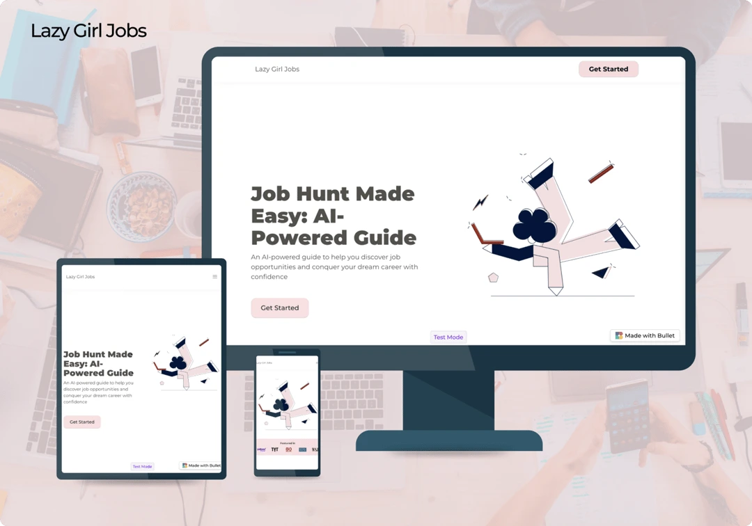
Implement research findings to develop bullet.so. In the second week, we began crafting the website using bullet.so. The addition of a one-on-one booking section and integrations such as live chat and Google Analytics improve the program's effectiveness and potential revenue line. This platform empowers users to effortlessly craft professional websites through Notion, eliminating concerns about plugins, hosting, or page speed.
Design
Here is a website link to the final product.
Delivery
This is a UX challenge from the Sprintfolio project, and we secured the project among 18 Teams. Here are the comments from Sprintfolio, Bullet.so, and Gabrielle Judge.
This is a UX challenge from the Sprintfolio project, and we secured the project. Here are the comments from Sprintfolio, Bullet, and Gabrielle Judge.
“The winning team is Cerulean! They crushed the scope of work while also tackling the brownie points so precisely. Like I said in their feedback, it looks like a high-end site and I absolutely love this site's functionality.” Gabrielle Judge, Founder of Anti-Work Boss Girl
“The consistent usage of colors in buttons, images, and even icons is a visually pleasing aspect of the site. I appreciate the decision to keep the sales page within the main website while moving other texts to the knowledge base. This keeps the content organized and avoids overwhelming visitors.” Aswin Kumar, Founder of Bullet
“Really great work in grappling both the business strategy and design. The UX writing, site architecture, improvements in navigation, and execution of Gabrielle’s branding was fantastic! I found it impressive that this team took time to include innovative features such as the live chat and google analytics. Yashant and Thet worked really well together! They consistently checked in with each other, and provided updates as they worked in two different time zones, as well as two different countries! Well done!” Kai Tran, Cofounder of Sprintfolio
Next Steps
After finalizing the bullet design in a 2-week sprint, we made necessary touch-ups based on feedback. We also removed one-on-one booking and live chat features, currently out of the brand owner's scope, and replaced them with a testimonials section. This addition boosts revenue through social proof, encouraging program sign-ups. We had a client meeting to align on preferred illustrations and member stack/paywall integrations. The initial version of LazyGirlJob launched in approximately 3 weeks.
Here is a website link to the final product.
Key Takeaways
Our team encountered several challenges during the redesign process.
We faced limitations with Bullet.so templates hindered full workspace customization. Conducting a heuristic evaluation on Notion was challenging due to platform constraints. However, our team collaborated to find creative solutions and make design trade-offs, enhancing workspace usability.
Like this project
Posted Mar 7, 2024
The Lazy Job Girl Program aims to provide job seekers with the resources and guidance they need to succeed in their job search.
Likes
0
Views
1


