Brunna's Soda Fountain - Visual Identity & Packaging

Rebecca Arnaud


The client
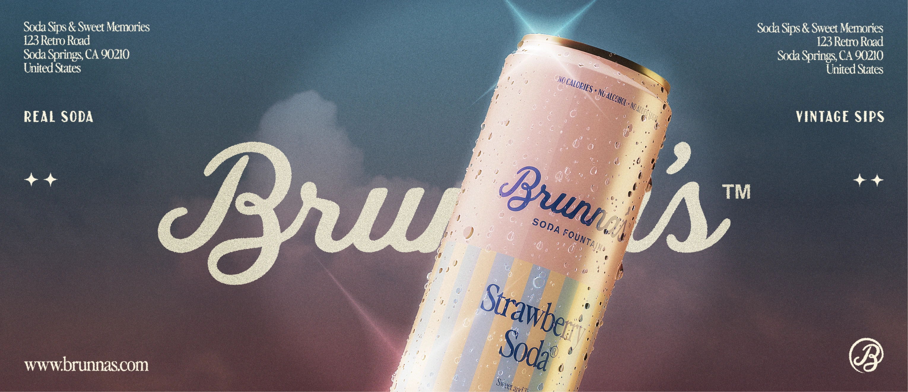
Brunna’s is a fictional soda brand created as a passion project. The idea came from discarded concepts of a real client project that never moved forward. Instead of letting it sit unfinished, I decided to turn it into a full brand experiment driven purely by curiosity and creative freedom.
Role: Visual Identity / Packaging / Collaterals
The challenge
The challenge was taking an idea that had been set aside and giving it a real voice. I wanted to explore how a brand inspired by the 1920s could feel playful and nostalgic without becoming stiff or overly “retro.” More than aesthetics, the goal was to create something that felt alive, usable, and intentional, even as a fictional project.
Our Solution
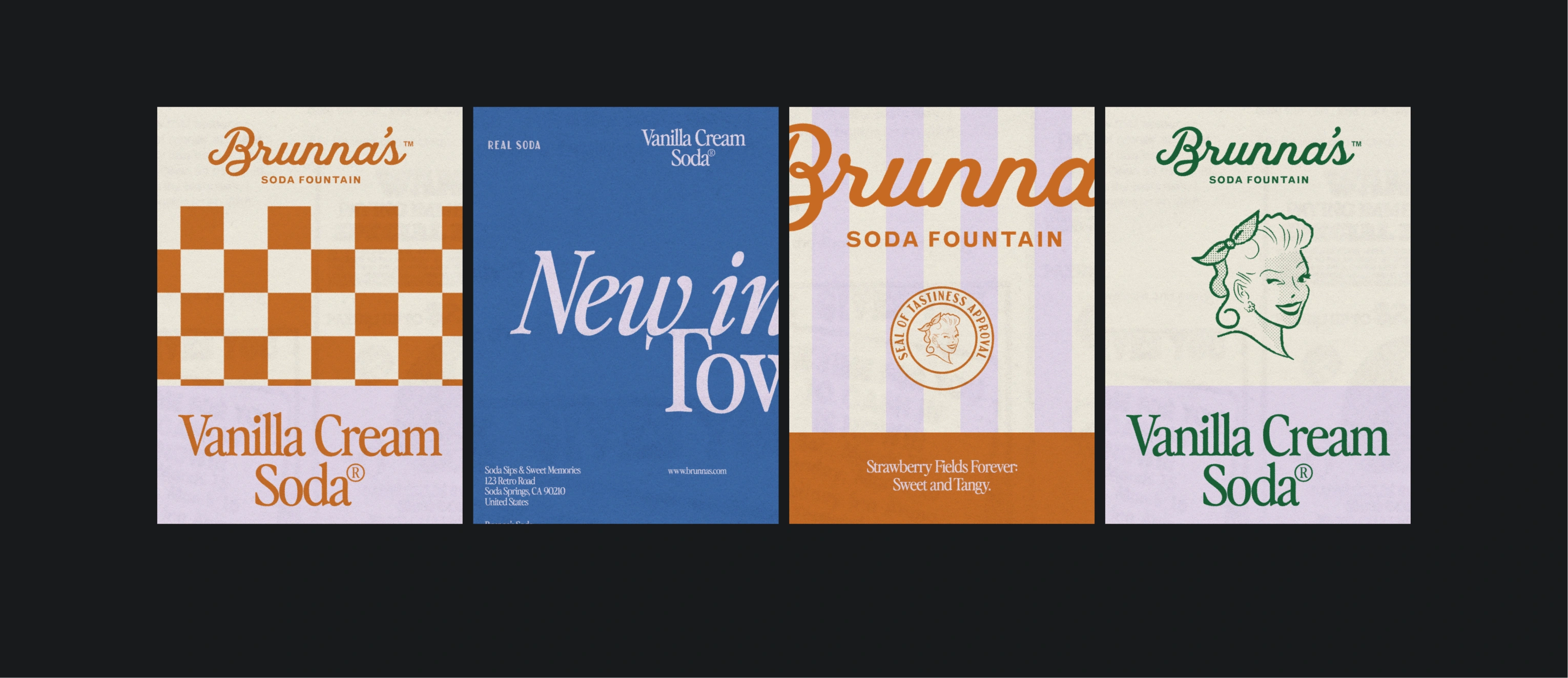
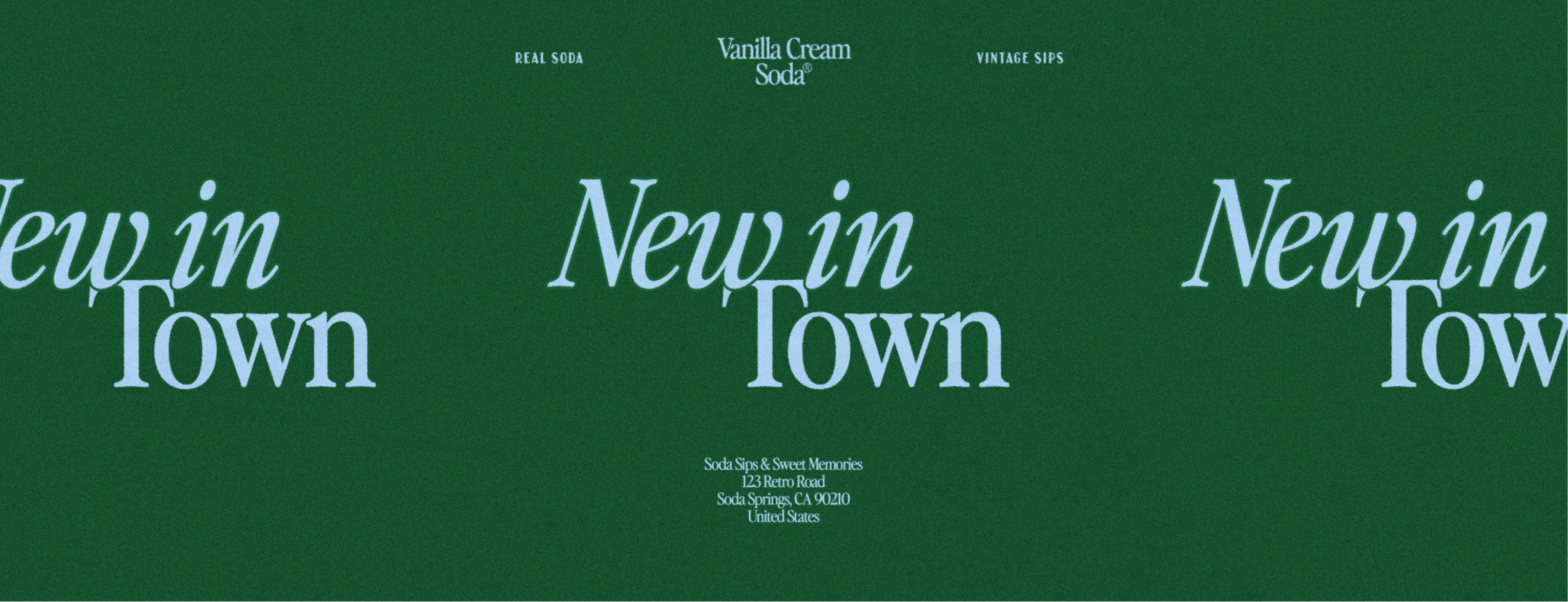
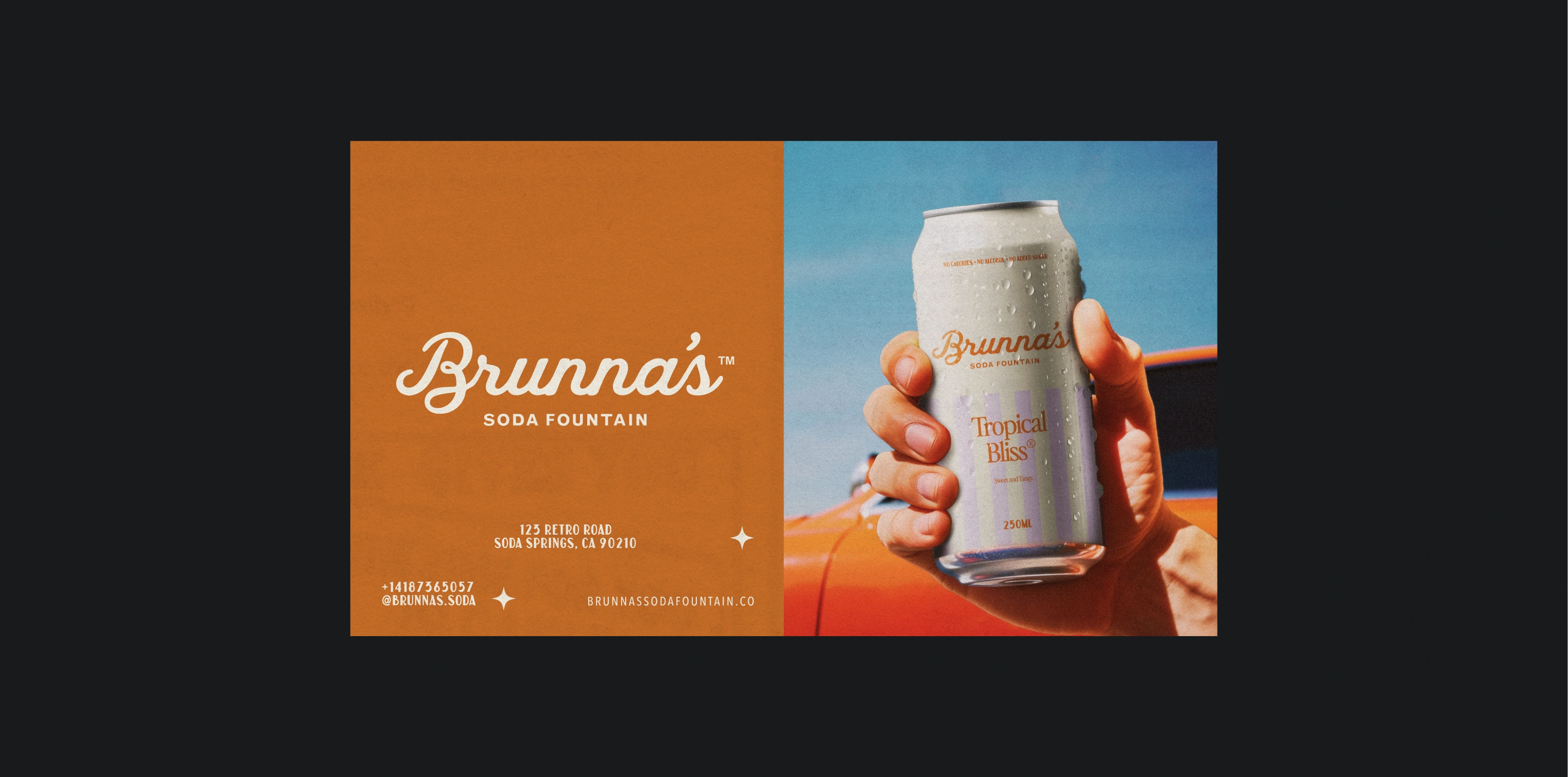
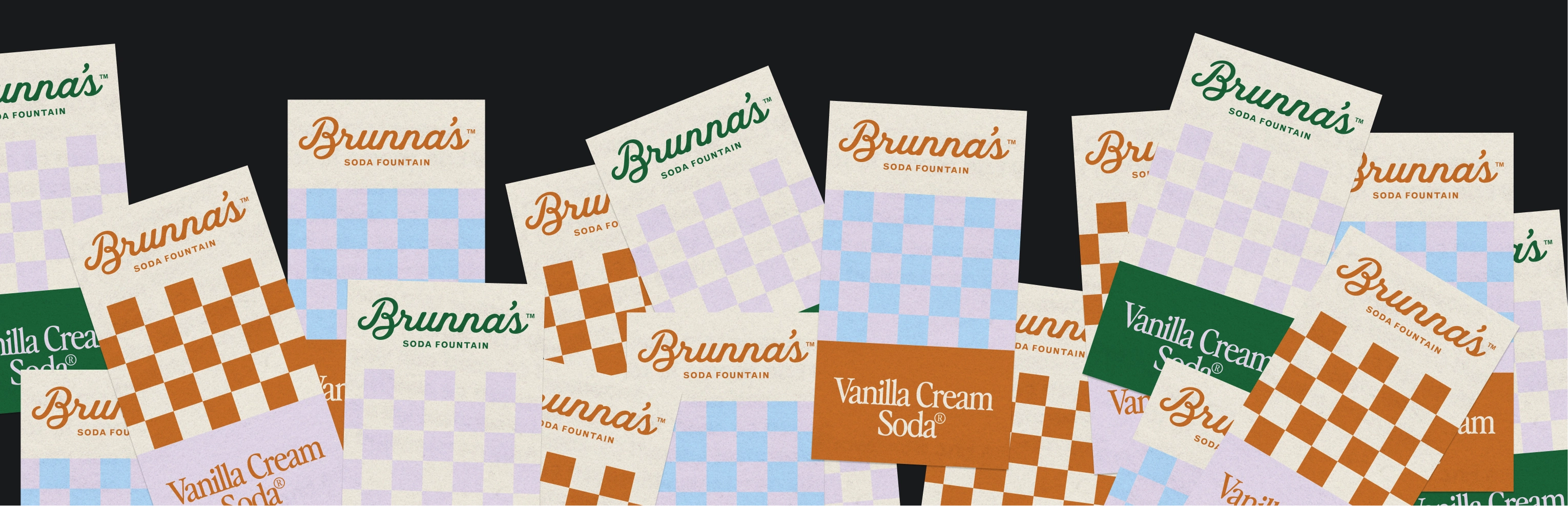
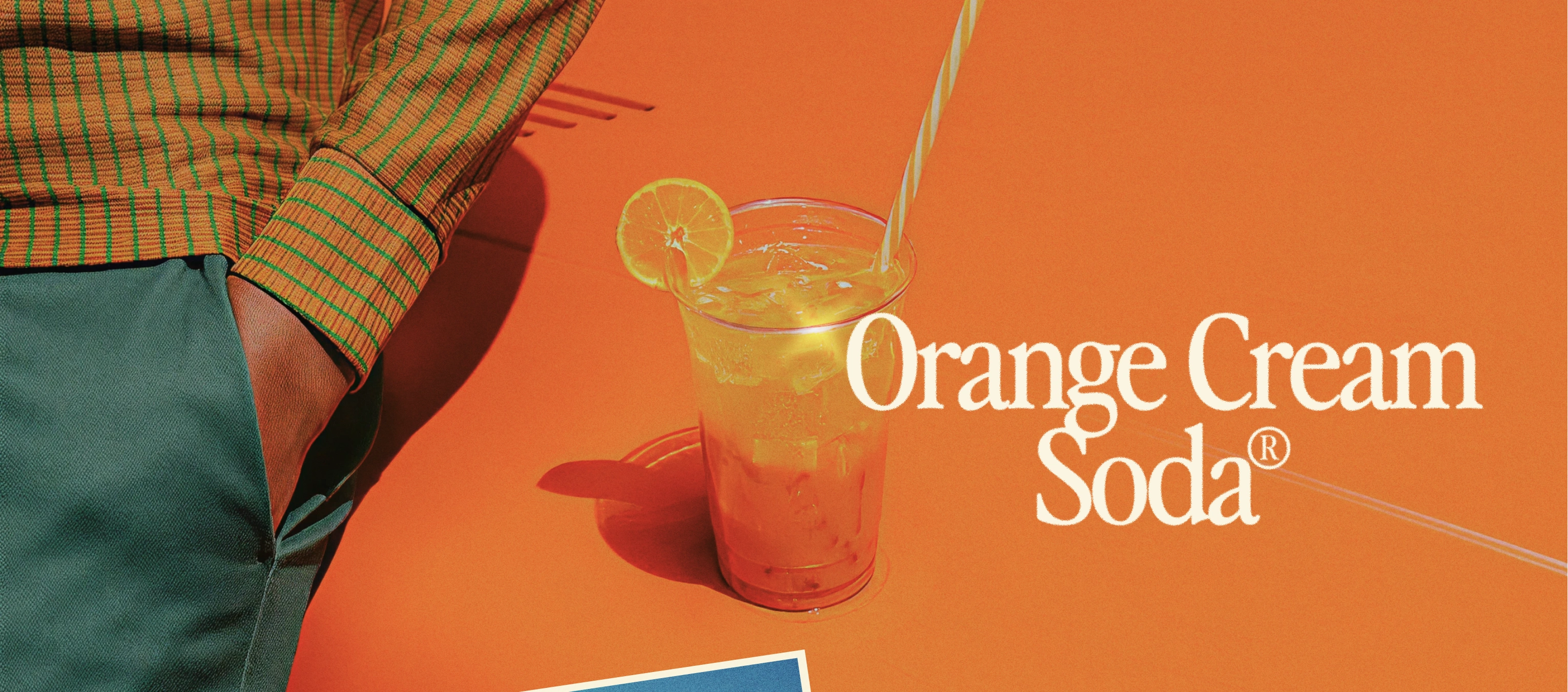
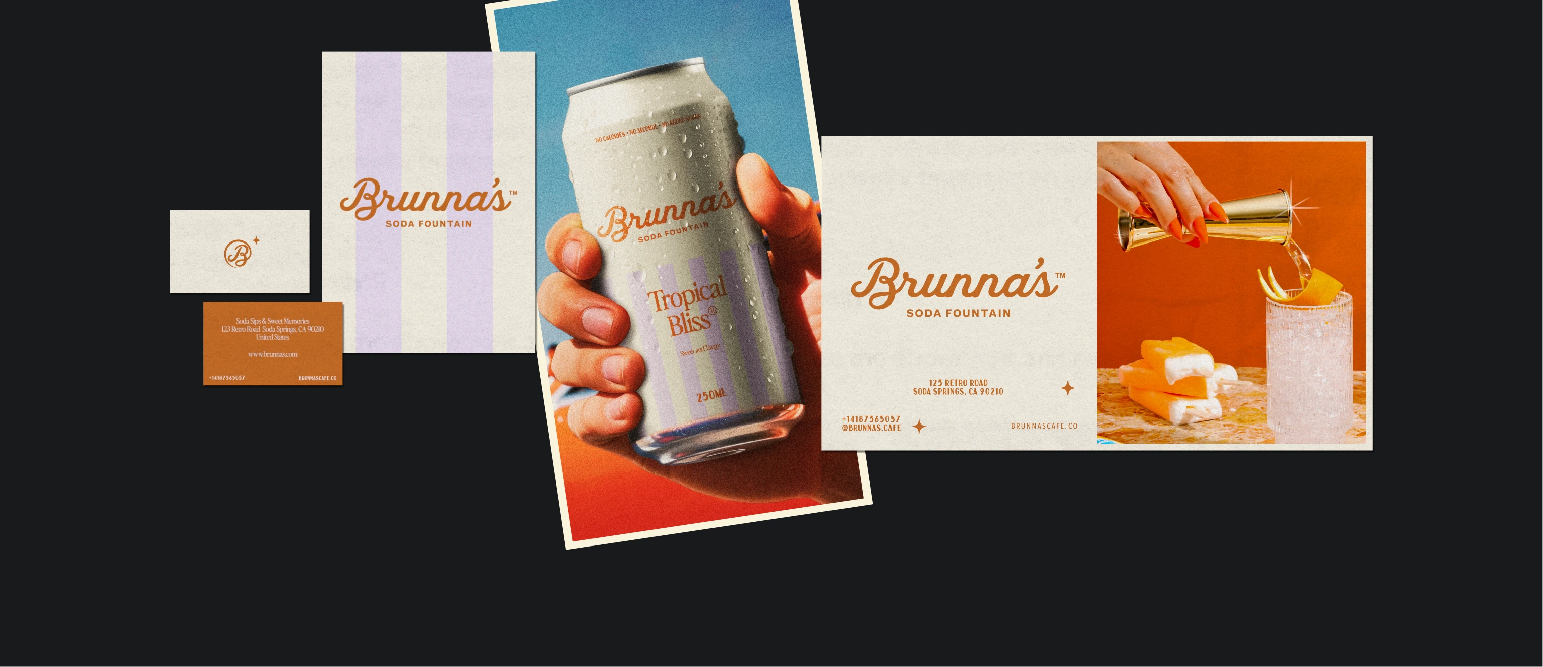
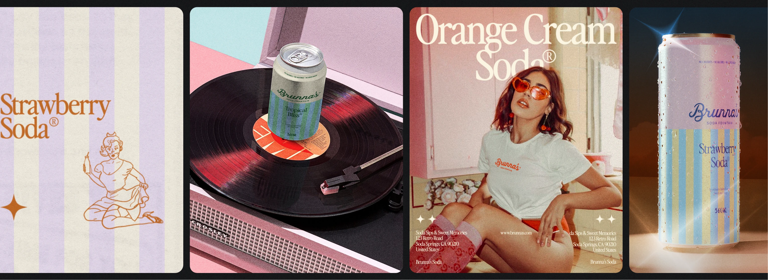
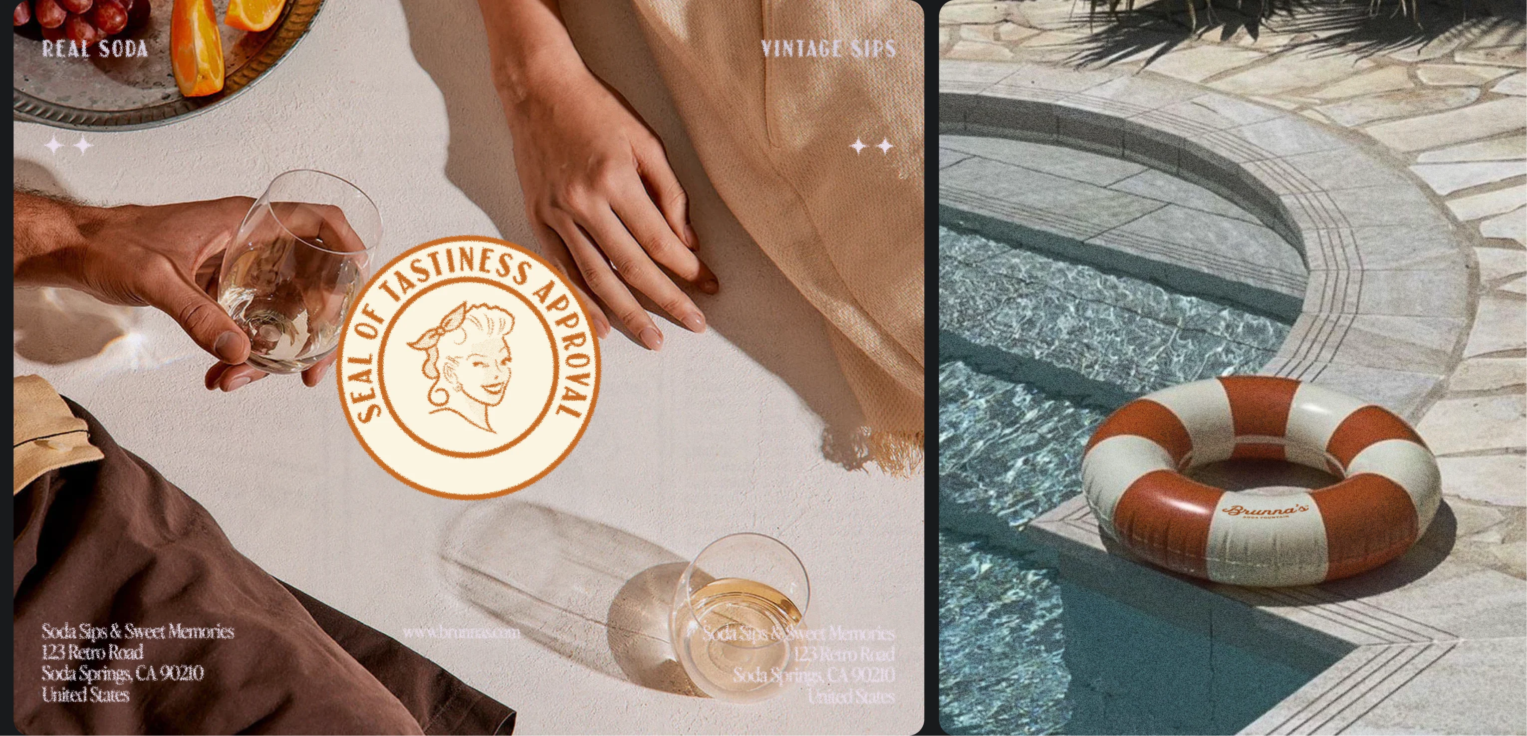
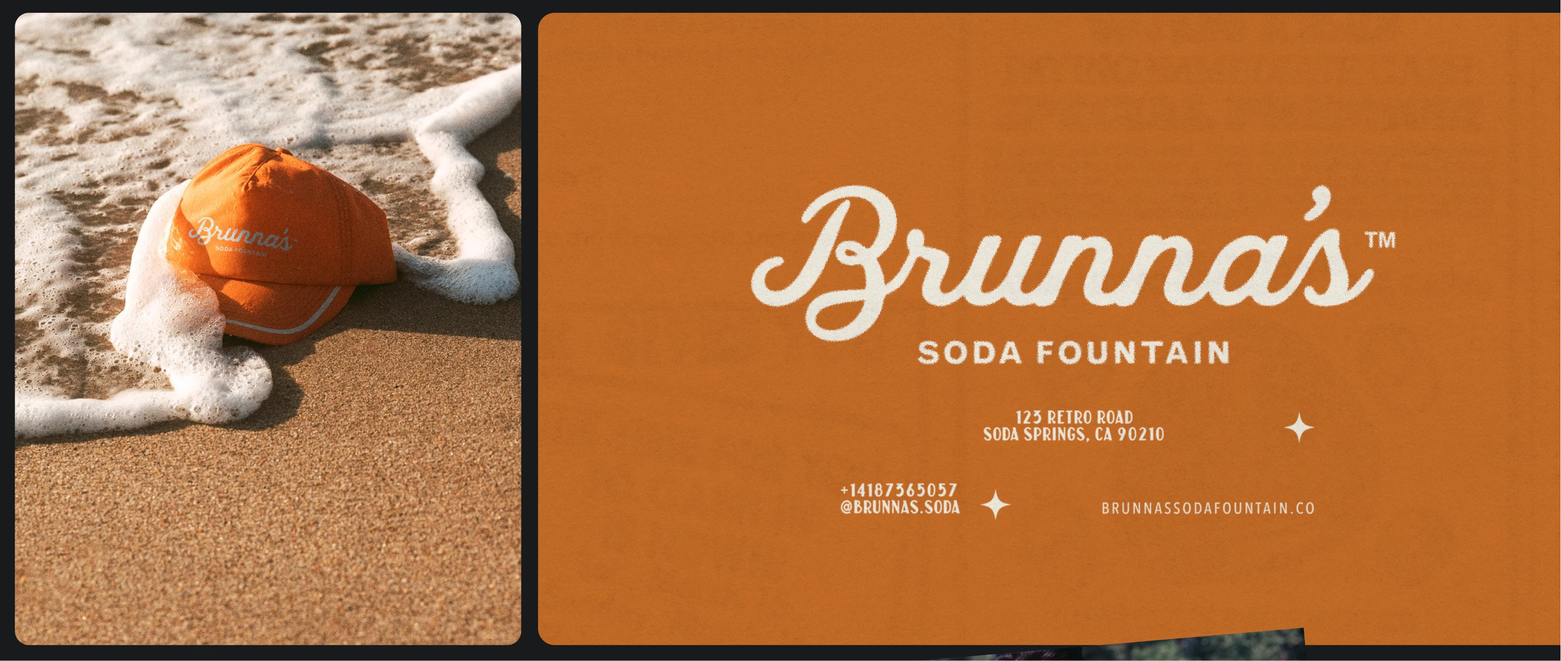
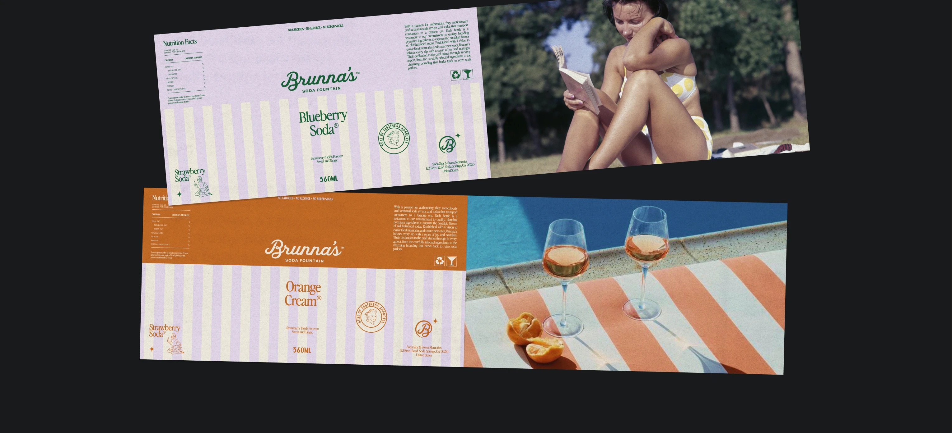
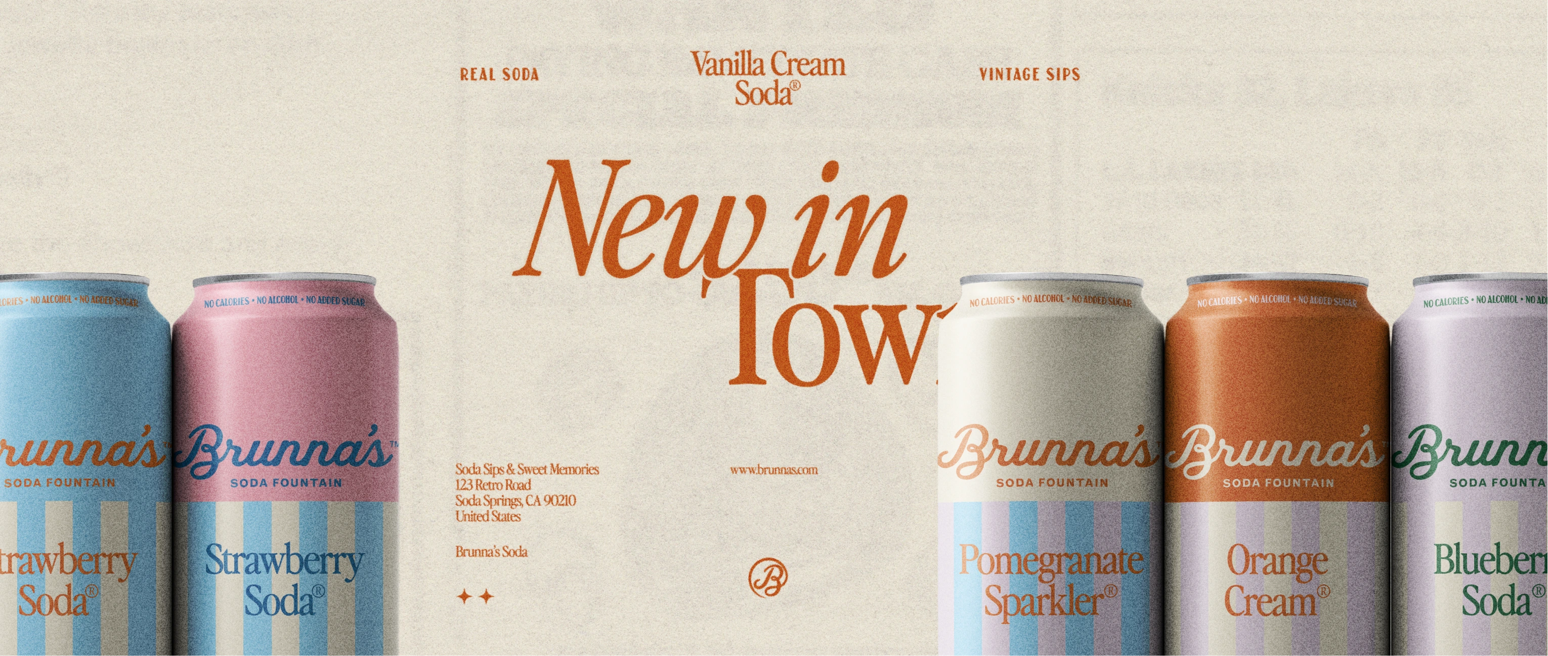
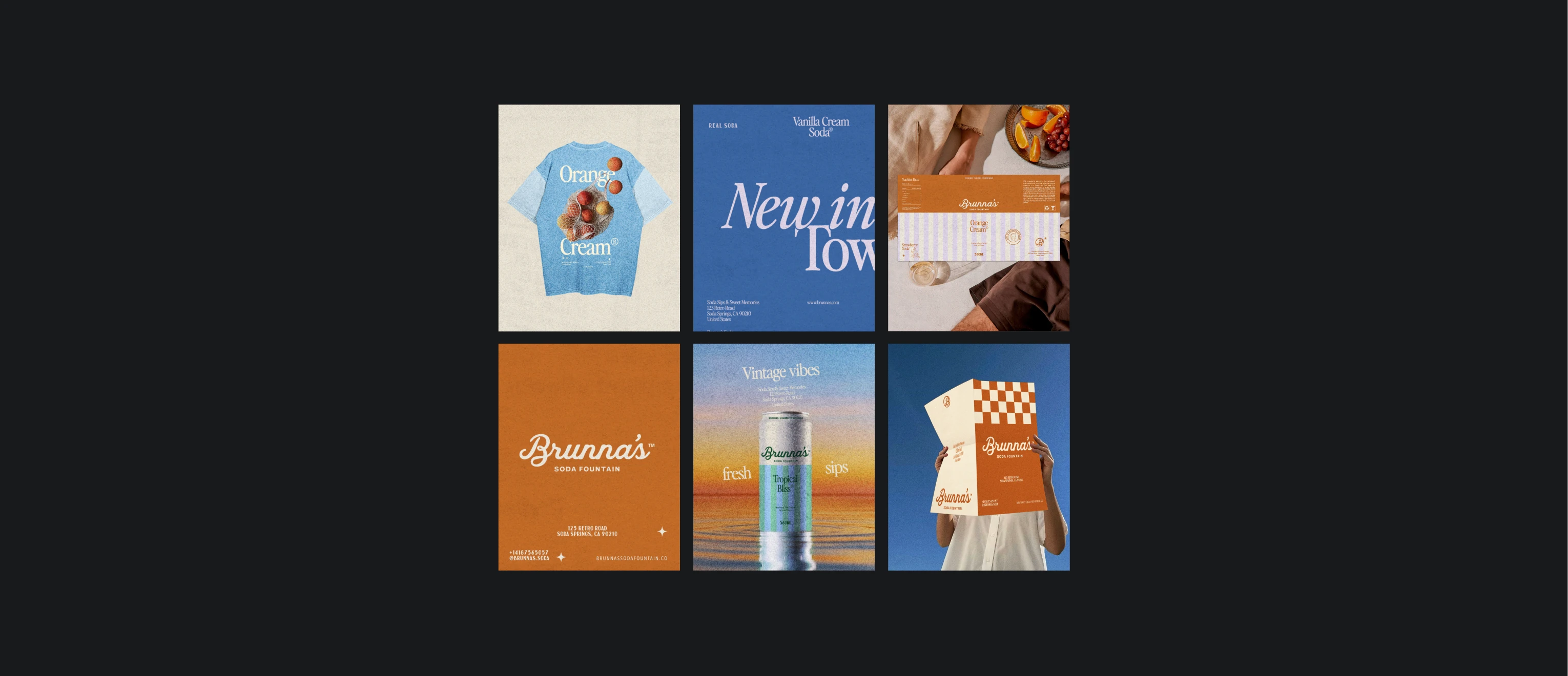
I focused on building a flexible visual system instead of a single “perfect” asset. Pastel tones, expressive typography, hand-drawn illustrations, and glossy, dreamy imagery helped shape the brand’s personality. Illustration wasn’t forced into the logo, it became a supporting character, allowing the identity to breathe and adapt across different applications. Everything was tested in context, letting the system guide decisions naturally as the brand evolved.
The Final Brand Experience
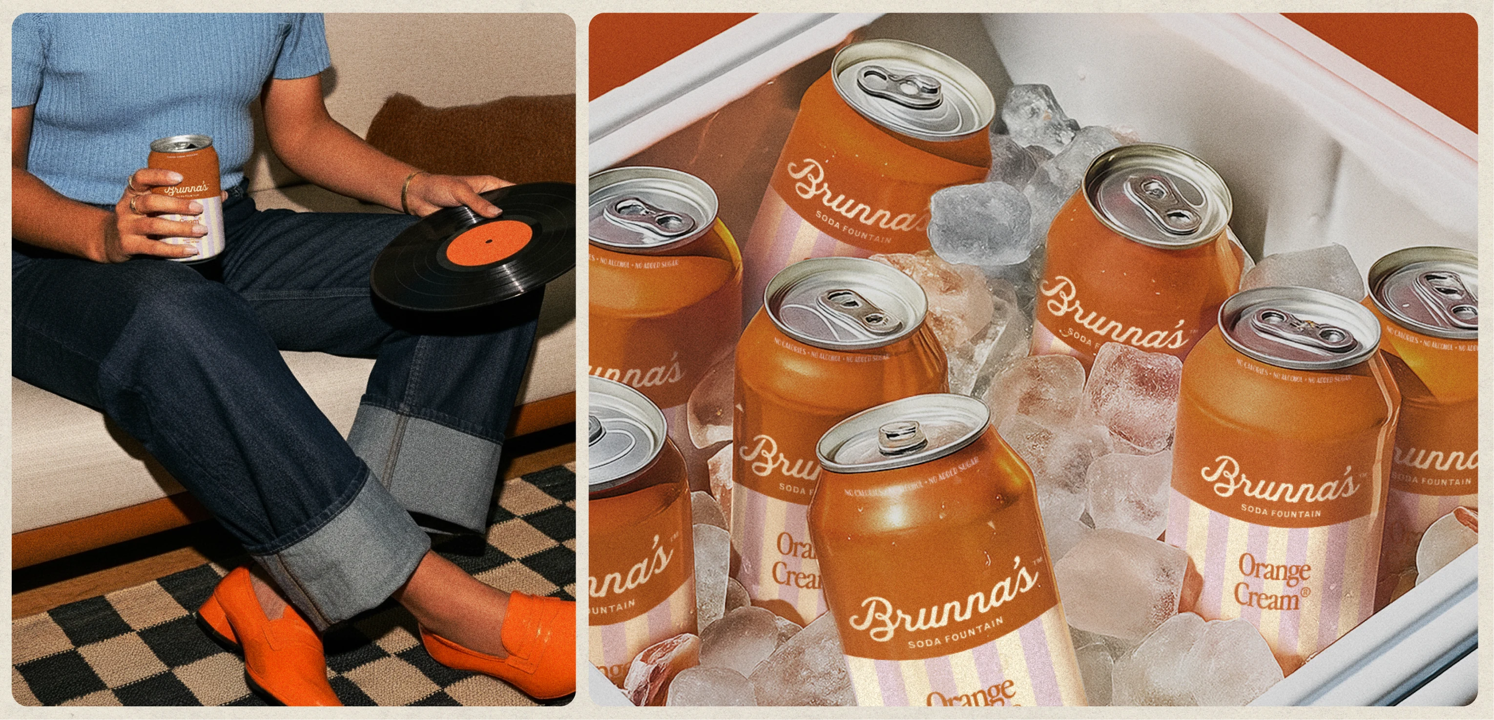
Brunna’s now feels joyful, nostalgic, and a little whimsical, carrying the charm of vintage soda culture while staying light, modern, and expressive. The final experience shows how passion projects can be more than creative play, becoming intentional, thoughtful explorations that reveal how a designer approaches brand building from the inside out. I had a lot of fun creating this brand.
For inquiries, reach out via e-mail or request our packages
Like this project
Posted Jun 18, 2026
Brunna’s is a fictional soda brand created as a passion project. The idea came from discarded concepts of a real client project that never moved forward. Instead of letting it sit unfinished, I decided to turn it into a full brand experiment driven purely by curiosity and creative freedom. The challenge was taking an idea that had been set aside and giving it a real voice. I wanted to explore how a brand inspired by the 1920s could feel playful and nostalgic without becoming stiff or overly “retro.” More than aesthetics, the goal was to create something that felt alive, usable, and intentional, even as a fictional project.