Westbury Golf - Visual Identity

Rebecca Arnaud



The client
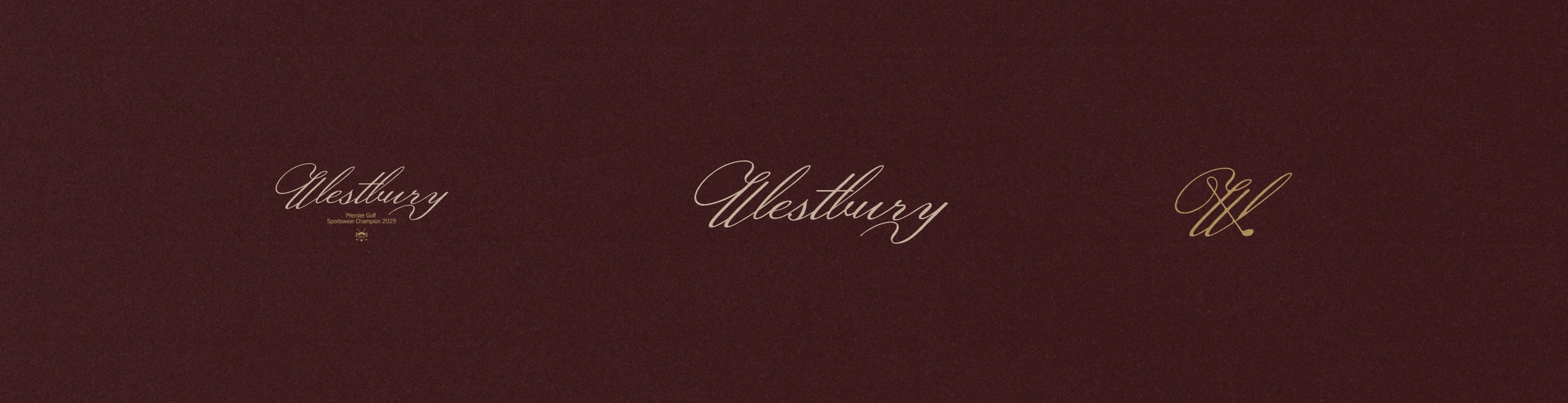
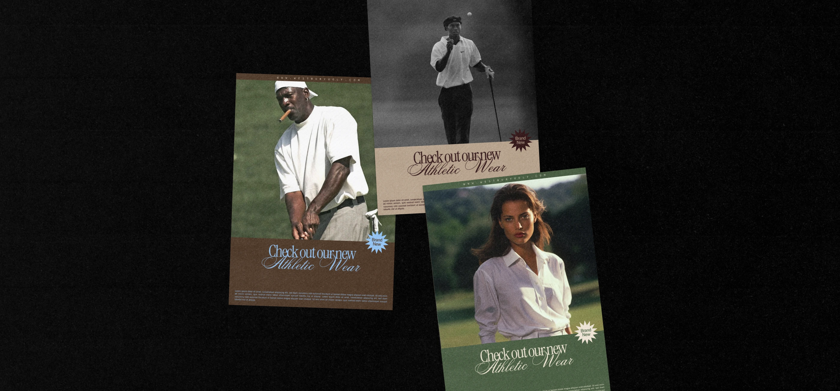
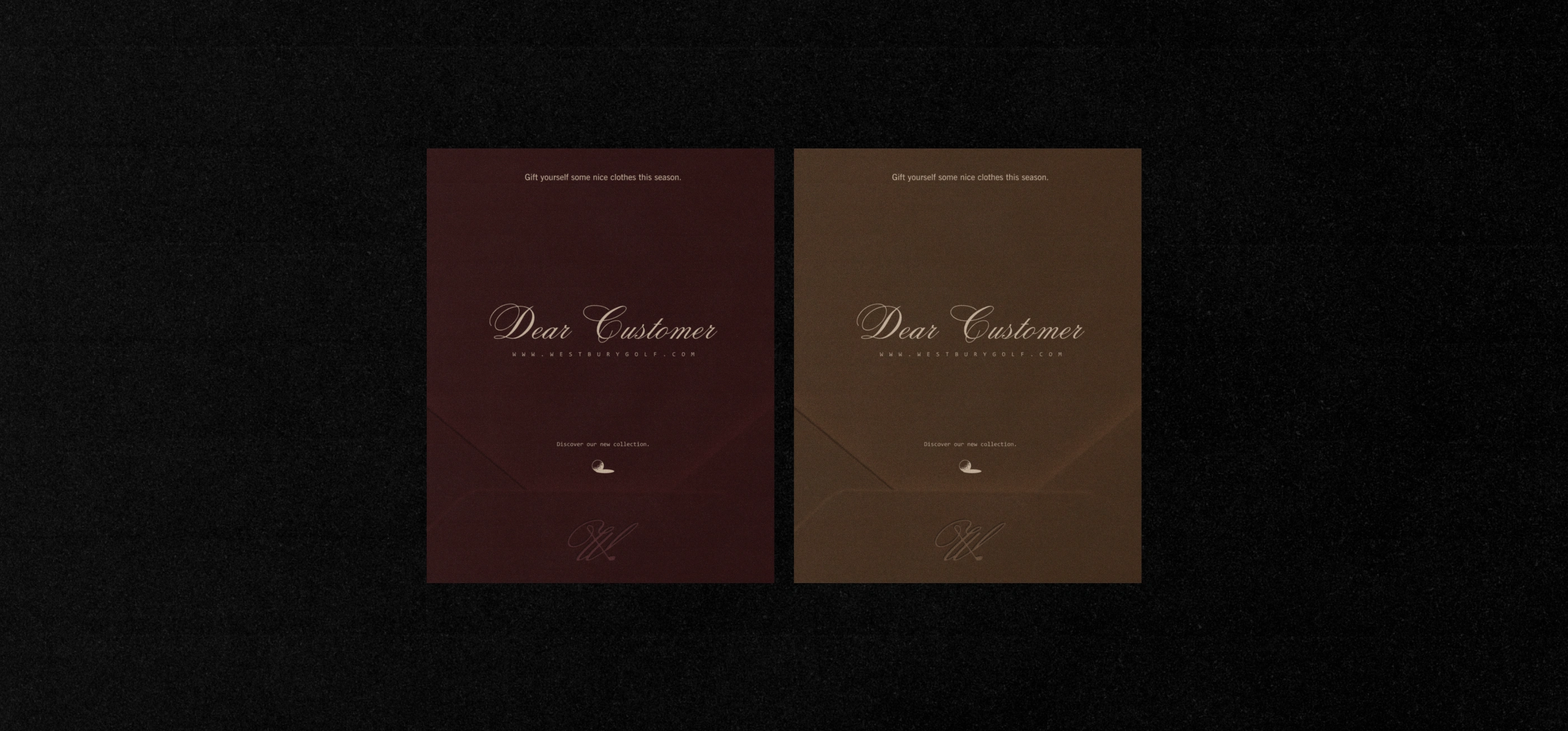
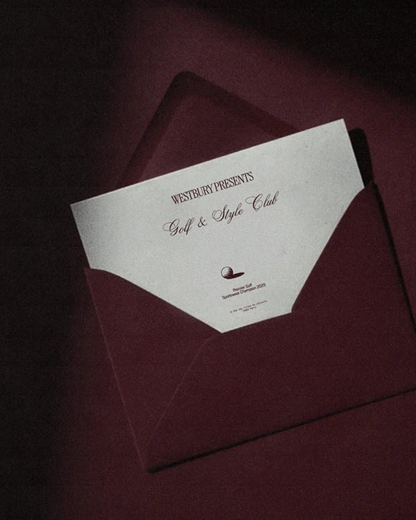
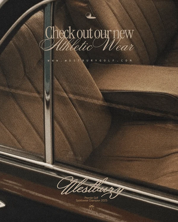
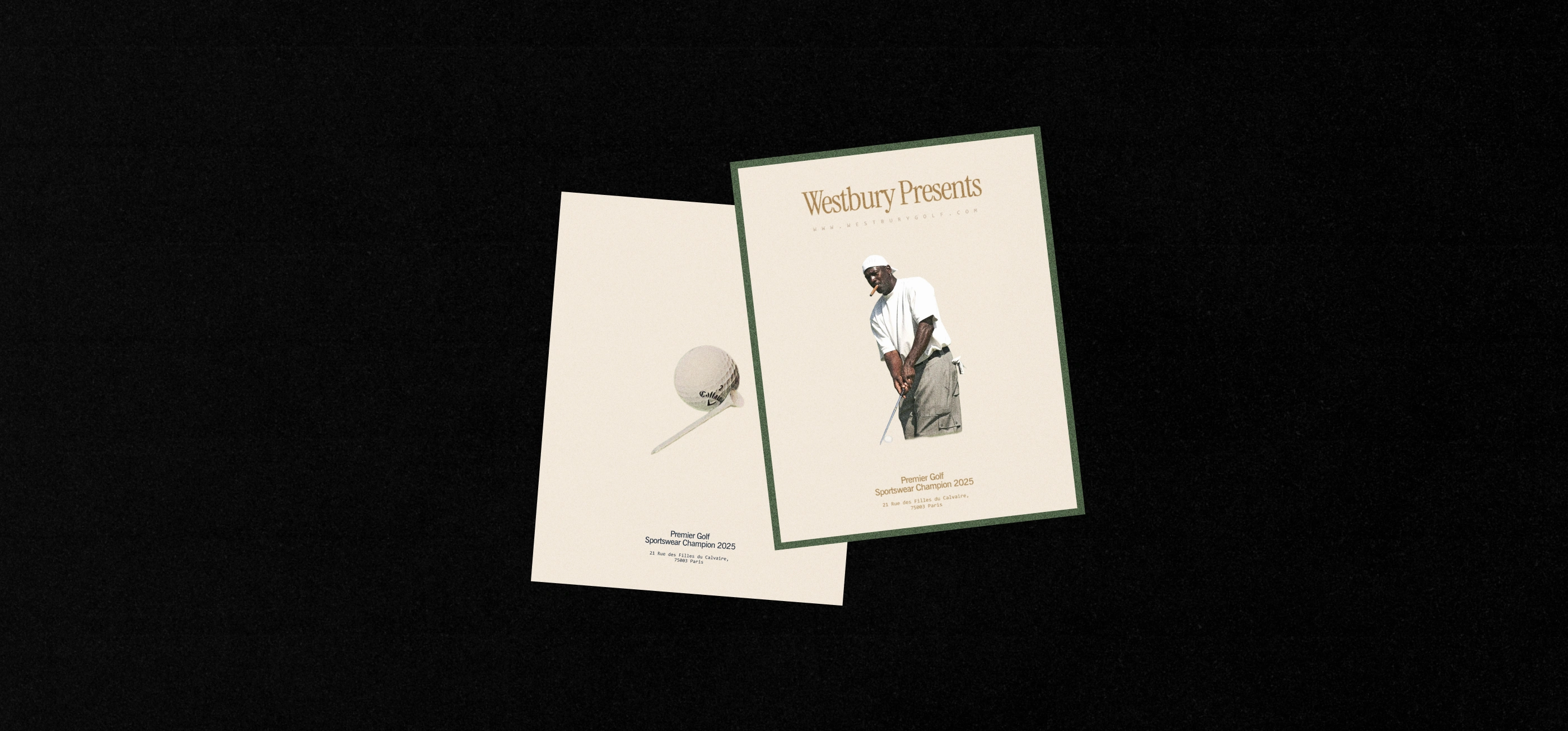
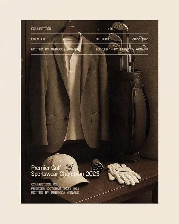
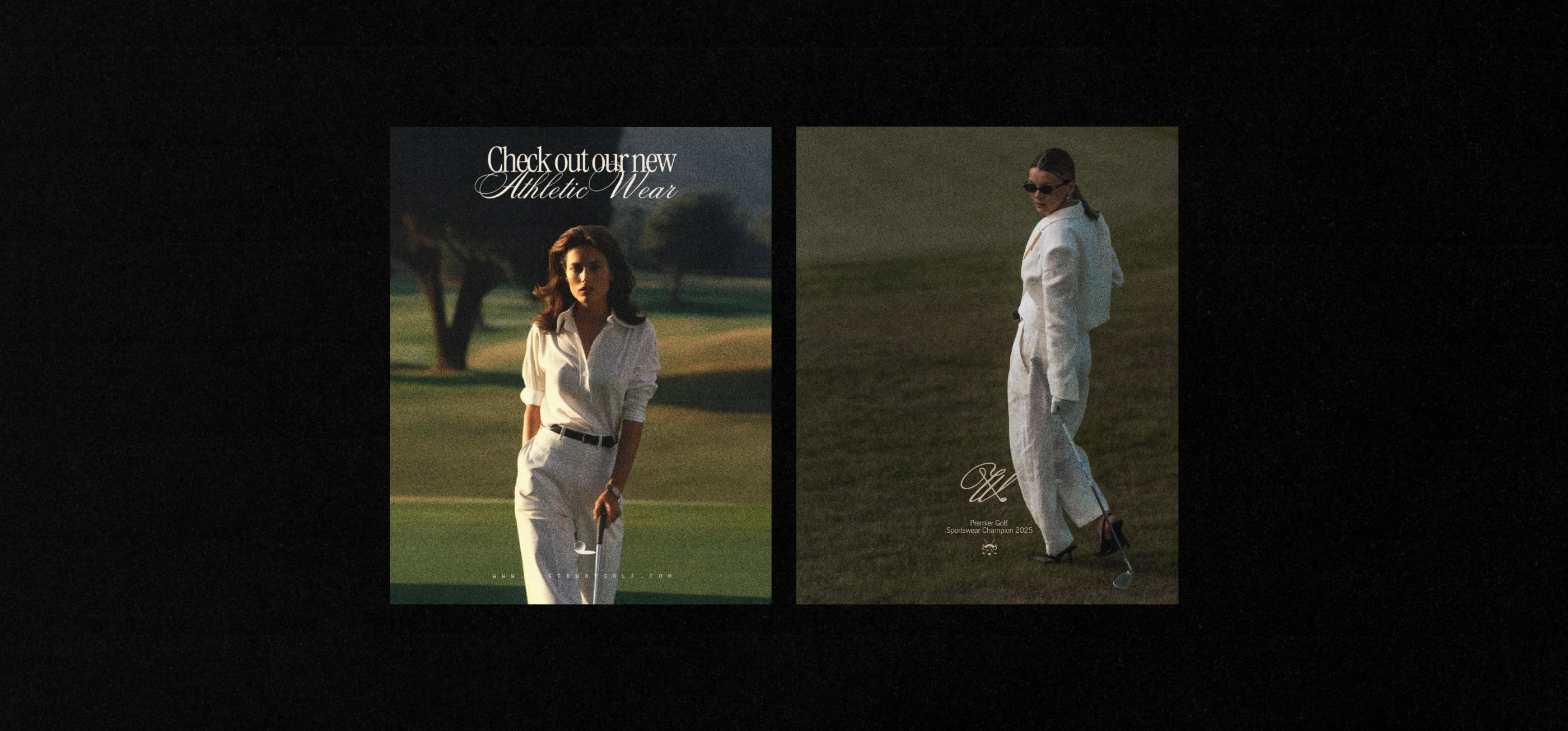
Westbury is a new golf apparel brand redefining the intersection of sport and personal style. Designed for a new generation of golfers, the brand blends performance with a fresh, elevated aesthetic that feels both premium and wearable.
The challenge
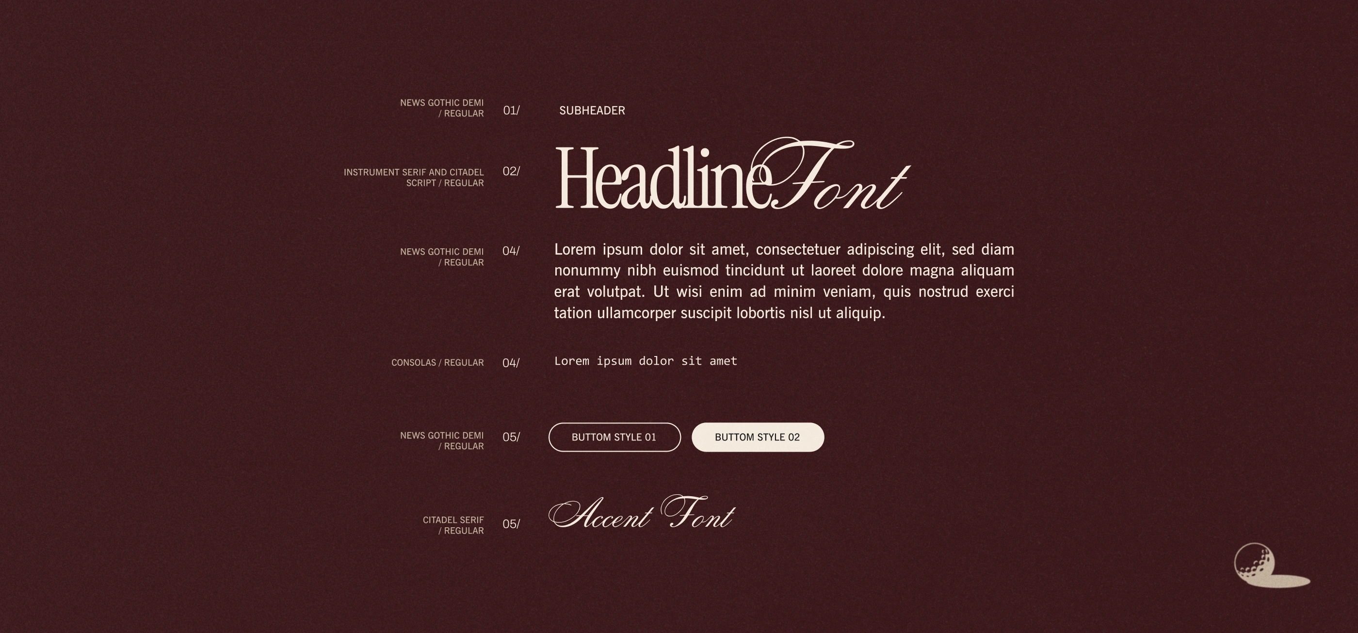
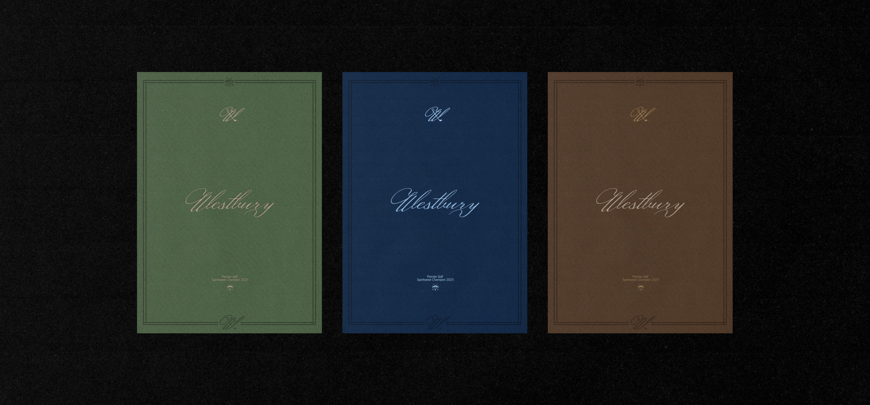
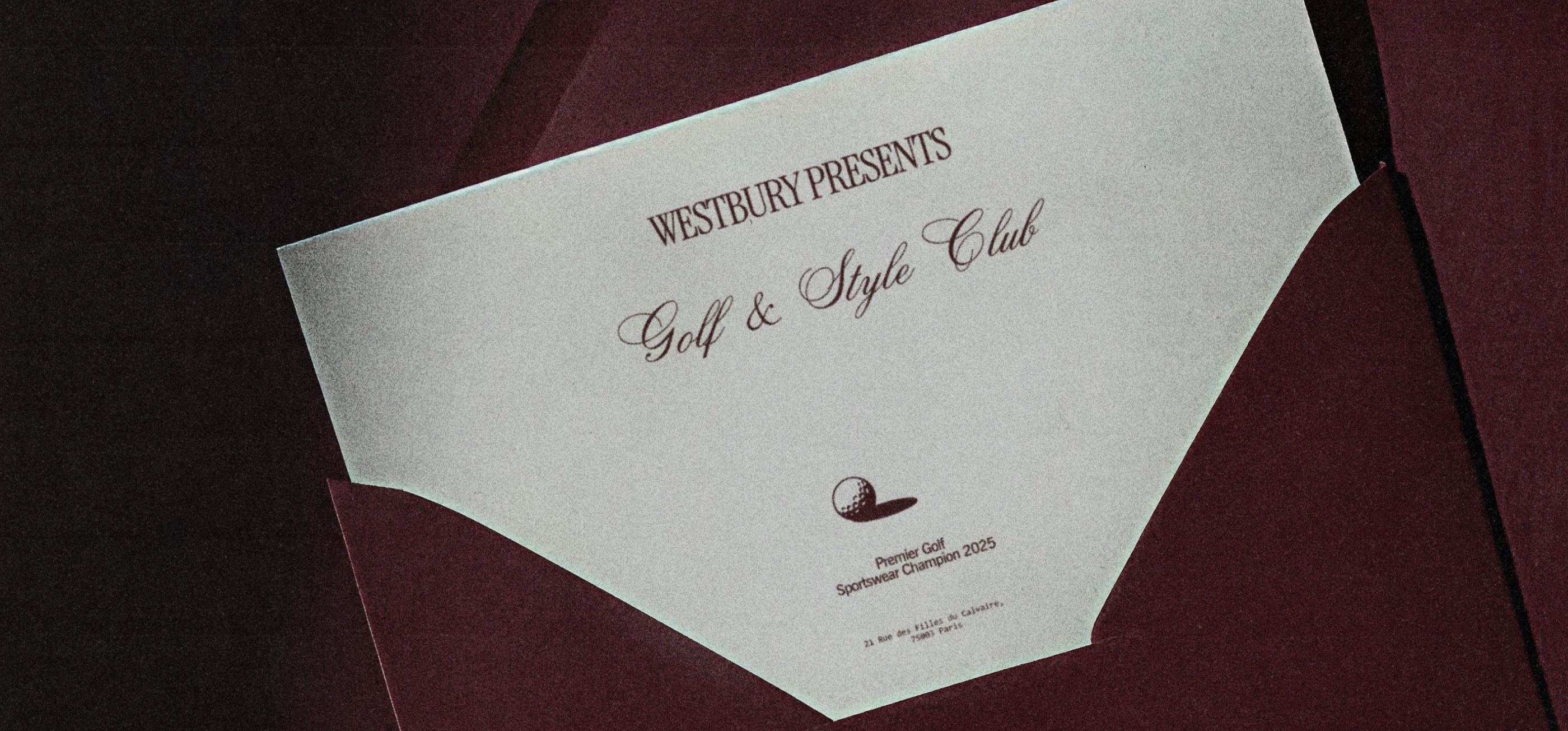
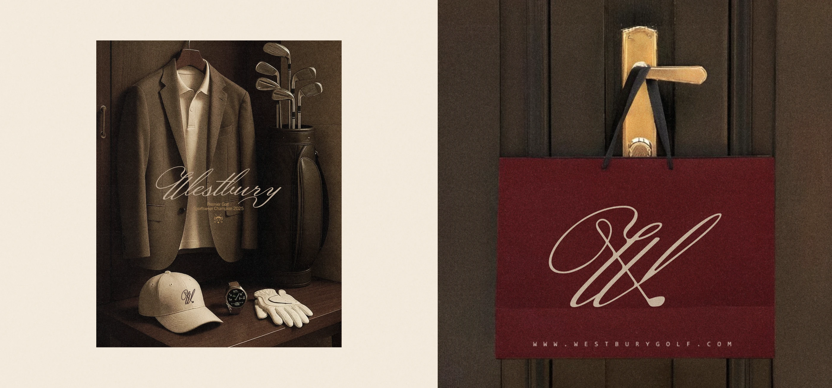
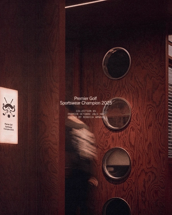
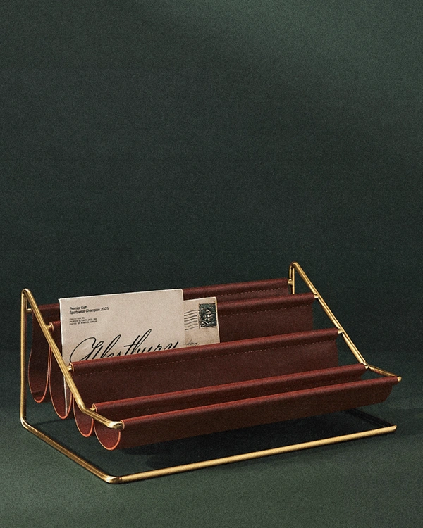
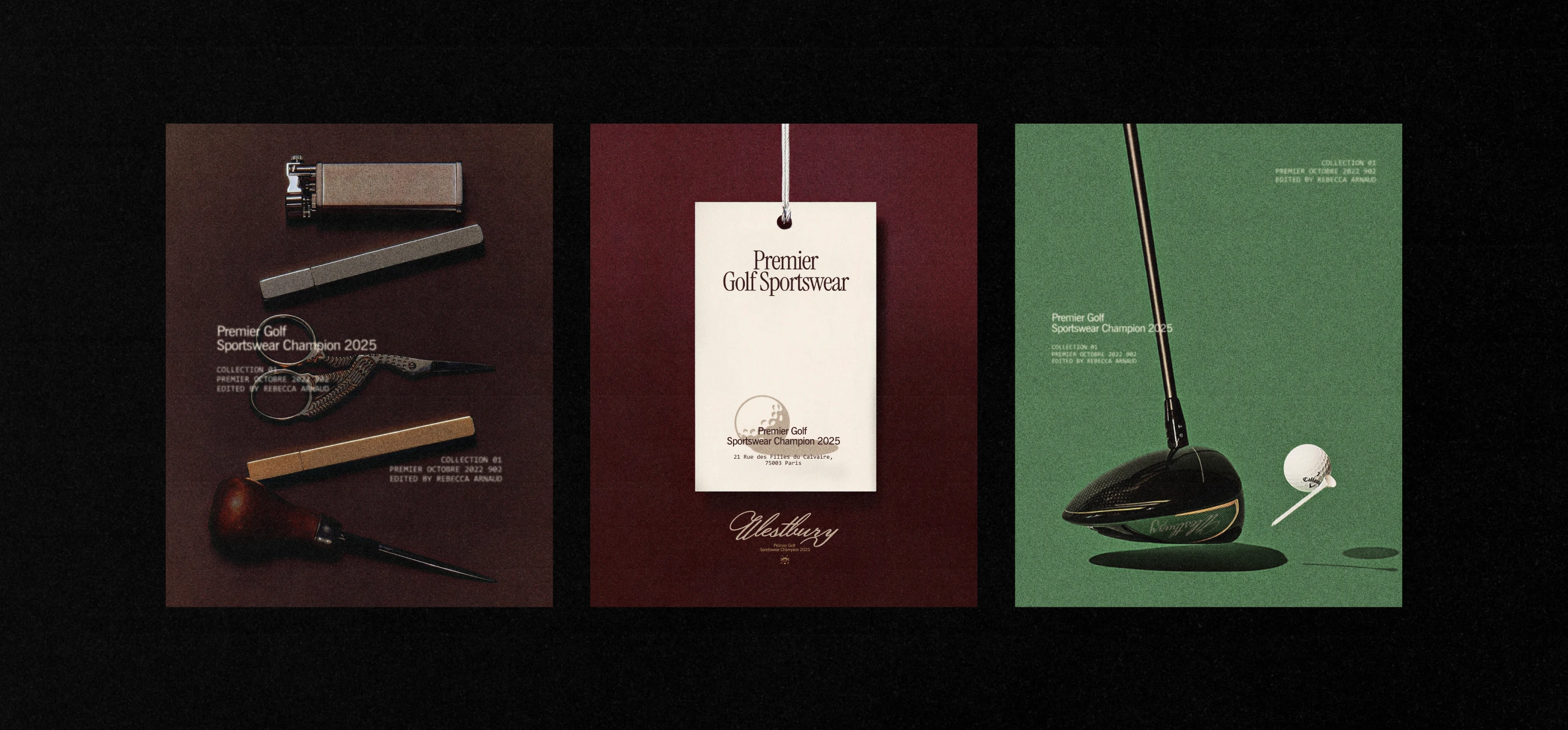
The goal was to build a brand identity that didn’t feel overly traditional, but still respected the sport. Westbury needed a look that felt stylish and functional, with a tone of quiet luxury and versatility both on and off the course.


The Audience
The brand speaks to modern golfers in their 20s to 40s who value design, detail, and performance. People who care about how they show up, whether they’re on the green or grabbing drinks after the game.

Like this project
Posted Jun 18, 2026
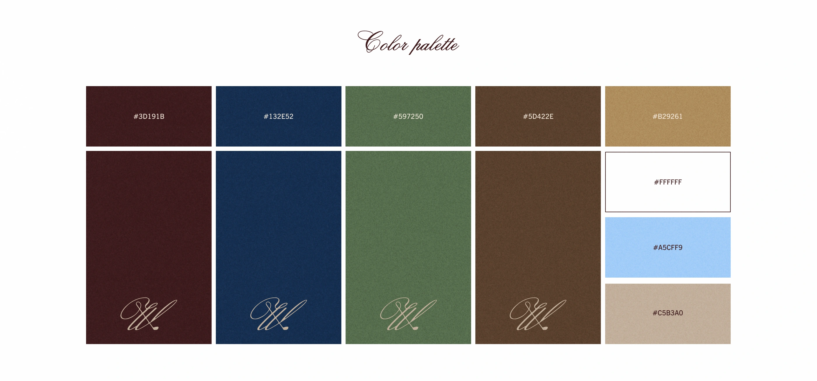
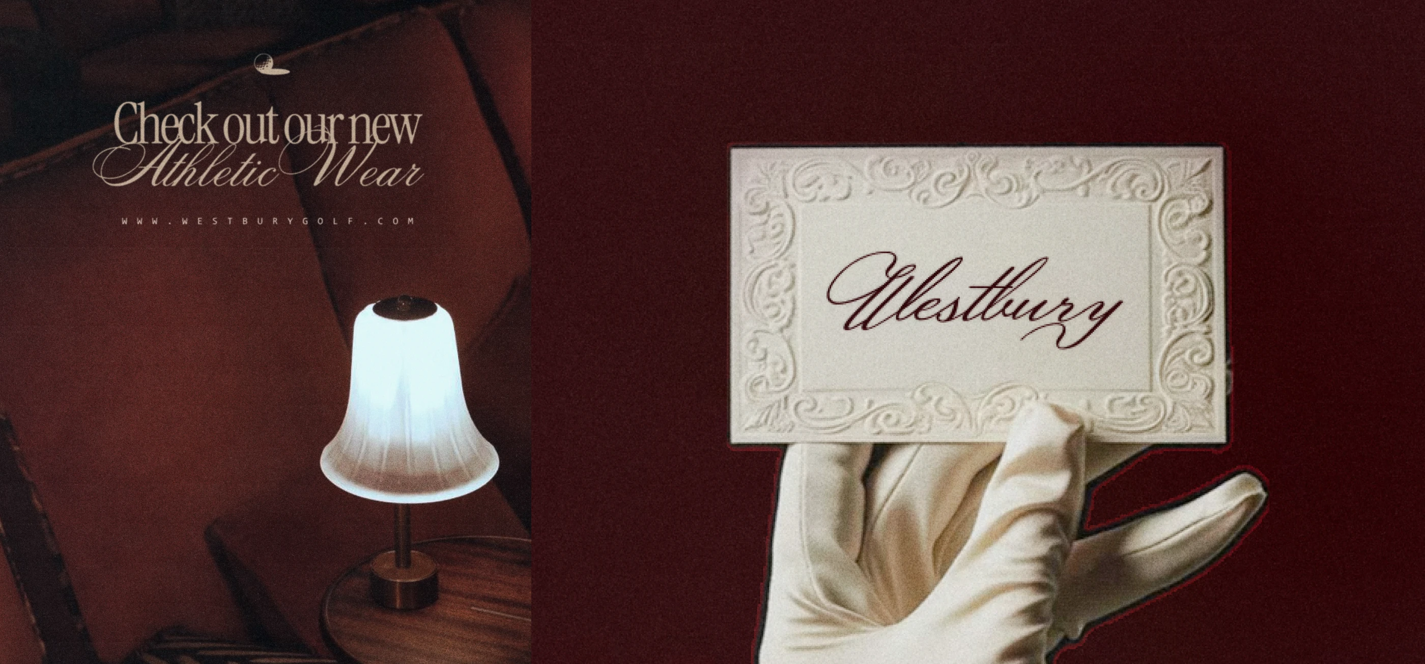
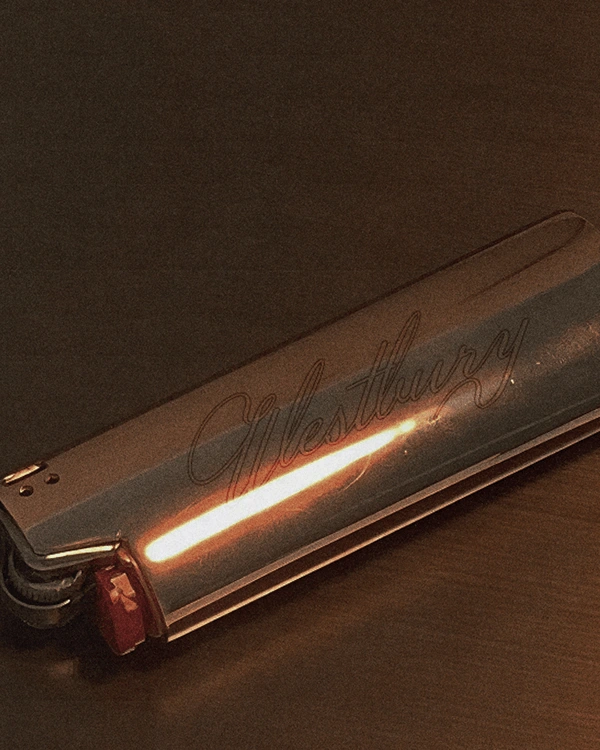
Westbury blends golf performance with quiet luxury and modern style, creating a refined, versatile identity designed to move effortlessly on and off the course.
Likes
0
Views
8