Built with Jitter

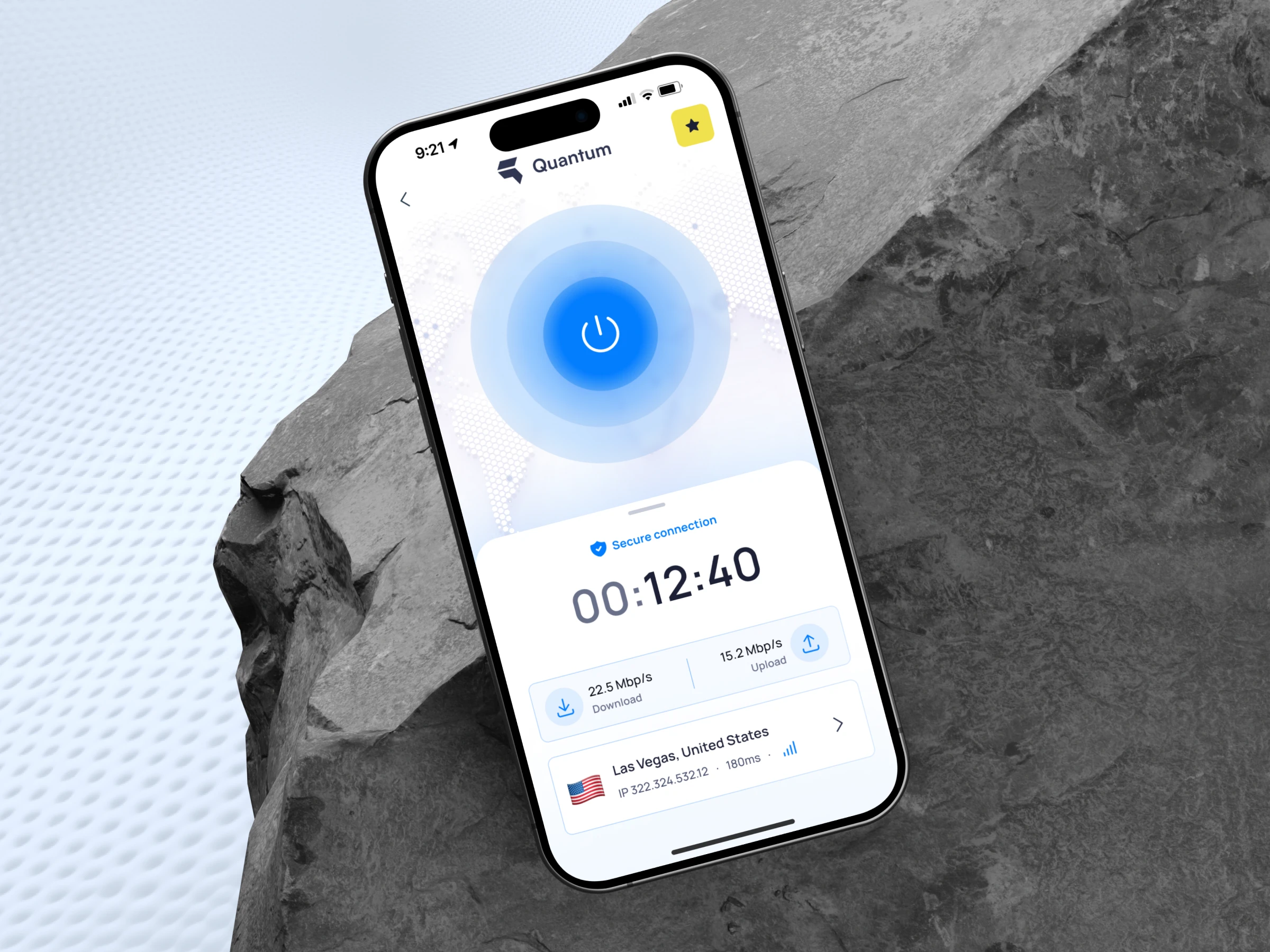
Mockup main
Quantum VPN mobile app screen breakdown
Quantum VPN is a secure, high-speed VPN app designed for effortless online privacy and access. It protects users’ data with strong encryption, allowing them to browse safely on public Wi-Fi, access geo-restricted content, and maintain anonymity online.
Importance of Focusing on UX
In a VPN app like Quantum, focusing on UX is crucial. Users expect security, but also simplicity and trust. A well-thought-out UX ensures the app is easy to navigate, quick to connect, and transparent about its functions — building confidence and encouraging daily use without overwhelming users with technical jargon. Here is the UX/UI breakdown of the crucial connection screen:
Quantum logo
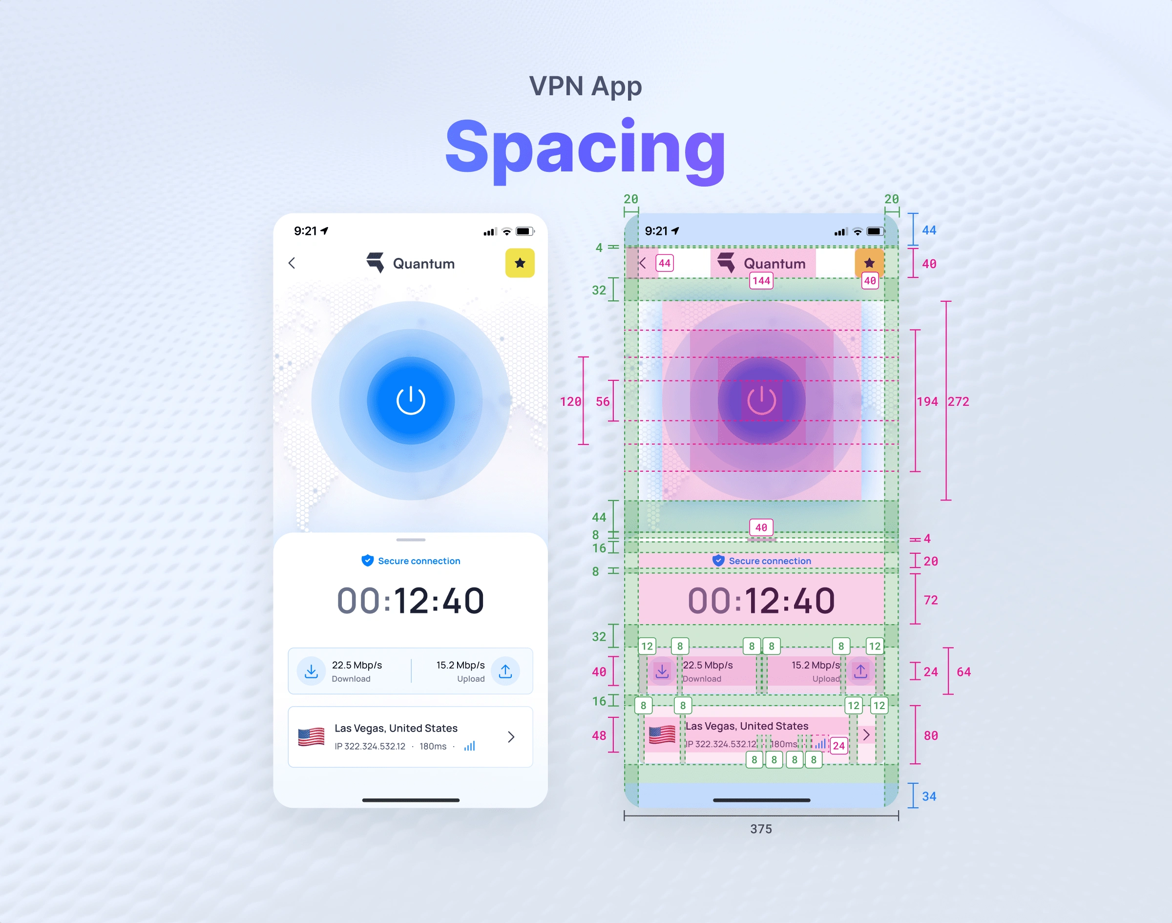
Spacing
To achieve a clean and consistent layout, Quantum VPN uses a 4pt spacing system. This method means that all padding, margins, and gaps between elements are based on increments of 4 pixels (e.g., 4px, 8px, 12px, 16px, etc.). It helps create a balanced, organized look and ensures the app feels harmonious across different screen sizes and devices.
Spacing breakdown
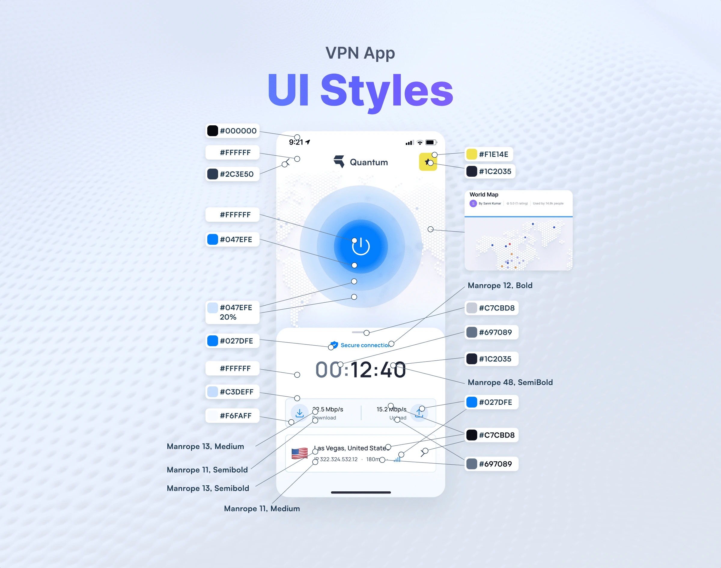
UI Styles
Quantum VPN uses a modern sans-serif font for a clean, tech-forward look, with carefully scaled sizes and weights to ensure clarity and easy readability.
The color palette features calming blues and neutrals to convey security and trust, with accent colors highlighting key actions for a consistent and intuitive user experience.
UI styles
UX explanation
Quantum VPN’s UX focuses on simple, intuitive navigation to help users connect quickly without confusion. Clear flows and minimal screens ensure a seamless experience, building trust through ease of use.
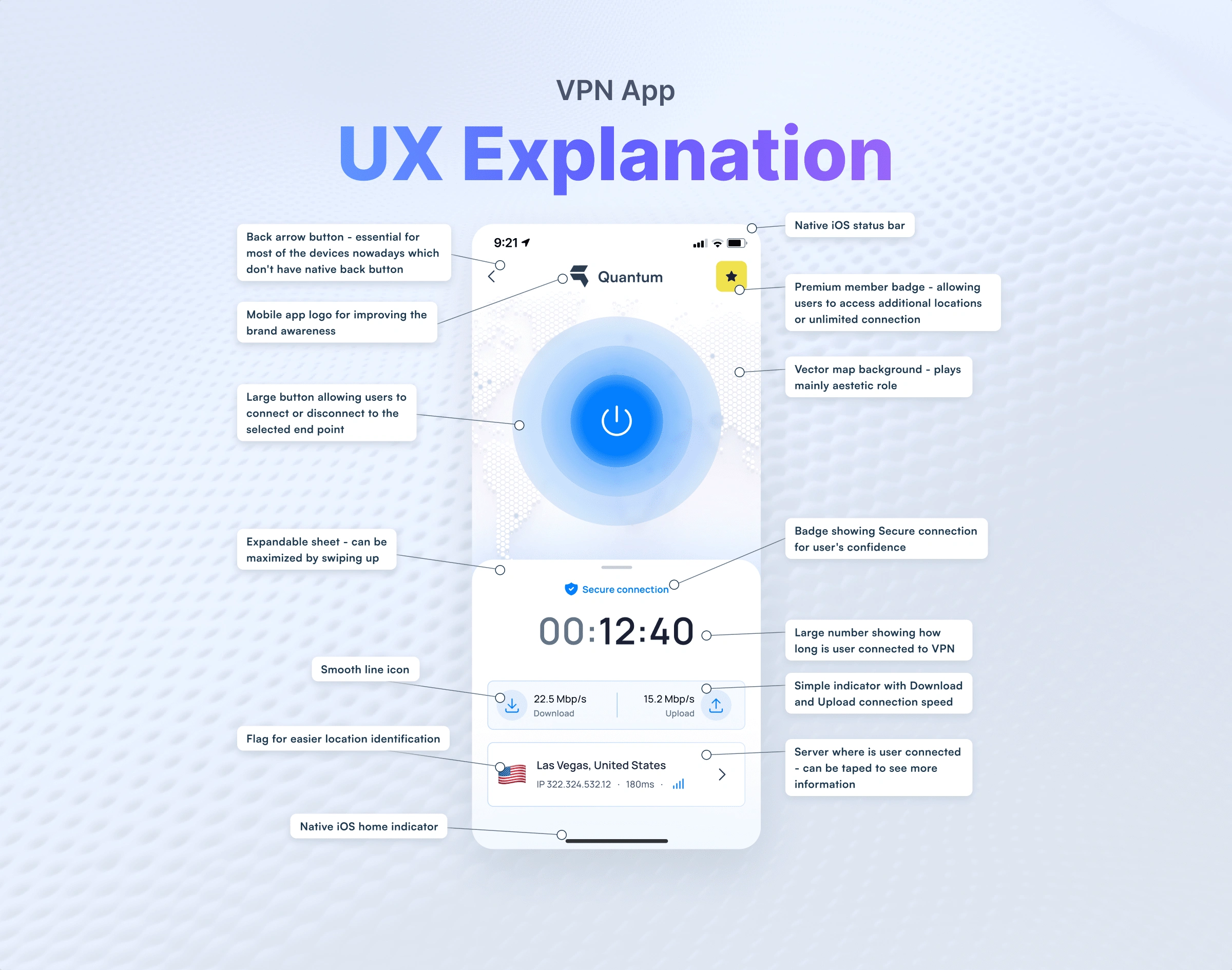
UX explanation
Don't forget to duplicate the Figma file here! ⬇️
6 likes · 373 views · Apr 29, 2025
I conducted a detailed analysis of the Quantum mobile app screen used for connecting to a VPN from a UX and UI design perspective.

