Tesla A4 Certificate of Completion
Design Process
Tesla is known for its commitment to innovation, sustainability, and clean energy, which are all integral aspects of the brand identity.
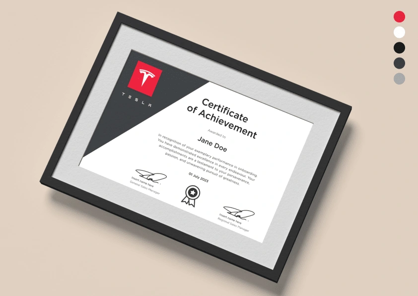
I made several design choices to ensure cohesiveness and convey the essence of the company. To align with Tesla's brand, I opted for a clean and modern design aesthetic. I used a sleek and minimalistic approach, incorporating a white background to symbolise the simplicity and purity of their design philosophy. This choice emphasizes the company's commitment to cutting-edge technology and forward-thinking solutions.
For the colour scheme, I decided to utilize Tesla's signature colour palette. The combination of the colours I have selected evokes a sense of energy and sophistication, while also representing the brand's electric vehicle offerings.
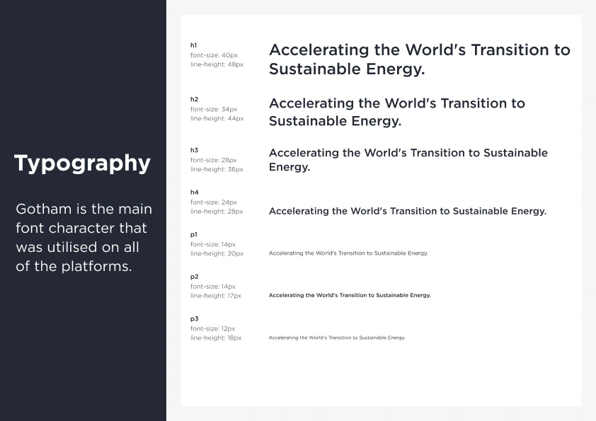
Visual hierarchy is incorporated using the typography I have created based on the observations and research I have done on Tesla's design elements on their website as well as their social media platforms. The lining and spacing were used to enhance the hierarchy, ensuring the user specifically pays attention to the title, the name, as well as the branding logo. This original red logo is used to place a contrast on the monochromatic design because it grabs the user's attention that this certificate is sourced from Tesla.
I have played around with different shapes to see how it fits well with this design. My final choice was using the sharp-edged shapes on this design, rather than placing a logo in the circle, as it gives the idea that Tesla is at the forefront of "modern cutting-edge technology".
For the badge design, I've hand-drawn using the vector tool that symbolises a positive achievement with the user. Dark grey colour is incorporated to not overpower the red Tesla branding logo but to enhance the attention to the Tesla's logo.
Like this project
Posted Sep 13, 2023
This design is awarded to Tesla Advisors who successfully complete the onboarding program. Read more for my full design process.

