Website Landing Page
Design Process
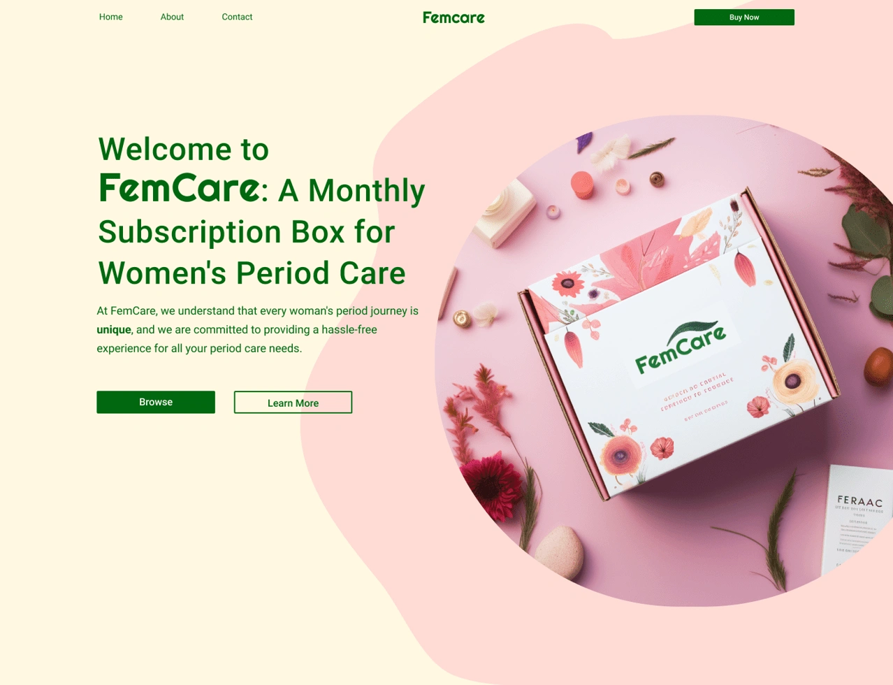
To plant a contrast to the rest of the texts on the website, I used a geometric-based font called “Righteous” which compliments the paragraph texts and also brings the user’s attention to the logo. The design is clean and minimal, but sophisticated. It signifies that using feminine hygiene products are hassle-free and convenient at their doorstep.
For the purpose of this mock-up, I retrieved this leaf illustration from freepik.com which is an image bank website that allows designers to use their images for the purpose of mock-ups and presentations. I have made a few tweaks on Illustrator to omit the background and place it on top of the text for added flair.
Adding a leaf above the text captivates the interplay between organic shapes and structured letterforms. This juxtaposition can create a dynamic interaction that draws the viewer's eye.
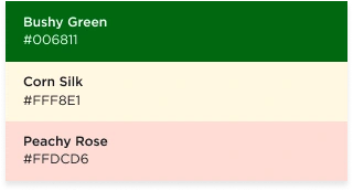
Furthermore, this design encapsulates the company’s values such as being eco-friendly, trustworthy, and receptive to feedback. This colour palette targets the emotional and psychological needs of familiarity, comfort, positivity, and reassurance. Ultimately, the chosen colour palette contributes to the overall brand identity, message, and user perception of the feminine hygiene product, creating a design that is both aesthetically pleasing and emotionally meaningful.

Final Design
Like this project
Posted Sep 13, 2023
Created a Website Landing Page called Femcare that focuses on providing monthly subscriptions to feminine hygiene products. Read more to see the design process.
Likes
0
Views
11
