Pilates Pals - Brand Identity

Bella Brillantes


OVERVIEW
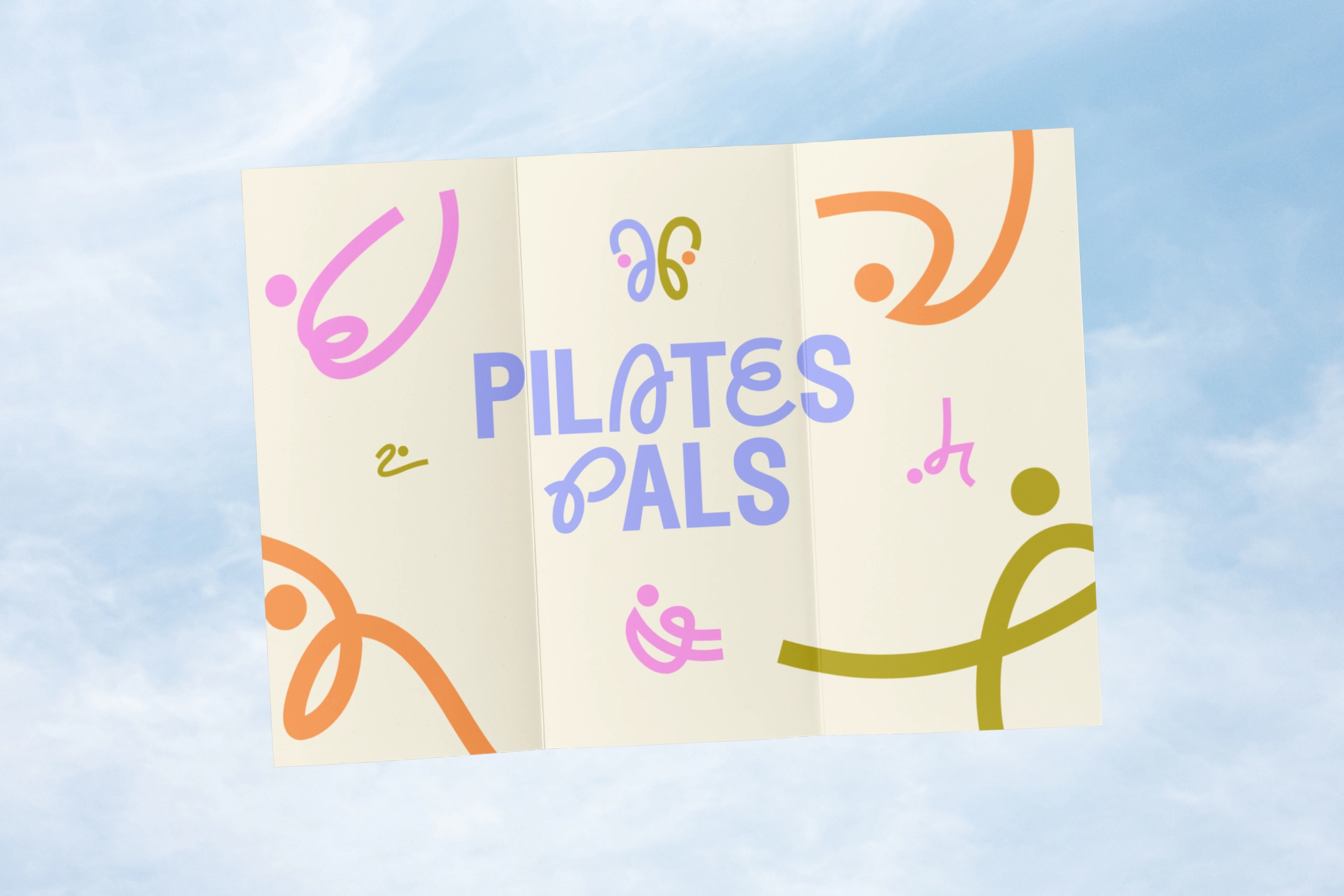
Pilates Pals brings Manila's pilates community together beyond the studio through meetups, events, and brand partnerships. The brand needed an identity that felt as social and energetic as the community itself, without tipping into generic wellness-brand territory.
Brand Guidelines
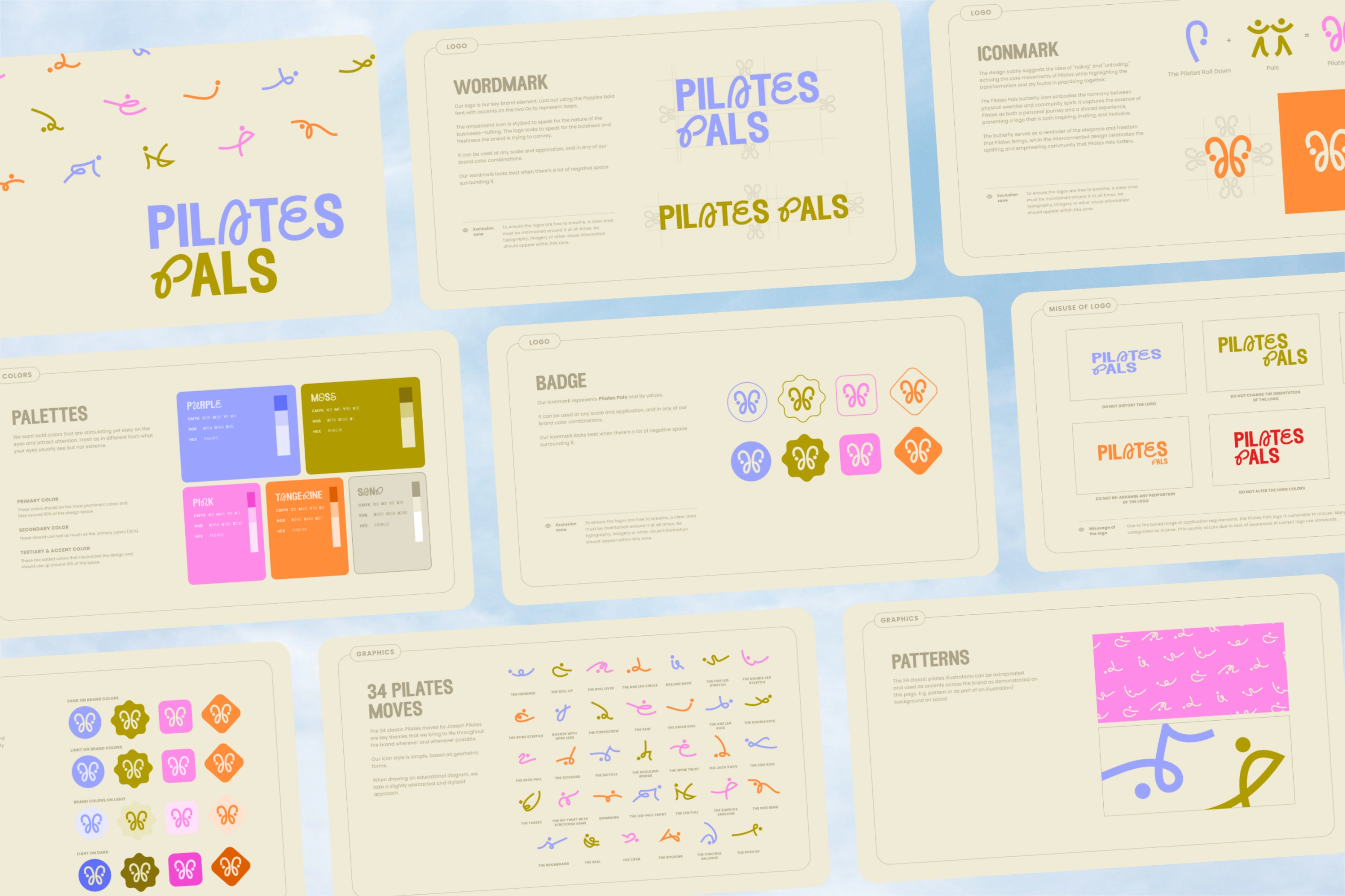
A wordmark with movement. The logotype curves and loops with the same fluidity as the practice it represents: expressive without sacrificing legibility across formats, from event signage to Instagram grids.
A palette that breaks from wellness-brand convention. Periwinkle, moss, pink, and tangerine replace the expected sage-and-neutral spa aesthetic, giving the brand more personality and better stand-out power in a crowded fitness feed.
A custom iconography system. 34 pilates movements distilled into a consistent line-illustration language, built to flex across social content, patterns, and merchandise (a scalable asset library, not a one-off logo.)
A complete brand toolkit, covering usage guidelines, badge lockups, and misuse examples, so the identity stays consistent as the community (and its partner network of studios and brands) continues to grow.
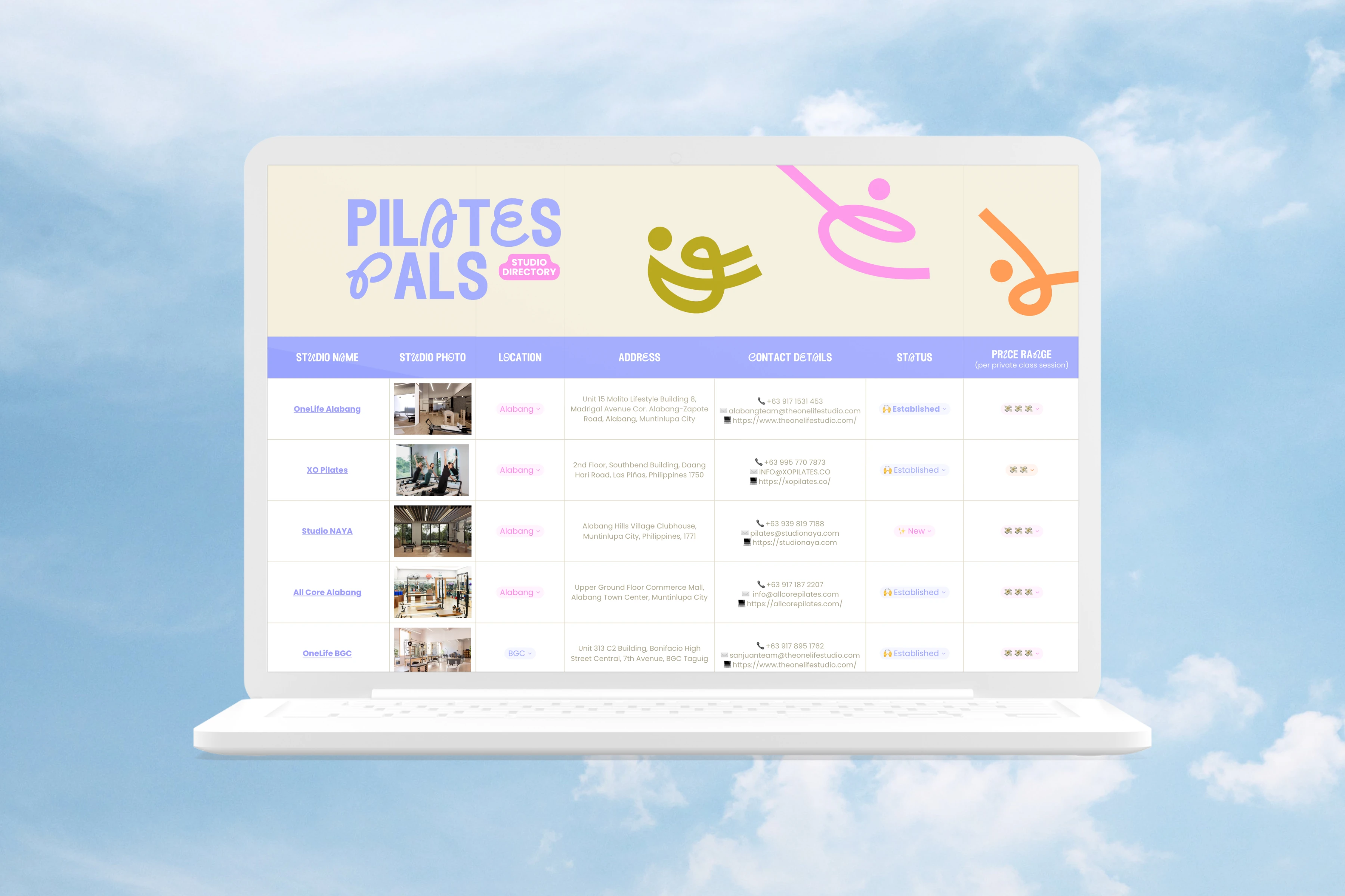
Studio Database
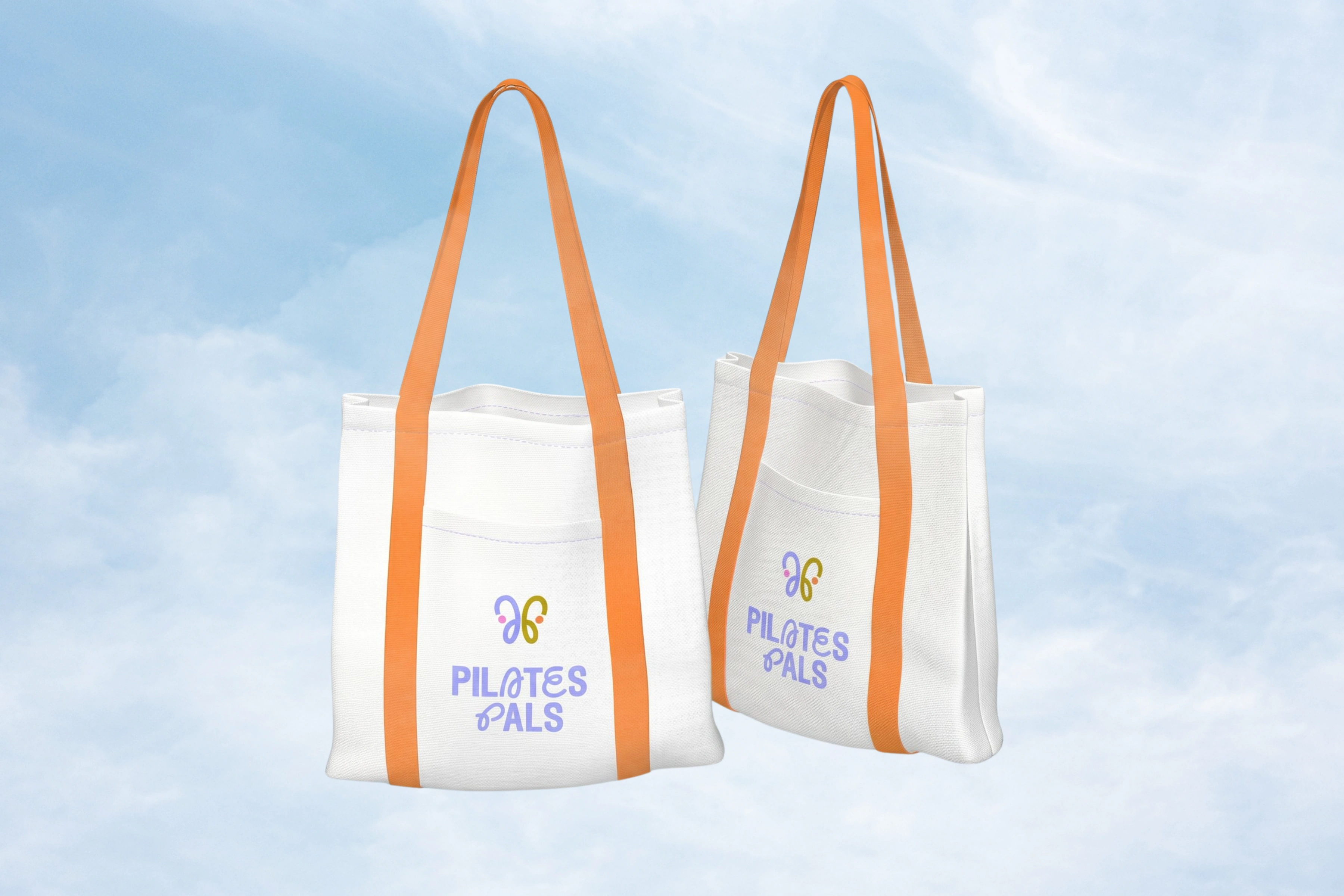
Tote Bag
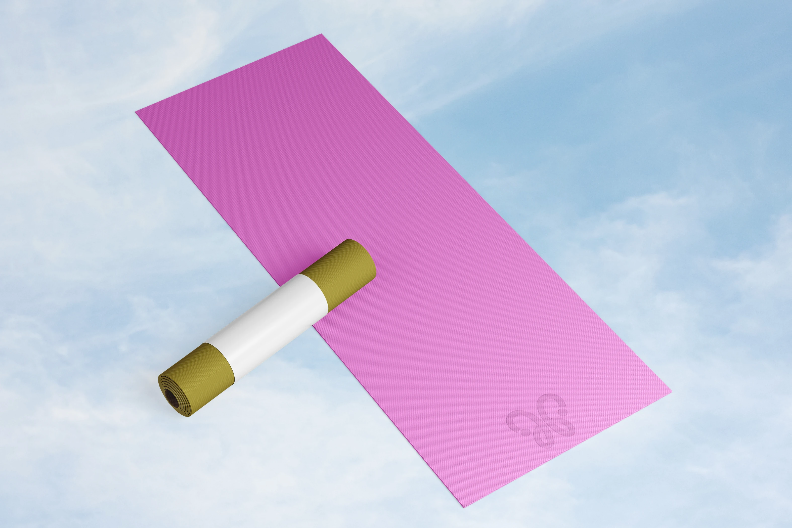
Yoga Mat
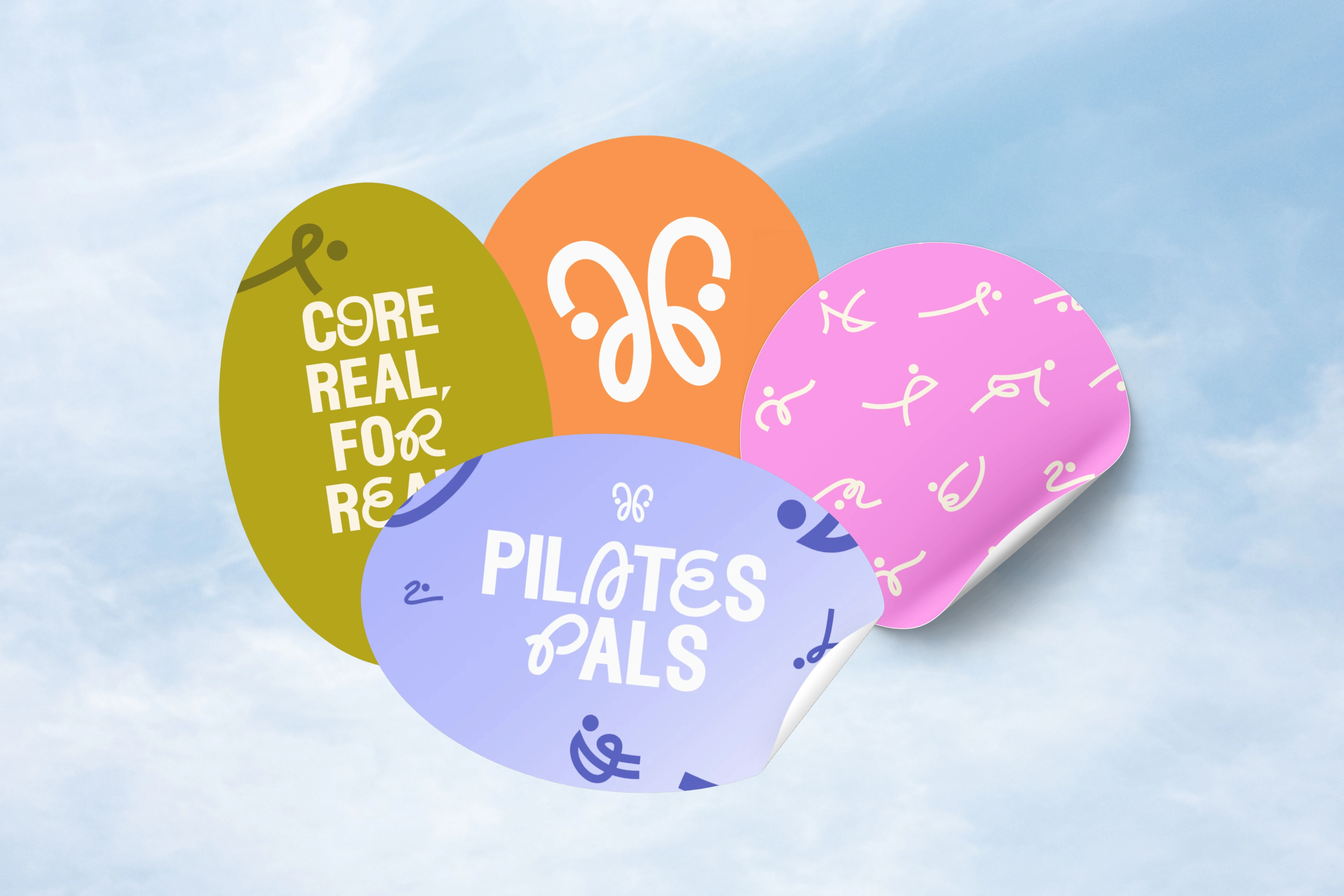
Stickers
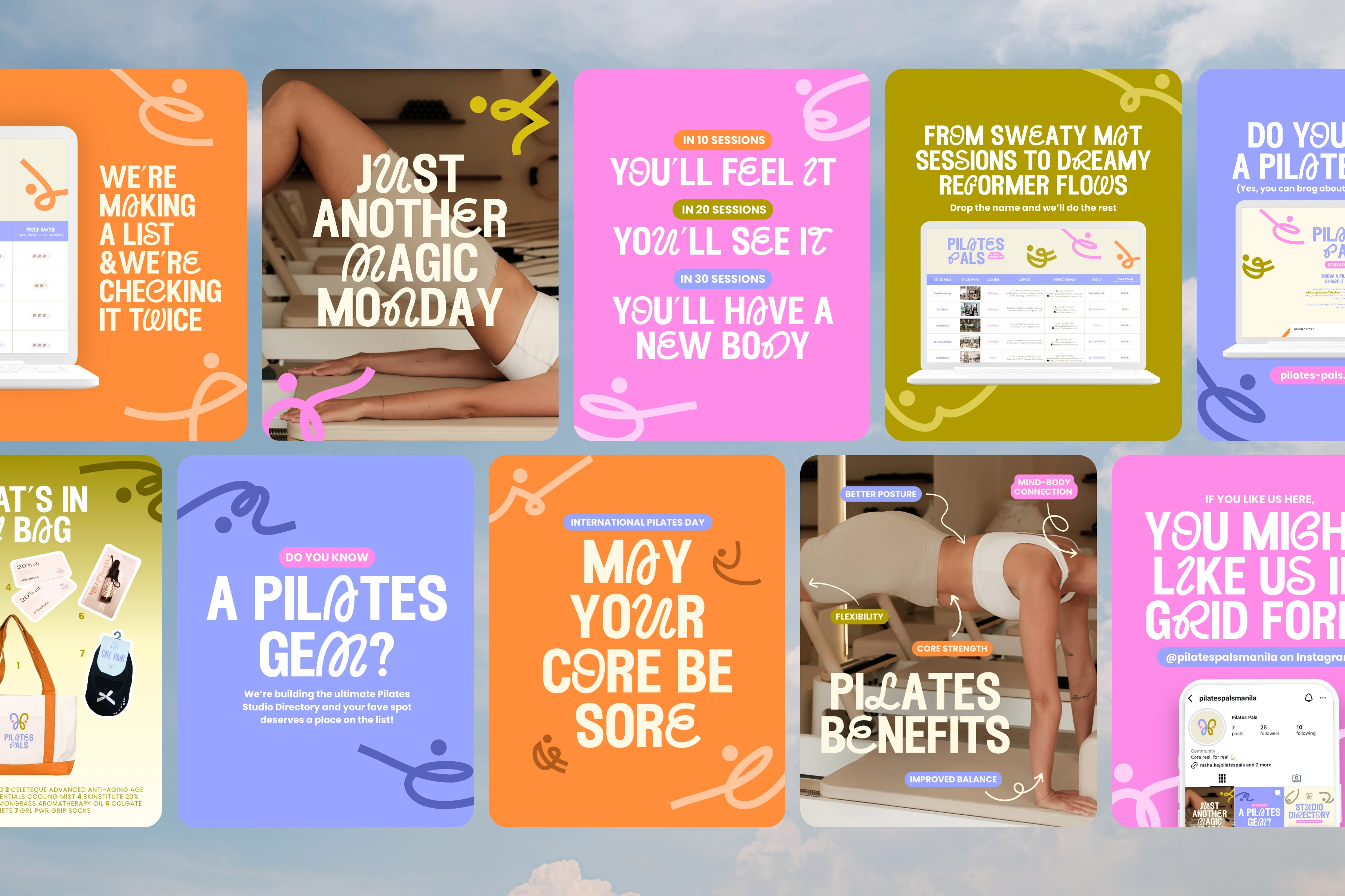
Social Media Posts
Like this project
Posted Jul 12, 2026
Developed a fun and whimsical brand identity for Pilates Pals with vibrant colors and unique iconogrophy that highlight movement and community 🧡