Angel City Soils
Angel City Soils
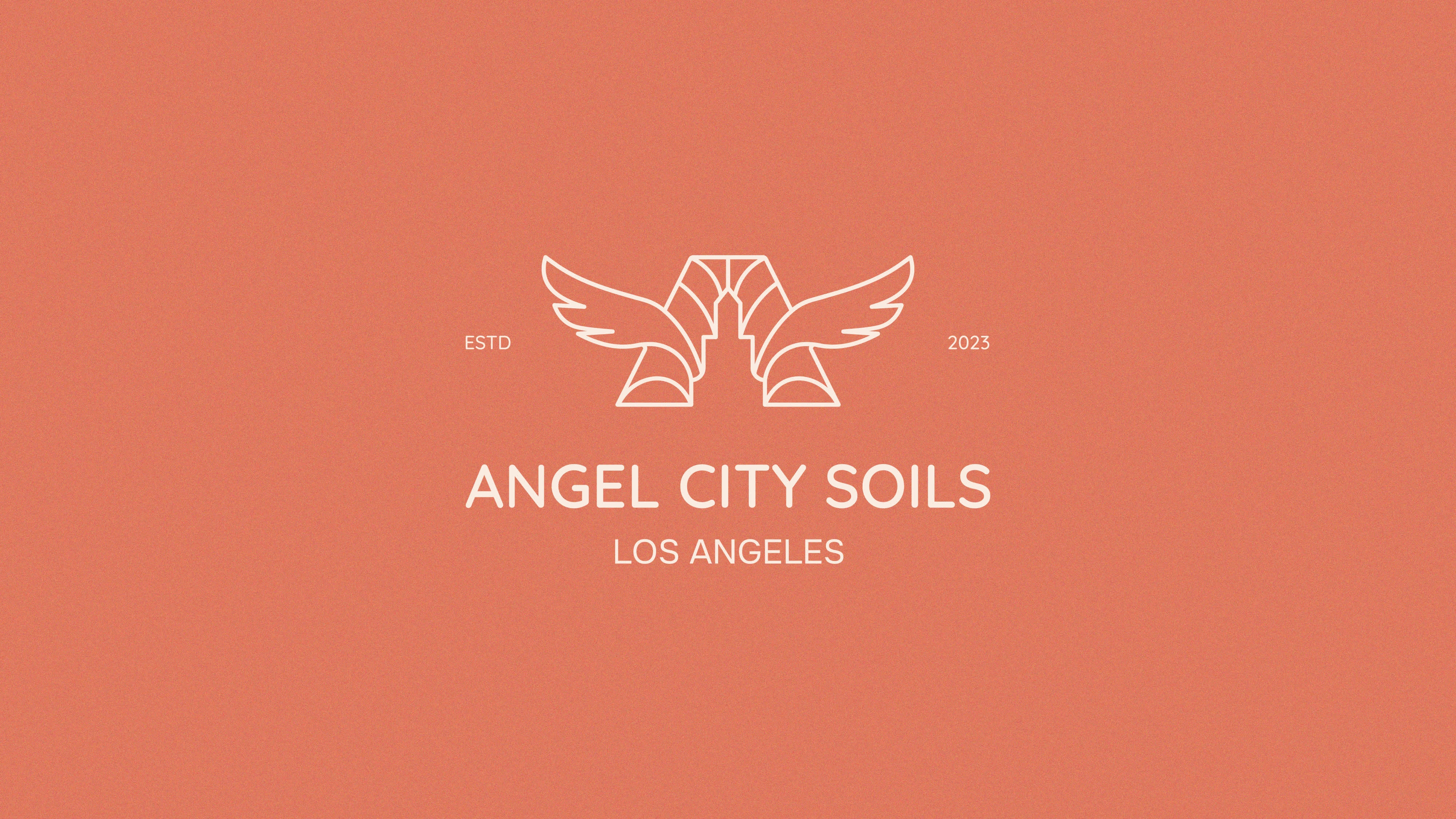
Angel City Soils is a pioneering initiative based in Los Angeles dedicated to transforming urban landscapes through sustainable practices. They wanted a unique logo and brand identity that showcased sustainability, sophistication, and a representation of Los Angeles.
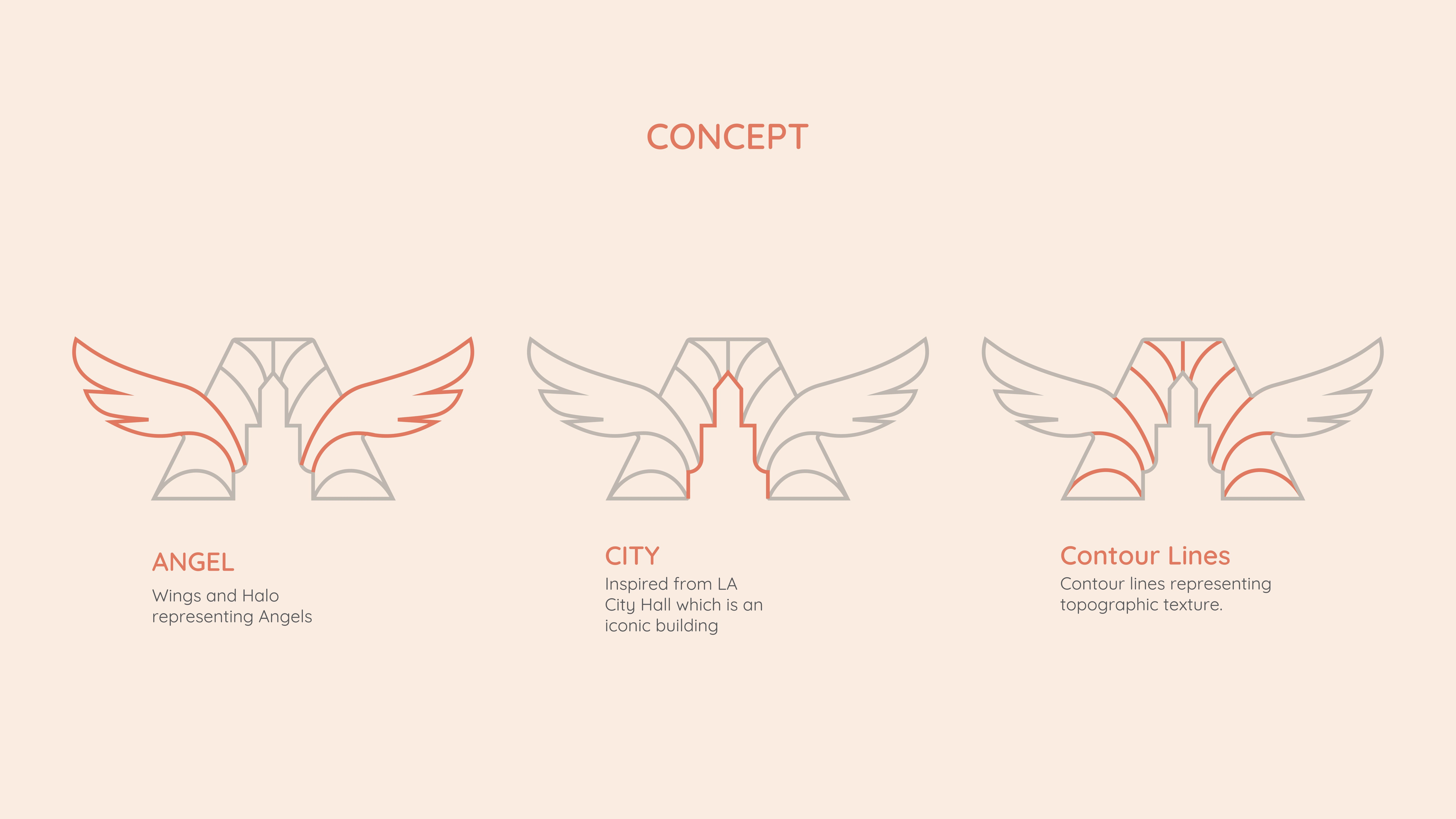
The first step was to create a logo that showcased sustainability which was also relatable to the name of the company. The concept of the logo mark is explained below.


A Down-to-Earth Identity
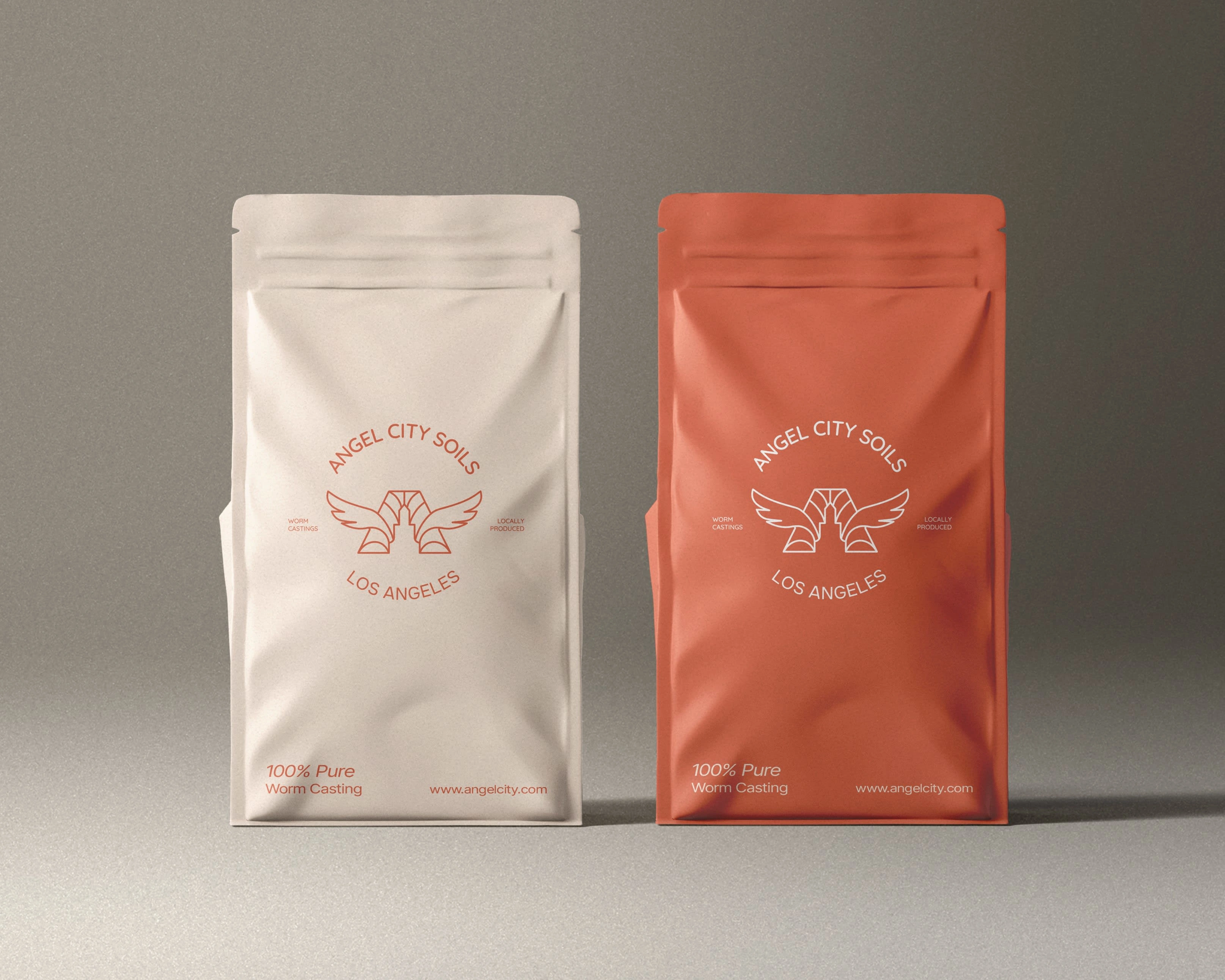
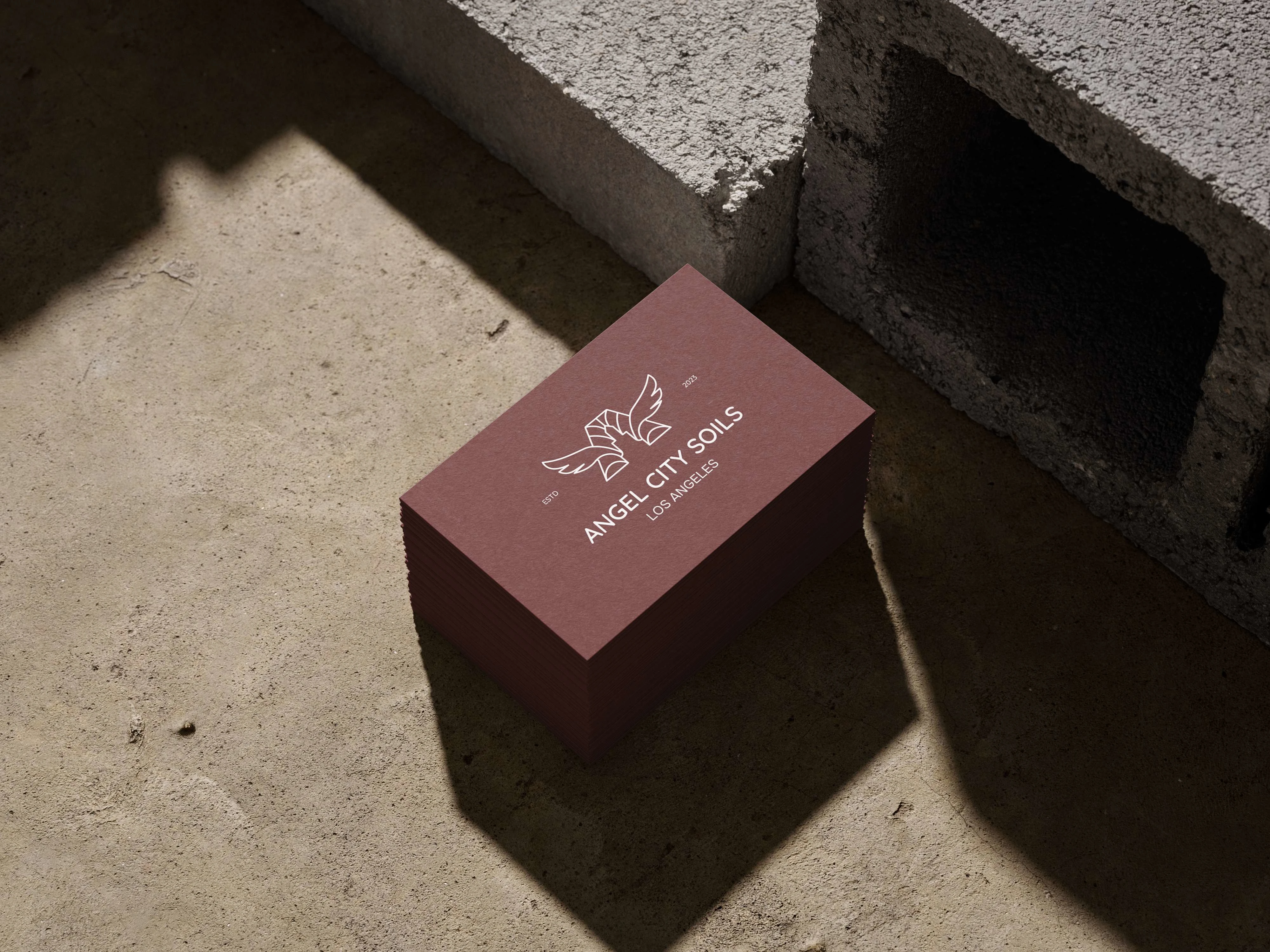
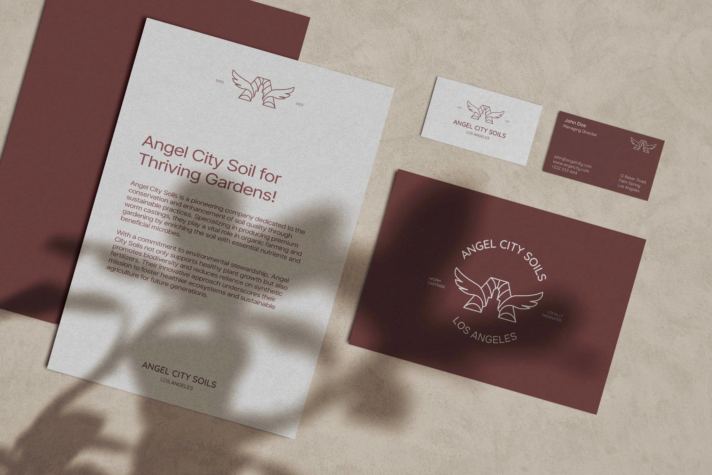
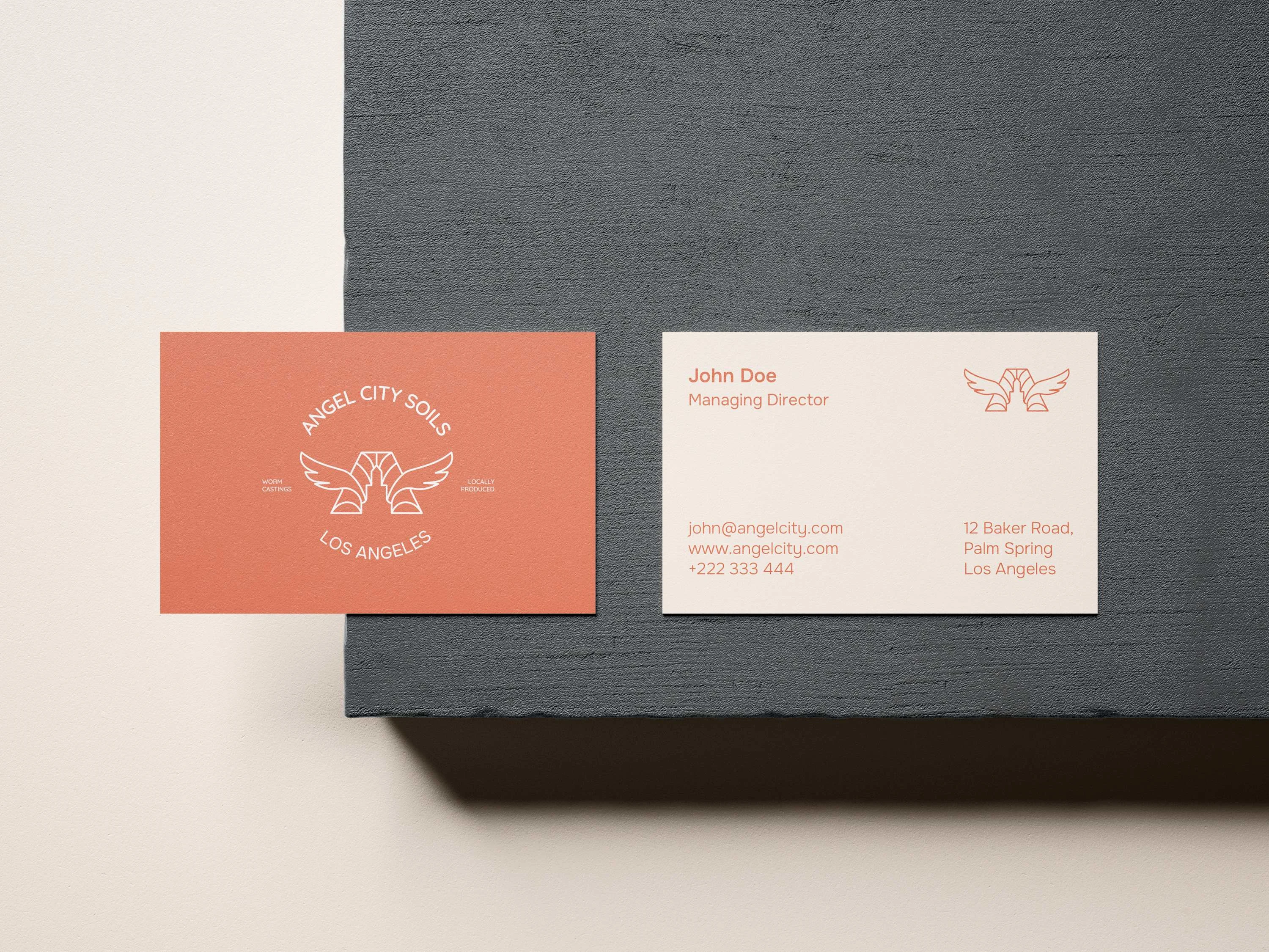
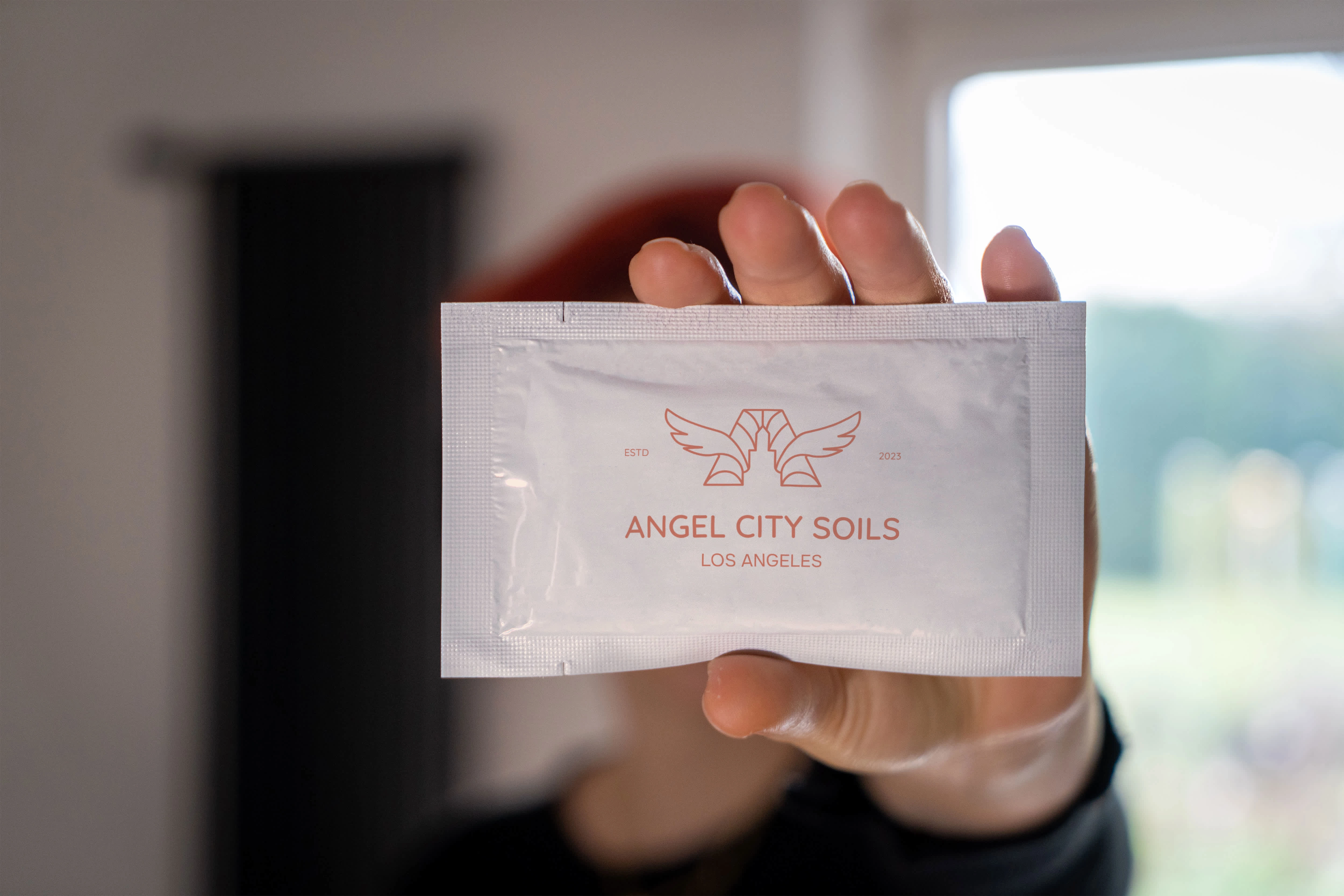
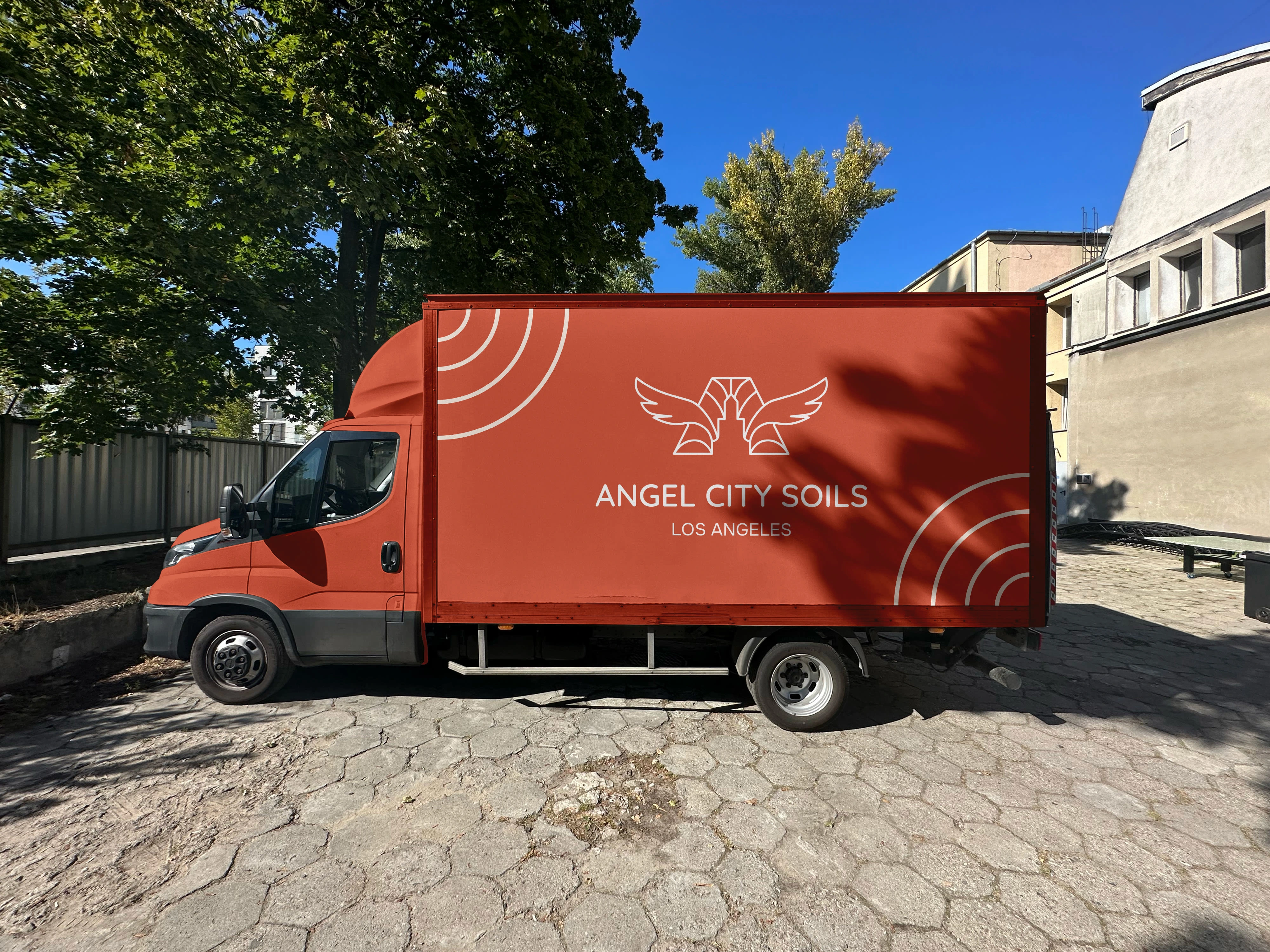
Earthly tones and colors were picked for all the brand materials. The idea was to create something that was rooted in Earth and soil and felt Organic. Shades of brown, orange, and cream colors were used throughout the brand materials. Three sets of typefaces were selected for Primary, Secondary, and body texts. Textures and grains are also used on business cards and other print materials to make it feel more organic as we hold them in our hands. The whole identity feels like it was covered in fertile soil.
Sustainable and Organic
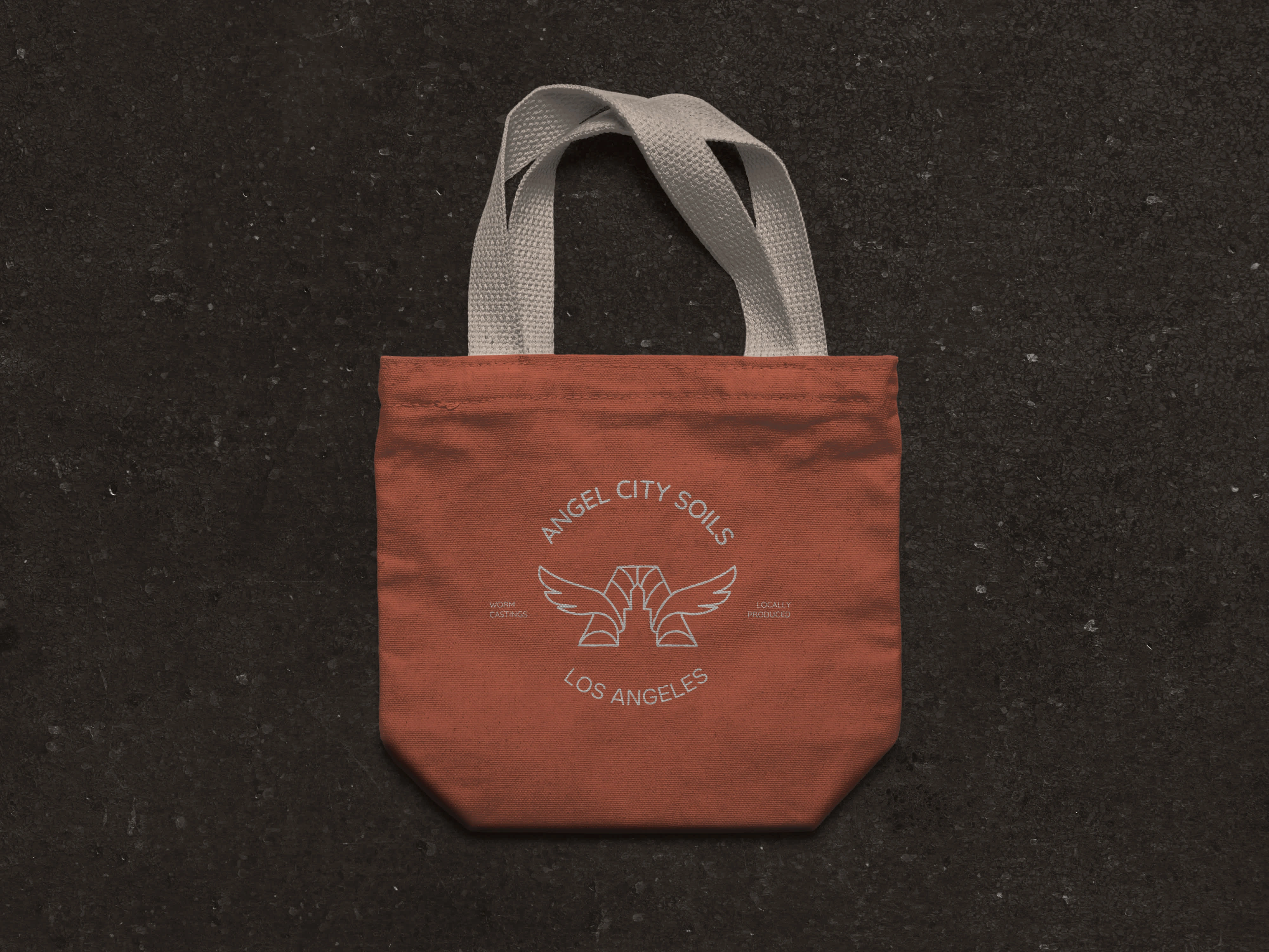
The brand stationery and materials were selectively picked to emphasize sustainability. The identity was adapted from organic materials such as cotton bags, recyclable plastic, cardboard boxes, and environment-friendly paper.

Like this project
Posted Jul 15, 2024
The goal of the project was to create an identity and logo that captured the sustainability and environment-friendly nature of the brand.


