
Beyond Surfaces® Logo Design
Beyond Surfaces® Logo
Business Card Mockup/Design
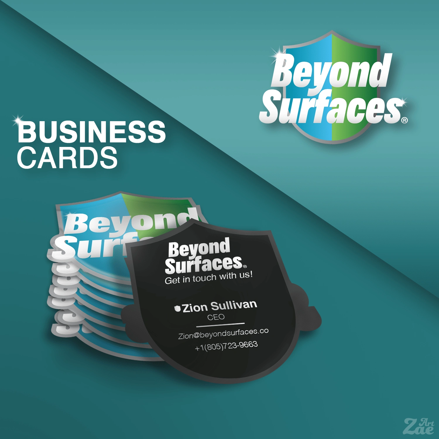
Design
Overview
Founded by Zion Sullivan, Beyond Surfaces® is a newly established disinfectant company with the purpose of multipurpose and multisurface cleaning and with their formula, has the capabilities of taking care of 99.9% of germs and 100% of the stains from all surfaces. The properties of the formula go beyond the surfaces and ensure protection on a cellular level, wiping out bad bacteria and guarding the surface entirely.
Design Goals
The purpose of my design choice was to create a professional logo that would objectively make the most sense for a company that revolves around cleaning and disinfecting.
Visual Direction
Inspiration
I needed to do a good bit of research as disinfectants are not necessarily within my realm of knowledge. However, I have learned a lot from the companies listed:
Clorox
Lysol
Windex
Mr. Clean
Each of these companies has very unique designs from each others and that Is something I wanted to strive for in order to have Beyond Surfaces® stand out but also feel like it fits alongside the established market leaders. A strong presence in the space is what I'm hoping for with this company and I think a solid logo would be essential to that.
Process
I began my ideation process. The CEO of Beyond Surfaces®, who I have had contact with throughout the course of the design, requested the following:
- Memorable logo (pass the squint / no glasses test)
- Recognizable with the symbol alone
- Color ideas: Blues, greens, yellows
- Logo ideas: Glossy shield
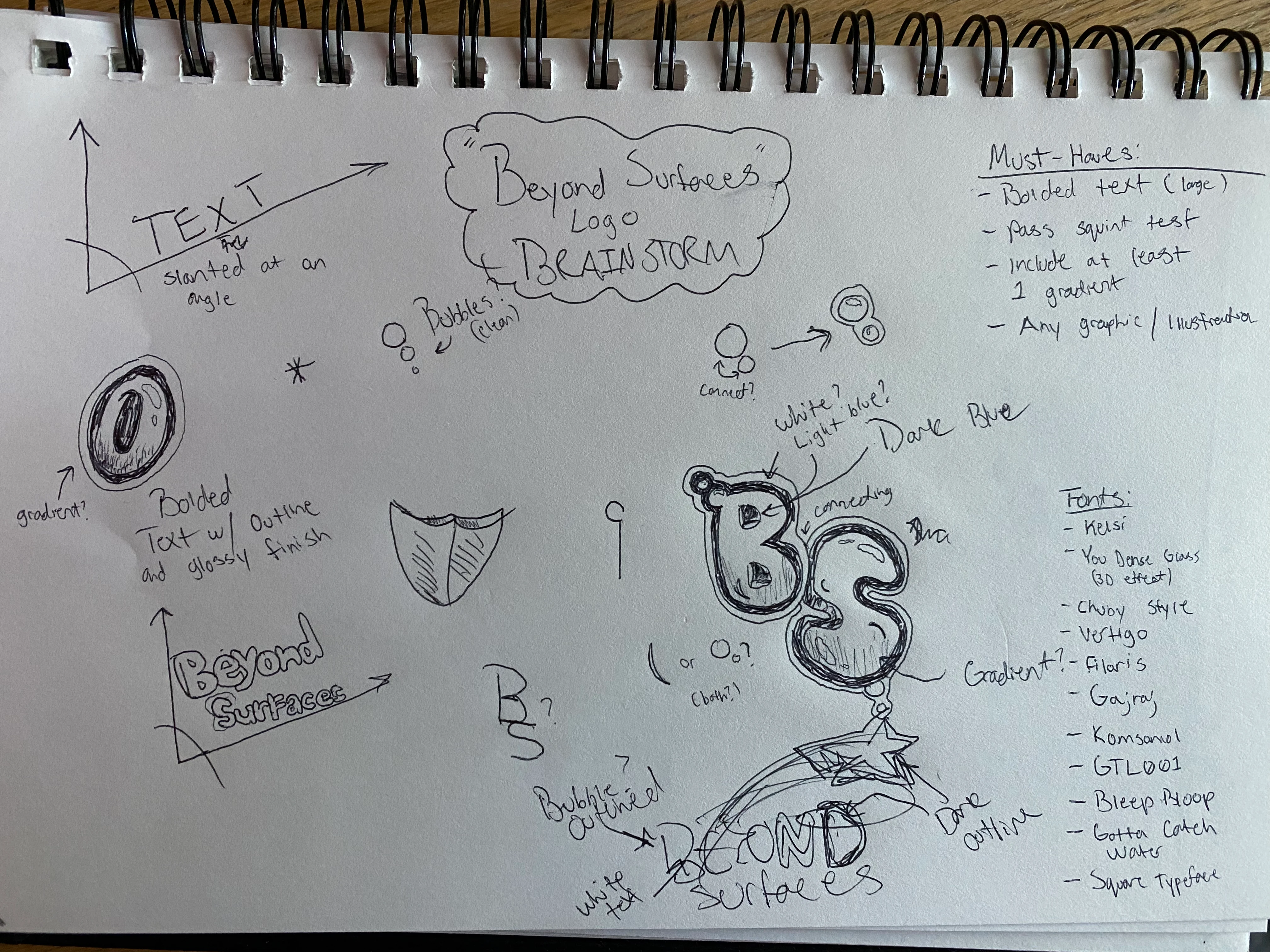
With that information, I started to brainstorm. Anything that came to mind I jotted down in my sketchbook. This is a part of my ideation process to enable myself to be creative and to get my brain thinking.
Color Palette
The colors I chose (Blue, Green) are meant to emphasize the product's purpose: Disinfectant, clean, pristine, etc. Those colors represent all of those when used effectively. I utilized the gradient to fulfill the request for a "glossy shield" logo.
Beyond Surfaces® Shield Icon
Typography
The typography aspects could make or break the logo. I needed to be sure that the text could still stand alone as its own logo for websites or other professional means. In order to create a strong presence I needed a strong typeface. I believe the typeface I chose plus the minor tweaks I've done to it fulfill that need well.
Beyond Surfaces® Logo (text only)
After I created the text as a standalone logo, I combined the two separate elements (the shield and the text) to create a unified logo. My client was beyond excited about the finished product.
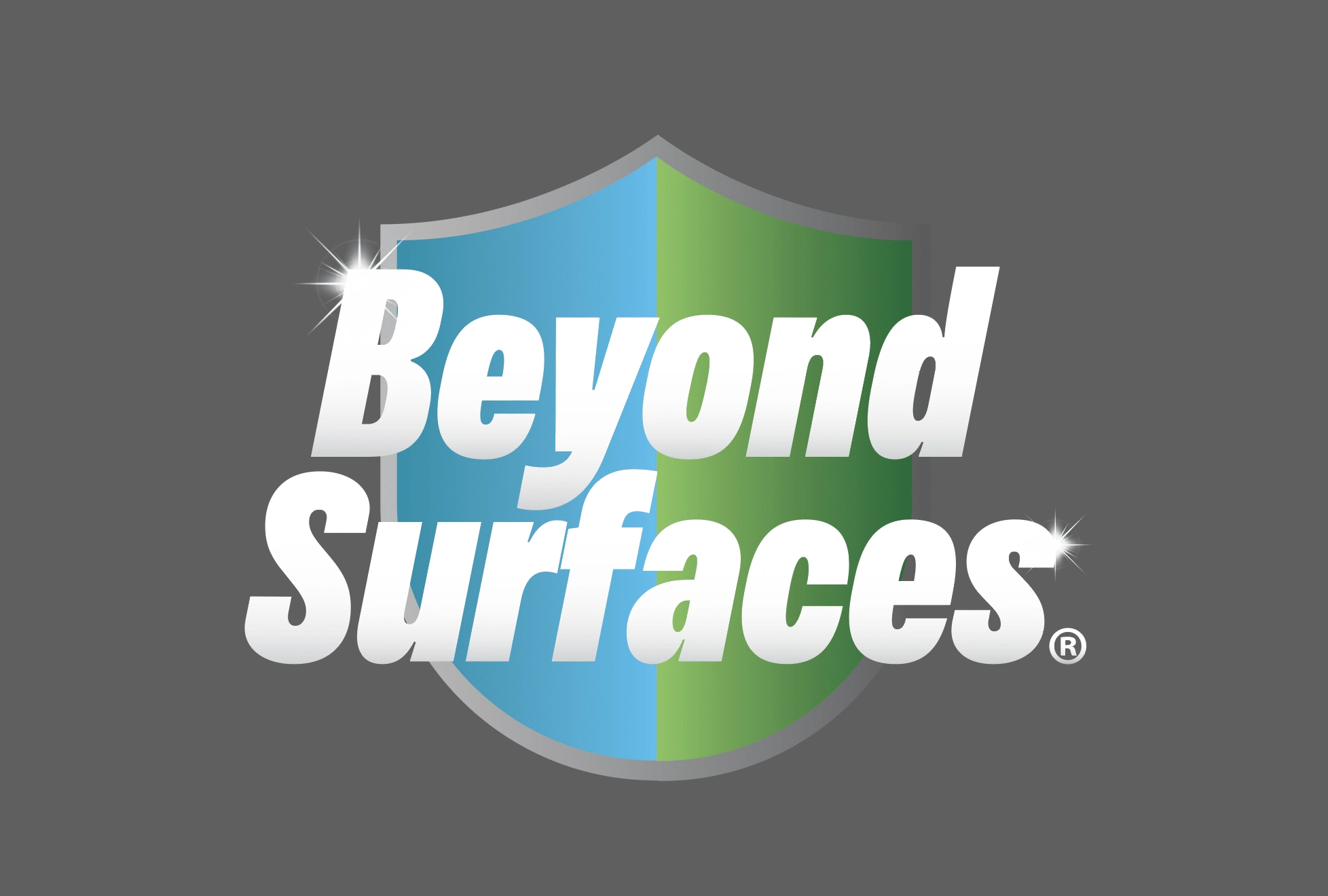
Beyond Surfaces® Logo
0 likes · 43 views · Apr 6, 2023
I created a professional logo for Beyond Surfaces®, an up-and-coming disinfectant company

