'THE BIG RED BOOT' by MSCHF® — Advertisement
MSCHF® Advertisement

Advertisement Mockup
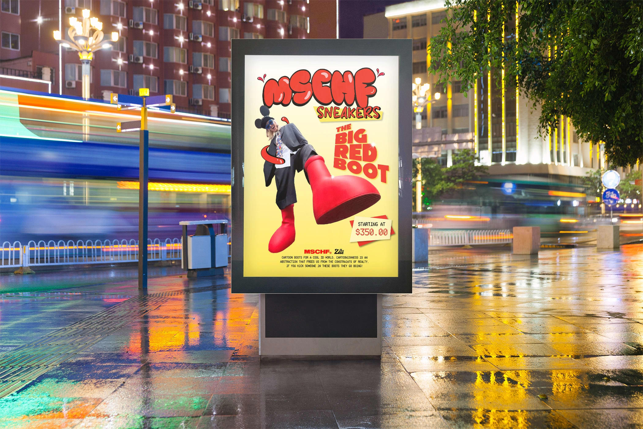
MSCHF® Sneakers 'THE BIG RED BOOT' ad sign mockup
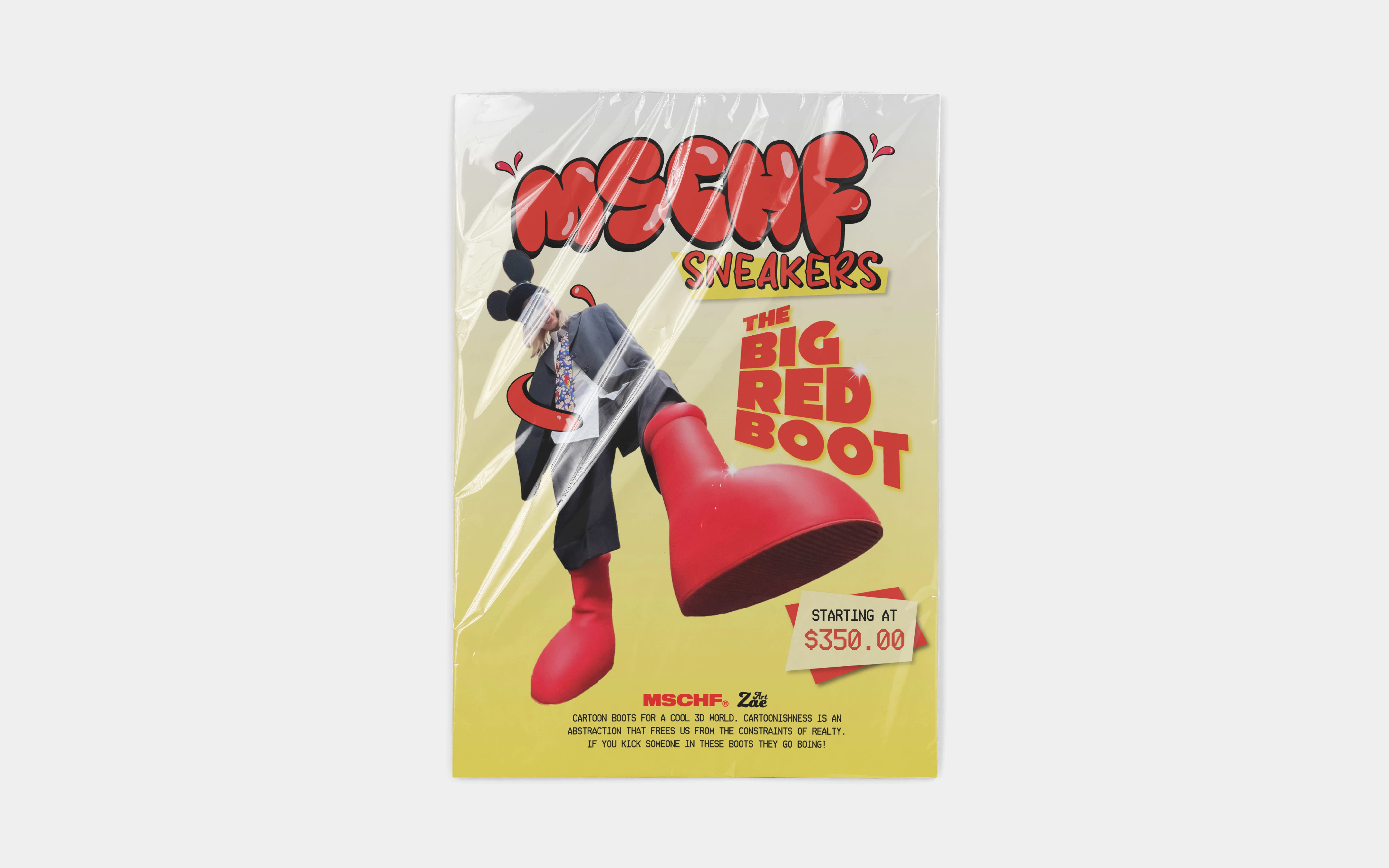
MSCHF® Sneakers 'THE BIG RED BOOT' ad plastic wrapped mockup
Design
Overview
Founded in 2016 by Gabriel Whaley, MSCHF® is an American art collective based in Brooklyn, New York. In February of 2023, MSCHF® has been trending due to its latest innovation, The Big Red Boots. The campaign began with various celebrities and fashion moguls spotted wearing these cartoon-like boots.
Goals
The purpose of my ad was to market to teens/adolescents who would be the most inclined to wear cartoon-styled boots as a fashion statement. I personally reached out to MSCHF® recently to show them my creation in hopes of future collaborations.
Visual Direction
Inspiration
My inspiration for this design came from a few minutes of scrolling through my TikTok feed. A graphic designer appeared and used a bubbly typeface to present a Nike ad. I was interested in the chewy style of the typeface and thought about brands and corporations that would utilize that style of typography. Some that came to mind included:
TikTok
Huggies
MSCHF
Hersheypark
Due to the current trends surrounding 'THE BIG RED BOOTS', MSCHF® would be my best option.
Process
I started off by searching for images of some of the celebrities who helped market the campaign. I wanted to find an image where the boots were the most prominent part so I chose the image of Instagram model, SAUSAGELORD (@sausagelord via Instagram).
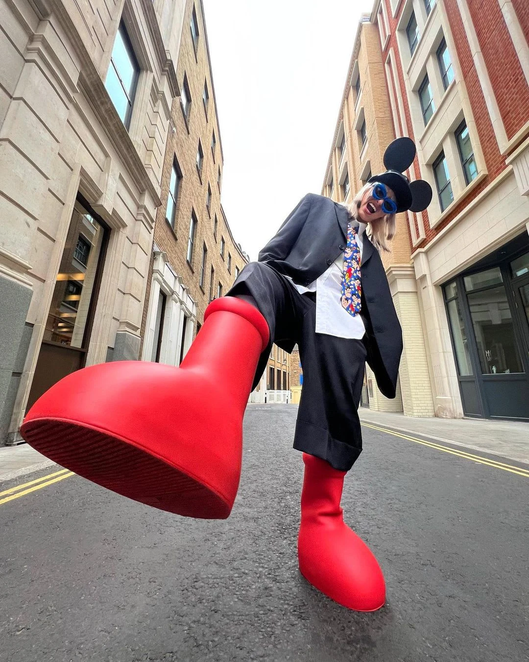
INSTAGRAM / @SAUSAGELORD / VIA @MSCHFSNEAKERS
Color Palette
The use of color was simple. I chose the red and yellow found in their primary minimalist logo displayed below:

MSCHF® Logo
Typography
The typography aspects of this design were definitely the most critical part. I identified many challenges that came my way for this design and how I executed plans to overcome them:
What typefaces to include?
What information should be presented?
How can I determine hierarchy?
Where would the typefaces best fit?
What colors should the typefaces be?
I started off by using the bubbly style that inspired me to create the design in the first place. The red located in the MSCHF® logo is very bold and makes it easy for the text to stand out. I included a black outline and a glossy look to give it the maximum cartoon look.
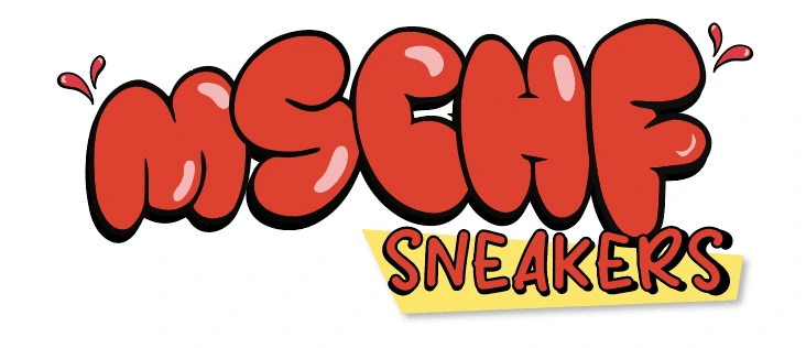
MSCHF® Sneakers Text
Next, I inserted the image of SAUSAGELORD. To take up enough white space, and not interfere so much with the "MSCHF SNEAKERS" text, I inverted her. It allowed me to almost center the boot to create a focal point for the composition.
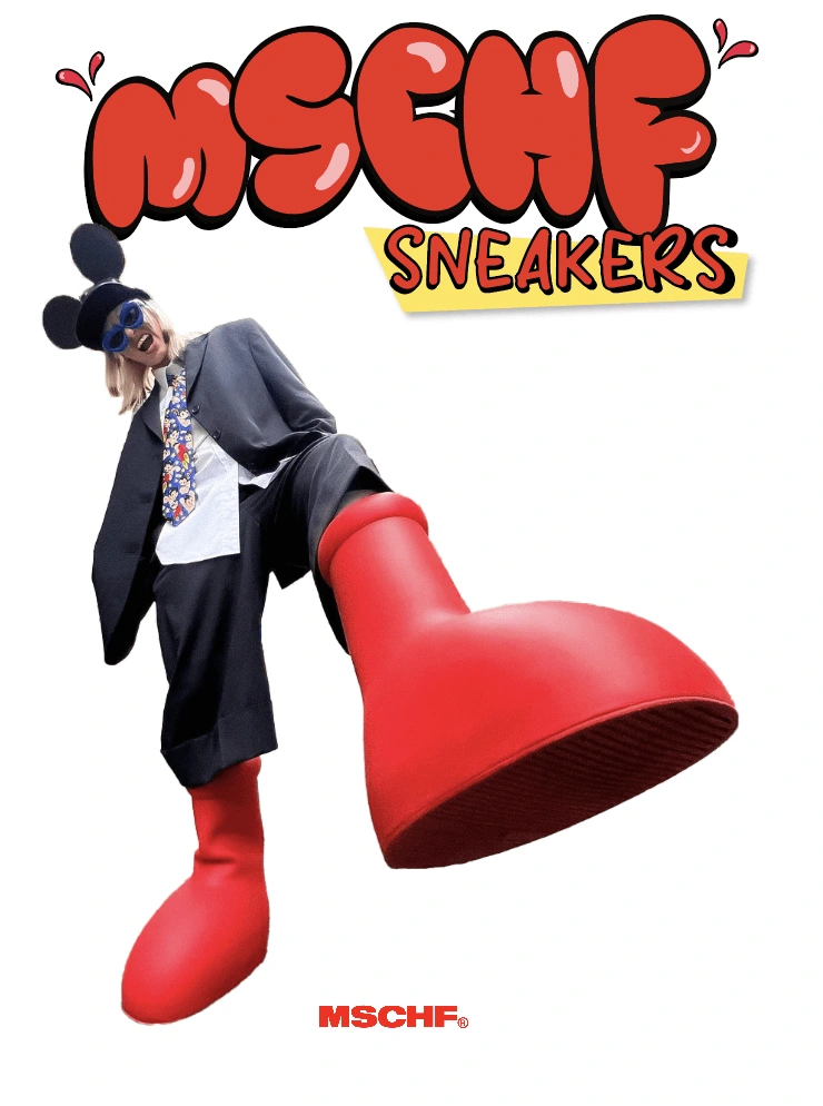
MSCHFT® Sneakers unfinished Ad
My next challenge was to decide what other typefaces should be included and what information should be presented. I decided to include the name of the boots, the pricing, and a brief description provided directly from the MSCHF® website. I knew the text for "THE BIG RED BOOT" needed to be presented in a way that allows it to be a primary point in the hierarchy. I chose a bold font, similar to the boldness of the boots, and sized each line of text to give it a subtle shape of a boot. With the pricing and description, I used a ticket-style font similar to the one on their website and placed a description at the bottom of the ad. To have a cleaner color hierarchy, I included a gradient for the background as well. Below, is the final design:
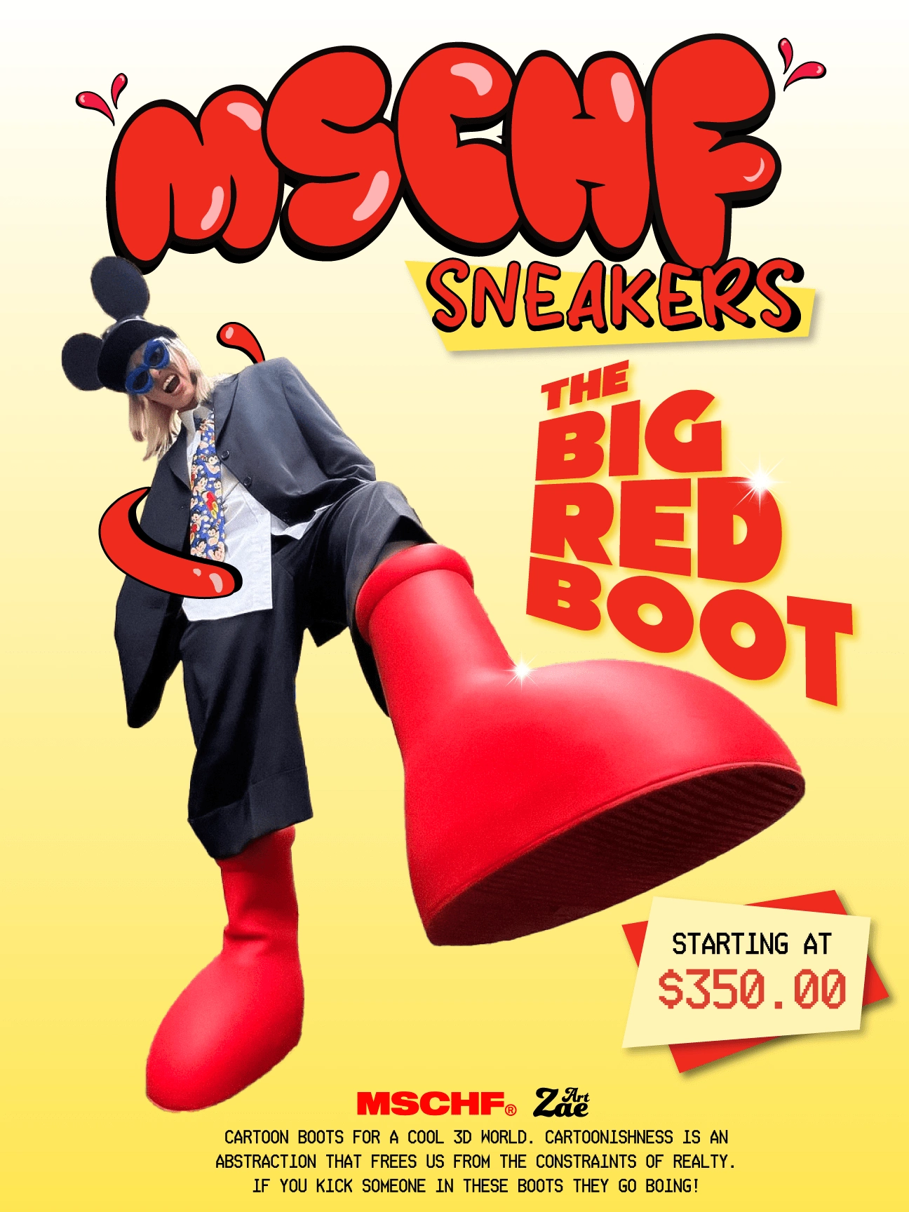
MSCHF® Sneakers 'THE BIG RED BOOT' Ad
Like this project
Posted Feb 19, 2023
I created an ad to go with the marketing campaign by MSCHF® Sneakers based on their latest release, 'The Big Red Boots.'
