BOLD new Brand Identity - Nurika
Akinola Samuel

We’re excited to unveil our new brand identity that better reflects our vision of transforming your wellness into a rewarding adventure. It goes beyond surface-level aesthetics and aims to establish a deeper connection with you, our users. It underscores our dedication to spearheading innovation and providing solutions that propel healthy lifestyle choices and growth.
This commitment is further exemplified by introducing our AI-powered health monitoring system which leverages user behaviour data collected from mobile devices and wearables to predict and prevent potential health issues.
We empower users to take proactive steps toward better health outcomes with early warnings and tailored recommendations.
So, let’s unravel the why, how, and what behind the new Nurika brand identity.
Why the new brand, you ask?
Our new logo is similar to the previous one but reinvigorated with new life. We’ve tightened it up and rounded it out a bit more. Some key points are the thicket typography “Ñurika”, and the perfect alignment of the typography and the icon. By rounding out the letters, updating the font, tightening the letter spacing, and our colour change from "Orange" and "Green" to "Teal" we’ve brought more warmth and humanness to who we are in a way that reflects the importance aspect in our project, Health and Wellness.
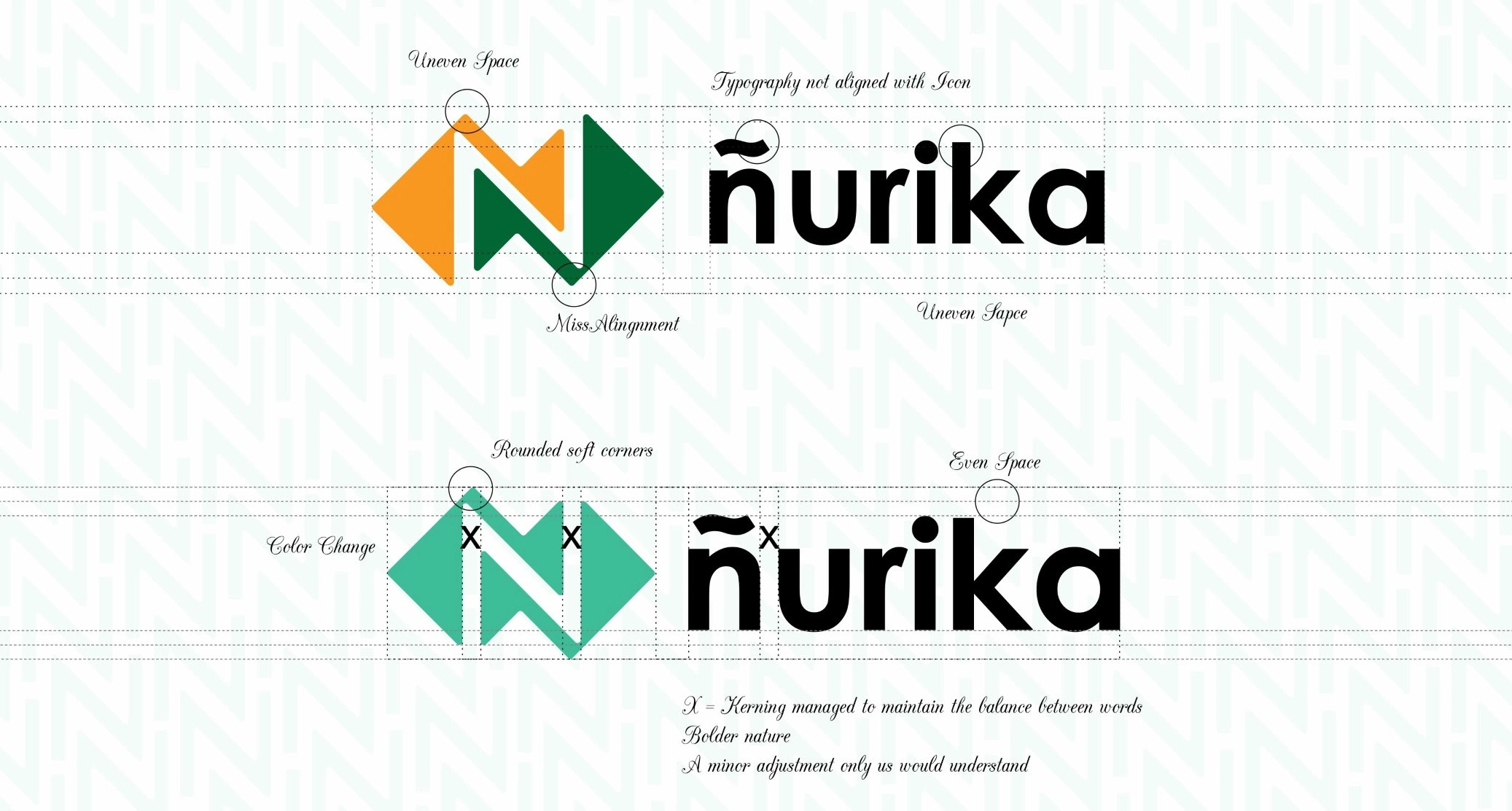
A refined icon
The original Nurika logo drew inspiration from multiple sources, including the concept of M2E (Move to Earn), the app’s health-tracking benefits, and its rewards system.
The logo featured an ascending walking path forming the letter "N” which split a solid shape into two distinct halves, symbolizing your journey towards better health and the conversion of your steps into valuable tokens.
In summary, our logo is more than just a design – it’s a reflection of the lives we impact every quarter, all across the globe.
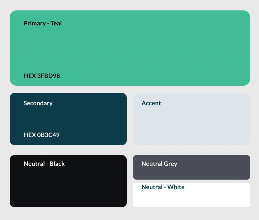
Colour palette: Teal
We’ve also updated our color palette. Our main color is now Teal (yes, it’s teal…not Orange and Green anymore!), accompanied by Soft Black. While paying homage to the Orange and Green from our old branding, we’ve changed it up this time to show our evolution forward, intensifying the teal and softening the Black.
"Teal, tightly wound yet effortlessly soothing. A color that invites relaxation effortlessly. Teal, a choice found in many homes, beckons us to unwind. Life's stresses may bring anxiety and frustration, but teal reminds us that these emotions are transient. Rooted in reality and understanding, teal stands as a bulwark against negativity.
With its profound wisdom and invigorating spirit, teal rejuvenates those seeking a fresh perspective. If you crave a new lease on life, turn to teal. This color bestows the gift of a revitalized outlook. Teal's mission is to uplift, offering valuable insights and guidance. When you find yourself at a crossroads, let teal gently steer you in the right direction."
Together, these colors create a powerful visual identity that evokes feelings of trust and reliability. They convey how far we’ve come, and how we envision our future of continued evolution to better serve individuals around the world.
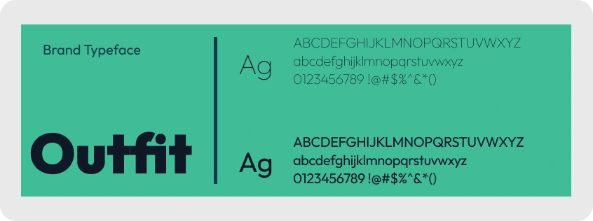
Typography - Outfit Font Family
Outfit Font Family is a sans serif font with simple, clean, and visual elegance. The outfit is a beautiful geometric sans serif typeface. The official typeface for Nurika The Outfit family comes with 9 weights from Thin to Black, including the variable font.
Tone of voice
Our tone of voice is designed to embody rationality, simplicity, and inspiration, conveying a sense of maturity that we bring with our expertise. We believe in using language that brings out curiosity and appeals to both the logical and emotional side of our audience, whether they live a sedentary lifestyle or an active lifestyle.
We’re proud of the evolution of Nurika and can’t wait to share more of it with the world.
Huge thanks to Akinola who made this happen
Like this project
Posted Dec 18, 2023
Unveiling the new brand identity that better reflects the vision of transforming wellness into a rewarding adventure for Nurika Health.
Likes
0
Views
19