Fidelity Ghana Mobile Banking App Redesign
Overview 🔎
Project Summary
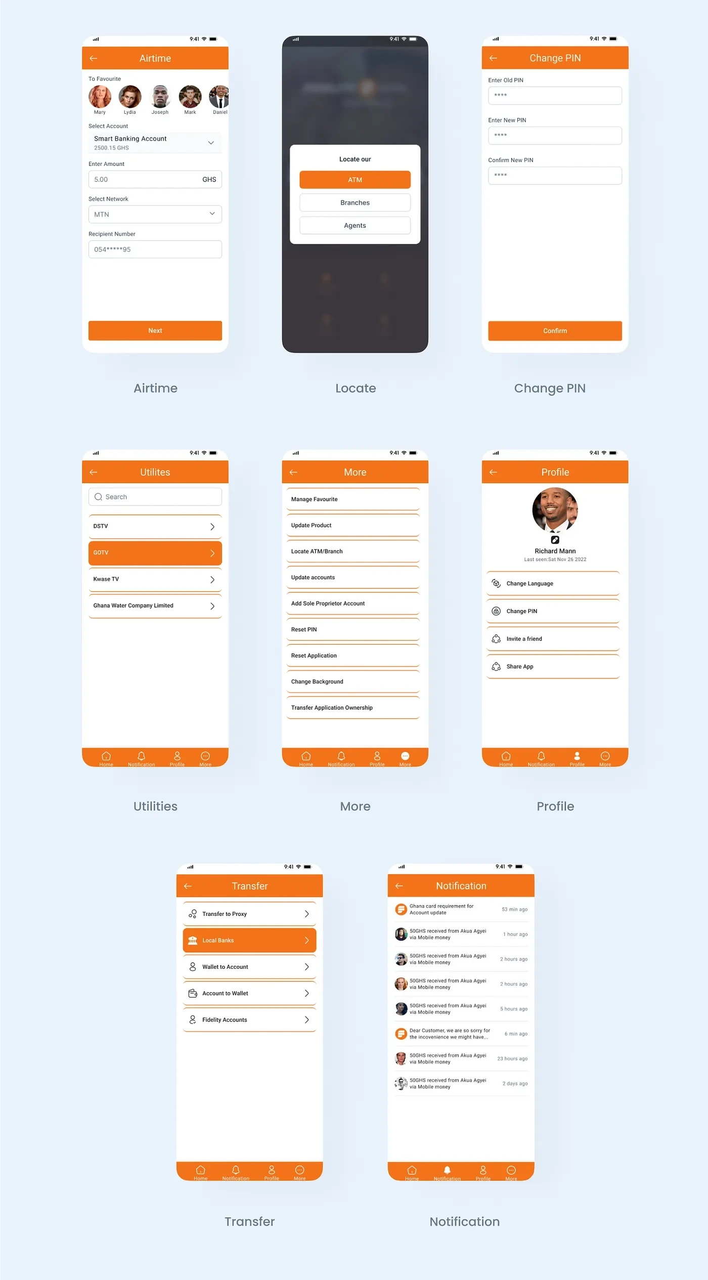
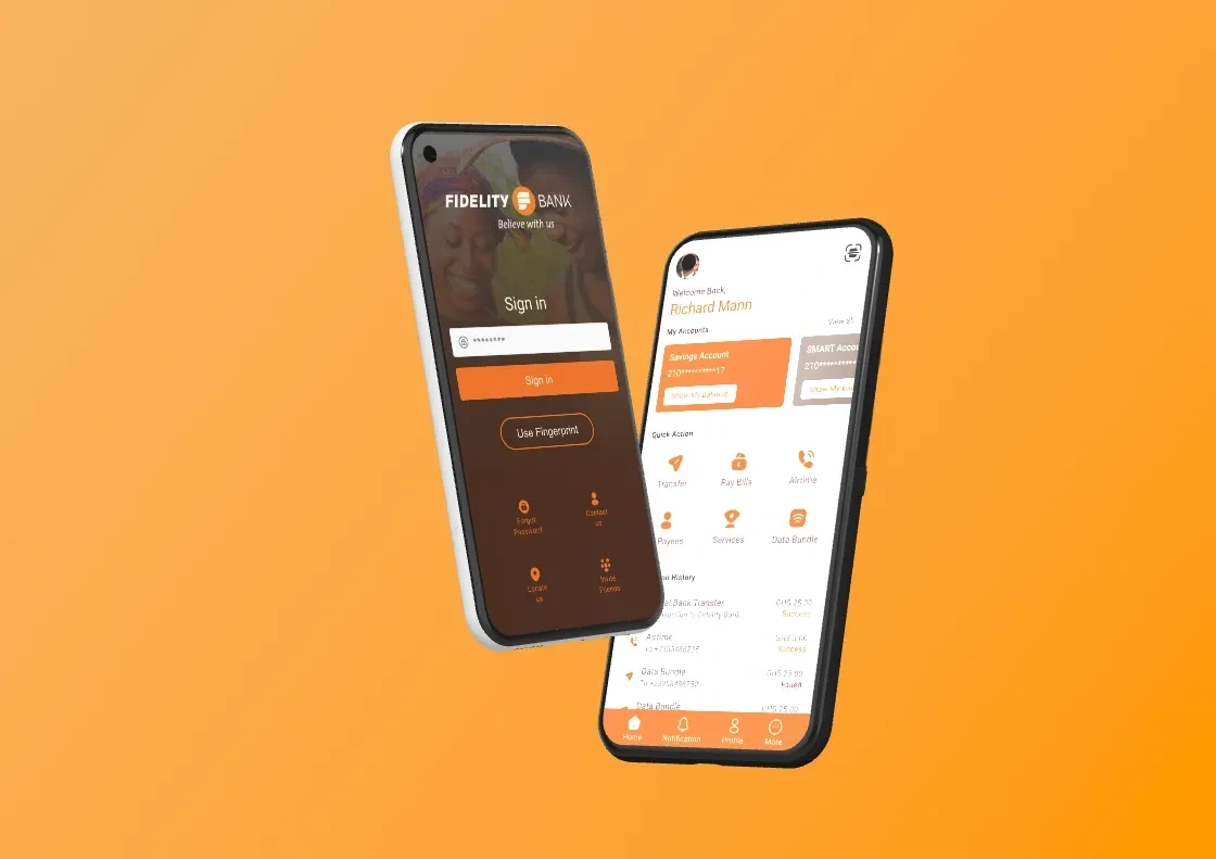
Redesigning Fidelity banking App with the primary goal of enhancing process efficiency in the banking system and solving customers' complaints. To streamline the essential procedures for onboarding and registration for new and current users
Problem Statement
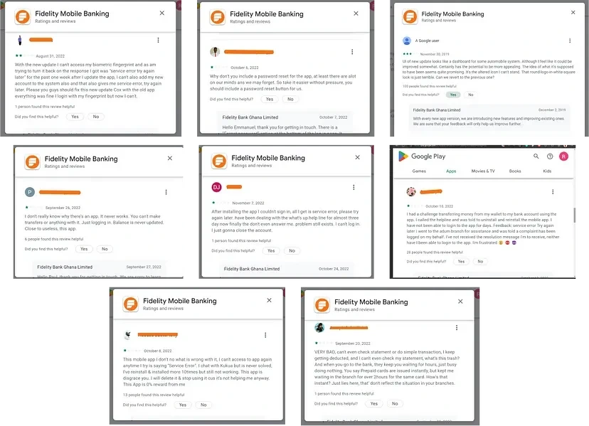
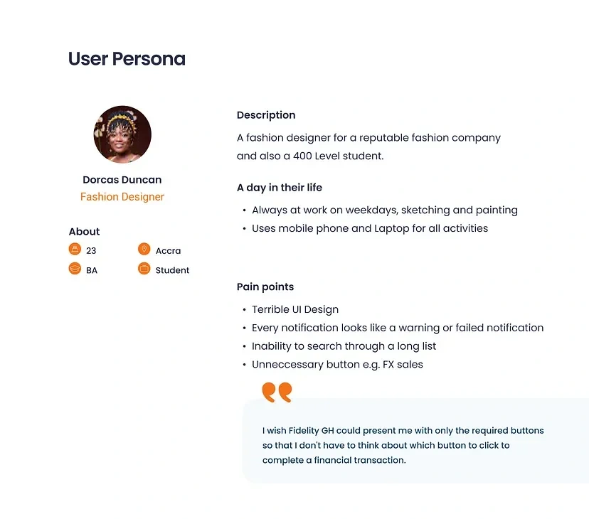
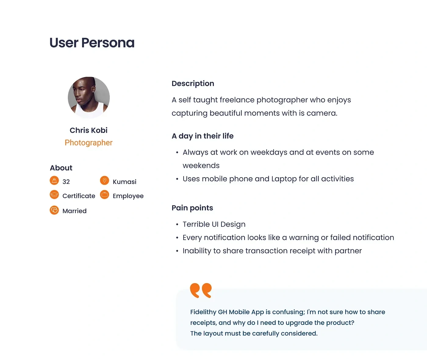
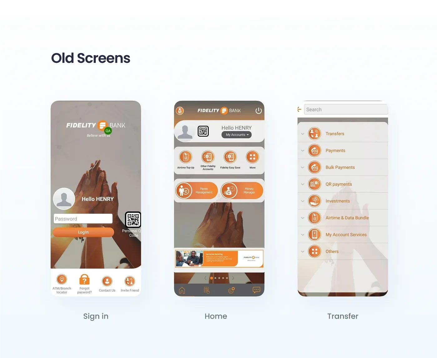
The app received a lot of negative feedback owing to UX issues that made the app difficult to use. The platform has lost a lot of users and reputation; they need to rethink their interface to make it easy for their consumers while also ensuring that the services are meeting the demands of the users. Furthermore, there have been several complaints from Fidelity customers and about difficulties utilizing the app, security authentication, and other issues. I had to explore the Google Play Store for further user complaints and do research to address the consumers’ concerns.
Objectives & Goals
Enhancing process efficiency in the banking system and solving customers complaints.
Improve usability and make the app more user-friendly.
Improve customers trust for Fidelity GH Bank.
Challenges
Bridging the gap between User Interface design and Back-end functionality.
Deciding which problem to solve.
Providing relevant buttons based on the type of User’s Account.
Unable to reference old screen because Fidelity does not permit screenshot
User Needs
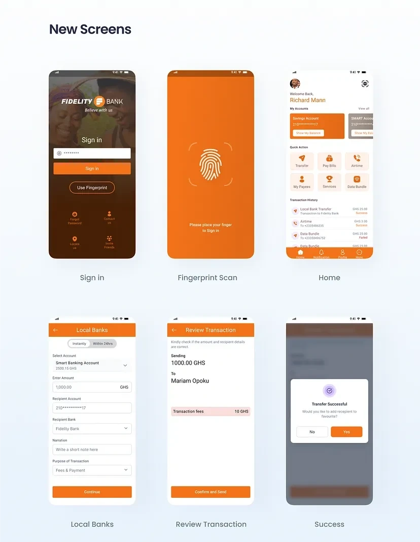
To sign up using my account number and personal information to make the process easier.
To use fingerprints to improve security and speed up login.
To integrate my credit card information in online purchases and track my online subscriptions.
To be able to look at my previous transactions in order to track my cash flow and export my total debit and credit for a certain time period as a financial statement.
To simply purchase airtime and mobile data from the app for myself and others.
To save numbers and favorite account numbers in the app for later purchase of airtime and money transaction.
Like this project
Posted Jan 2, 2024
Fidelity Ghana Mobile Banking App Redesign —UX Case Study


