OCAD U International Visual Identity

Rahul Bagdai


The Design Problem 🔎
OCAD University has individual international student teams that function from separate office spaces. Students usually get confused amongst each of the teams and fail to recognize the teams and their individual functions. OCAD U's International email account receives queries that are misdirected, due to the confusion and lack of awareness in students. This means, the team faces difficulties to get back to all queries properly and on time!
The Solution 🤝
The Logo System:
To brand the OCAD U International teams as one, a modular logo system was developed, formed of circular-capped lines (CCLs). The logo that represents the umbrella-group, termed “OCAD U International” is represented by a slanted-circular-formation of the CCLs. This simple formation, conveys the sense of unity and acceptance, as well as a welcoming factor.
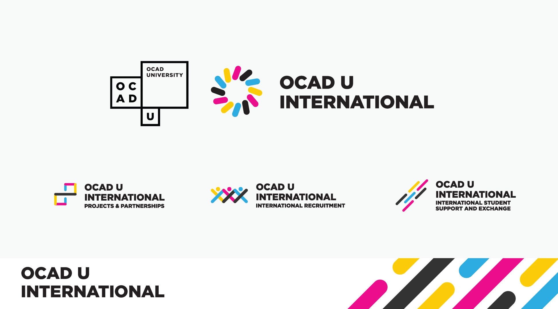
The Form:
The form is modular in nature, the CCL elements can be used individually and overlapped to render icon-logos for each of the teams under the OCAD U International umbrella-group. Doing this propagates unification of the international group’s identity, as well as, distinction of all the teams and their functions.
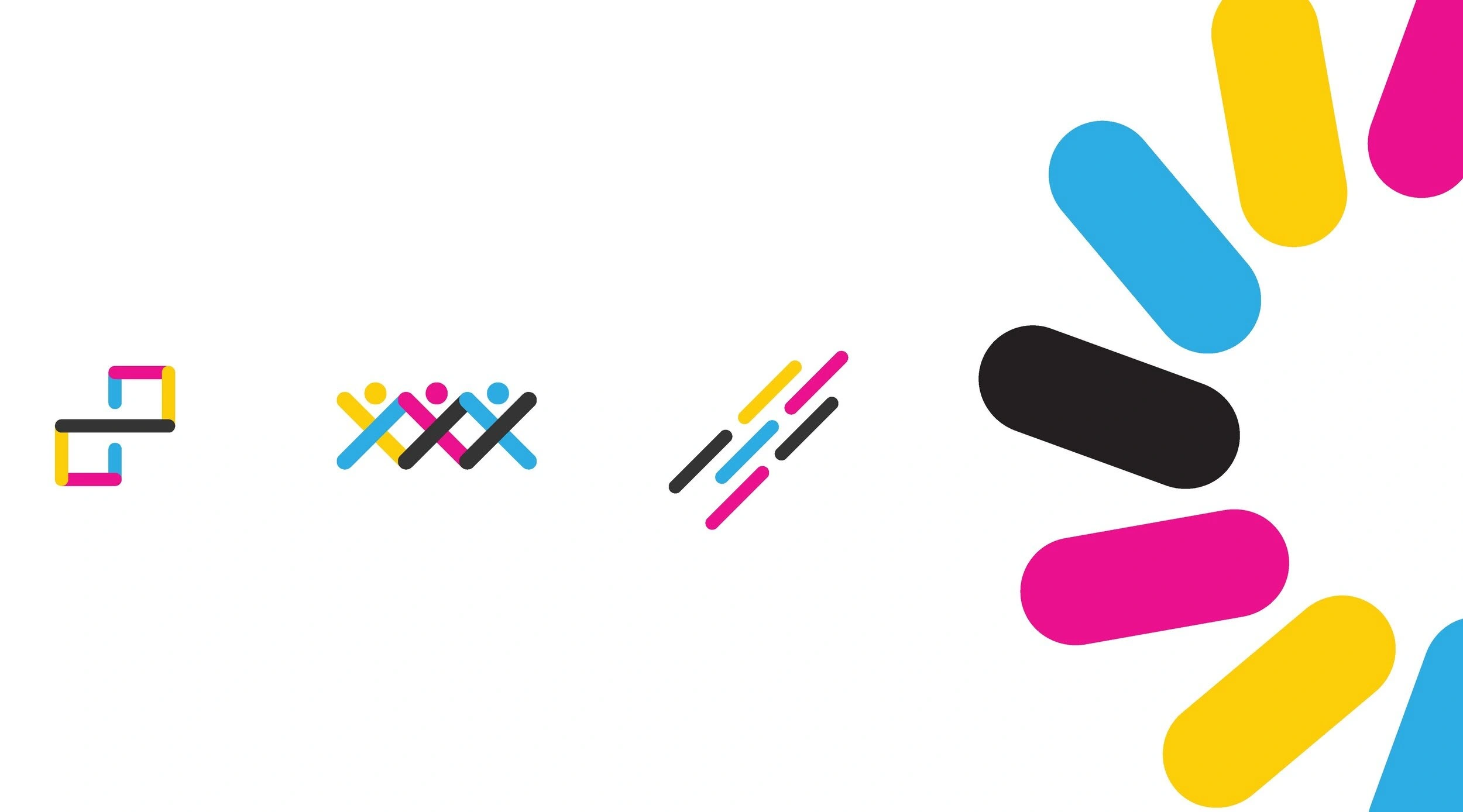
Movement:
Movement conveys the active spirit of the team, as well as the three main ideas: recruitment; exchange and support; and projects and partnerships, through one unified and three distinct form(s).
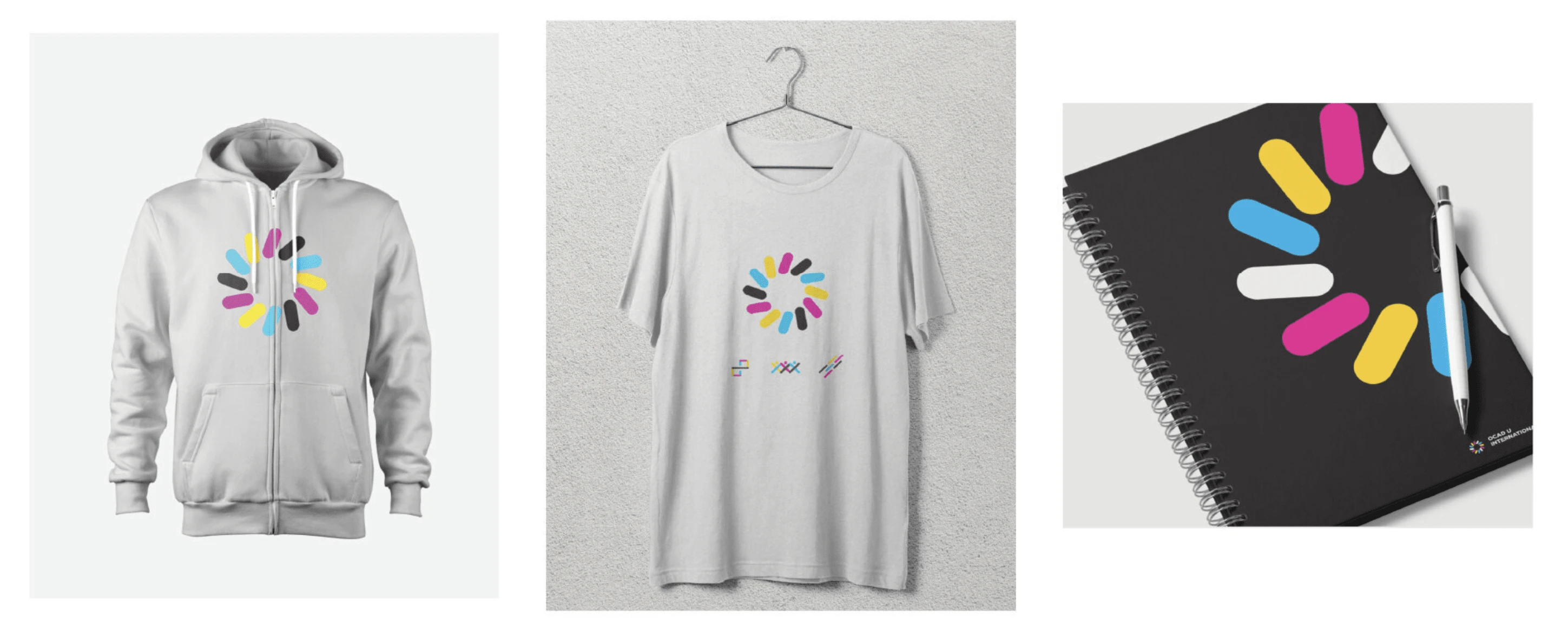
Creative Applications
Checkout the full project:
Like this project
Posted Aug 15, 2022
An award-winning visual identity developed for OCAD U International to represent the three teams under a single umbrella term.
Likes
0
Views
3
Clients
OCAD University