Visual Brand Identity for a Mental Health Services Business
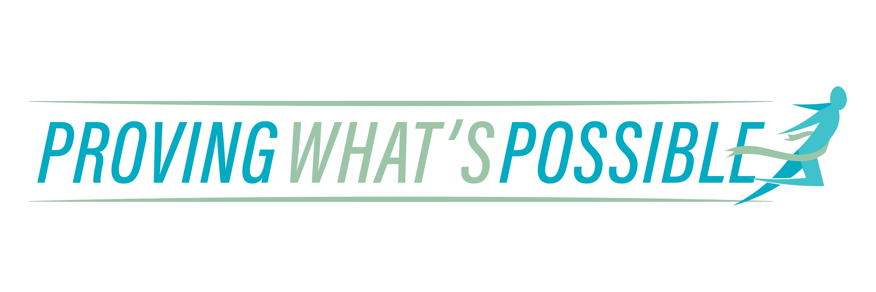
PWP Health is a provider of mental health services with a mission to empower and educate diagnosed patients, helping them restore their belief in their own potential. When they came to me, they already had an existing logo designed by another professional. However, with the upcoming launch of their business, they recognized the need for a cleaner and more professional logo. Here's the original logo they were using: While wanting an upgrade, PWP Health wished to maintain the essence of their existing logo and retain the original color scheme. They also expressed a desire to keep expenses in check. Here's what the old logo looked like:



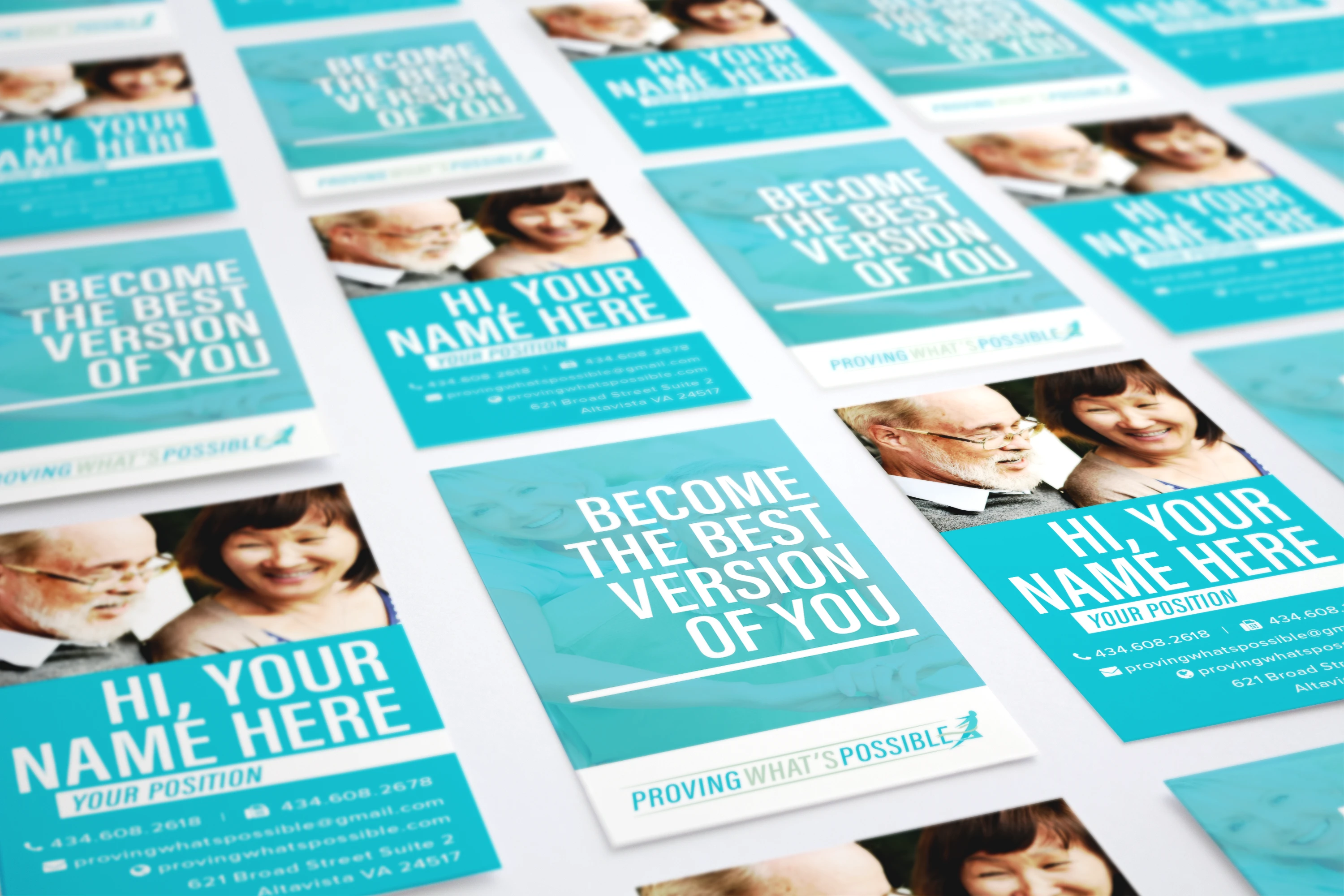
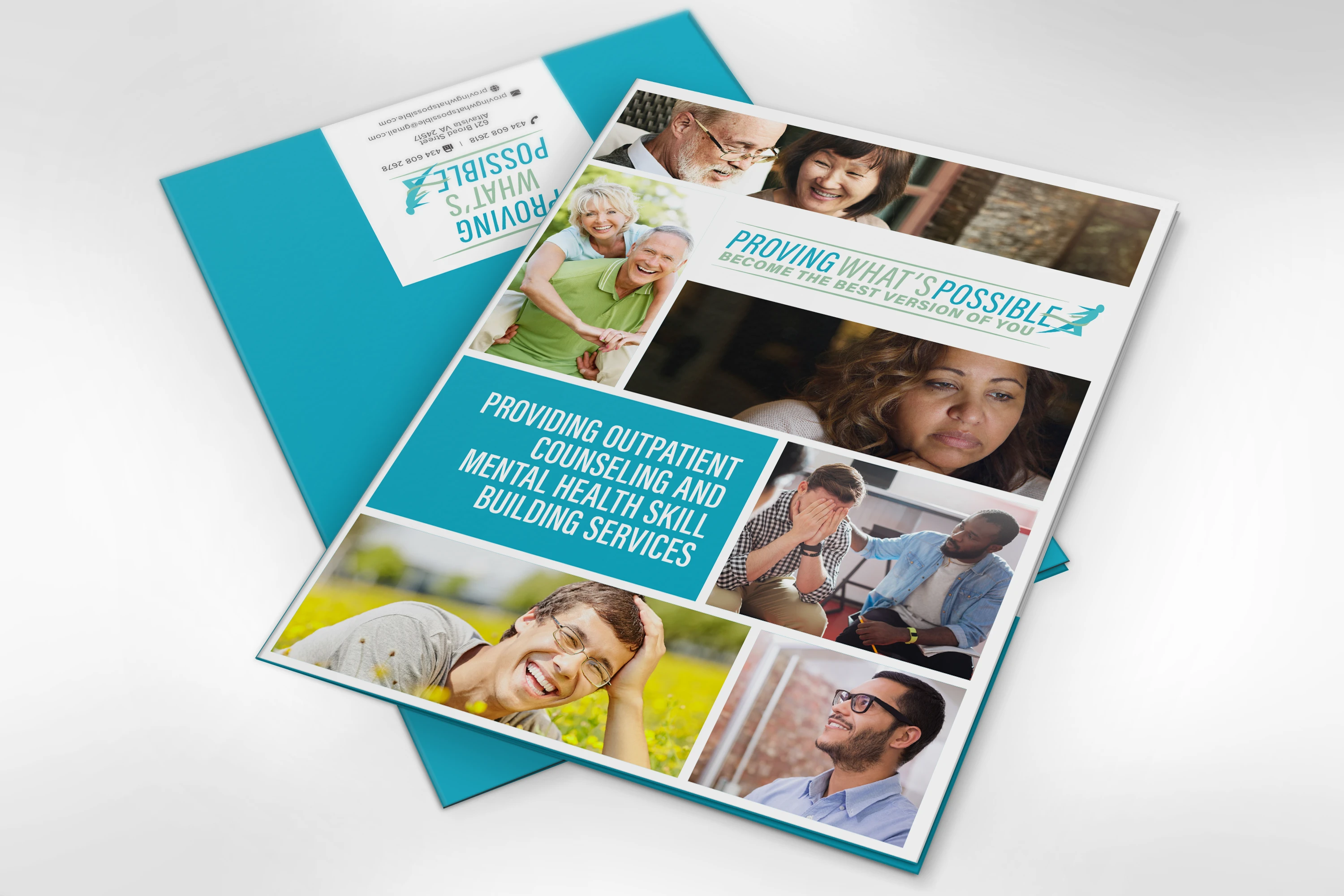
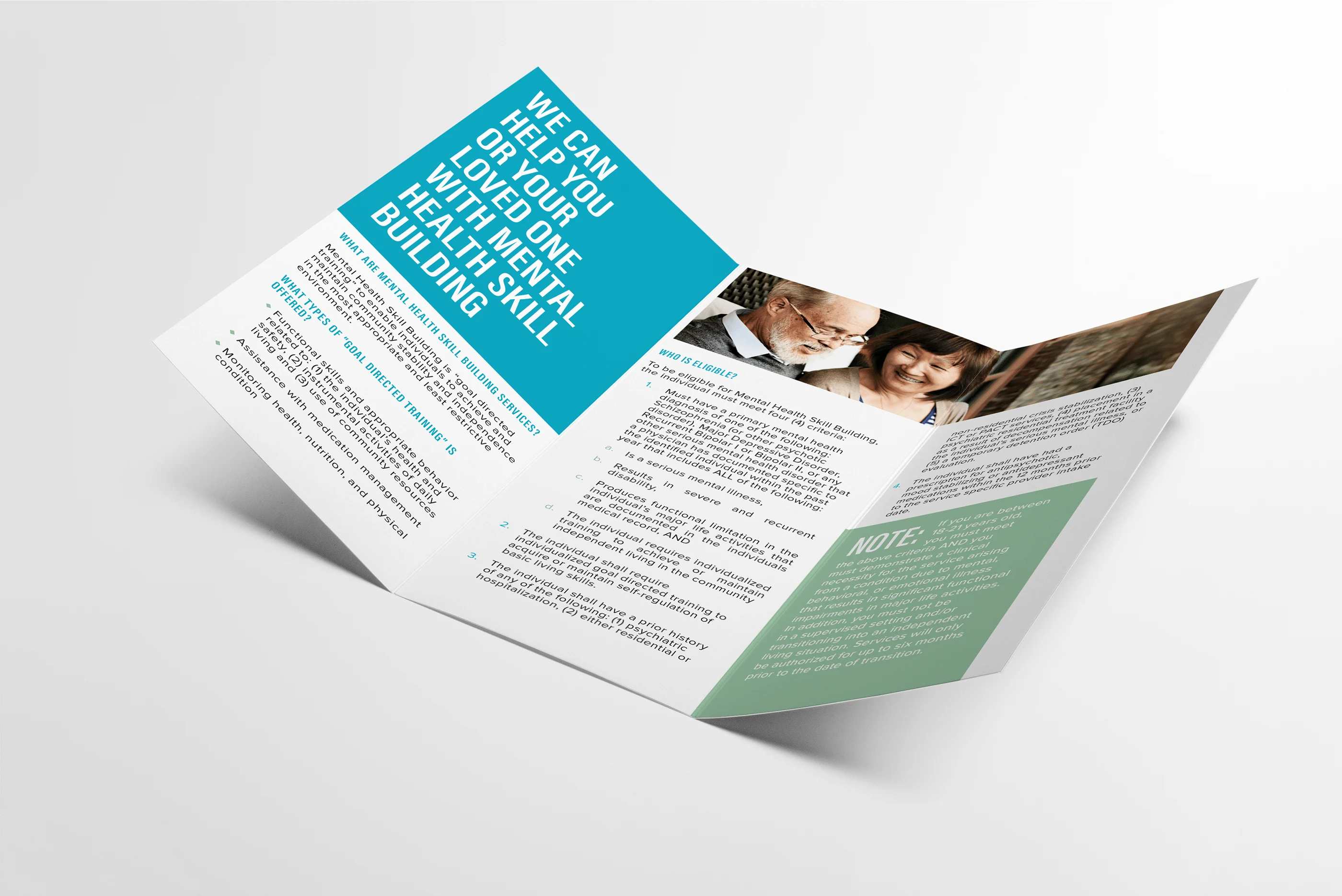
SOLUTIONS: I started the process by having them answer a short brand discovery questionnaire that I designed to help me understand their business, their target demographic, their vision, and mission. To help them hit the ground running while still keeping the costs down, I used the same concept in creating their logo, but making small improvements that changed its vibe in a big way. The original logo used the Raleway font, which is a round, friendly font. This is in contrast with the words they wanted to associate with their brand, which were “superior”, “intelligent” or “progressive". I changed the word mark to a tall italic font to match the running icon and to make it look more dynamic, like it’s reaching out to a goal. To save on costs, we decided to use a stock vector file for the main icon. I also selected one with a more dynamic and positive pose. And while I knew they were attached to the color scheme, I proposed to change it to a more medically-related color. The color scheme they had was more suited to organic food products, or other eco-friendly product. I proposed to use a shade of blue while keeping the shade of green. Blue is the color of trust and peace while green is a color closely associated with healing. The feedback was positive so I moved forward to creating the other assets. Below, you will see the new logo and marketing assets. Below is the new logo and marketing assets.


Like this project
Posted Jul 31, 2023
Graphic Design,Illustration,Adobe Photoshop

