Redesigning the Red Light Therapy Store Product Experience
fabiano pessoa
Case Study: Redesigning the Red Light Therapy E-Commerce Experience
Project Overview:
Collaborated with a Red Light Therapy equipment e-commerce store experiencing a significant drop-off rate on their website. The primary goal of the project was to identify the root causes of user abandonment and redesign the online experience, particularly on product pages, to improve user understanding and reduce friction in the purchase journey.
My Role:
UX Specialist, responsible for the end-to-end user experience redesign, including research, information architecture, wireframing, prototyping, and usability testing.
The Problem:
The client faced a critical business challenge: a high user drop-off rate, significantly impacting potential sales. Initial analysis and anecdotal evidence suggested users were struggling particularly on product pages. The core of the problem was an information gap leading to confusion when users attempted to understand product configurations, set up the equipment virtually on the page, and assess the best cost-benefit option for their specific needs. Unlike simpler products, the complex nature of Red Light Therapy equipment, with multiple versions and features requiring specific configuration to understand benefits, was a major point of friction.
Research:
To diagnose the issues beyond assumptions, a multi-method research approach was employed:
Hotjar & Analytics Analysis: Data revealed high exit rates and confused user behavior on product pages, including excessive scrolling and repeated interactions with configuration options, confirming the product page as a key pain point.
Netnography & Competitive Analysis: Explored online communities and competitor websites to understand user expectations, common frustrations when shopping for similar products, and how other companies (both direct and indirect competitors) structured and presented complex product information. This highlighted alternative, potentially clearer, ways to organize product details.
Keyword & User Intent Research: Analyzed search data to understand what users were looking for when seeking Red Light Therapy equipment. This revealed common queries around "how to use [product name]", "best value red light therapy device", and "what is red light therapy good for", indicating user needs for clear usage instructions, value comparison, and basic education that were not being adequately met on the original site.
Process:
Based on the research findings, a user-centered design process was followed:
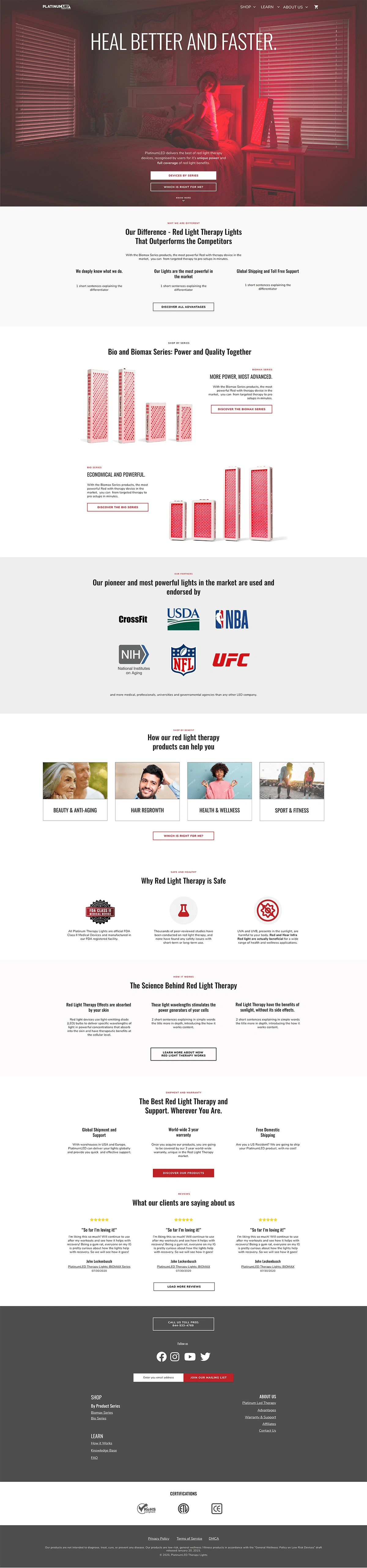
Information Architecture (IA): The site structure, particularly concerning product categorization and the organization of information on product pages, was redesigned. The goal was to create clearer categories and present products within those categories in a way that immediately highlighted their core benefits and how features varied between versions. This aimed to move users from a broad list to a selection based on their specific needs.
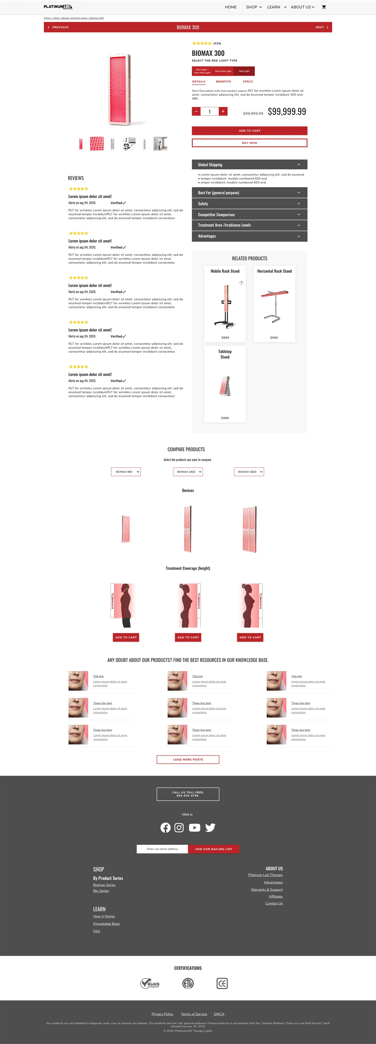
Wireframing & Prototyping: Low-fidelity wireframes were created to define the new layout and flow of the product pages, focusing on intuitive navigation and clear presentation of information. High-fidelity prototypes were then developed in Adobe XD, incorporating visual design elements and interactive features. A key design decision was the implementation of a responsive column structure on the product page, inspired by successful e-commerce platforms like Apple and Dell, to enable users to easily compare features and benefits of different product configurations side-by-side.
Usability Testing: Conducted formative usability testing with 5 participants using the interactive prototype. Users were given tasks simulating real-world scenarios, such as selecting a product based on specific illness needs, budget constraints, and technical specifications. The primary objective was to observe if the redesign successfully reduced confusion and the information gap identified in the research.
Solutions & Deliverables:
The key deliverable was a comprehensive annotated prototype with detailed instructions. This prototype showcased the redesigned product pages, incorporating:
A clear and intuitive Information Architecture with well-defined product categories.
Product listings that emphasized variations between versions.
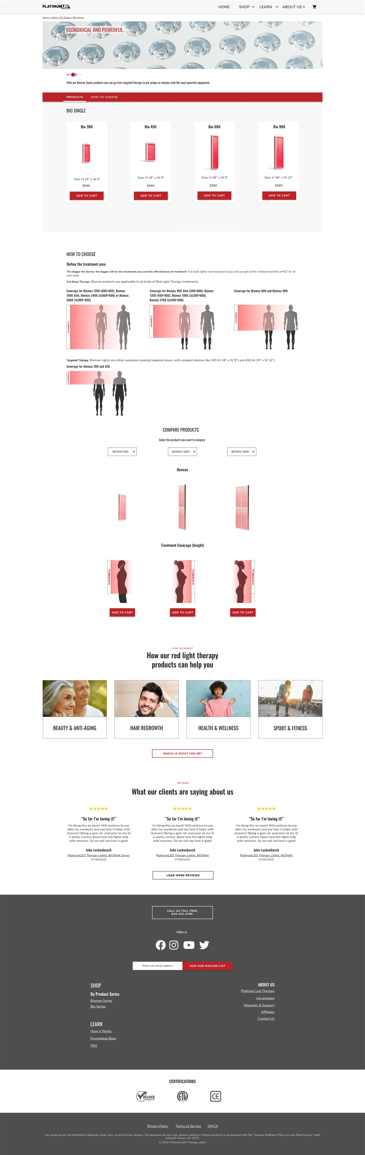
A responsive column comparison layout on the product page for easy feature and cost-benefit analysis and addition of a visual size guide relating product dimensions to average body size, directly addressing a point of confusion discovered during usability testing.
Integration points or clearly accessible sections addressing common user questions like "how to use" and "what is it good for."
Results (Validated through Usability Testing):
While post-launch quantitative data was unavailable, the usability testing provided strong qualitative and behavioral evidence of the redesign's effectiveness:
Participants found it significantly easier to identify the right product based on their specific needs when using the redesigned interface compared to the hypothesized experience on the original site.
The column comparison layout proved effective in helping users understand the differences between product versions and make more informed decisions regarding cost and benefit.
The introduction of the visual size guide successfully resolved the initial confusion users had regarding product sizing and its practical application.
These findings indicate that the redesign successfully addressed the core information gap and confusion points on the product page, validating the design hypotheses and demonstrating the potential for a reduced drop-off rate and improved user experience upon implementation.
Learnings:
Several key learnings emerged from this project:
Implementation Challenges: A significant challenge was the client's limited budget for implementing the comprehensive changes by a specialized Shopify developer. This highlighted the importance of considering implementation constraints early in the process and potentially proposing phased rollouts or more developer-friendly solutions where possible.
Validation of Process: The project strongly validated the power of a structured UX process, even with limitations. The use of Netnography proved particularly valuable in gathering rich user insights and market understanding when direct user interviews were constrained by budget. This data-driven approach from the research phase was crucial in justifying the time and effort spent on design and prototyping to higher management, demonstrating that the problems identified were real and based on user behavior and needs, not just assumptions. This reinforced that data, even from non-traditional methods like Netnography, is key to convincing stakeholders to invest in solving clear, evidence-based problems. The extensive data points gathered from Netnography helped mitigate concerns about sample size often associated with smaller qualitative interview groups.
Like this project
Posted Apr 29, 2025
Redesigned product pages for a Red Light Therapy e-commerce store to reduce user drop-off and improve understanding.
Likes
0
Views
12
Timeline
Jun 24, 2020 - Oct 30, 2020
Clients
Platinum LED