FinTech Product Design

Himanshu Sharma

Property managers and real estate investors are drowning in data — mortgage balances, occupancy rates, net cash flow, upcoming payments, tax deductions — spread across spreadsheets, accounting tools, and their accountant's inbox.
The client needed a SaaS dashboard that consolidated everything into one place: financial performance at a glance, upcoming obligations, and IRS-ready tax reporting — without requiring a finance degree to read it.
My job was to turn a complex financial data product into a UI that felt fast, trustworthy, and clean.
The Design Challenge
Financial dashboards fail in two predictable ways: they either oversimplify (losing the data that power users need) or they overwhelm (turning into a spreadsheet with a logo on it).
Quicklease had to thread that needle — serve a property manager overseeing five properties who needs detail, while remaining immediately readable on first load without a tutorial.
Three specific problems to solve:
Hierarchy across heterogeneous data. Cash flow charts, payment tables, occupancy rates, and tax figures all need to live on the same screen without competing for attention.
Financial trust signals. Users are making decisions about mortgage payments, tax filings, and maintenance budgets. The UI has to communicate accuracy and reliability — not feel like a startup MVP.
Tax reporting that non-accountants can use. The Schedule E Tax Report screen had to surface IRS-relevant figures (Net Rental Income, Deductions, Taxable Income) alongside compliance alerts, without requiring the user to understand tax law to act on what they see.
Screen Breakdown
Main Dashboard
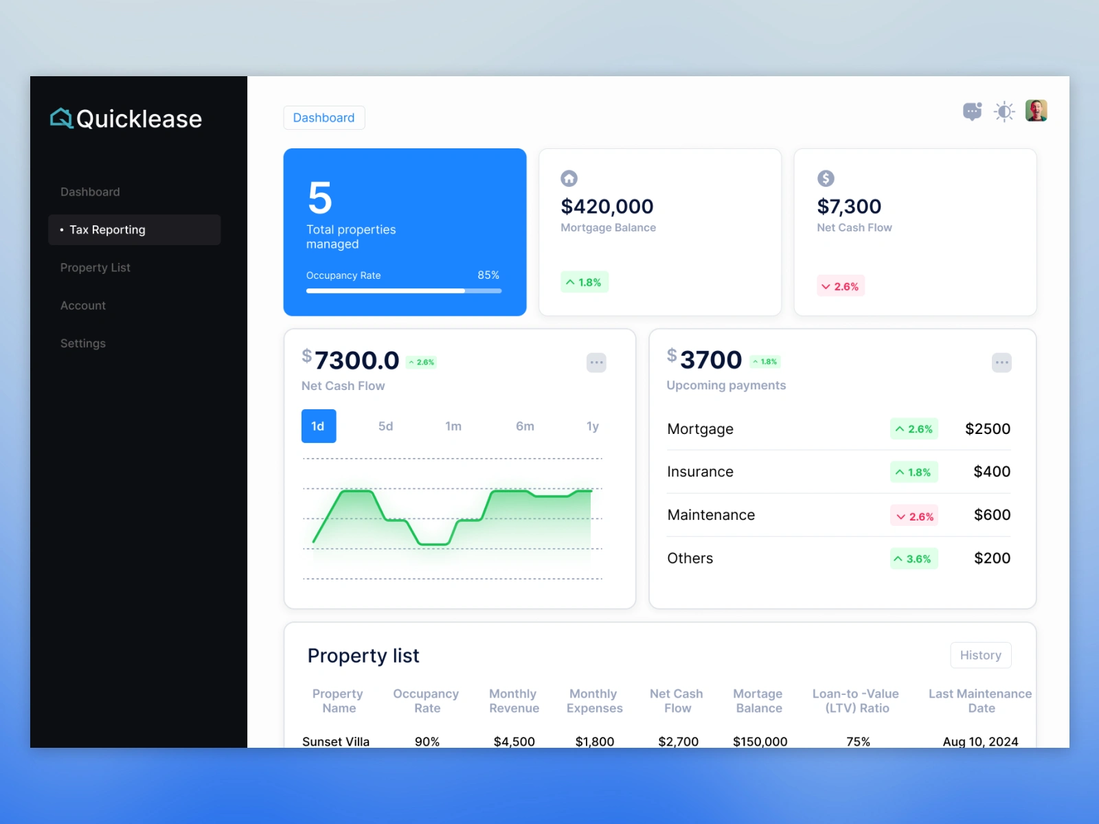
The dashboard opens with a three-card summary row: total properties managed (highlighted in brand blue), mortgage balance, and net cash flow. The primary card uses a filled blue background to signal priority — this is the number that anchors everything else.
Key decision — the hero card. Total properties managed sits in a larger, coloured card while financial figures use white cards. This hierarchy is intentional: the count of properties is the user's identity in the system. It grounds the financial data that follows.
Schedule E Tax Report Screen
This is the screen most SaaS products get wrong. Tax data is inherently complex — but property managers aren't accountants. They need to know their numbers without interpreting them.
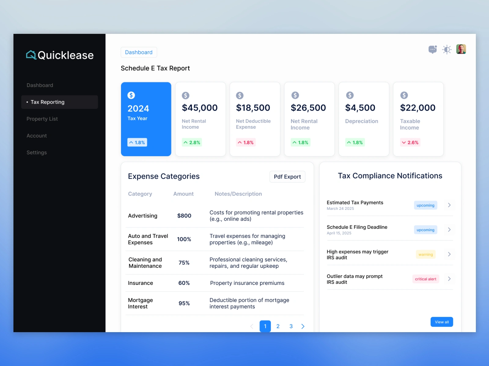
The screen opens with a six-card summary row: Tax Year (2024, highlighted in brand blue), Net Rental Income, Net Deductible Expense, Net Rental Income, Depreciation, and Taxable Income. Each card carries the same YoY trend badge system from the dashboard — building consistency across the product.
Key decision — the Tax Year anchor card. Placing the year in a prominent blue card before the financial figures does two things: it immediately contextualises all numbers that follow, and it gives the user a clear reference point for the reporting period. It mirrors the "total properties" hero card logic from the dashboard — the anchor always comes first.
Below, the layout splits into two panels:
Left — Expense Categories table with a PDF Export button. Categories (Advertising, Auto & Travel, Cleaning, Insurance, Mortgage Interest) show deductibility percentages and plain-English descriptions. The PDF Export action is placed top-right of the card — visible but not dominant. Users who need it will find it; users who don't won't be distracted by it.
Right — Tax Compliance Notifications panel. This is the most operationally important element on the screen. Four alerts — upcoming estimated tax payments, Schedule E filing deadline, and two IRS audit risk warnings — are surfaced with colour-coded status tags: upcoming (blue), warning (amber), critical alert (red).
Key decision — the compliance panel. Most financial tools bury alerts in a notifications dropdown. Quicklease surfaces them inline, alongside the tax data they relate to. A property manager reviewing their Schedule E figures sees their filing deadline and audit risk flags in the same view — no tab-switching, no missed deadlines.
What I Can Do for You
If you're building a SaaS product where the data is complex but the experience needs to be simple — financial tools, property tech, analytics dashboards, reporting interfaces — this is exactly the kind of UI work I take on.
Figma UI Design · SaaS Dashboards · Data-Heavy Interfaces · Financial & Products
I'm currently available for new projects.
Like this project
Posted Sep 11, 2024
This project was designed for a SaaS product company dashboard which is a real estate company. The project was solely converted from document to visual design.
Likes
0
Views
9