Loving Memoirs App Landing Page Design

Himanshu Sharma


Figma UX + UI Design · Mobile App Landing Page · Client Project
The Brief
Loving Memoirs is a mobile app for preserving and sharing life stories — celebrating loved ones, keeping pet memories, and building living legacy pages that families can visit long after someone is gone.
The product sits at an emotionally charged intersection: grief, love, and memory. The landing page had one job — communicate that warmth and permanence in a way that made a stranger trust the product within the first scroll.
The Design Challenge
Apps in the memorial and memory space fail in one of two ways. They either lean too dark — heavy, grief-forward, clinical — or they go overly cheerful and feel tone-deaf to loss. Neither earns trust.
The design challenge was to find a third register: warm, celebratory, and quietly reassuring. The kind of feeling you get from a well-kept family album, not a funeral home website.
On top of that, the page had to serve two distinct user intents in one scroll:
Emotional conversion — someone who just lost a loved one and needs to feel safe enough to start
Feature discovery — someone evaluating the app for a family member and comparing it to alternatives
Both users needed to feel seen, without the page feeling split or confused.
Design Decisions
Visual Language — Warm Cream + Gold
The entire page is built on a warm off-white/cream base (
#FAF6EF range) with a consistent golden amber accent. This palette does specific work: it reads as analogue, nostalgic, and tactile — closer to old photographs and handwritten notes than to a SaaS dashboard.Gold was chosen deliberately over the default blues or greens of consumer apps. It carries connotations of preciousness, permanence, and celebration — exactly right for a product about preserving life stories.
The result is a page that feels like it belongs in the same visual world as the memories it's asking users to store.
Hero Section — Lead With the Promise, Not the Product
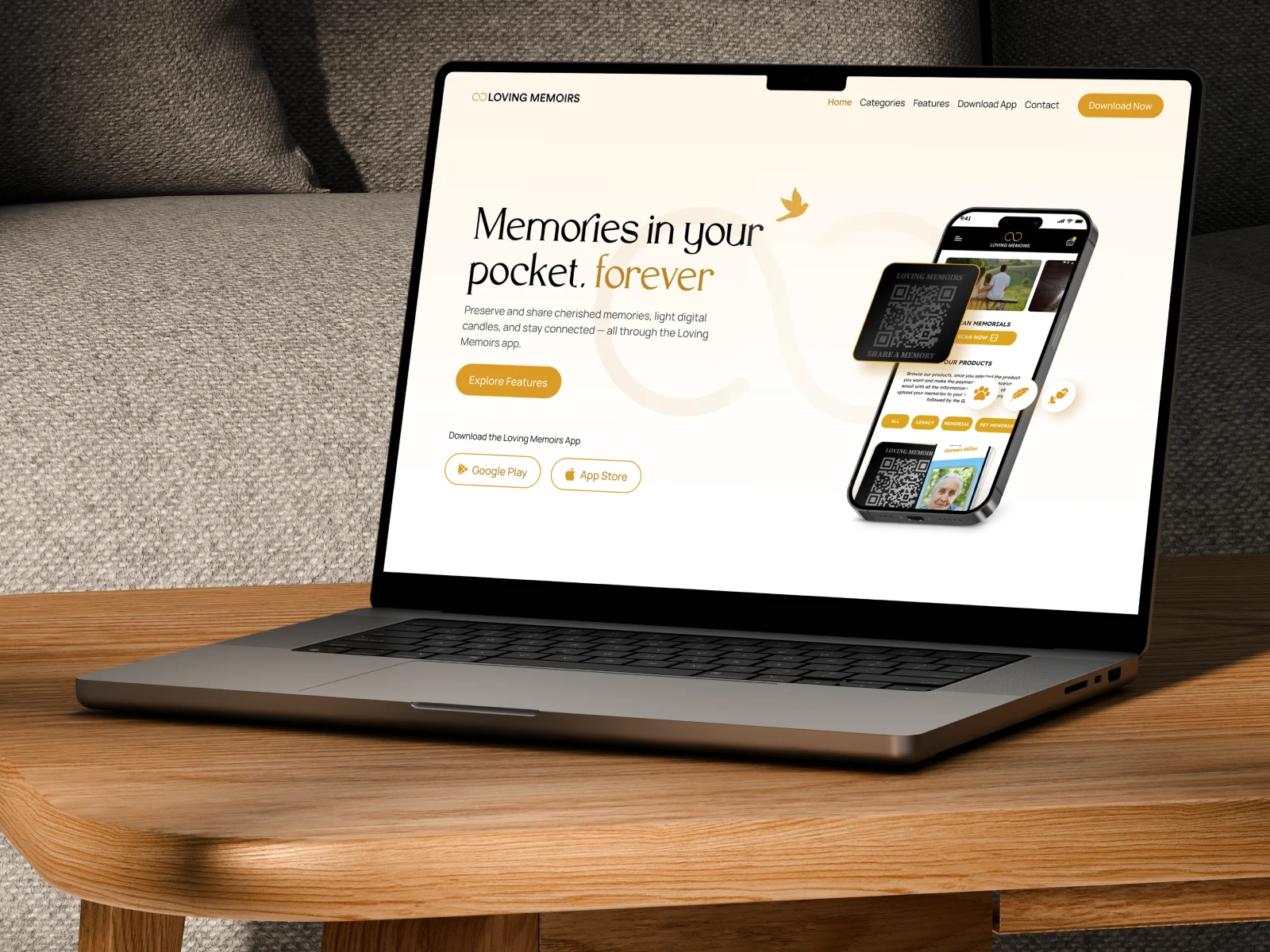
The headline "Memories in your pocket, forever" leads with emotion, not features. The word forever is set in the gold accent colour — the only coloured word in the headline — drawing the eye to the product's core value proposition before anything else is read.
App store badges (Google Play + App Store) sit directly below the primary CTA, giving users two immediate action paths without visual competition.
The hero mockup shows the app in context — a real phone, real UI — rather than abstract illustration. This builds product credibility from the first frame.
Section Architecture — Emotion First, Features Second
The page flows in a deliberate sequence:
Promise (hero) — What this is and why it matters
Social proof by use case (Celebrating a Loved One / Living Legacy / Keep Your Pets Forever) — normalises different emotional entry points
Memorial Page creation — lowest-friction CTA, free to start
Premium plan — value ladder, after trust is established
Feature deep-dives (Audio & Video / Memory Collection / Heavenly Messages) — for evaluators who need detail
Final CTA — download-focused, minimal friction
This sequence mirrors how a user actually moves from emotional resonance to rational evaluation to action — rather than front-loading features before trust is earned.
Use Case Blocks — Three Entry Points
The "Celebrate Every Life, Every Story" section surfaces three distinct user types with real portrait photography: a grandmother, an elderly man, a pet. This is a deliberate UX decision — it tells three different visitors "this is for you" without requiring them to self-select from a dropdown or navigate to a separate page.
Each block uses a real face, not an illustration. At this emotional register, stock-style icons or abstract imagery would undercut the authenticity the product is built on.
Feature Sections — App Mockups as Social Proof
Rather than bullet-list features, each capability (Audio & Video Memories, Memory Collection, Heavenly Messages) is shown via in-context app mockups alongside a short description. This does double duty: it communicates the feature and demonstrates the app's UI quality — visual trust-building for users still evaluating.
Pricing — Anchored After Emotional Investment
The Premium Plan (
£8.99) is introduced only after the free Memorial Page CTA — meaning users encounter the paid tier after they've already been invited to start for free. The checklist of premium features is legible and benefit-led, not spec-led.Footer & Navigation
The navigation is clean and minimal — Home, Categories, Features, How Your Memoirs App, Contact — with a persistent gold "Download App" CTA button in the top-right. The footer reinforces the brand mark and provides structured links without visual clutter.
What This Demonstrates
Designing for grief and memory requires a different kind of restraint than typical consumer apps. Every colour, typographic choice, and section order carries emotional weight — and getting it wrong doesn't just hurt conversion, it can feel actively disrespectful to users who are in pain.
This project required holding two things simultaneously: genuine sensitivity to the emotional context, and rigorous UX thinking about how a stranger moves from "I just found this" to "I'm downloading it."
The result is a page that earns trust before it asks for action.
What I Can Do for You
If you're building a consumer app or SaaS product where the emotional register matters as much as the feature set — health, wellness, family, legacy, mental health, or any product where users bring their whole selves — this is the kind of design work I take on.
Figma UX + UI Design · App Landing Pages · Emotionally Considered Consumer Products
I'm currently available for new projects.
Like this project
Posted Jul 1, 2026
Figma UI/UX designer & Framer developer. I design mobile apps, SaaS dashboards, and marketing sites that convert. Clean systems, sharp decisions.
Likes
0
Views
13