Built with Framer
“izivizi Digital Marketing Website — Anti-Navigation, Bold”
MONO BO
Crafting a Digital-First Marketing Brand for izivizi
Client chose this direction for its bold, contemporary approach–designed to make brands visible and memorable in a digital world.
The izivizi project was a complete transformation from our initial concept. The client’s vision called for a marketing experience that lived up to their philosophy: “Brands exist only if they are seen – get vizible easy.” We pivoted toward a digital-first brand identity, focusing on clarity, engagement, and storytelling across every customer touchpoint.
-this was the initial site before the redesign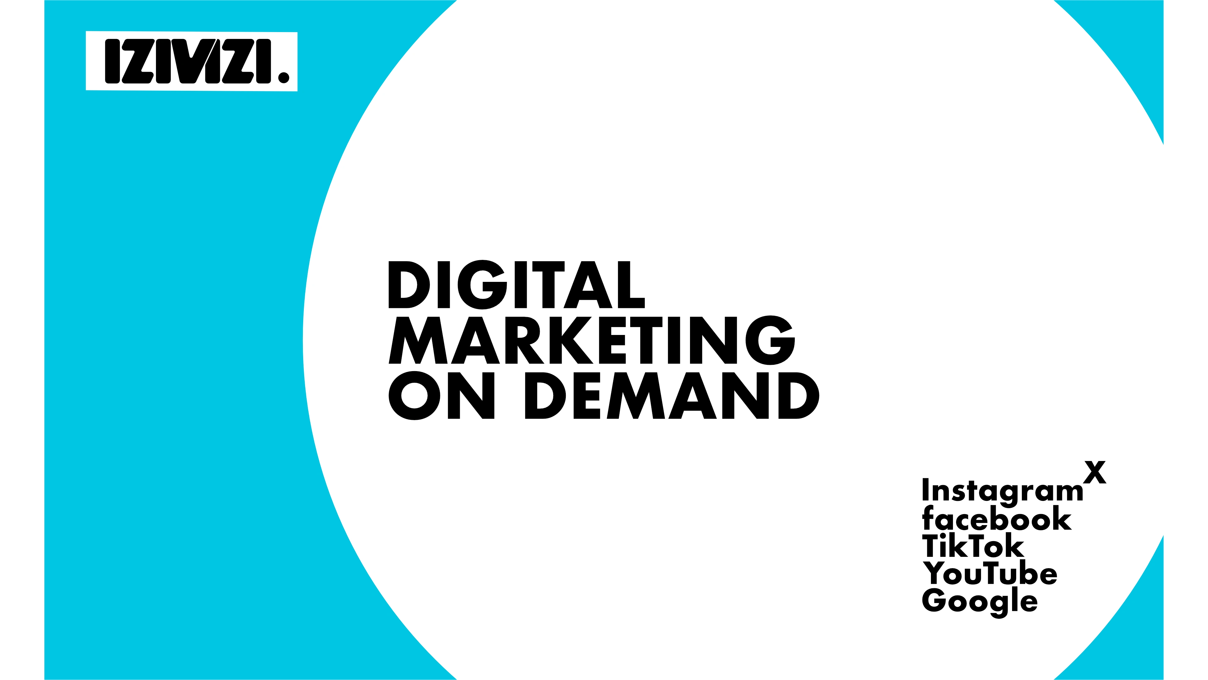
first site before redesign
// A series of iterations led to the final palette—a sophisticated mix of vibrant accent colors and confident neutrals. Icons and typography were refined for a clean, modern look, bringing subtle beauty and visual clarity to the whole site.
We built a cohesive online platform showcasing izivizi’s full spectrum of services:
Social media amplification
Strategic ad campaign management
Next-gen web design
Data-driven insights and analytics
Content strategy and email marketing
Each section was shaped by collaborative feedback and a drive for practical impact. The final site offers not just services, but actionable growth steps and real-time insights for ambitious brands.
But before all thsi let me share how the brand image led to few drastically different interations before development went through.
Design 1
first design
Clearly this is what the agency was looking towards achieving: Big bold text and colors, see me or i see you, there is no question that the strategy was clear, there is one purpose for this agency and it is to prove to anybody that you cannot pass y anything in relation to it without seeing it, from a post on linkedin anyone in the office can see from 20 feet away to the site giving you a OH WHAT IS THAT, carefully crafted hit hard material, eauty comes later into the decision making but for the main goal, GET SEEN OR GO HOME is the name of the game.
wheather you can undestand or not, you remmeber it or not, the point was for anyone when they see the website to say what was that, ad that;s what most brains remember_the Odd thing.
Building on this idea we developed few more iterations that of course did not make it in the website for few reasons first technical as the platform used was wordpress and coding and they were hesitabt about webflow or wix, so as i came in with the idea to migrate them to Framer, their life changed, now the website can be edited in a fraction of the time, everyone can do their thing without breaking the site, no updates, marketing can do inline text changes and photos swaps from their phones while eating breakfast and socials people can also make especially today with gpts new blogs and articles content on the fly during their day as they please without going to an office and sitting down to write the article infront of the computer, like they do in Buzzfeed maybe, not anymore, it is freedom for the team, colaboration and all that while designers can access the site for layout or design changes without other people getting affected (no more everyone do not touch the site i am in). VERY IMPORTANT
second iteration
New japanese origami type site design
The new design works, the shapes change on scroll with variants, amazing stuff.
Problem is: where do we place the content?
It went from a landing page to a poster. Not what we want--Partially not.
Third time
#rd design iteration of the site
Here i really dig the footer, few wobble jellyfish animations on the footer yellow islad and text roll in both direction for the Email addresses if you have not seen them already.
Design was locked agency loved it, now few things changed and other requirements show up and the design is dumped.
New wireframe came and new decisons were taken by them and now another verison needs to happen, this design won't cut it for the new page count and data inputs. difficult and time consuming.
Decision: launch the site as is, start the new site on Framer and when ready migrate and unpublish the other on.
Coming back to the current website
Defining a Bold First Impression
From the start, my goal was to disrupt expectations for what a digital marketing agency website should feel like. Instead of handing visitors a predictable “About, Services, Contact” menu, I wanted their first reaction to be a mix of wonder, intrigue, and curiosity—almost confusion. I wanted the immediate response not to be “I want the same,” but “What is this? How did they do it?”
Unconventional Interaction & Immersion
Navigation is hidden by design—forcing users to explore, not just skim.
Signature elements like the pulsing heart-shaped button and spinning radar aren’t decorations, but core to the brand’s digital personality.
The site speaks with every scroll, as if the brand itself is guiding the visitor, not just listing offerings.
Brand as an Experience, Not a Pitch
The intent was to move away from the generic agency pitch of “Hello, we do X and Y for Z,” and instead build an immersive brand journey. Every visual and interactive element is part of a conversation, designed to make visitors feel the brand’s energy and attitude before they even see the services or the price.
Header
The header above shows the amazing flexiility of the tool with zero code involved and the ingenius implementation of the USP if i have to say in one small interactinve component, wehre there is on scroll events scrambling the text, on hover events showing the service the word or phrase is talking about, and finally on click event where the service becomes a rolling text explaning the service you have just landed one, the header obviously sets the ground for the main 4 services important for brand success which is under the tell your story show your brand get vizible and those are Social media, owned channels, Branding and advertising, a good team of actions when done in combination thoroughly lead to a very possible successful brand awareness and success.
Obviously this is not enough there was still some techincal and strategic stuff that needed to be included being a marketing agency it goes without saying, a multitude of forms and sheets were linked, quizzes to share or test your marketing level or your brands marketing situation where added just at the right time in a very smooth not invasive time, when the user visits the section that talks about it , a banner slides from the side and tells you what to do with its own call to action and a nice hover shoud i say pill but a message asking you again to take the quizz in a fun way that the user cannot understand how it is done, the point was to make the normal site become a rememberable site. The effect of being memorable.
-here is the section belowIf you are questioning what the rotating thing was , it was the call to action MAIN, with the radar animation simulating a CTA hunting for customers, like a navy ship
here is the bulgarian version of it with a slightly modified animation as not to bring up the navy thing
another iteration of this CTA is in redesign and might be added in the site refresh soon.
here it is below on my x.xom
Coming back to the top the navigation deos not really exist in a NAV BAR form but when links are needed they are placed as needed where needed. it is not against the google seo practices or bad for accessibility as long as they are labeled.
here is an example of the littel nav corner that has the links to the main pages connected to the home that are important, example changing language, getting to pricing, seeing the timing and calling also copying email or sending an email. all important so they re there.
Nav corner for home page
scrolling down the home page, instead of having an about us section on the nav bar fixed, the choice was for a surprising section that presents the agency in a digital way in code then the code is transcribed in a second variant as ms dos style cathodic tube writing on grey screen. here it is below
Aout section
Then after the visitor is aware of what is what he gets to see the benefits of working in this manner with this agency in a dynamic way instead of static pills or bentos or cards, it s a scroll variable text with highlight.
here it is below
Notice that every section has a worked cursor designed specifically for navigation hints and interactivity, changing circles turning words targets, arrows for direction and more like memojis the best way to experience their importance is by visiting the site and trying the experience.
as visitor scrolls more down it is time to showcase some services and they are indeed showcased in a modern manner, with again dynamic moving frames to stay in the social media and advertising feel and world, that is what it is all aboutm you visit the site and you feel that it s the advertising and branding place, at least that is the goal and the method.
EN service section
BG service section
as you see the bulgarian version is more market targeted and it has a slightly different approach where it shows the service on hover in a visual way. to give a sence of what is hidden instead of a hidden way. Notice the target on the call to action in ensemble with the cursor on hover.
Sections
Other than the home page you can oblviously go to other sections and the most important of them for this agrncy is the SSM social media marketing section.
Let me tell you about this.
As a separate but connected page of the site it really acts as a seperate ewebsite on its own with it s own case studies and pages linked to it, a littel more complex but important in this case for few reasons that are not necessary to talk about, however let me show you the page and what was done and why.
The same way you enter a mall for example and all the stores look the same although they really do not look the same each its own branding and style and interior design etc, the same was applied in this website. this page tells a story about social media advertising so the point is to be seen as it is the same brand or agency we are communicating with but this is what it becomes when it talks about advertising on socials.
Starting the the main idea of the theme: Make the visitor who came for social media ads feel what it is and see what it is.
Feel what it is was implemented by designing the page in a pseudo-editorial fashion(no pun intended).
Utilizing elements you can realte to the fashion industry and the fashion editorial industry. both of which were guidelines for the design. so columns clean titles etc like a maybe a vogue page.
See what it is was implemented by showing the visitor the actual advertising. simple.
This lead to building the interface UI of the 4 AD socials this agency works with Facebook, Google, Linkedin, Instagram.
The interface UI was not built in FIgma surprisingly, Framer and I had a good time rebuilding the UI bits and the whole animation was made with variable events.
COmplicated but simple, lots of hours of work on this one but the result was satisfying to me.
The addition of a few CTAs and links to case studies that were also designed in Framer and their animated graphics were also built in framer (will link to them further down).
Here is the link to the Advertising page, it is in bulgarian but it is beautiful and it has music on for a fashion show feel.
Truly immersive experience on this page.
Few points of interest on this page
Facebook ad
Google Ad
INstagram Ad
Case study inegration
Case studies
In an industry overflowing with cookie-cutter templates and safe choices, izivizi set out to redefine what a digital agency website could be.
Armed with an audacious brief and a passion for visibility, they abandoned the expected paths and embraced bold interaction, mystery, and immersive storytelling. Resulting in s digital experience that defies convention, grabs attention, and draws visitors into the brand’s world.
Below, I’ll take you through visual ingenuity behind the Case study pages—before Telling why it made such an impact.
BTW, the case study is about a client that izivizi applied these same principles to get the results they needed. doing a bold design works once it may be luck but if repeated still works it could tell the theory behind it is correct and it is a system that works.

case study 100k
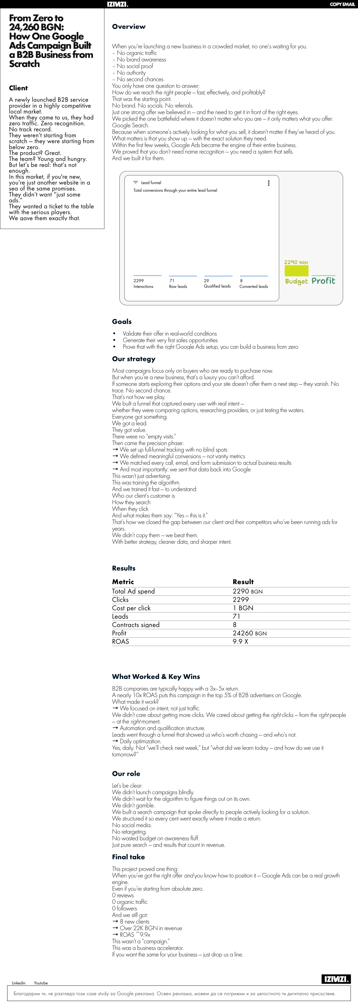
case study 24k
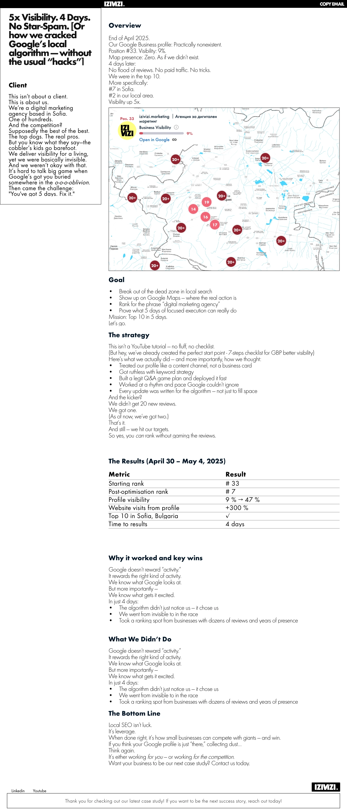
case study 5x
Here is a link to the case study page you can see how sharp pand professional it looks without going far from the main image of the brand.
Other pages
other pages were neede for the success of some campaign trackings like thank you pages with recorded short vertical videos autoplaying muted and loaded on vimeo.
this help tracking the breo of zapier campigns
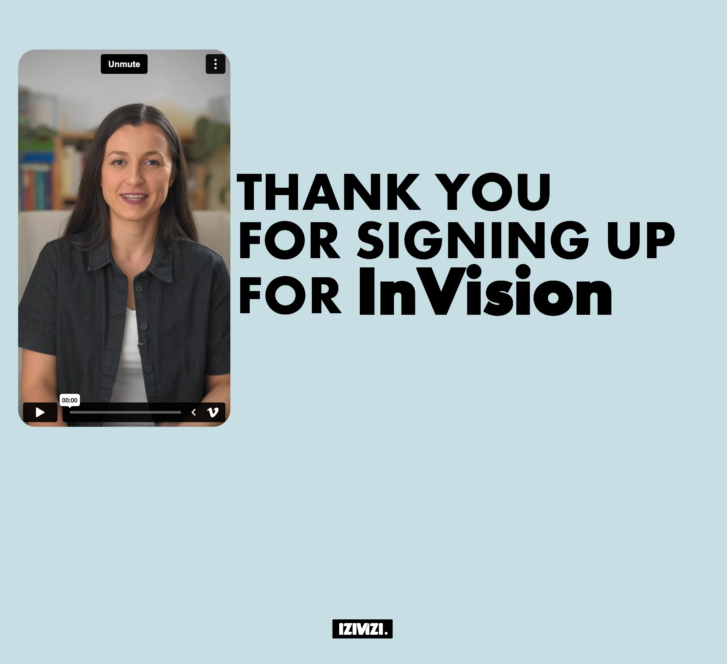
Newsletter signup thank you page
PLace holder image with the agency branding was setup for the video containers in case they load a couple seconds late from the youtube or the vimeo cloud. all about the detail and keeping it on brand.
placeholder for video container
An articles page overview was setup and teh design of the articles also was made following a neutral on brand approach . Less is more.
Articles english overview
Here is an example of the english article page and it is all dynamic and set in a format, with linking next and previous article aith programmed autopopulate of the articles pages and overview as more articles are added to the site, nothing needs doing it is all programmed via cms calls.
Article page english
Here is the Bulgarian version with slightly different styling to fit the market
Here on the wesite service of the agency the focus was on effects and interativity, so the visitor sees that fun animated scrolls can be done nicely, that was the purpose, so it was playful and animated with a couple of components worth mentioning like, the CTA gameboy style push button in red and the reproduced monochrome display scrolling up on page scroll, built in framer, and the we build for mobile first section component animation that was also built withing framer where the page comes up as usual you would think it is a section and then it resizes down to fit the phone display tht just popped up on scroll, and then,,, the magic happens, the oof moment where the display gets stuck on the screen but the page starts scrolling up within the display, you have got to see this, other simple effects compoennts from other creators in the framer scene were added as they were good for this example, shout out to you if you read this i do nto remmebr but thank you for helping the community.

website services page on izivizi.marketing website
Here is the link above to the page where you can interact with the page.
Pricing page
The prcing page was completely made with one component. or the pricing section, it was a test to the new feature on framer, the workshop feature that uses prompts to make the code for the design you want.
this page is fully features, it has:
Animation
computation: one hourly price was set and all the calculations are done in code for the other plans, change in price leads to updates ui and code for the schema
2 languages
discount and price change with one change in the main price
schema marhkup embedded incode as it is dynamic component with changing UI eleents and data
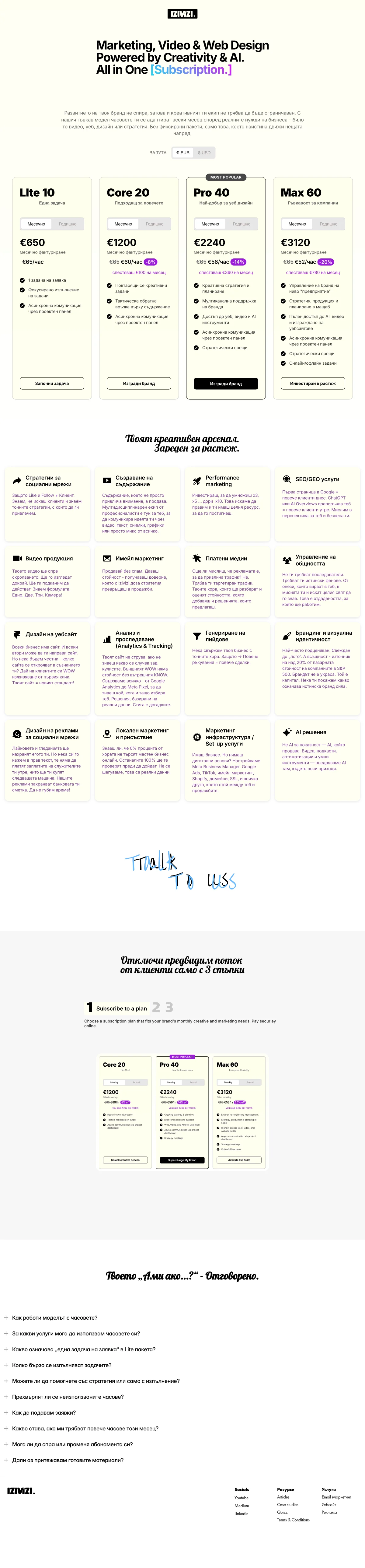
here is a link to explore the page and try the paricing toggles.
Honesly i will have to add more to it at a later time as this is quite long....TBC
Coming up, the explanation of how during christmas a game was implemented with the physics component from google to have the code drop from the page to the bottom of the page and the user moves the squares around to make up the code , it is only 9 squares in this case and tehn the program will send the next page which is the form with the code so they get a voucher fora discount on one of the services (that was before the implementation of the subscription service)
Like this project
Posted Feb 24, 2025
digital agency website, reimagined with interactive anti-navigation and dynamic storytelling. Designed in Framer for easy visibility & brand-driven visitor eng
Likes
2
Views
16
Timeline
Dec 2, 2023 - Ongoing