Multitech Auto Repair: website in Figma & Framer

Miguel Recio
$2.5K+ earned
1 collaborator


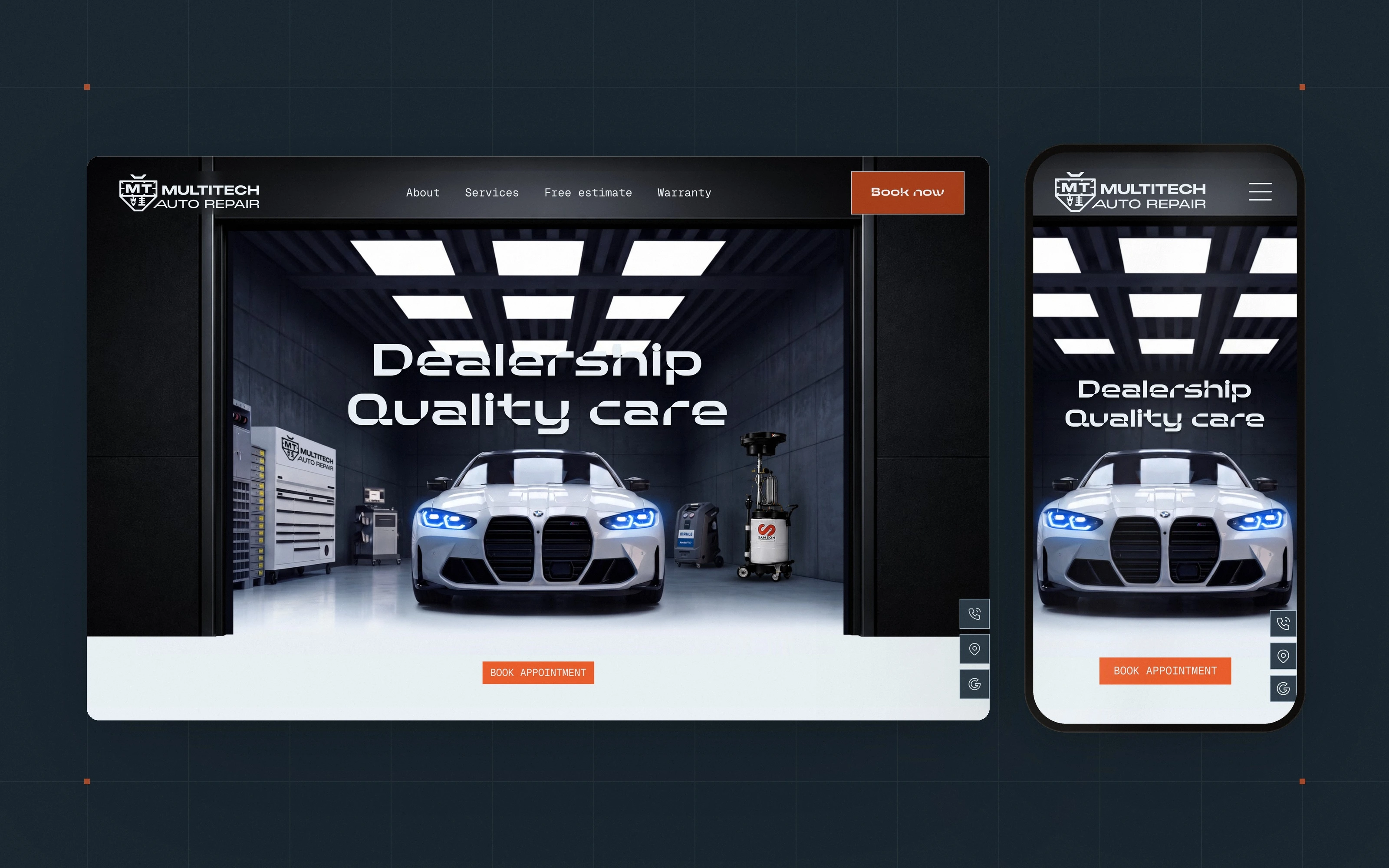
Multitech Auto Repair is an independent European car specialist in Fairfield, California, competing with dealership service departments. I had already designed their brand identity; this project took it onto the web. The whole site was conceived in Figma first, then built in Framer on a design system carried over from the brand. See the live site.
A website that looks like the shop
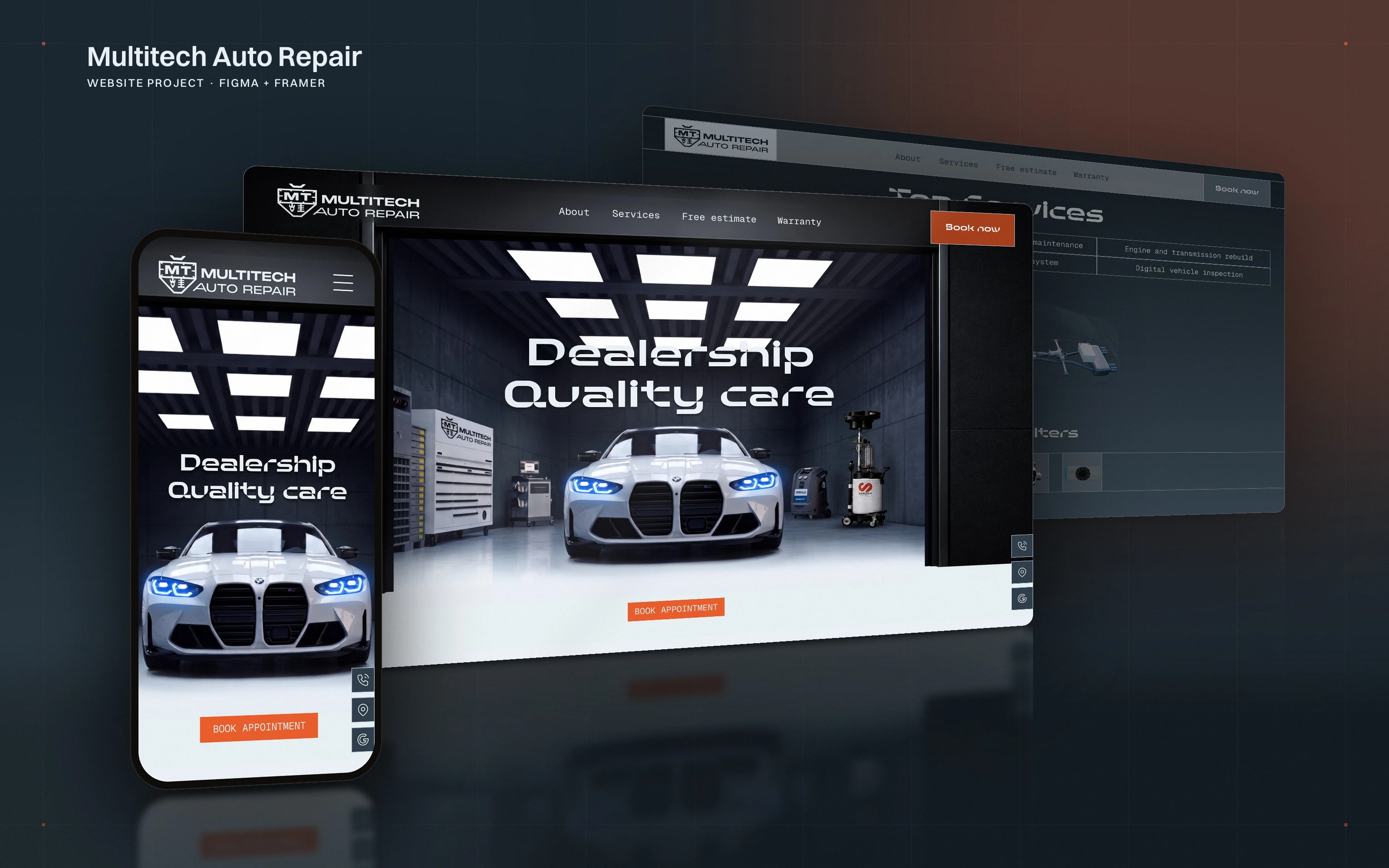
The homepage opens on the workshop itself: the door up, the lights on, a car in the bay and one orange button. Everything the customer sees from here on, from the sign on the building to the invoice to this screen, is the same brand.
From a template to a brand
The old site ran on a generic template: black background, a cyan that belonged to no brand, stock renders of cars the shop had never touched. Good mechanics with an invisible online presence. An independent European car specialist competes with dealership service departments on one thing above all, trust, and online, trust is perception. The brief was simple: the website had to look as precise as the work.
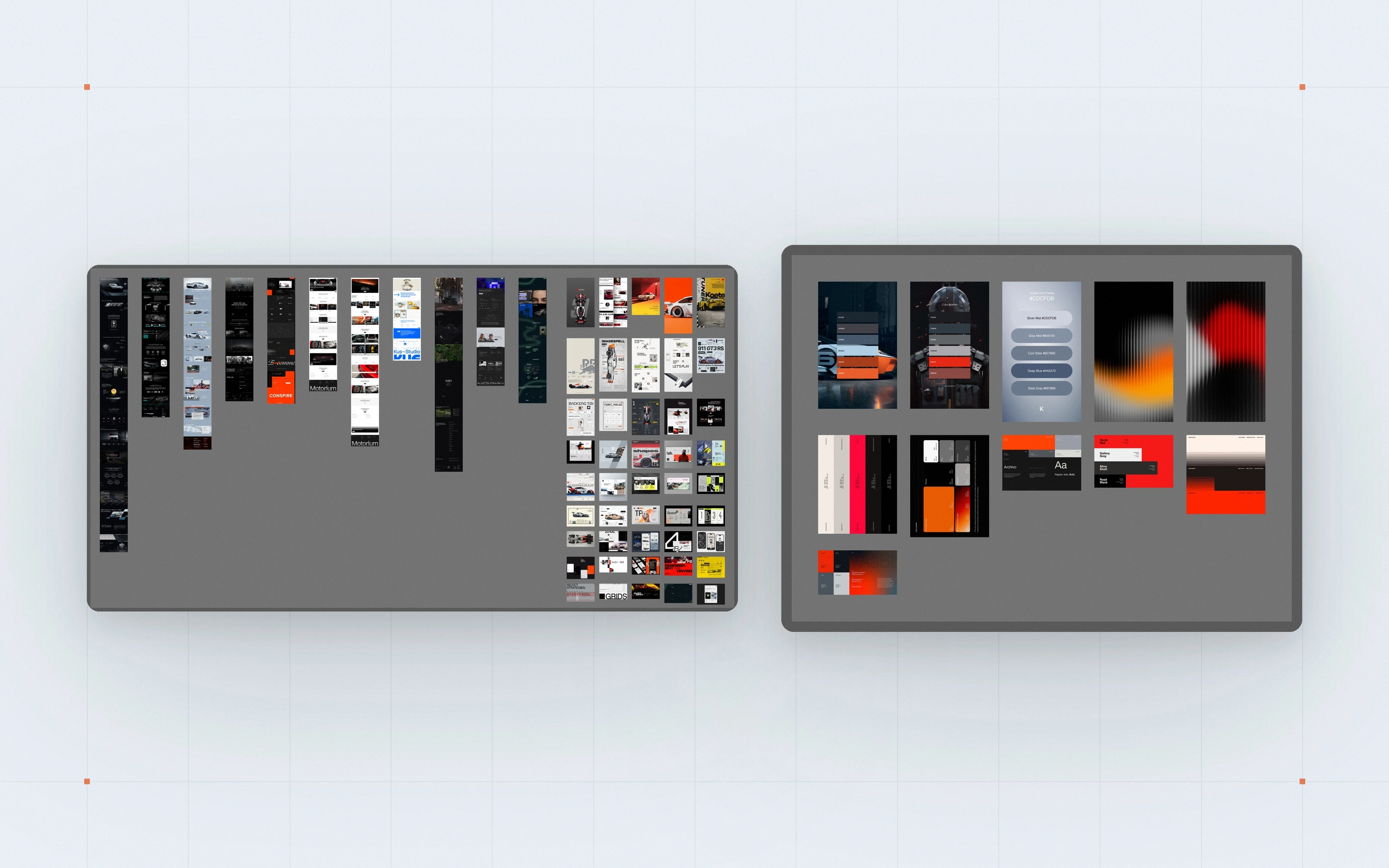
Concept first, in Figma
Before building anything, the whole site was designed in Figma: a moodboard and a colour exploration to check that the brand palette survived on screen, then the homepage. Working from an approved concept meant no surprises in Framer and fewer revision rounds.
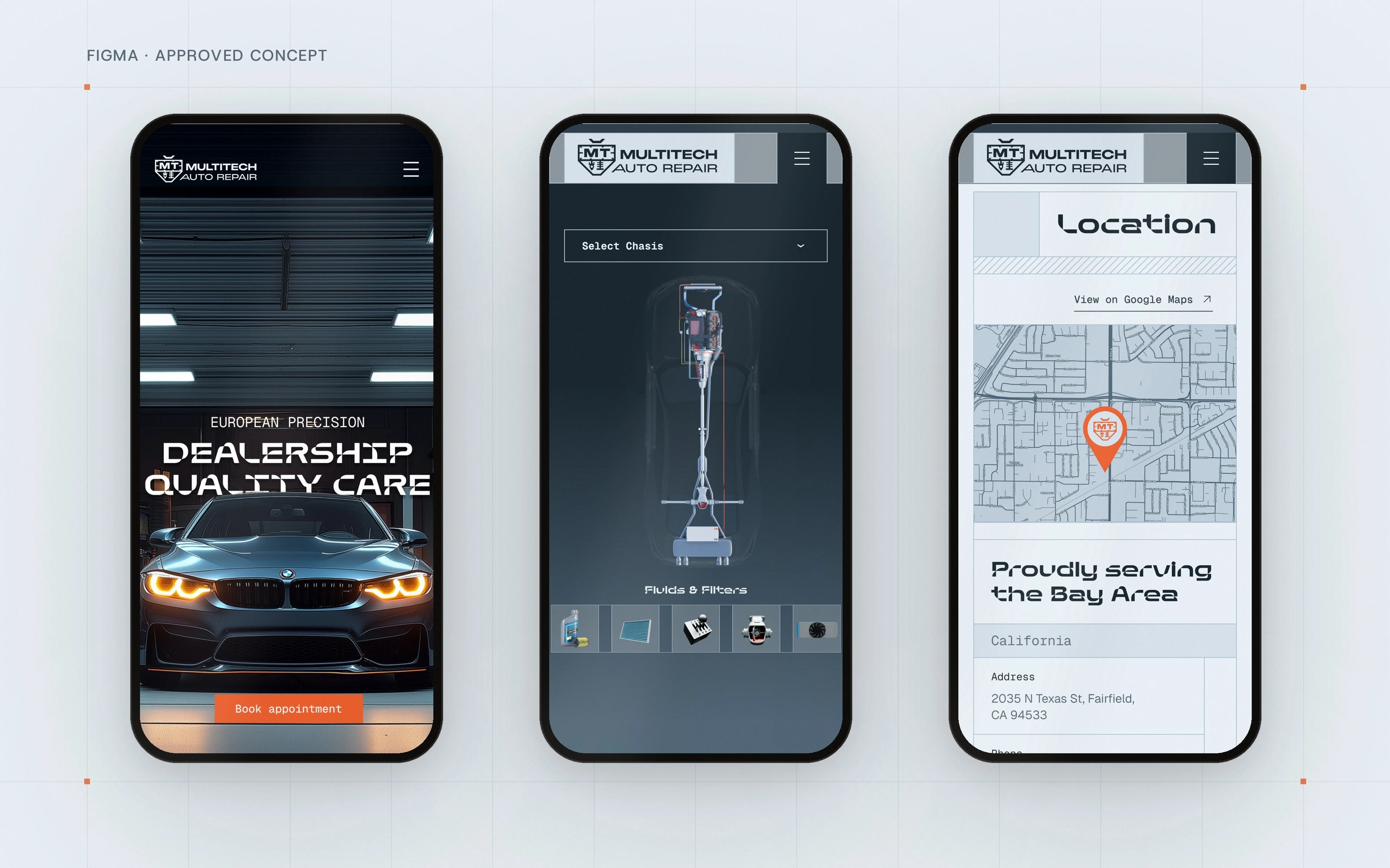
Mobile designed alongside, not after
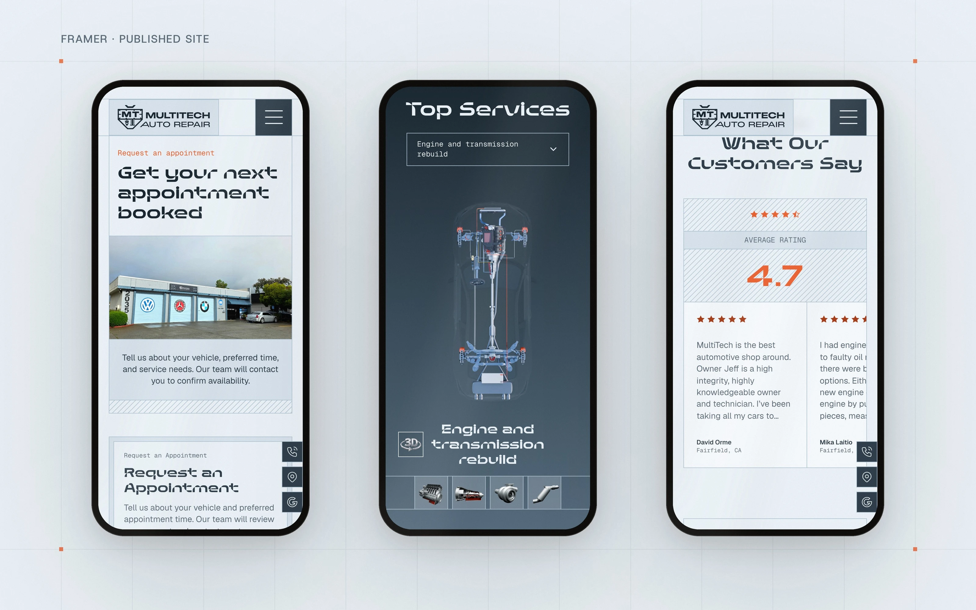
The phone version was drawn at the same time as the desktop: the garage door open, the makes and the map, all in Figma before build. Most customers of a local workshop arrive from a phone, often standing next to the car, so the mobile layout was a design decision, not an export setting. Further down you will see the same screens as they shipped in Framer.
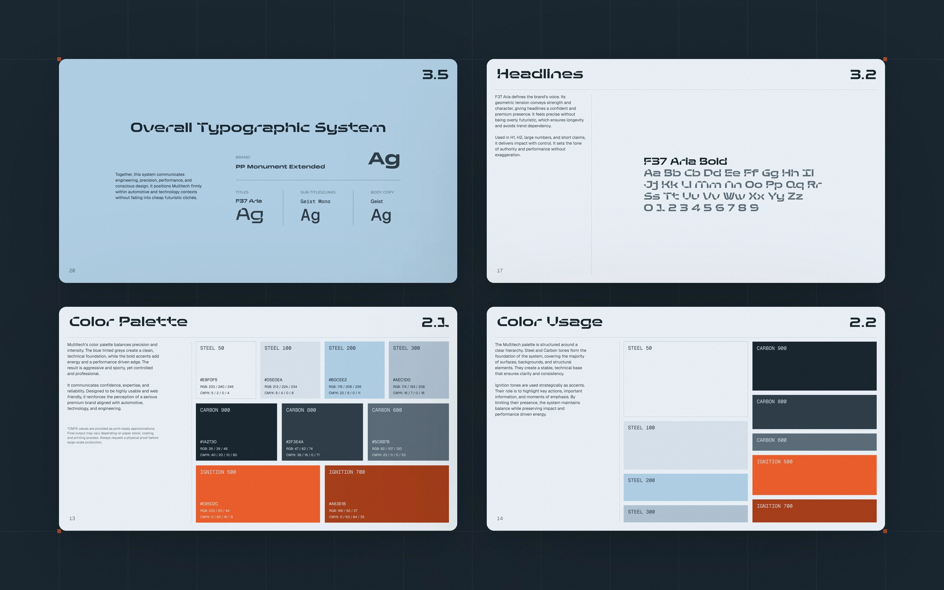
A design system carried over from the brand
The identity already defined the palette and the typefaces: F37 Aria for titles, Geist Mono for navigation and technical details, Geist for reading. Nine colours with a job each: Steel for surfaces, Carbon for text and dark sections, one Ignition orange reserved for actions. On the web those rules became tokens, text styles and components, built once and used on every page. See the identity project for the full system.
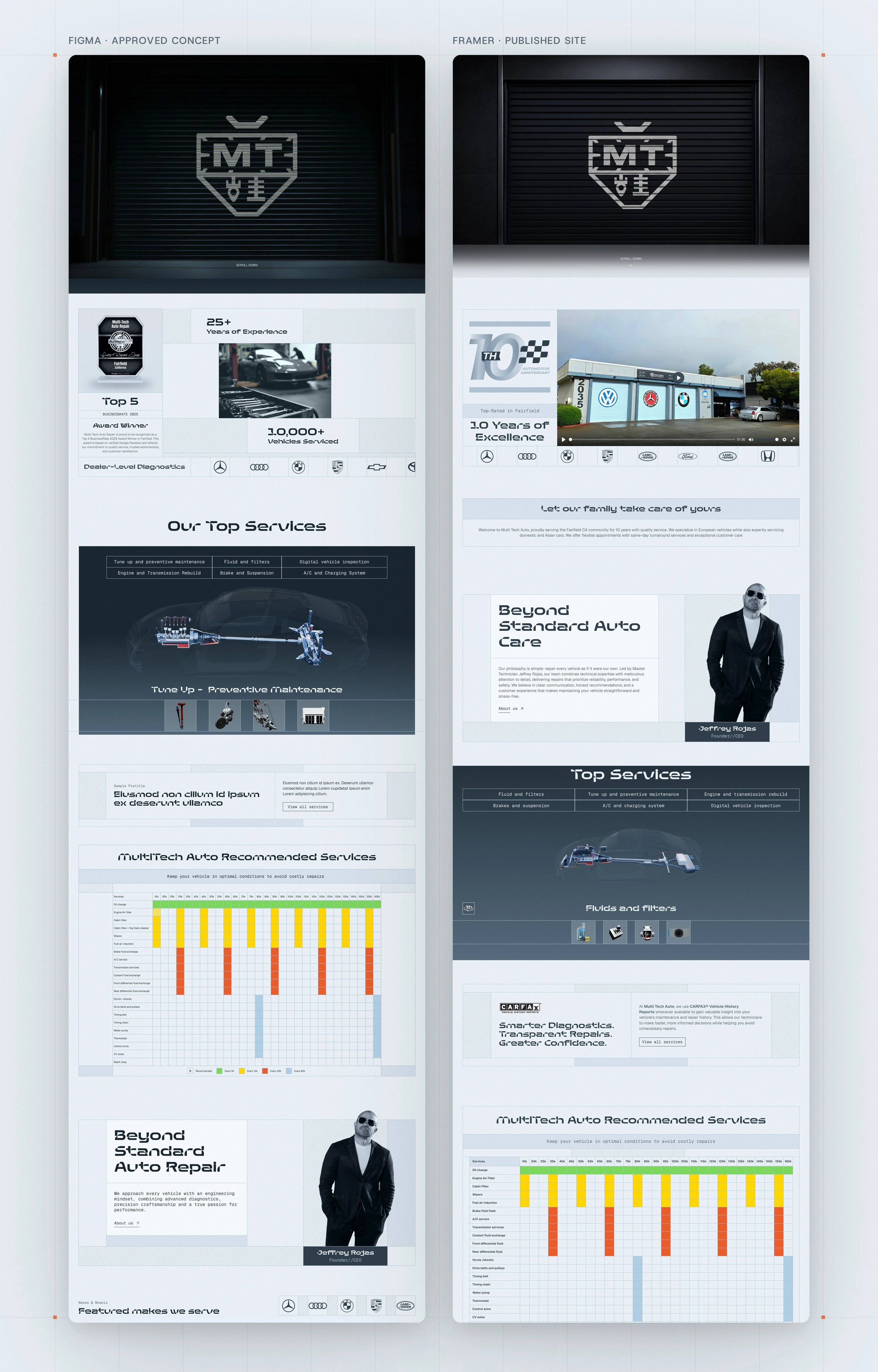
From Figma to Framer: what changed, and why
Left, the approved concept in Figma. Right, the published site, section by section, Top Services included. The concept is the map; the site gets finished in the browser. Top Services is the clearest case: in Figma the table of services sat under the title with the chassis below it. In production the table moved above the car, because the module is sticky and cannot grow, and the table up top frees the height the chassis needs. Placeholder text became the shop's real copy, and the Google rating was updated to the real one. What did not change is the idea that mattered most: the garage door survived intact from the first Figma frame to the published site.
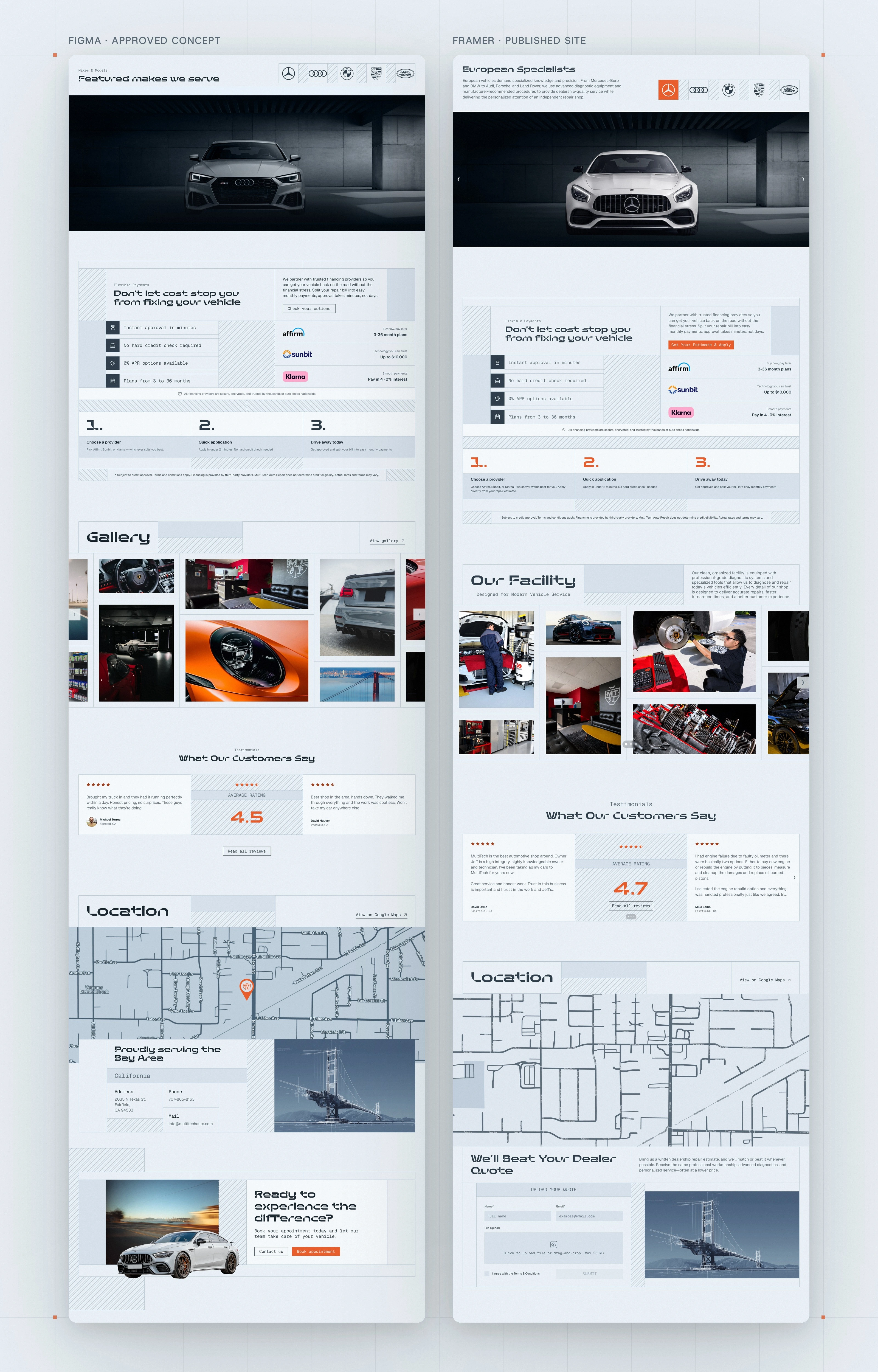
The second half of the page, before and after production
Featured makes, financing, the gallery, reviews and the map. The structure held; the details moved. The makes section gained the five badges and the real render, the financing block got the shop's providers and a call to action, and the gallery went from stock to the actual workshop. A Figma file is a promise; this is what it looks like kept.
A first impression that moves
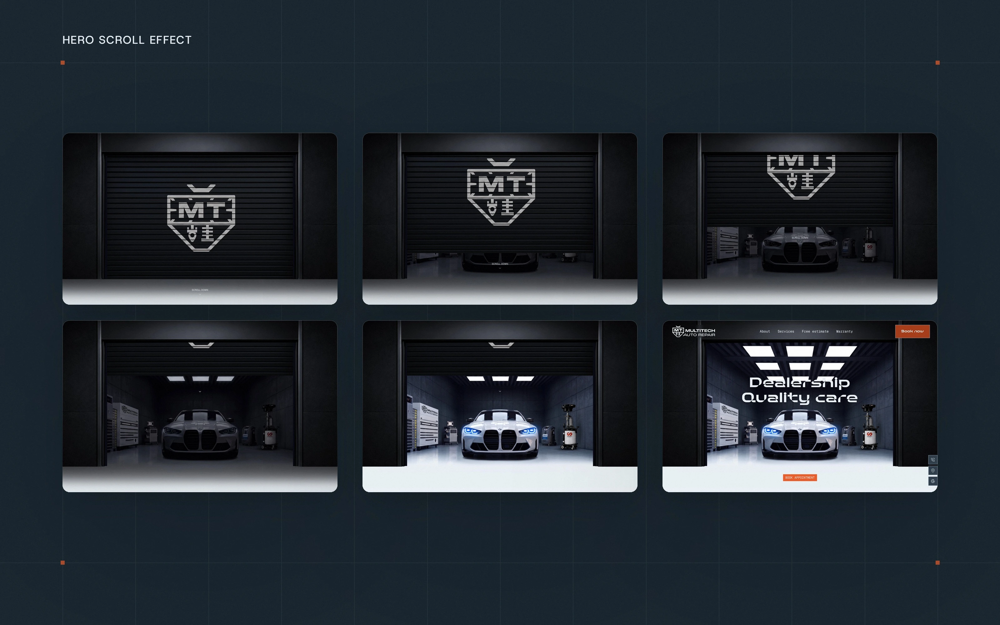
Six frames of one scroll: closed door, half open, the car in the dark, the lights coming on, the headline and the button.
The homepage opens on a closed garage door with the emblem on it. As you scroll, the door lifts, the lights come on and the car appears. It says what the shop is before a word is read, and it costs nothing in loading time: there is no video file, the page simply responds to the scroll.
Services shown on the car, not listed in a menu
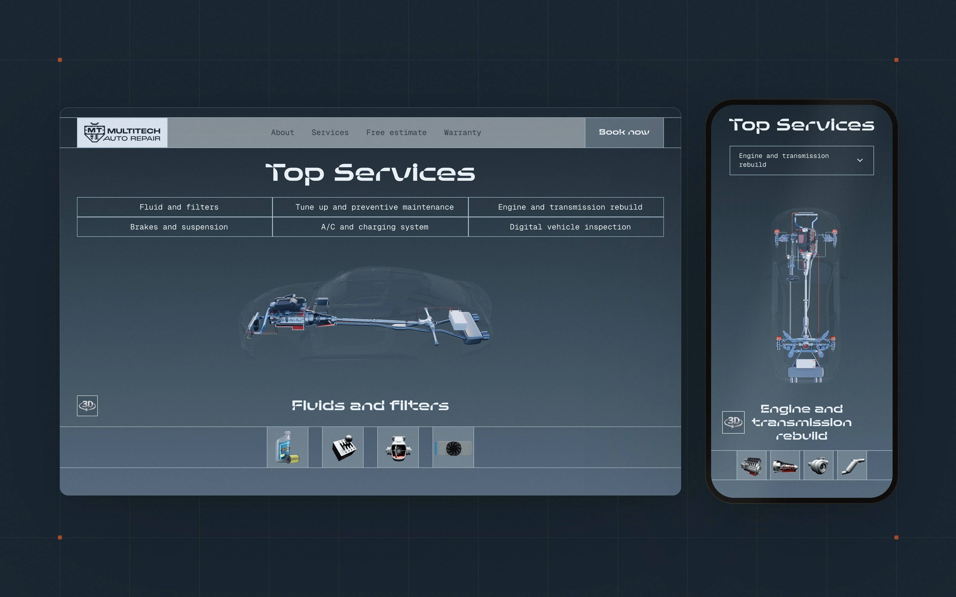
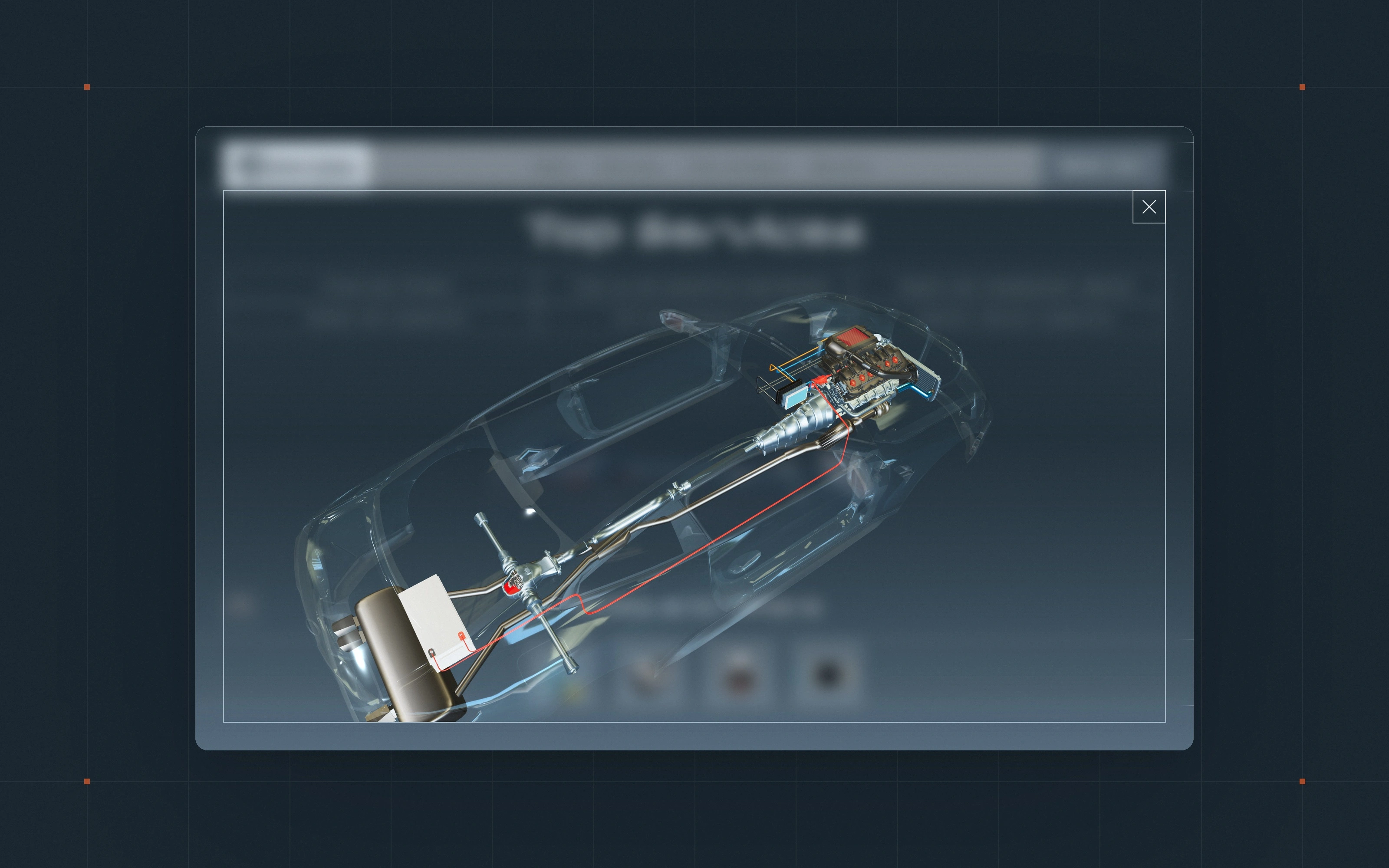
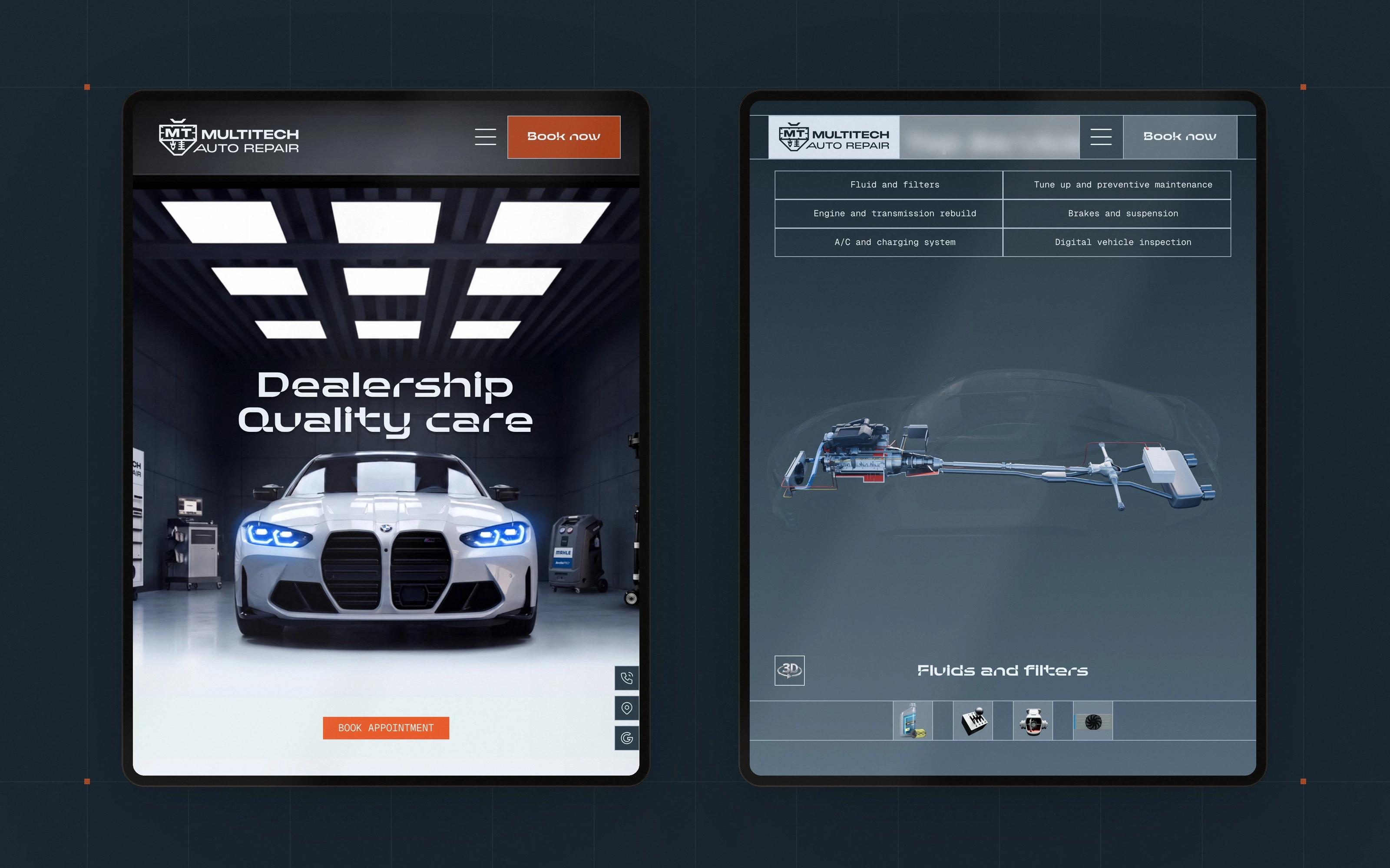
Most auto repair websites hide their services in a dropdown. Here they are the centrepiece of the homepage. Choose a service and a transparent car lights up the parts it involves. On the phone the table becomes a dropdown and the car turns vertical; the idea is the same.
Six services, one car
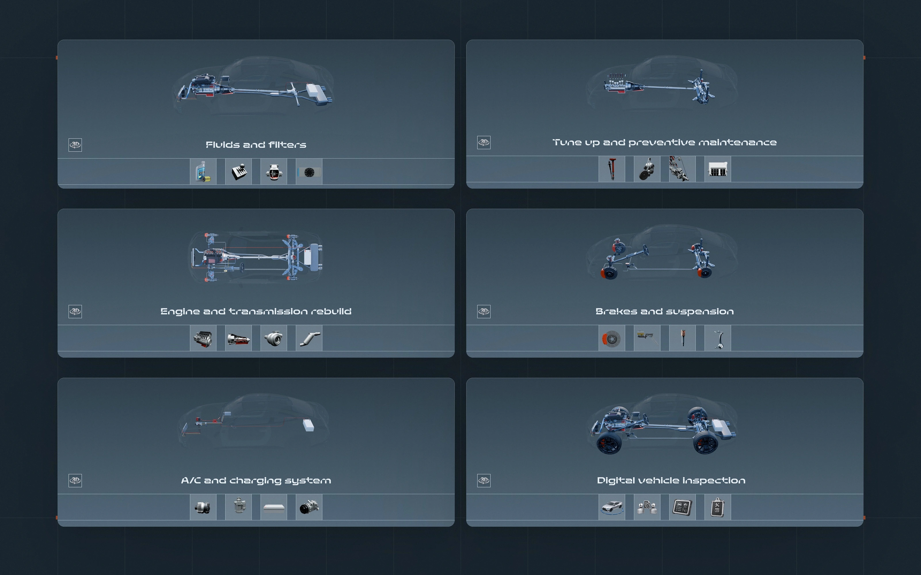
Fluids and filters, tune-up, engine and transmission, brakes and suspension, A/C and charging, digital inspection: six states of the same chassis, each with its own row of service icons below. It turns a list into something a customer understands in seconds. The transparent car, the chassis states and the 3D model are CGI by Gabriel Naretto.
Tap a part, read what it involves, book it there
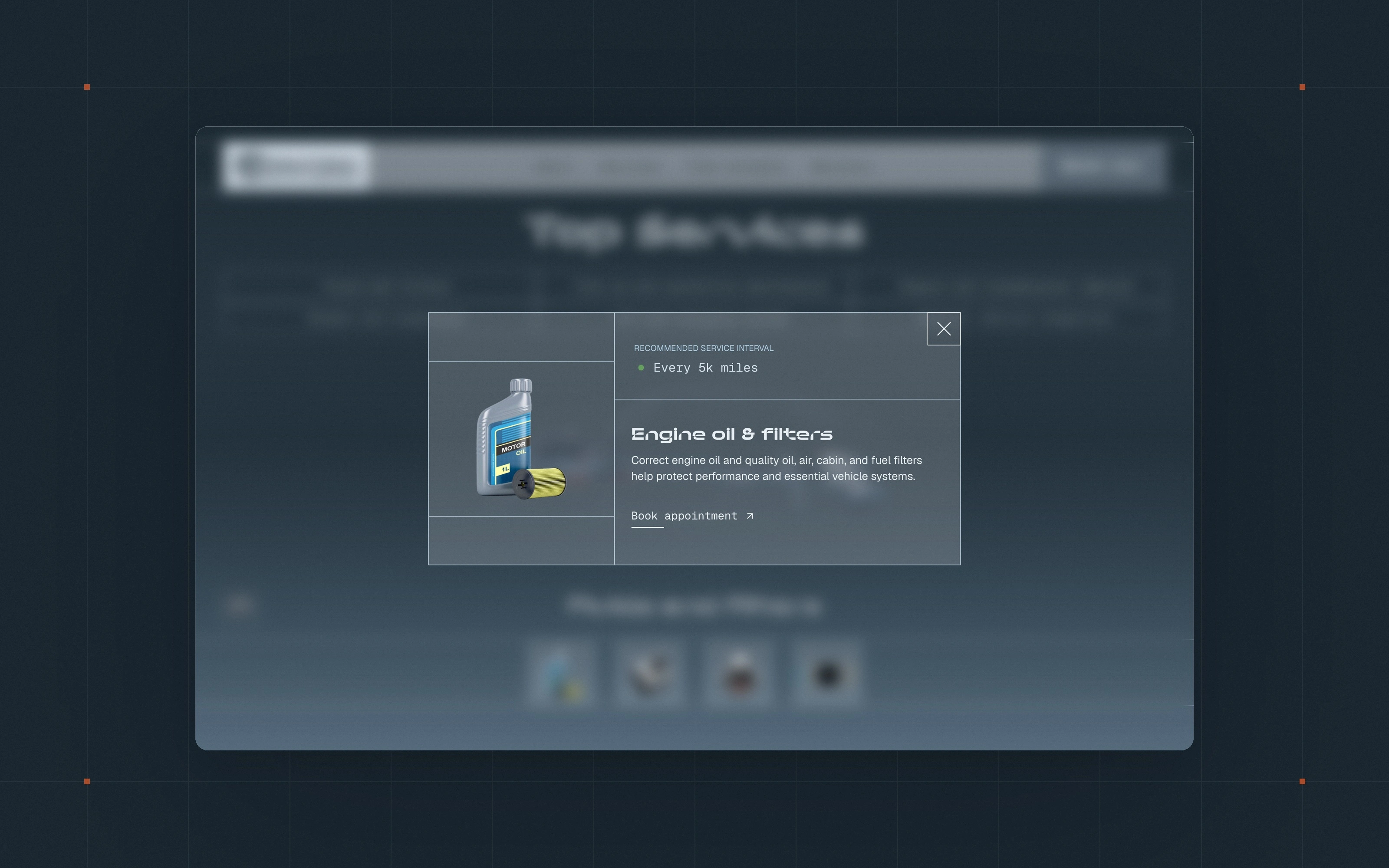
Each service opens a card with the recommended interval, what the work covers and the booking button. Nobody has to go looking for the appointment page.
Turn the car around
A 3D viewer lets the customer rotate the car and see where the parts sit. It is the same model that drives the six states, so the module stays light and consistent.
A maintenance schedule a customer can read
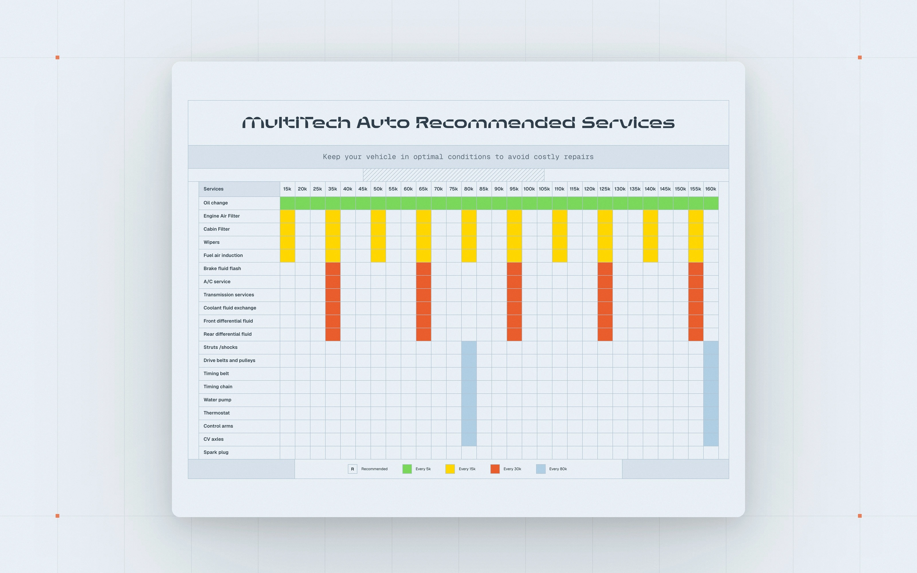
Every service by mileage, in a table that reads at a glance and answers the question a European car owner actually asks: what does my car need at 60,000 miles? On mobile the table scrolls sideways and keeps its legend.
Answer the four questions before asking for the booking
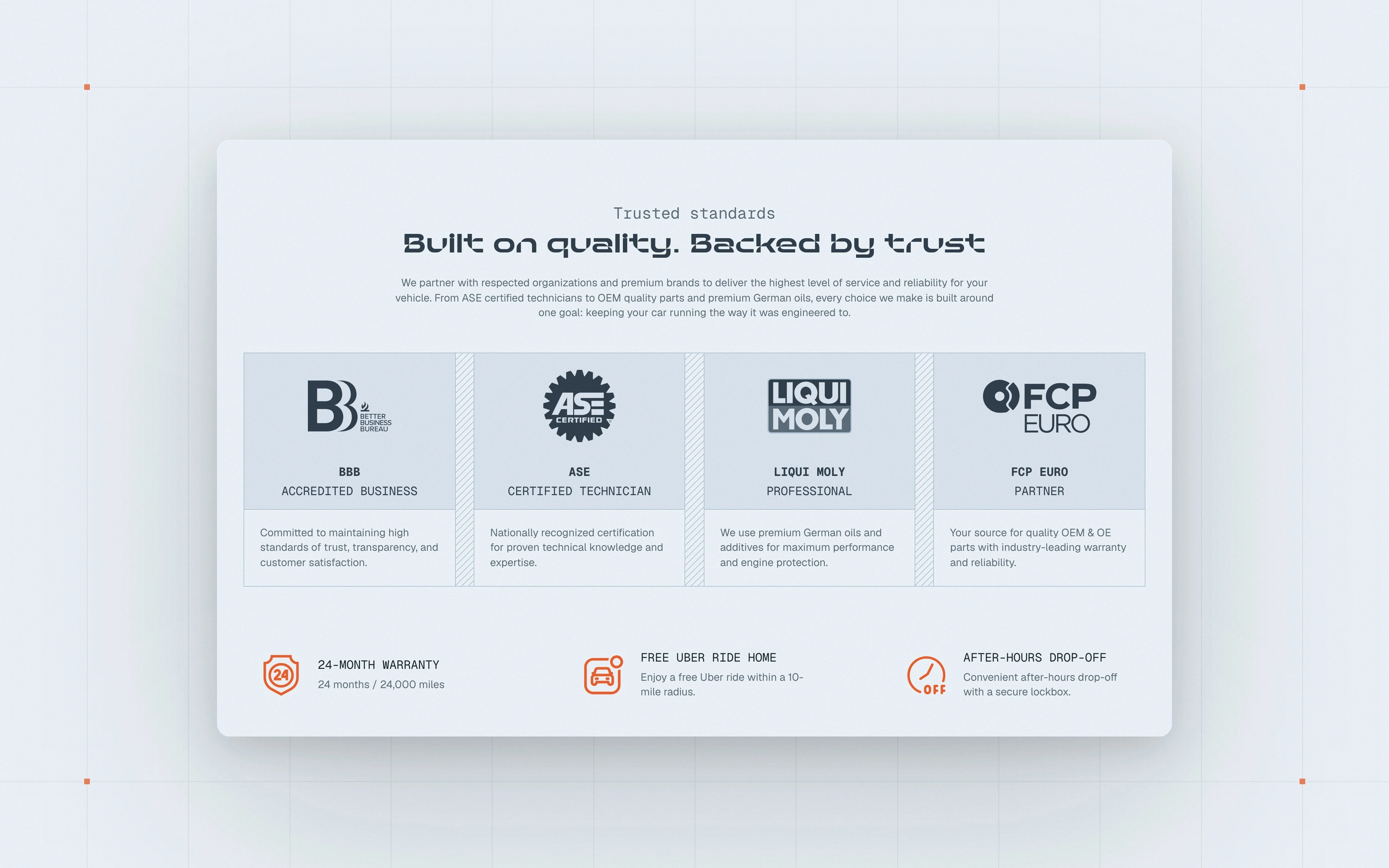
A customer with a European car asks four things: can I trust you, do you know my car, what will it cost, where are you. The homepage answers them in that order. First, trust: certifications and partners, the 24-month warranty, a free ride home, after-hours drop-off.
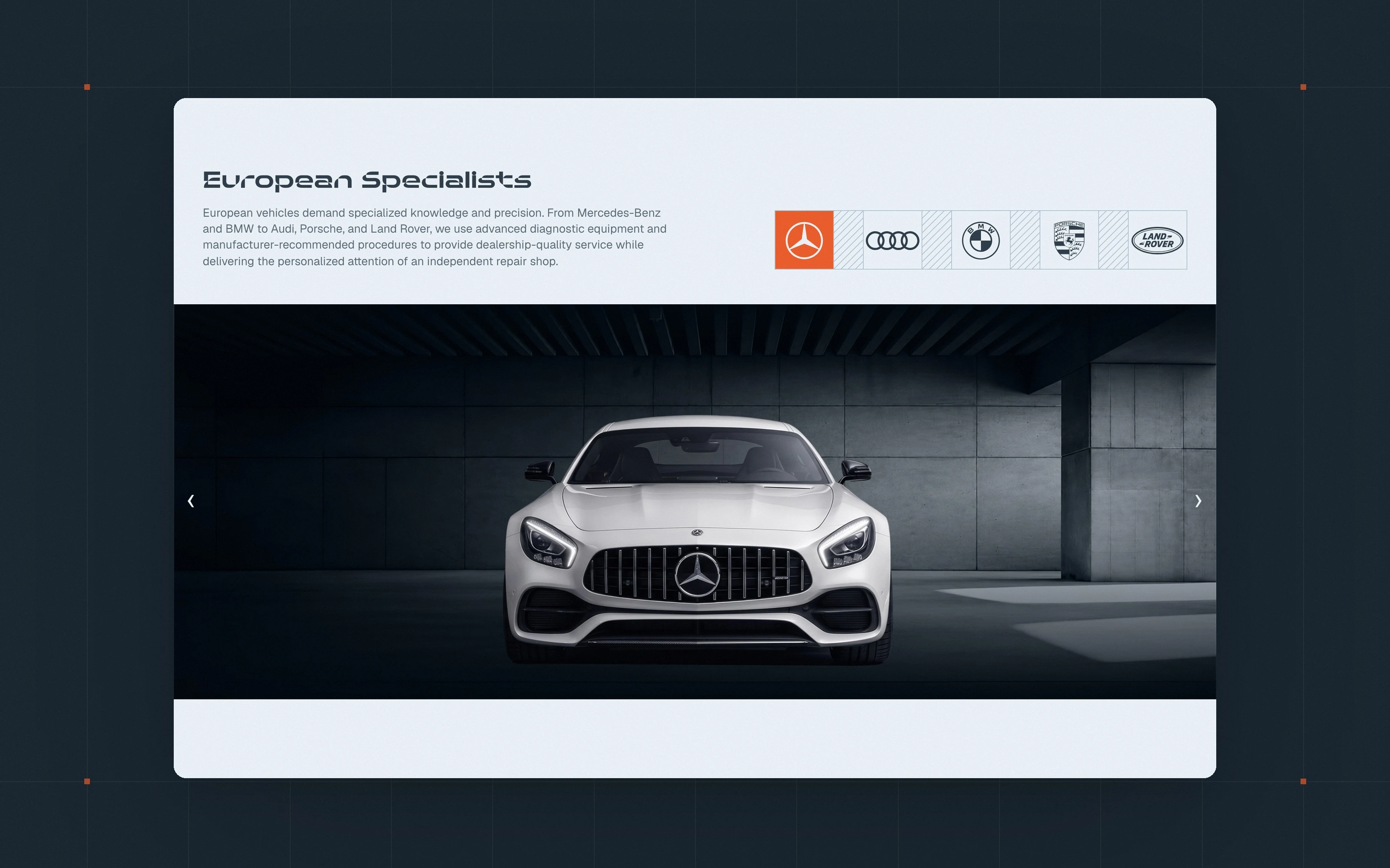
Do you know my car?
The five European makes the shop specialises in, each with its own section and its own photography. Greyscale architecture and cars, so the one orange on the page keeps its meaning.
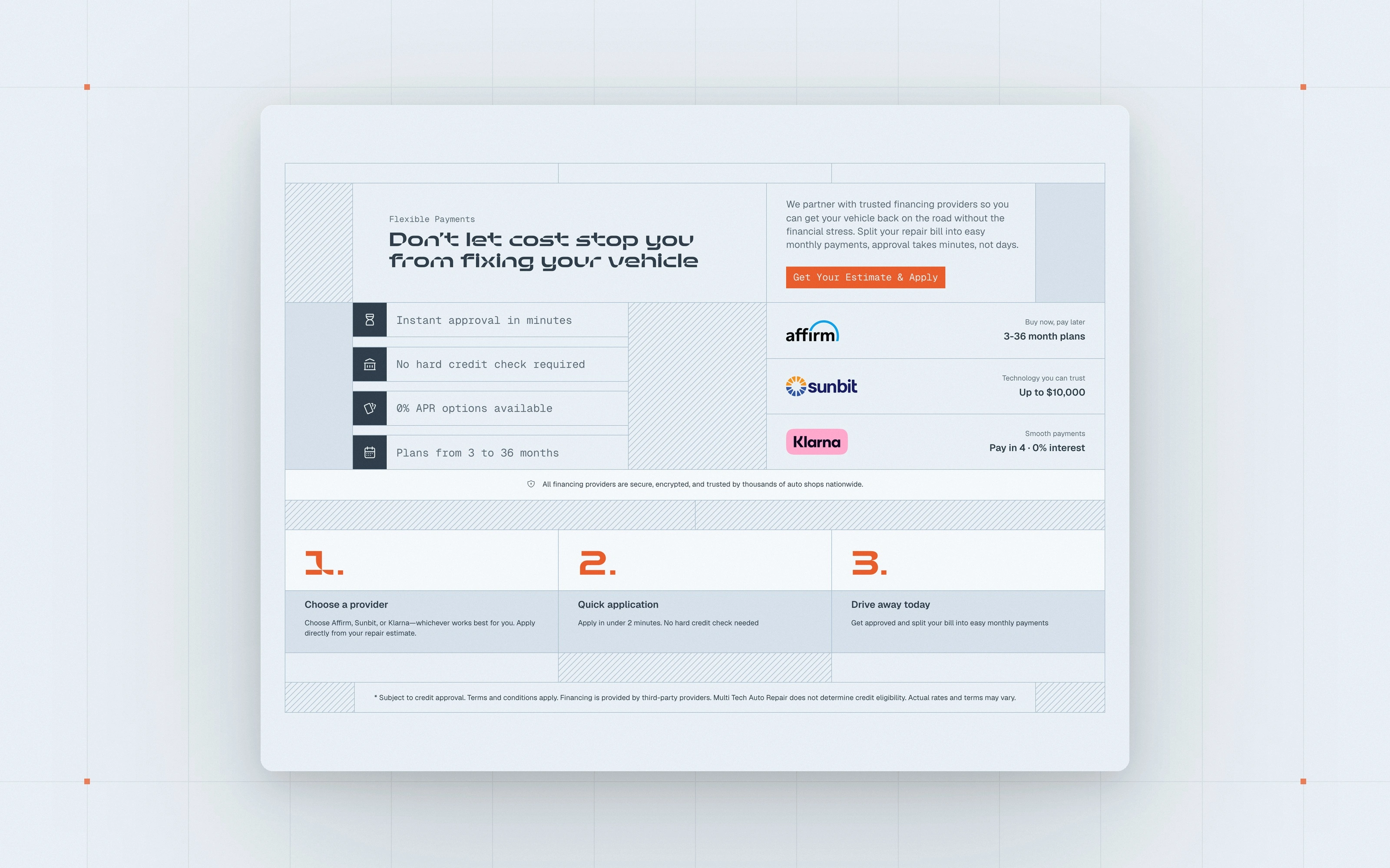
What will it cost?
Financing through Affirm, Sunbit and Klarna, explained in three steps with the providers the shop actually works with. No jargon, no fine print hidden.
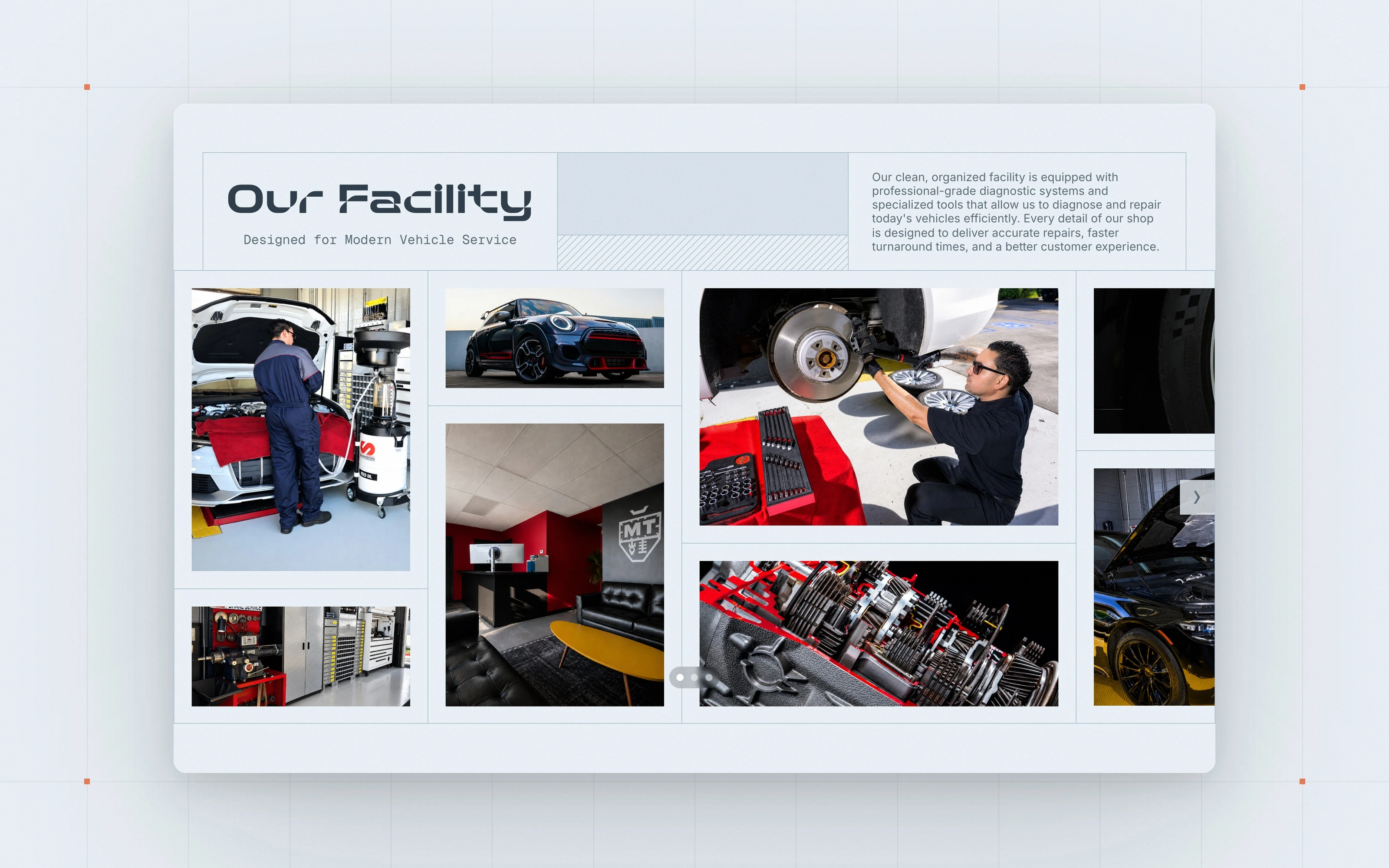
The real workshop, not stock photography
The gallery shows the actual bay, the actual team and their customers' cars. In a trade sold on trust, the real place is the strongest image.
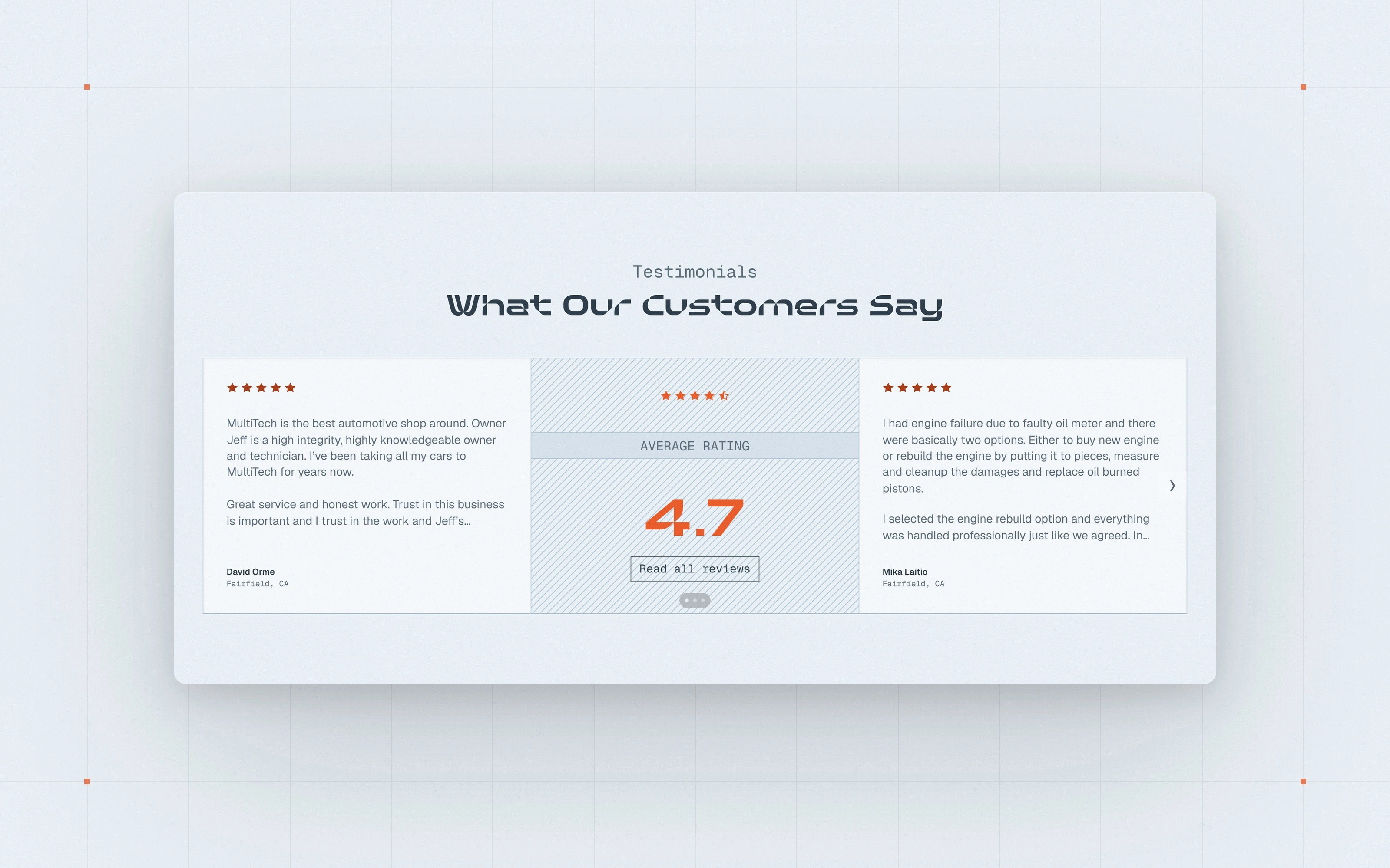
Real rating, real reviews
The Google rating is the real one and the reviews are quoted as written. It is placed right before the map and the booking so it does its work where the decision happens.
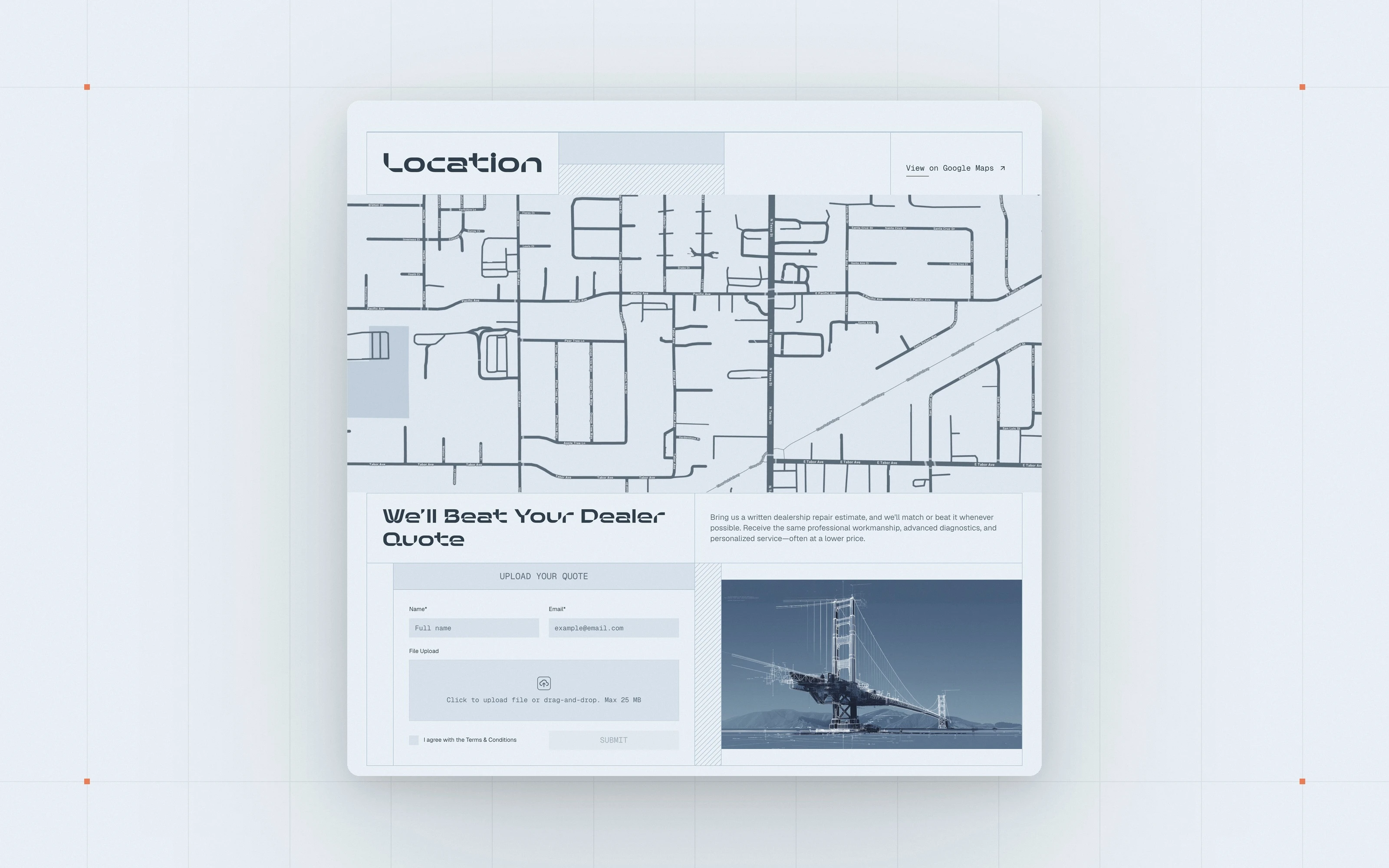
Where are you, and can you beat this?
A map in the brand colours and a form to upload a dealer quote the shop promises to beat. Only then comes the appointment button, in the one orange the site uses for actions, so it is never missed.
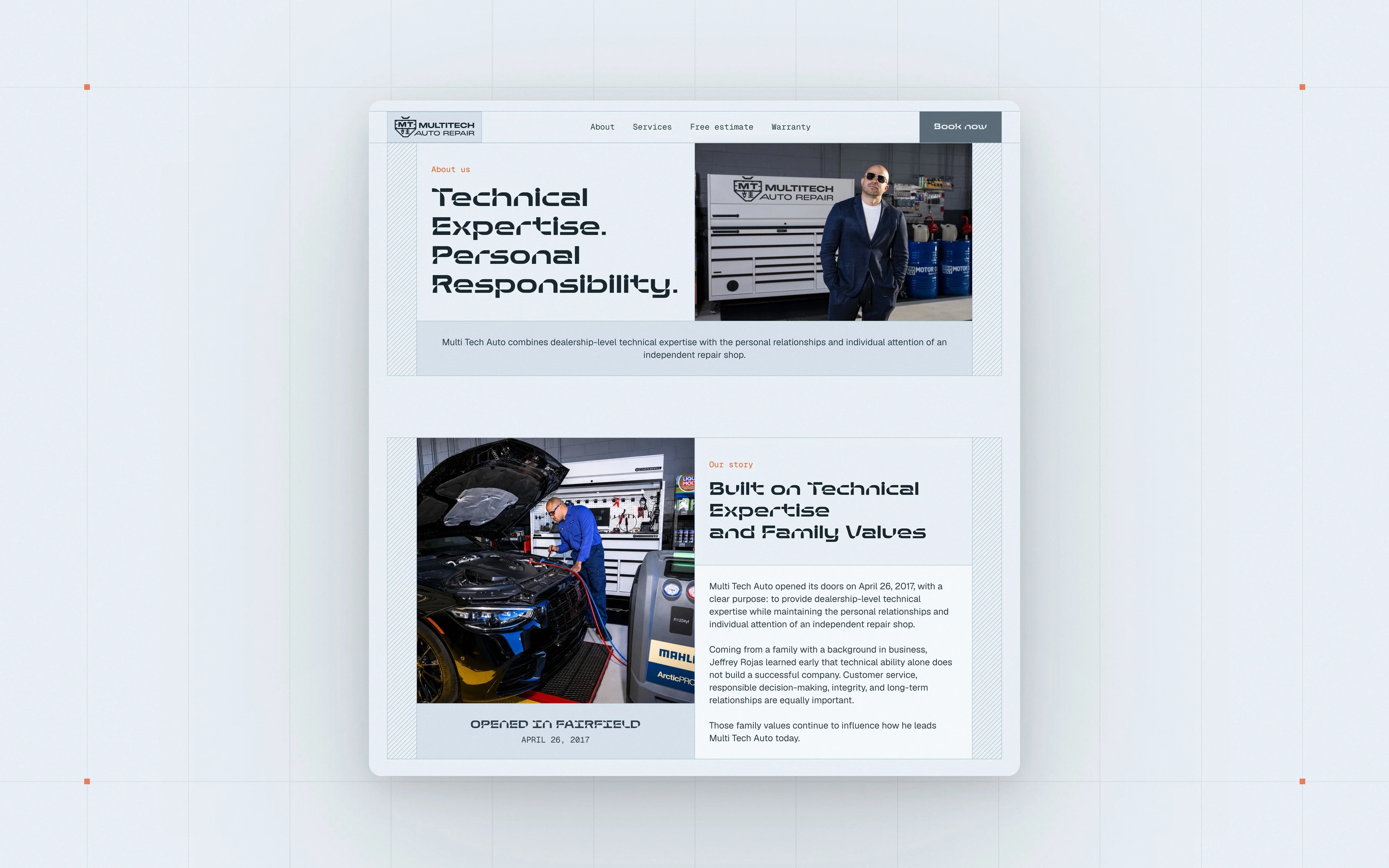
About: the founder and 25 years in the trade
The story of the shop and the person behind it, told with the shop's own photographs. Technical expertise and personal responsibility, in that order.
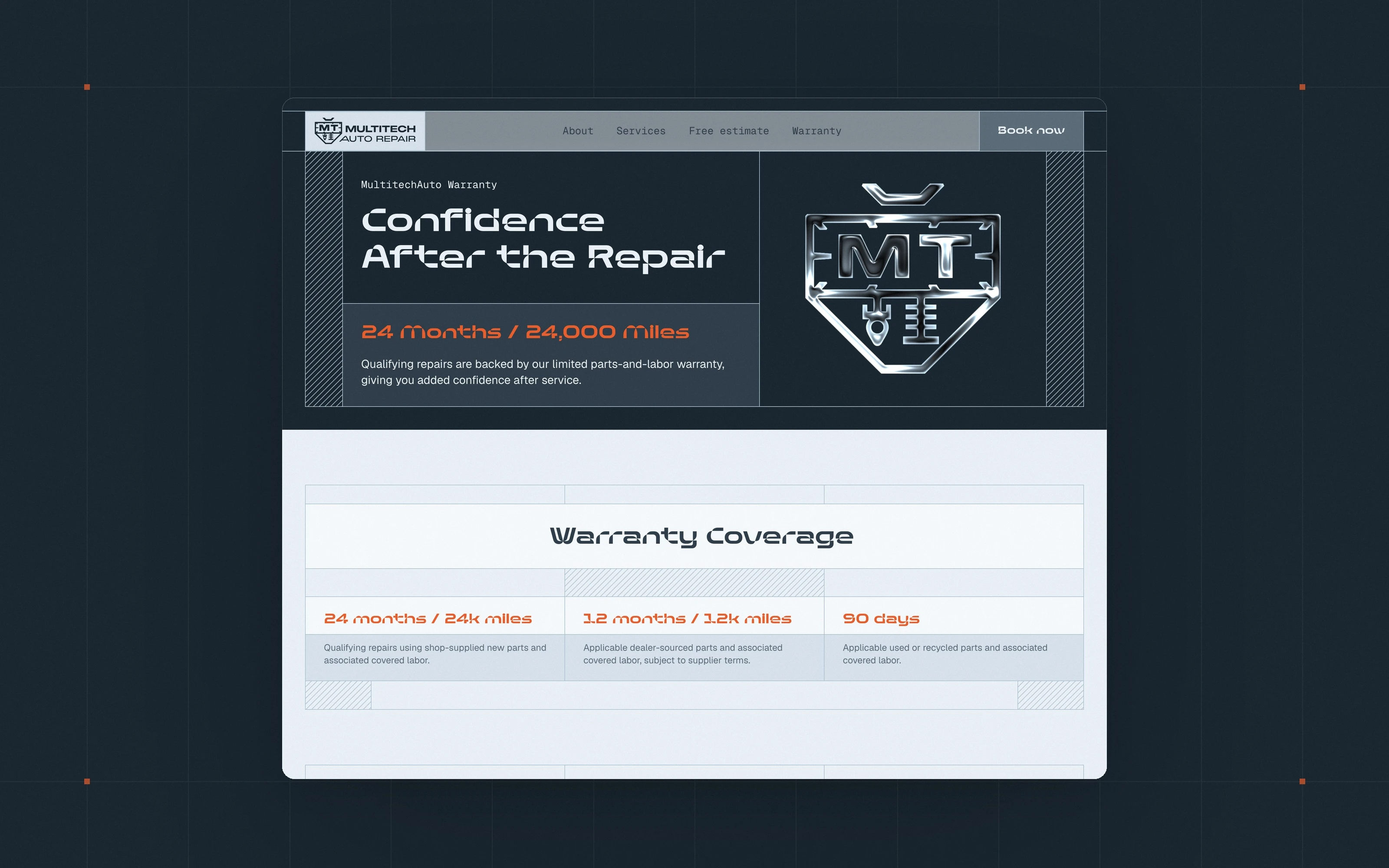
Warranty: the coverage in plain numbers
24 months or 24,000 miles, with the tiers and the conditions laid out in a table. A warranty page that a customer can read without a lawyer is part of the trust.
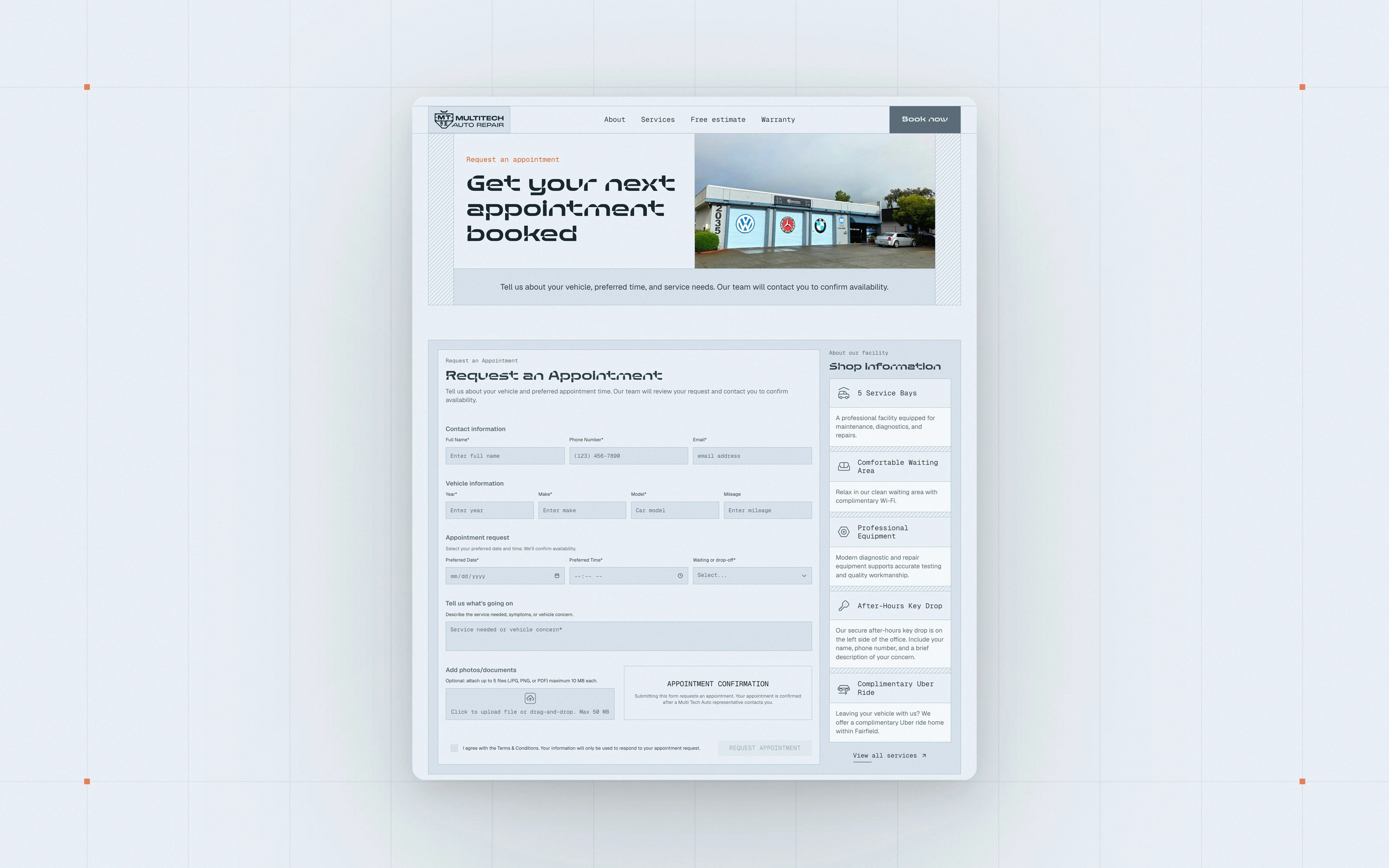
Contact: a real booking form
Vehicle, service, preferred date and time, photos of the problem, next to the practical details a customer needs, from the waiting area to the after-hours key drop.
Built for the phone first
The site was designed and checked at five screen sizes, from phone to ultrawide. On mobile the services module turns vertical, the maintenance table becomes a dropdown, and every button is sized for a thumb.
Easy to keep alive, and what I took from it
Because it is built in Framer on a design system, the shop can update text, photographs and reviews without a developer, and new pages follow the same rules. Delivered: concept and prototype in Figma, design system, homepage with two interactive modules, About, Warranty, Contact and Privacy pages, responsive at five breakpoints, published on Framer.
What I took from it: for a local business that sells trust, the website has to answer the customer's questions in the order they ask them, and show the work instead of describing it. And an approved concept is not the end of design. The best decisions on this site were made while building it.
Credits: design and Framer development, Miguel Recio. Brand identity, Miguel Recio. CGI, 3D renders and chassis states, Gabriel Naretto. Photography, the client's own.
A website that works as hard as the shop
Concept in Figma, built in Framer, live on every screen: a garage door that opens on scroll, a services module a customer understands in seconds, and a booking form that turns trust into appointments. If your workshop, dealership or automotive business needs a website that says what your work is worth, I can help. See my web design services or book a free call.
Like this project
Posted Sep 26, 2026
Auto repair website designed in Figma and built in Framer: interactive services module, real booking form and a design system the shop maintains itself.
Likes
2
Views
16
Earned
$2.5K+
Timeline
Jun 17, 2026 - Aug 10, 2026
Clients
Multi Tech Auto Repair
Collaborators