Turquoise Coast
THE TURQUOISE COAST IS A STRETCH OF SERENE BEACHES AND NATURAL BEAUTY ON THE COAST OF SOUTH-WESTERN AUSTRALIA. THE TROUBLE WAS, THE REGION WASN’T GETTING MUCH VALUE FROM THEIR REGIONAL TOURISM BRANCH. SO THEY MADE THEIR OWN.
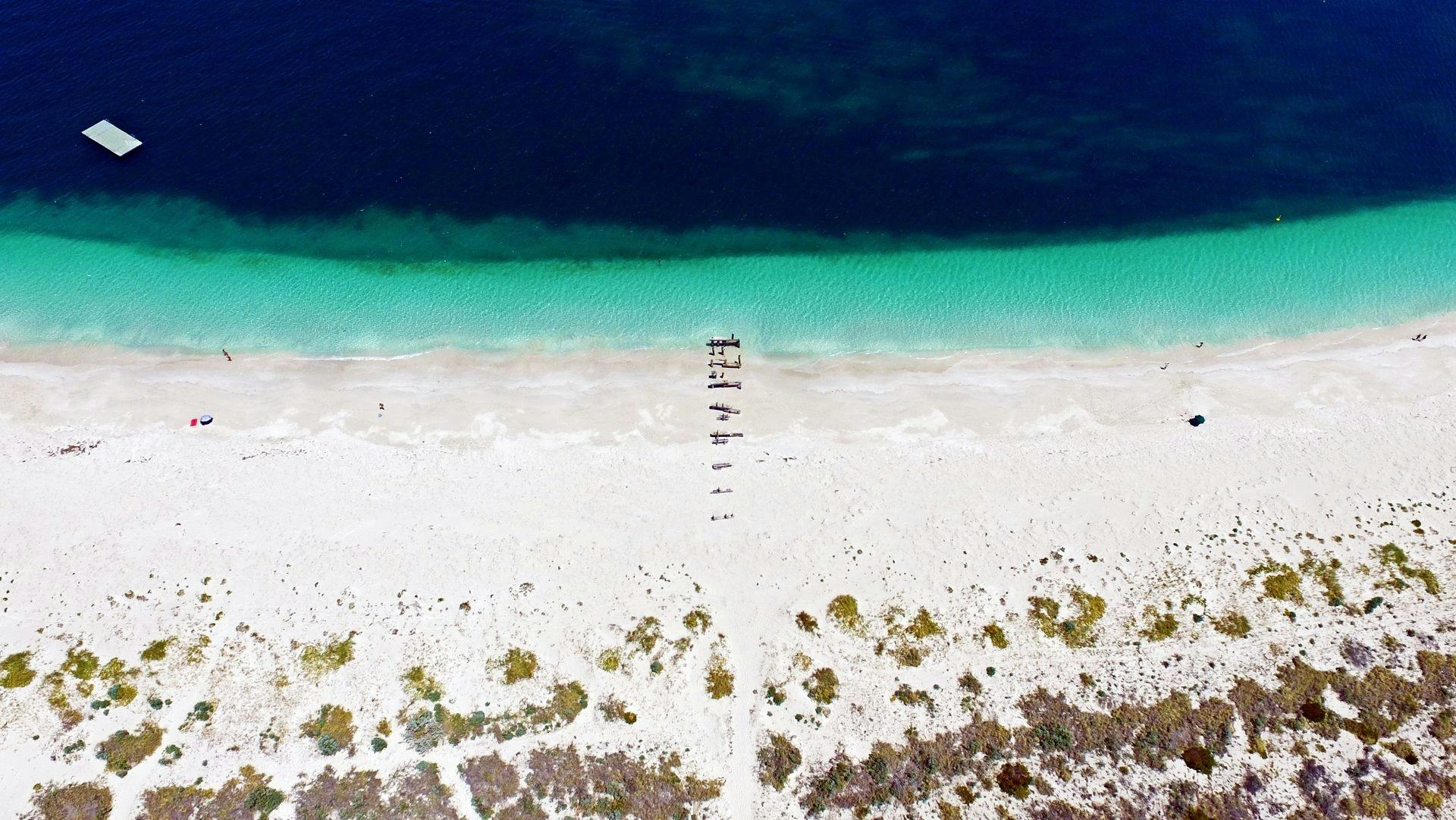
The Turquoise Coast is comprised of a few regional towns: Cervantes, Jurien Bay, Dandaragan, Badgingarra and Green Head, and sits at around a 2 hour drive north of Perth, Western Australia. The region’s well known for its natural beauty, ranging from stunning coral reefs and golden beaches to the fascinating Pinnacles - all the while being quiet enough to not compete with the more highly-visited towns and coastline along the South Western coast of WA.
It found that although it fell under a local tourism arm, it wasn’t being adequately serviced or given enough attention for it to truly thrive in a post-Covid tourism landscape.
As such, the Shire of Dandaragan opted to push to create a new tourism body that would encompass the region, and help to bring more visitation to the area.
It aimed to focus on catering for ‘grey nomads’ (elderly travellers going from town to town in caravans) and younger families as a weekend getaway destination, owing to its close proximity to the Perth metropolitan area.
Marketforce’s role in this process was to create a strategy-focused brand identity for the tourism body that would be the Turquoise Coast, which would then later be pushed to a website and other tourism-focused collateral. My individual role in this was to lead the design process, and it largely remained under my creative jurisdiction until my departure from Marketforce.
THE APPROACH
As a part of the project, the Strategy arm of Marketforce devised a brand personality that would provide a basis for the Turquoise Coast brand and visual identity to stem from, including personality traits, brand values and a 'true north' - something that would act as a core of the brand.
Focused on the idea of being 'nature's melting pot', the new visual identity would have to reflect the myriad natural elements that make the region special, yet also reflect the more laid-back nature of the towns compared to other local tourism destinations.
As such, the physical environment would serve as an important reference point in the designing of the Coast’s visual identity. Simple organic shapes reminiscent of the natural shapes found in the reef shelves and the rocky structures of the Pinnacles helped to provide a strong foundation for the visual language found in the brand.
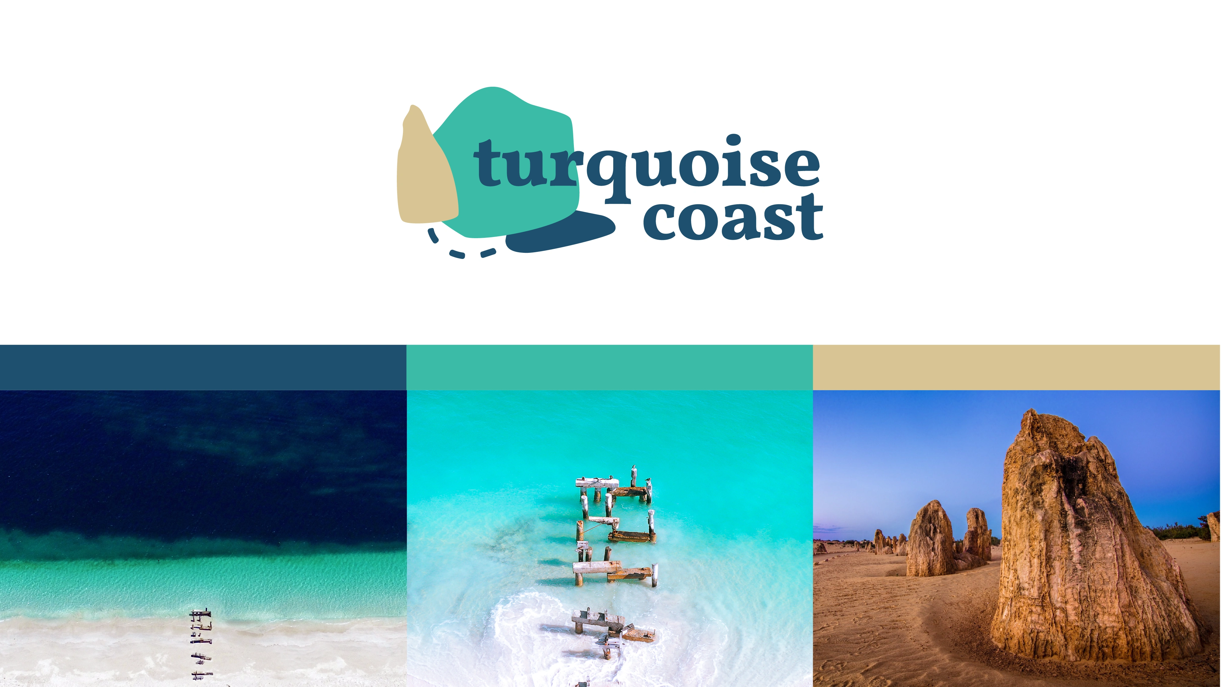
In regards to colour, we again looked to the physical attributes of the region - a pairing of a deep navy and a mid-tone turquoise reflected the marine environment, and a warm sandy beige tied into the sand and limestone formations found in the region.
It was also important for the brand to feel relaxed and approachable - so a lowercase treatment of Vollkorn paired with the well-balanced Nunito Sans helped to set the tone in type - all the while being placed in plenty of white space to allow content to properly breathe and flow freely.
THE OUTCOME
The client and its stakeholders found the proposed identity resonated greatly with the region, and was pretty much signed off then and there with little to no changes (something that feels very rare in the creative industry).
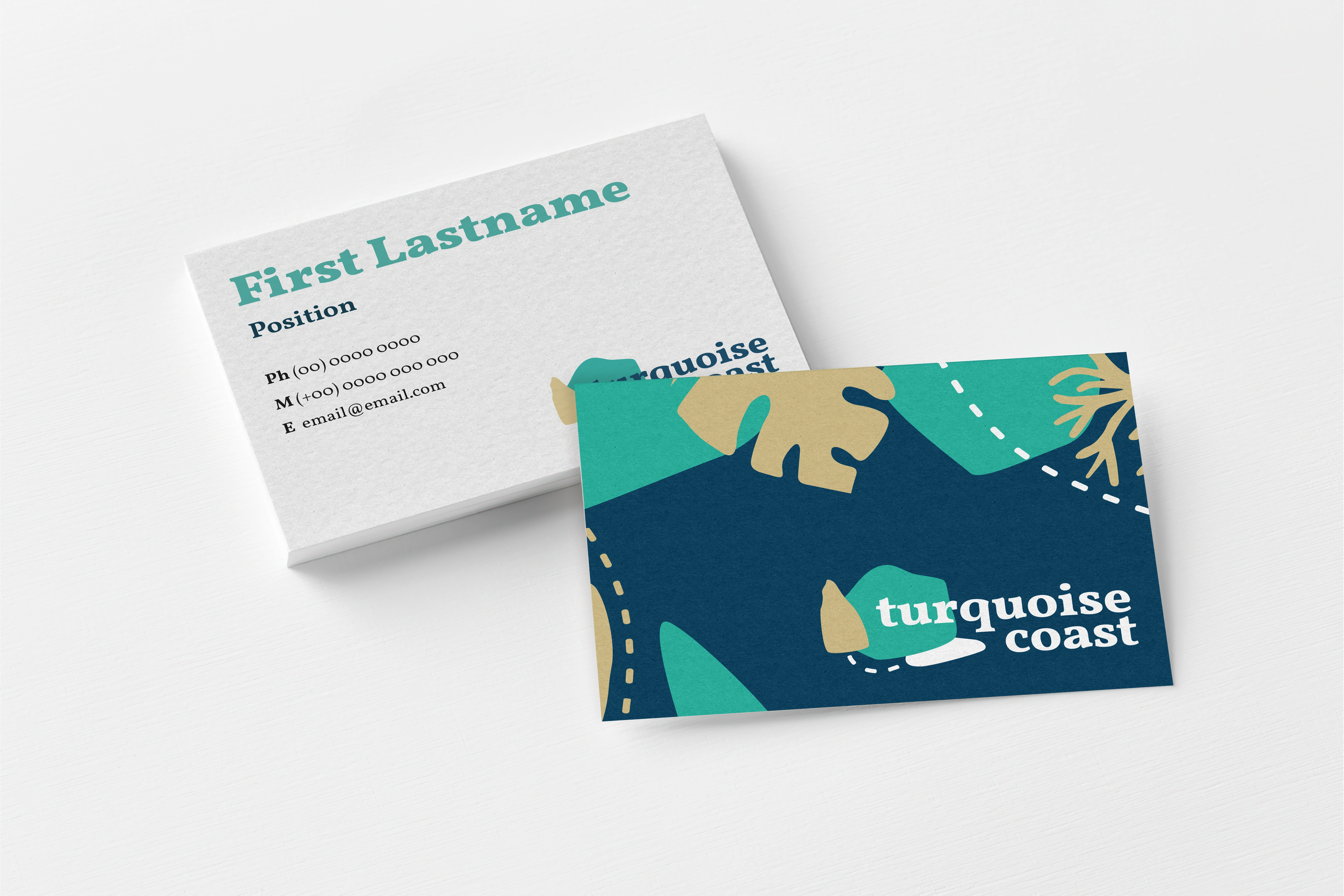
From there, we went on to update some of the existing tourism collateral and design a new website (also under my jurisdiction). The client also requested we update the roadside sign that sits along the highway leading into the Coast - which was a nice opportunity to work on something physical and tangible!
Overall, it felt like a very successful project, and was overall a joy to work on - so keep the Turquoise Coast in mind when you’re looking for your next getaway in Western Australia!
Like this project
Posted Feb 23, 2024
A full-scale brand identity launch for a regional tourism branch in Western Australia, including UI designs for a custom-built website.
