Library Dashboard

vansh patel

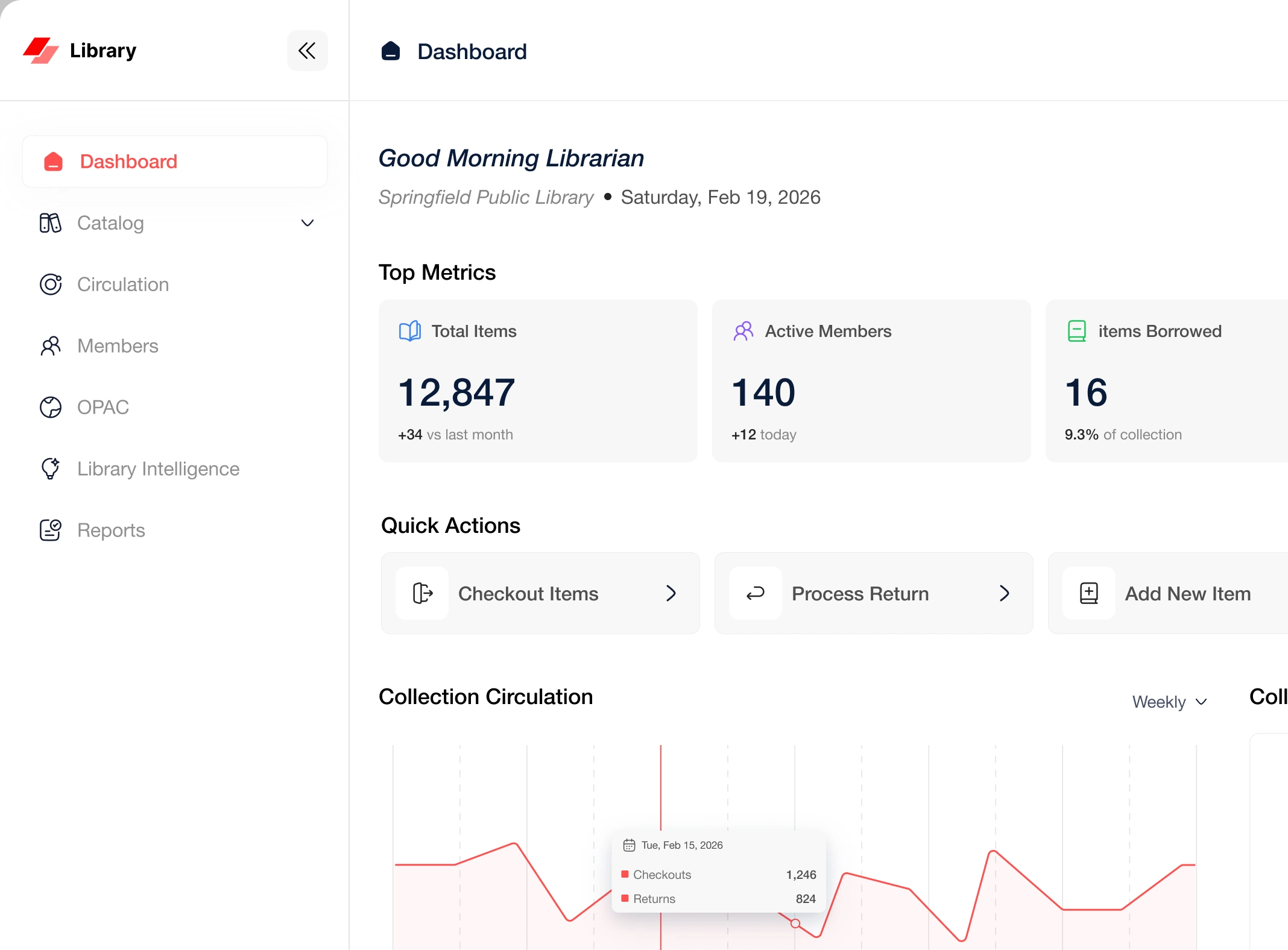
a library runs on a lot of small moving parts. items, members, checkouts, whos overdue, whats missing. most of that usually lives across a few different screens, or worse, in someones head. the goal here was to see if the whole thing could sit in one place where a librarian can just scan and get it.
the library dashboard pulls everything into one view. items, members, checkouts, overdue stuff, all right there. the whole idea was simple. dont make the librarian dig around for basic answers.
one place to scan. everything the librarian checks daily is on the main view. no jumping between tabs to figure out whats going on.
the intelligence panel. this was my favorite part. it doesnt try to be fancy for no reason. it just tells you what needs attention. demand alerts, collection gaps, auto-sort suggestions. useful things only, nothing there to look smart.
calm not cluttered. a dashboard with this much info can get loud fast. we kept the layout easy to read so the data helps instead of overwhelming.
the rule the whole time was, if it doesnt help the librarian do their job faster, it doesnt go on the screen. tools like this get bloated because everything feels important. the useful move is cutting, not adding.
a self-initiated product design by oceanlab.
Like this project
Posted Aug 31, 2026
a library management dashboard that pulls items, members, checkouts and overdue tracking into one calm view. self-initiated product design by oceanlab.
Likes
0
Views
7