Mobile-First UX/UI Design

Jerin Nusrat


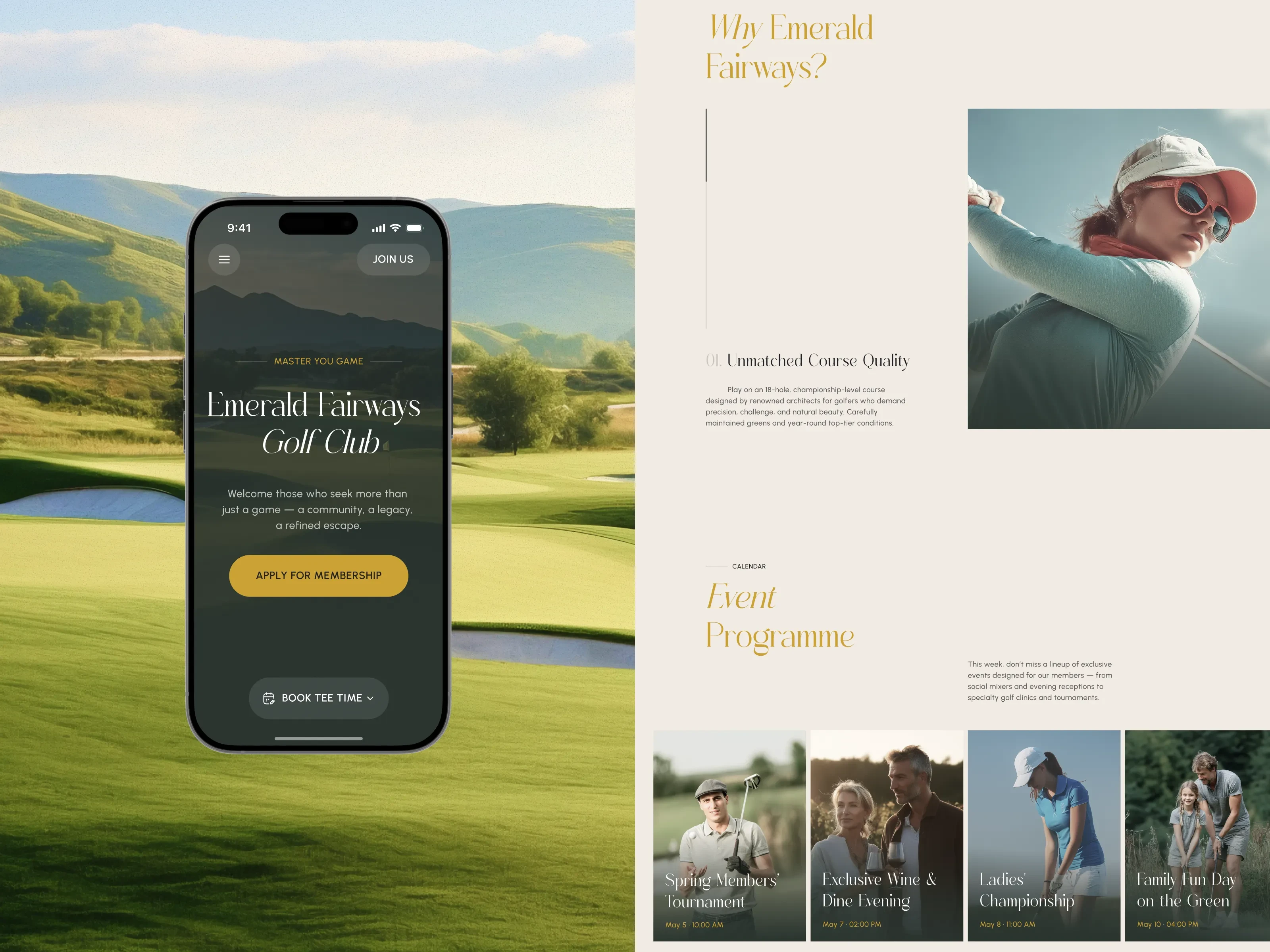
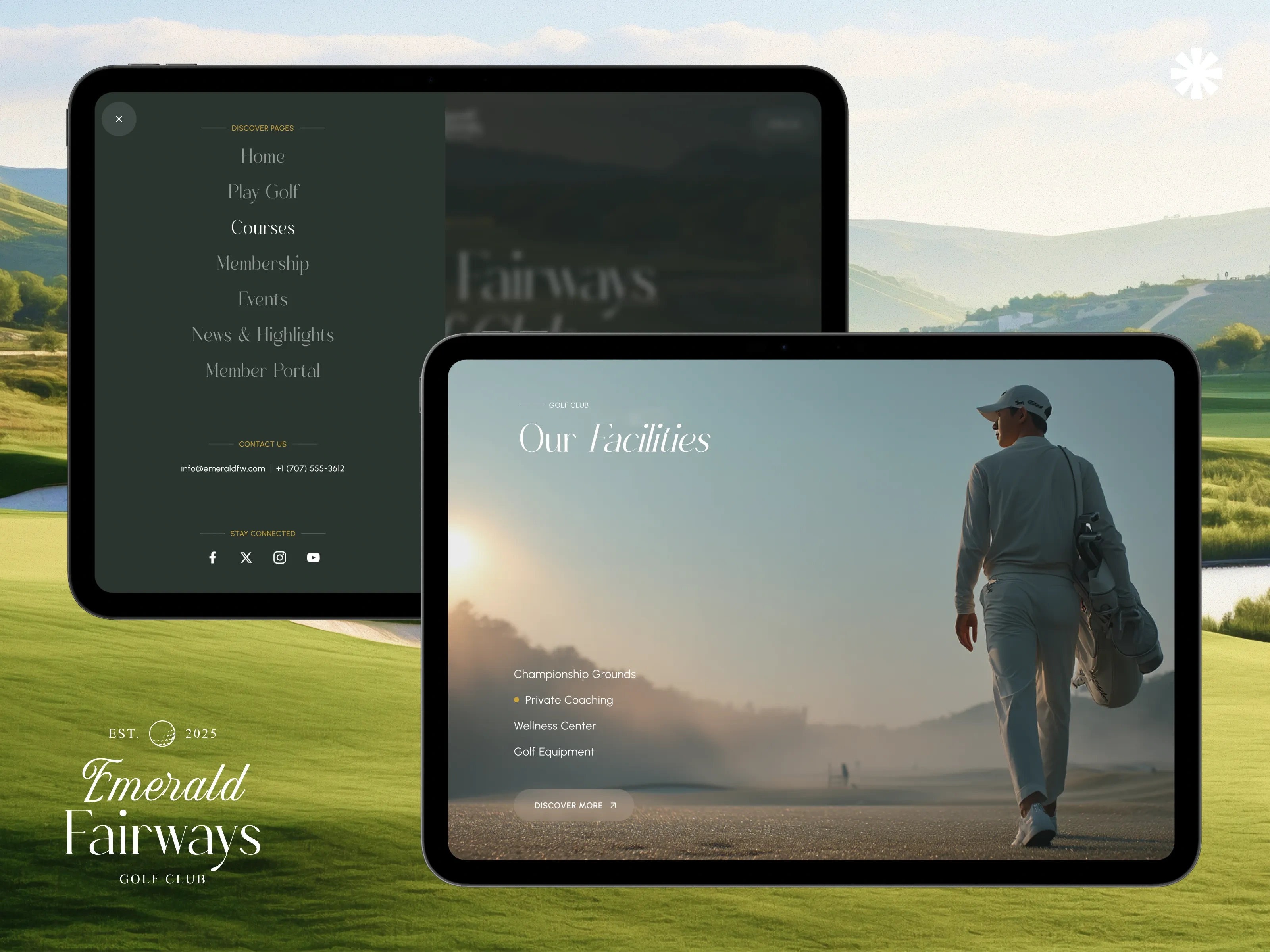
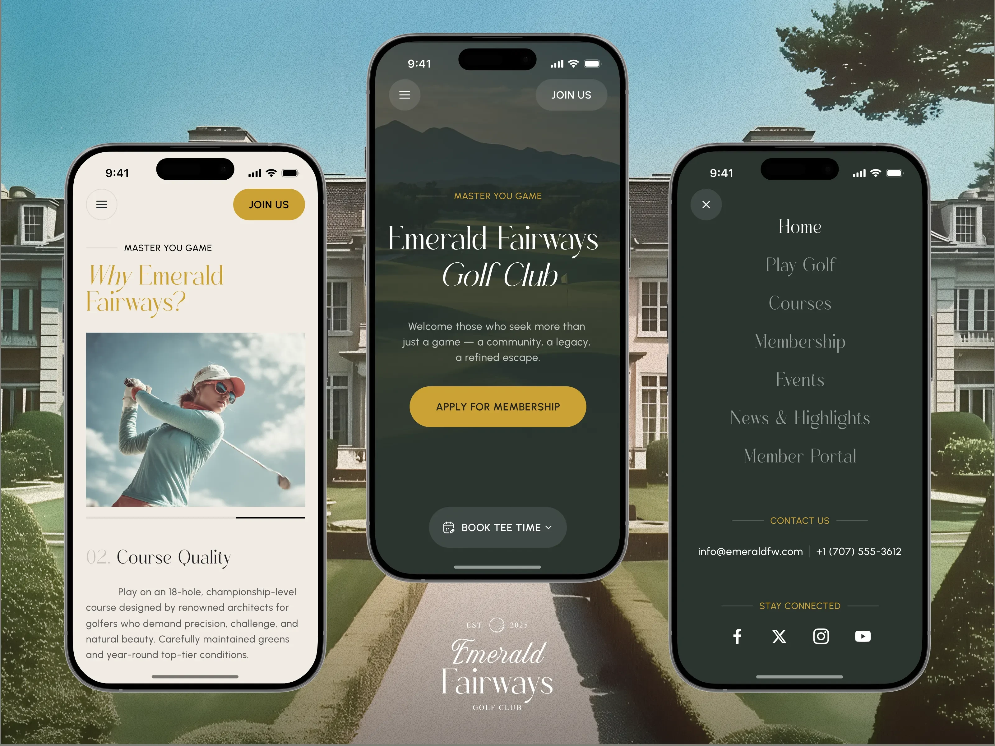
Luxury is not limited to large screens.
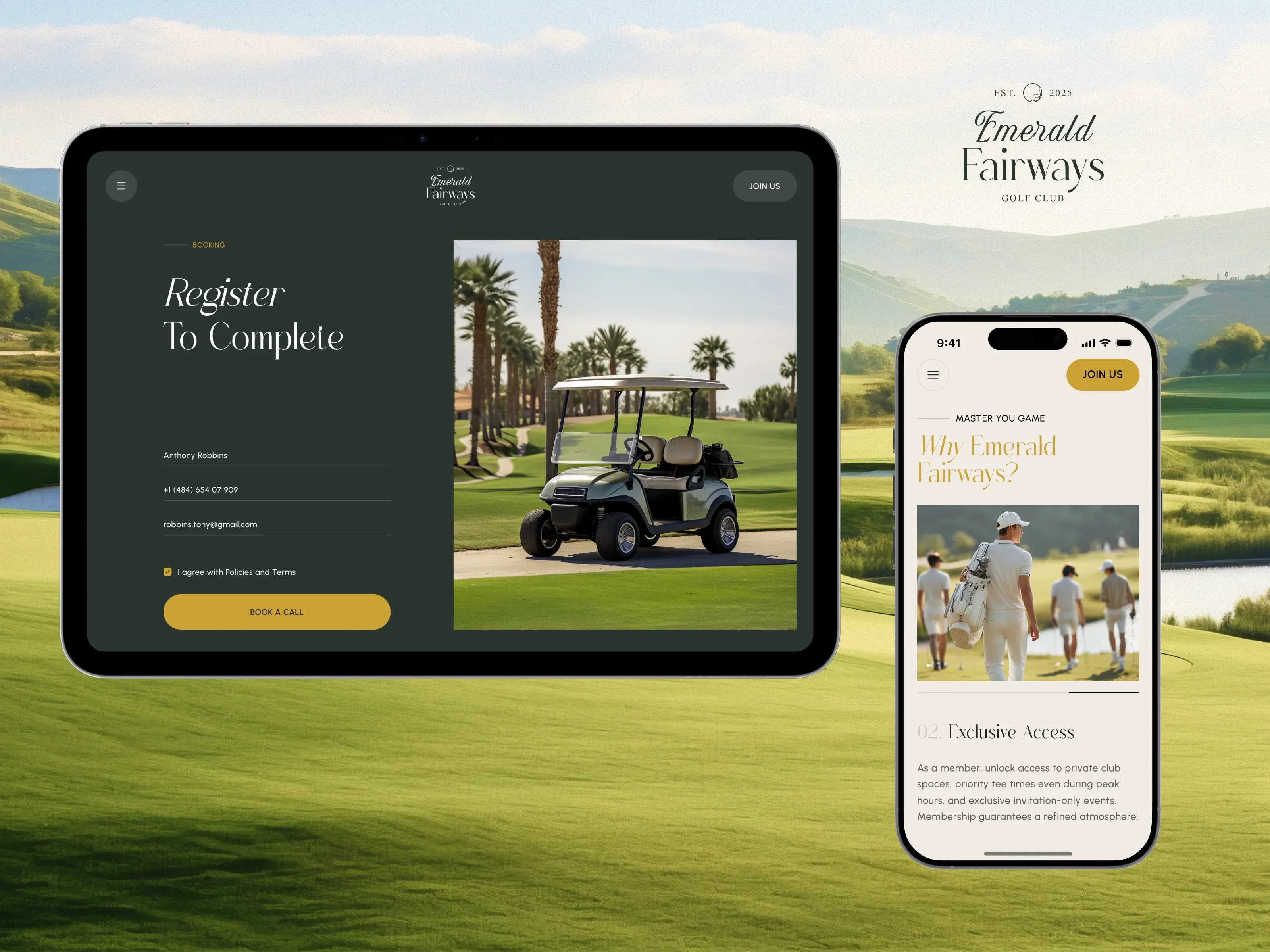
The design applies a mobile-first strategy, supported by a flexible grid system and scalable components. Key interactions — like booking a tee time, checking event details, or applying for membership — were carefully restructured for smaller screens, with touch-friendly elements, optimized content hierarchy, and reduced cognitive load. Every layout was tested for clarity, rhythm, and ease of use, ensuring that sophistication never gets lost, even on mobile devices.
Elegant by Design
A thorough analysis of premium golf and hospitality brands was conducted to establish a visual language that feels both timeless and intuitive. The design features:
Typography: The core of the design is Foresta Monesta, a sophisticated serif that brings heritage and clarity to every screen.
Layout: Clean layouts, elegant spacing, and calm transitions create a relaxed, editorial experience.
Color Palette: Deep green paired with gold accents reflects prestige and natural elegance.
Interactions: Subtle interactions and smooth microanimations echo the club’s character — refined, private, and confidently understated.
Effortless Booking, Designed for Precision
Booking a tee time is streamlined with a real-time scheduling engine that allows members to:
View availability
Select preferred times
Reserve a round in just a few taps
This tool is designed to be fast, intuitive, and beautifully minimal, making game planning feel as refined as the course itself.
Membership, Made Understandable
To present membership clearly:
A transparent, beautifully structured membership section outlines each tier with clarity and respect.
Benefits are thoughtfully detailed, distinctions are easy to compare, and every element feels welcoming — inviting the right people to see themselves in the Emerald Fairways community.
Like this project
Posted Oct 24, 2025
Designed a mobile-first UX/UI for Emerald Fairways, enhancing booking and membership interactions. Effortless Booking, Designed for Precision.