Holiya Health Tracking Mobile App Design

Jerin Nusrat


Holiya – Health Tracking Mobile App Design
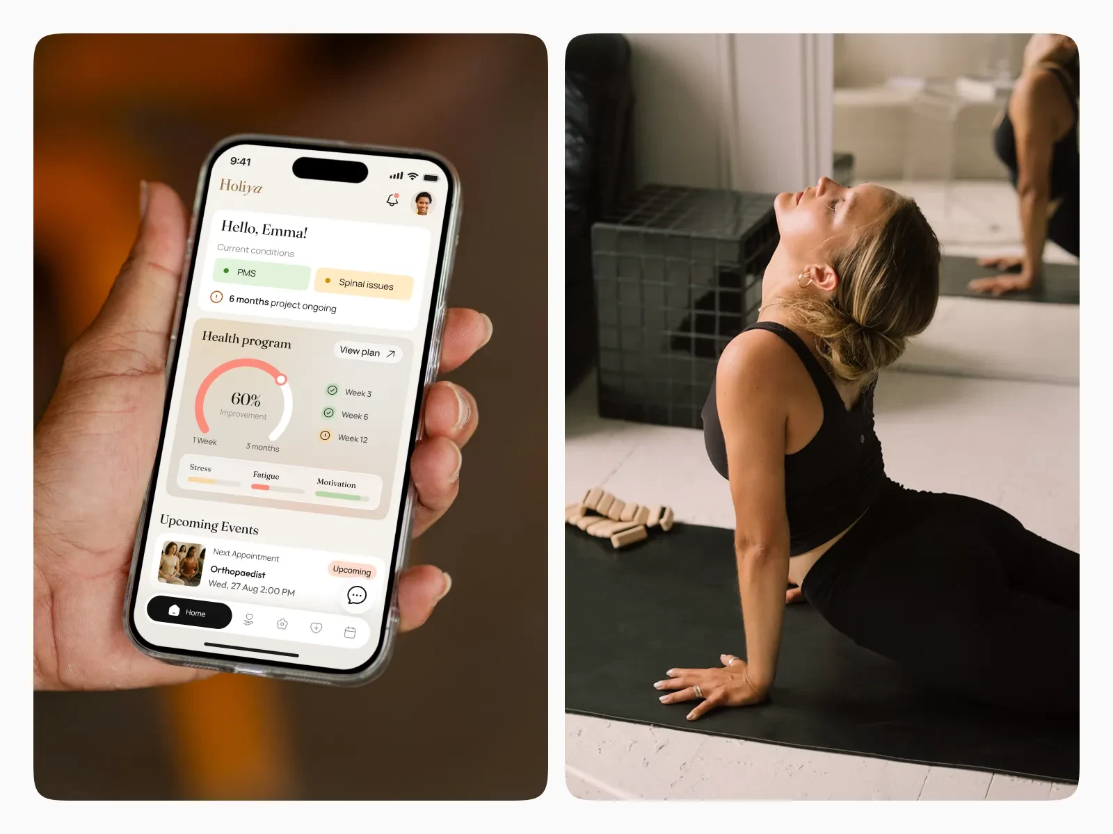
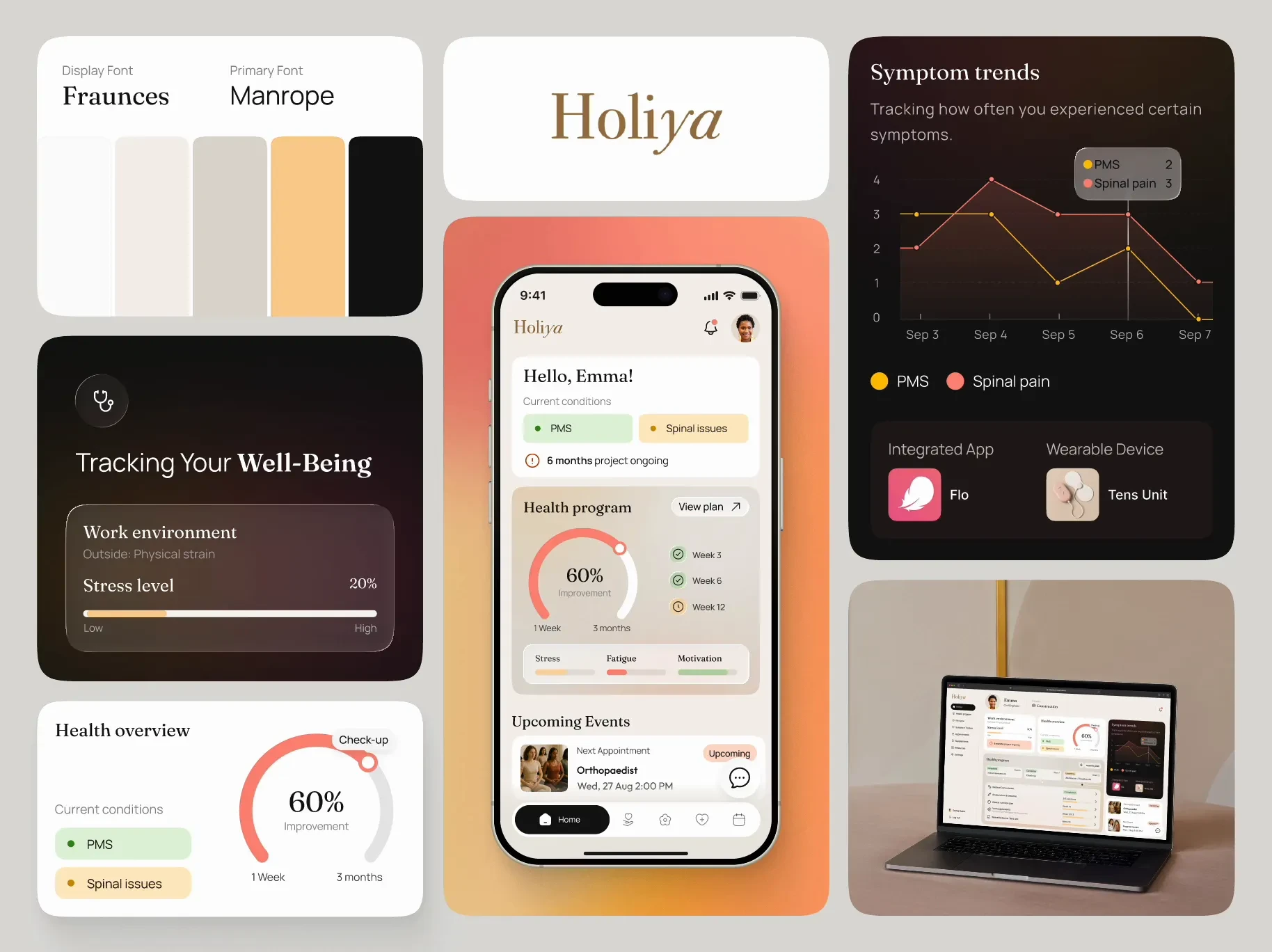
The Holiya concept positions itself as a well-being companion rather than just a statistics tracker. Aimed to help users track health progress, manage stress, and stay motivated through personalized wellness programs. The focus is on a calm, minimal, human-centered experience.
What Works Very Well
User-friendly tone: The tone is warm and calm: that lowers psychological barrier to using a health tracking app regularly.
Balanced aesthetics: The mix of minimalism + warm accent colours strikes a good balance: premium but accessible.
Readable data presentation: Modular cards and controlled visual hierarchy make it easier for users to digest key info.
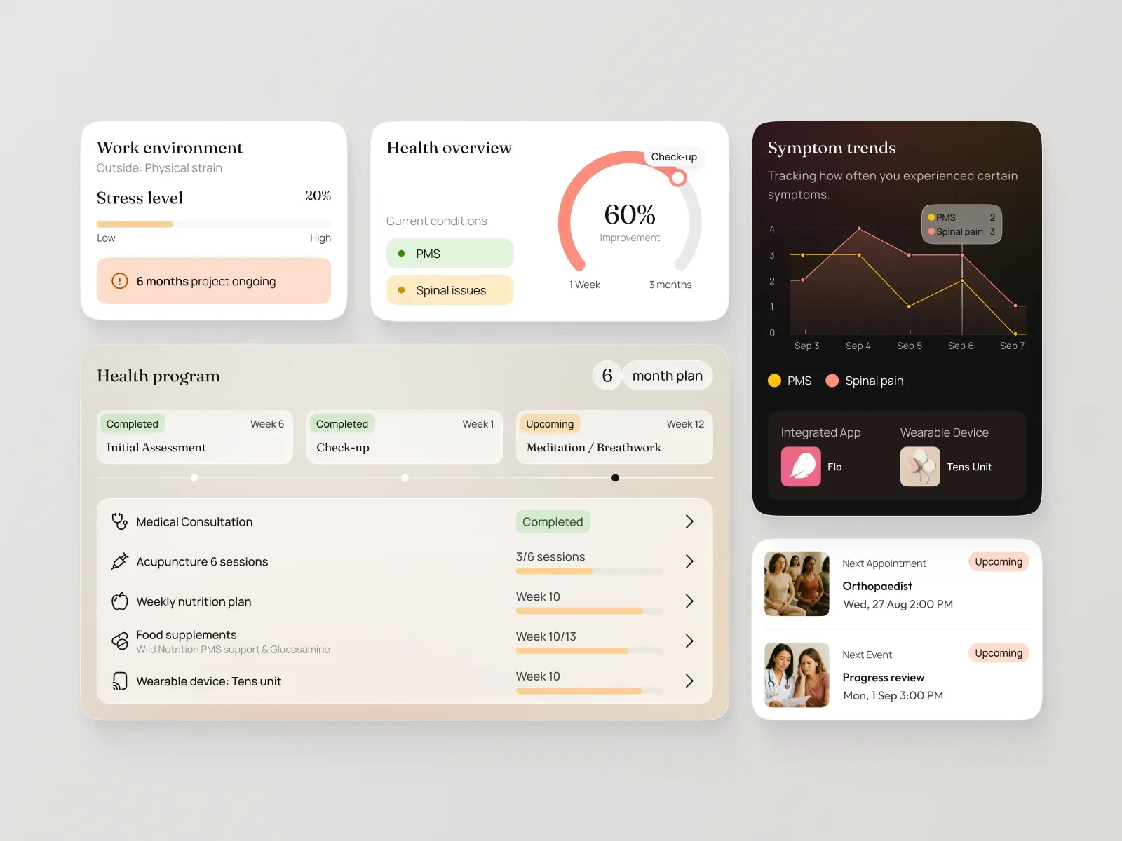
Emphasis on well-being, not just metrics: The design feels less about “scoreboards” and more about “progress & support” — a meaningful differentiation.
Takeaways for Designers
When designing for health/wellness, tone matters: aesthetics should evoke calm, safety and support, not clinical coldness.
Use modular, consistent cards/components to manage complex data in a digestible way: dashboards become manageable.
Align visual identity (colour, typography, layout) with the emotional state you want to evoke — in this case: calm, human, minimal.
Consider cross-platform consistency: When the project covers mobile + web/desktop, a shared component library and system helps keep the brand voice intact.
Don’t neglect accessibility & inclusive design — especially in wellbeing apps serving diverse audiences.
Use design to support behaviour change, not just display data: motivational cues, onboarding flows and feedback loops matter.
Like this project
Posted Oct 23, 2025
Designed a calm, minimal health tracking app for Holiya, focusing on well-being. The focus is on a calm, minimal, human-centered experience.