Adidas Sales Performance Dynamic Dashboard
Sidra choudry
Problem
Adidas faced challenges in understanding granular sales performance across different states, retailers, sales channels, and product categories. Without a centralized dashboard, it was difficult to:
Identify underperforming regions or channels.
Analyze month-over-month sales and profit trends.
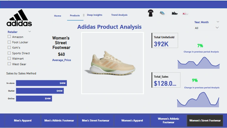
Compare product performance across gender and product lines.
Enable decision-makers to act quickly based on unified, visual insights.
Solution
To solve this, I designed a fully interactive Power BI dashboard that integrates multiple data points into three core analytical views:
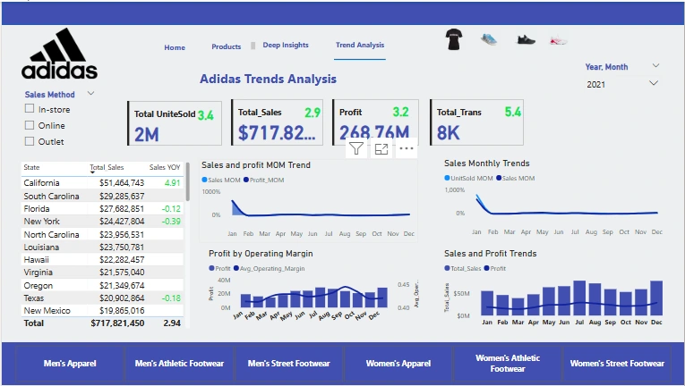
Trend Analysis View – Showcases total sales, transactions, and units sold across top-performing states, while tracking MoM sales and profit trends for proactive forecasting.
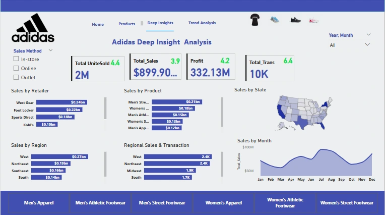
Deep Insights View – Breaks down sales by retailer, region, and product category. A map and transaction chart provide immediate insights into geographic and seasonal trends.
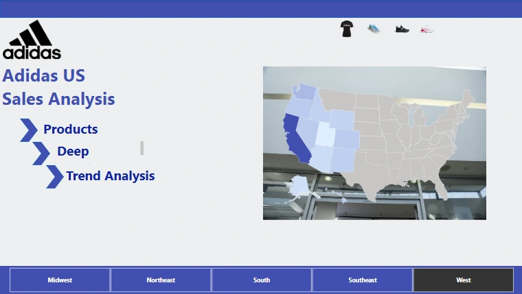
Navigation Hub – A clean, branded landing page that serves as a user-friendly entry point for slicing data by region or product type, enhancing user experience.
🔹 The dashboard uses advanced features such as:
YoY percentage change metrics
Drill-through analysis
Dynamic filtering by product type and region
Visual storytelling through intuitive layout and thematic coloring
This project helped translate complex datasets into a visual story, supporting data-driven decisions for Adidas marketing and sales teams.
Like this project
Posted Jul 2, 2025
Designed an interactive Power BI dashboard for Adidas to analyze sales performance.