Type – Anatomy of an icon
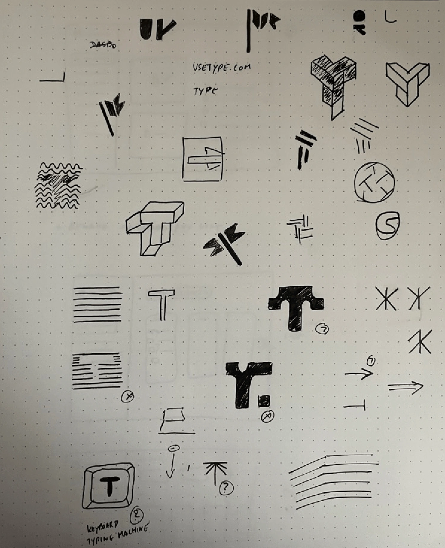
Quick sketches
Starting with quick sketches helped us align on the different directions we liked and disliked. Without much doubt, the idea of a keyboard key made more sense than any other idea.
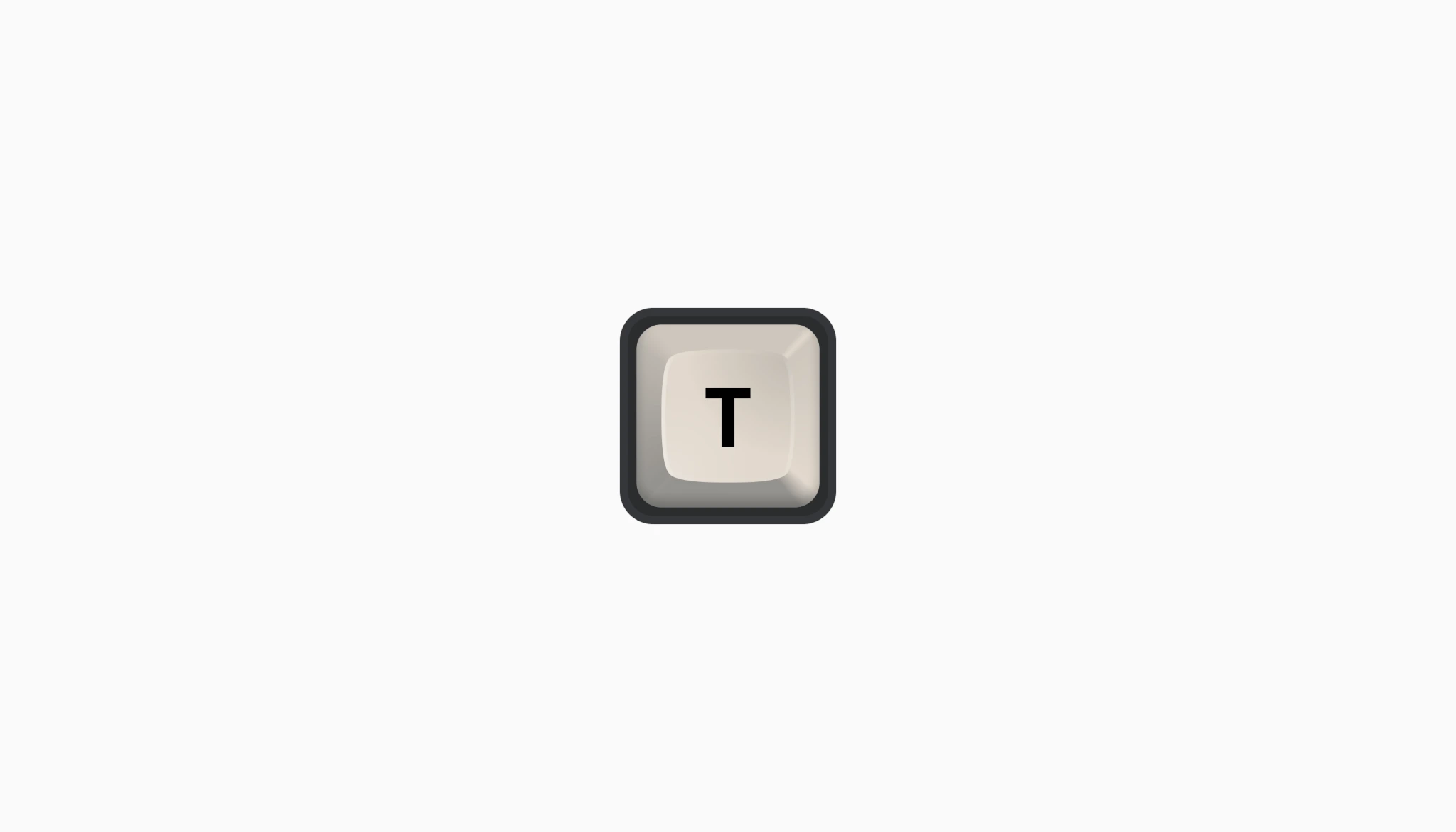
A keyboard key
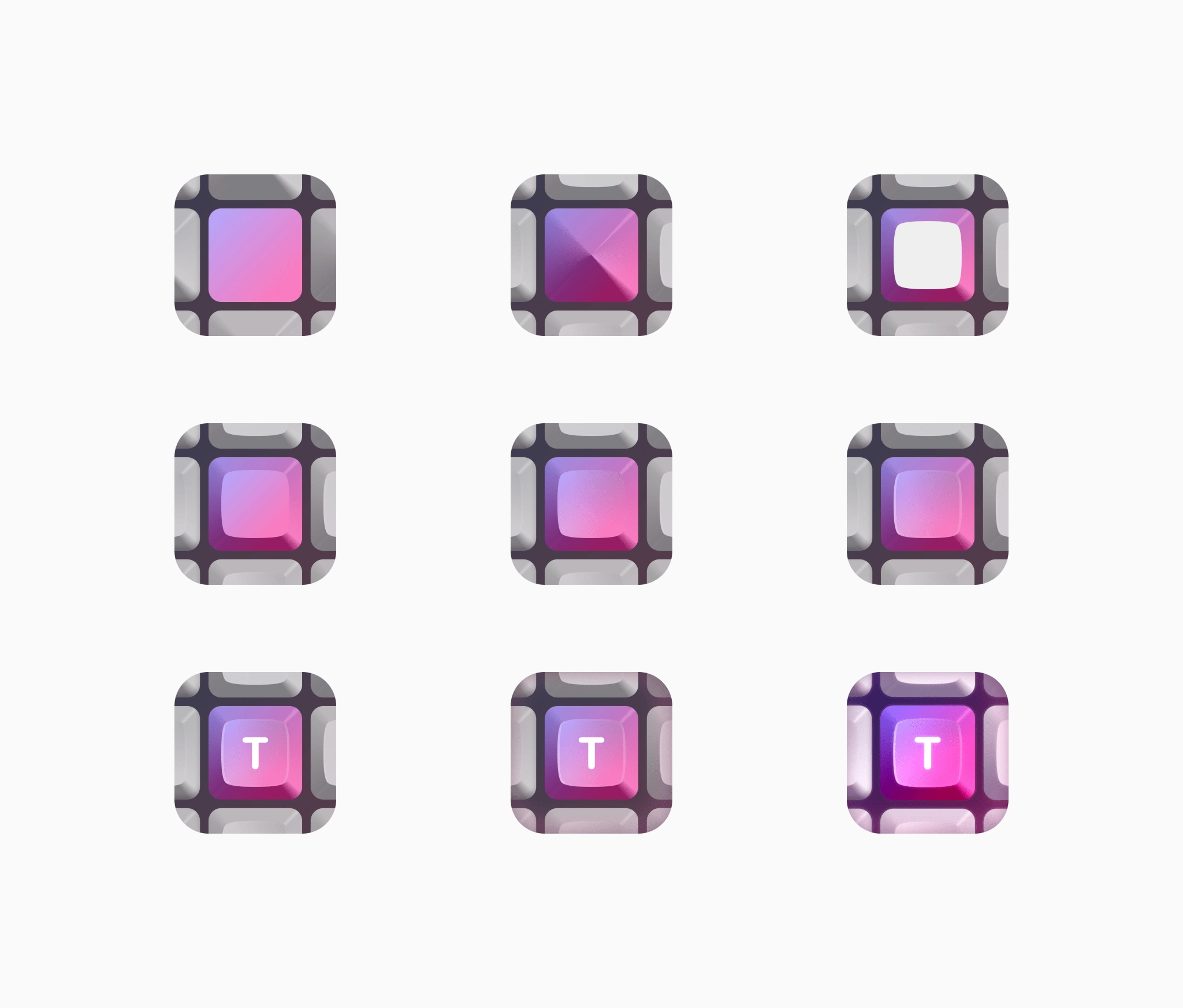
The first few high-fidelity keys had a retro feel but were kind of bland. I tried a couple of alternatives with tints or combination of more than one key.
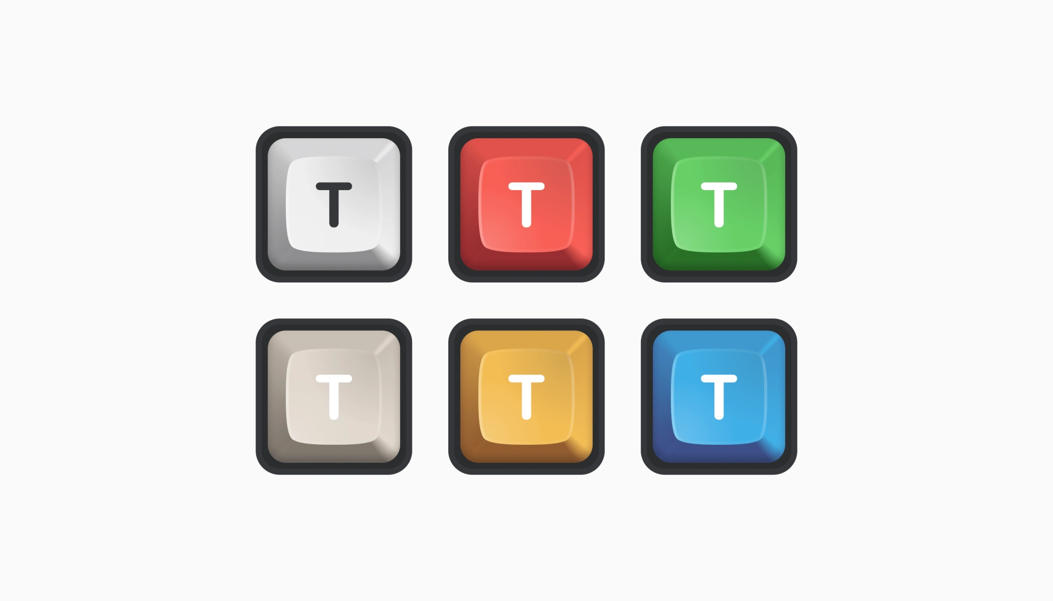
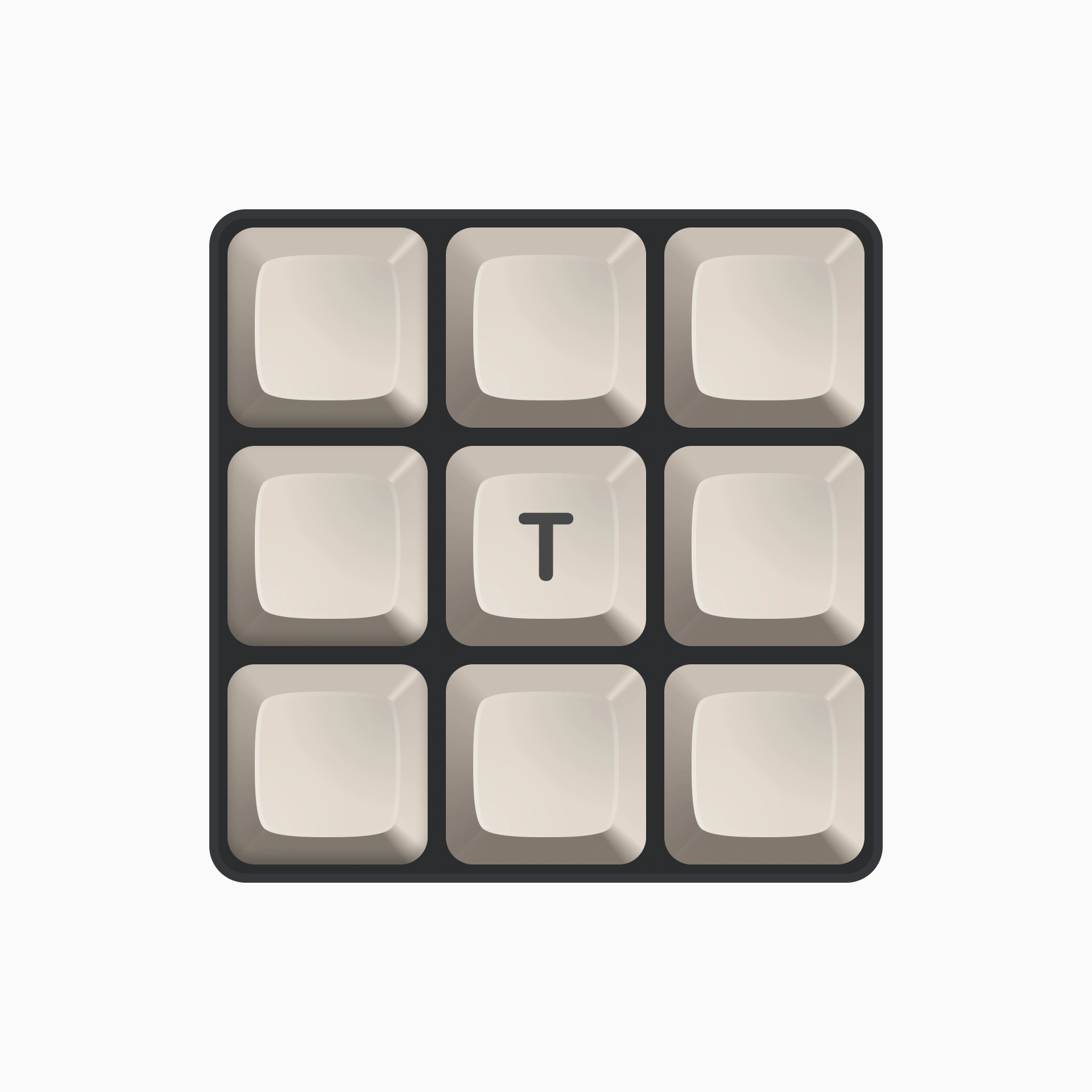
More substance
A key by itself wasn't strong enough but surrounding the main key with other keys made it feel more "realistic", keeping the focus on the main key "T" was our final decision.
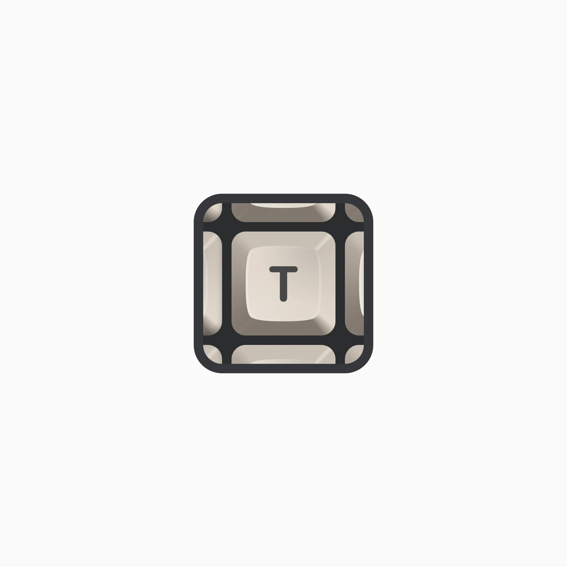

From dull to glow
We felt like the style of the keys was missing something, so while we were brainstorming, Nicolas shared a picture of his keyboard lights. The different colored glows added a unique touch that we loved.
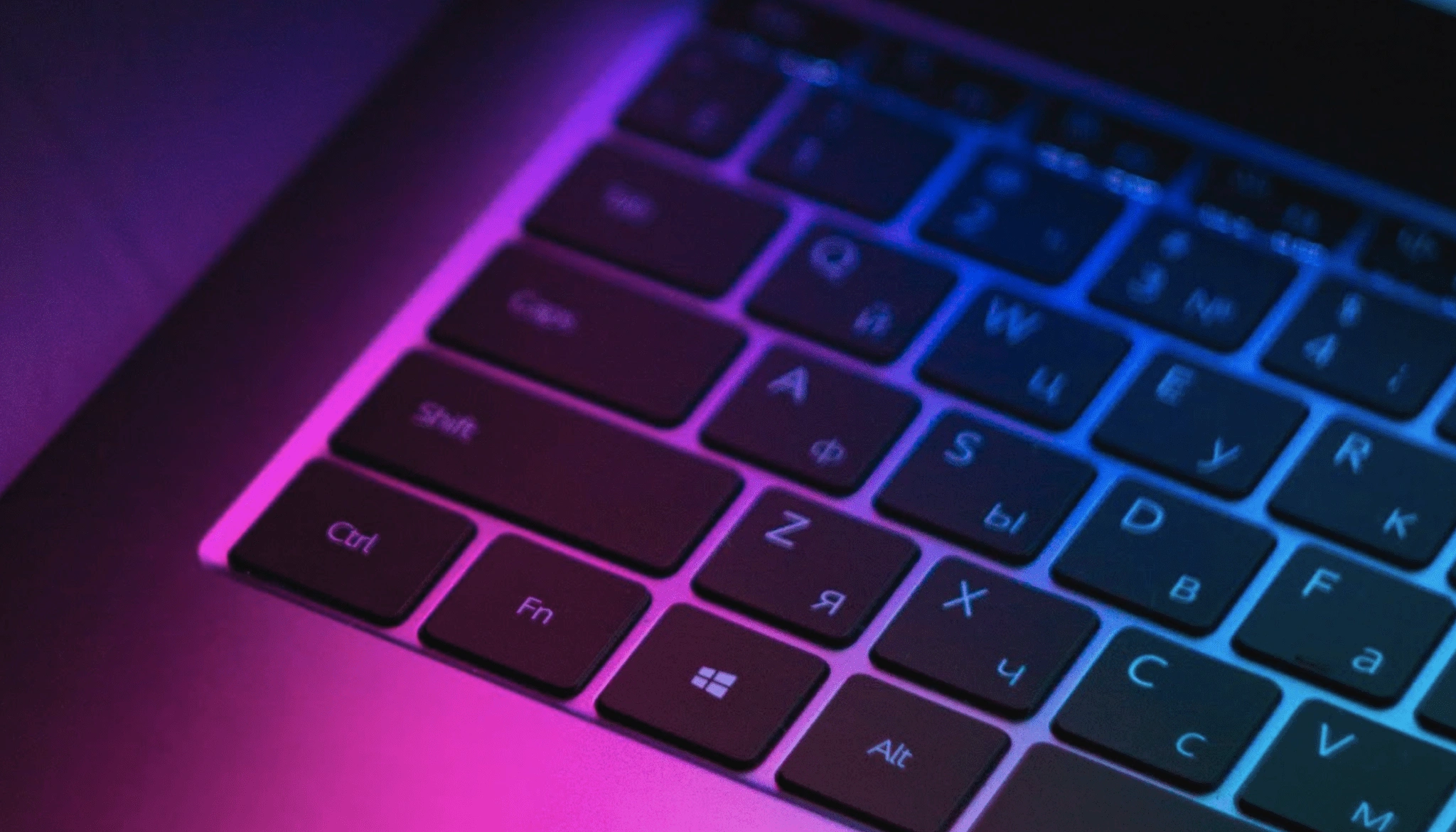
Credits: Nicolas Bichon
Send Denis Moulin a reply about this page
Like this project
Posted Sep 5, 2023
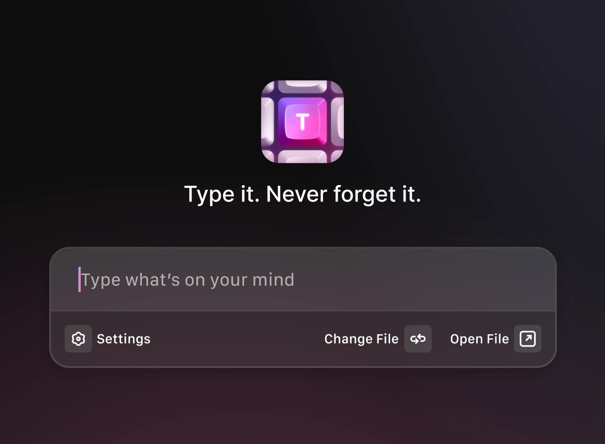
In late 2022, I worked on Type icon and app design, a tool that let's you quickly take notes without interrupting your flow.
Likes
0
Views
10
