SUNDRY | Café Brand Identity that F Social Standards
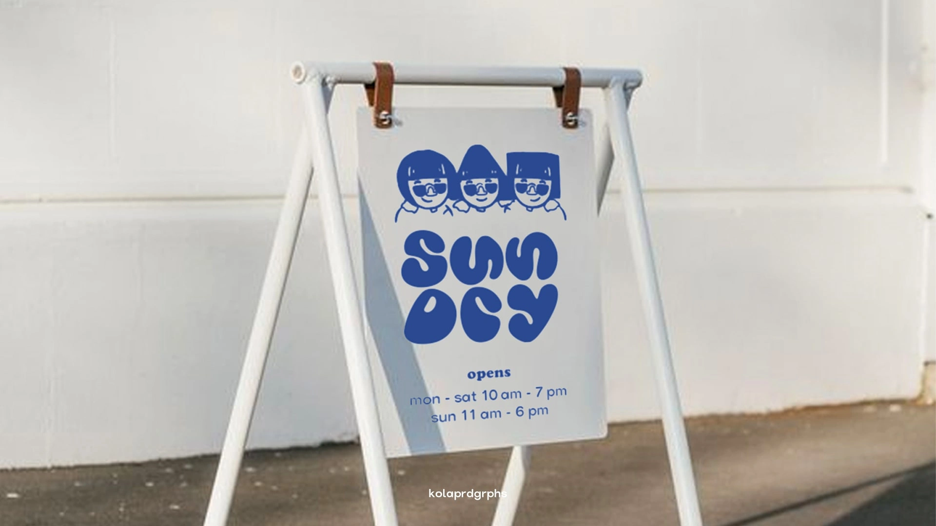
SUNDRY sidewalk board sign
🕵🏻♀️ Target audience:
Millennials and Gen-z, who think bold and are seen as the “mismatched” within the community as they come from diverse backgrounds (be it ethnical, racial or gender identities)
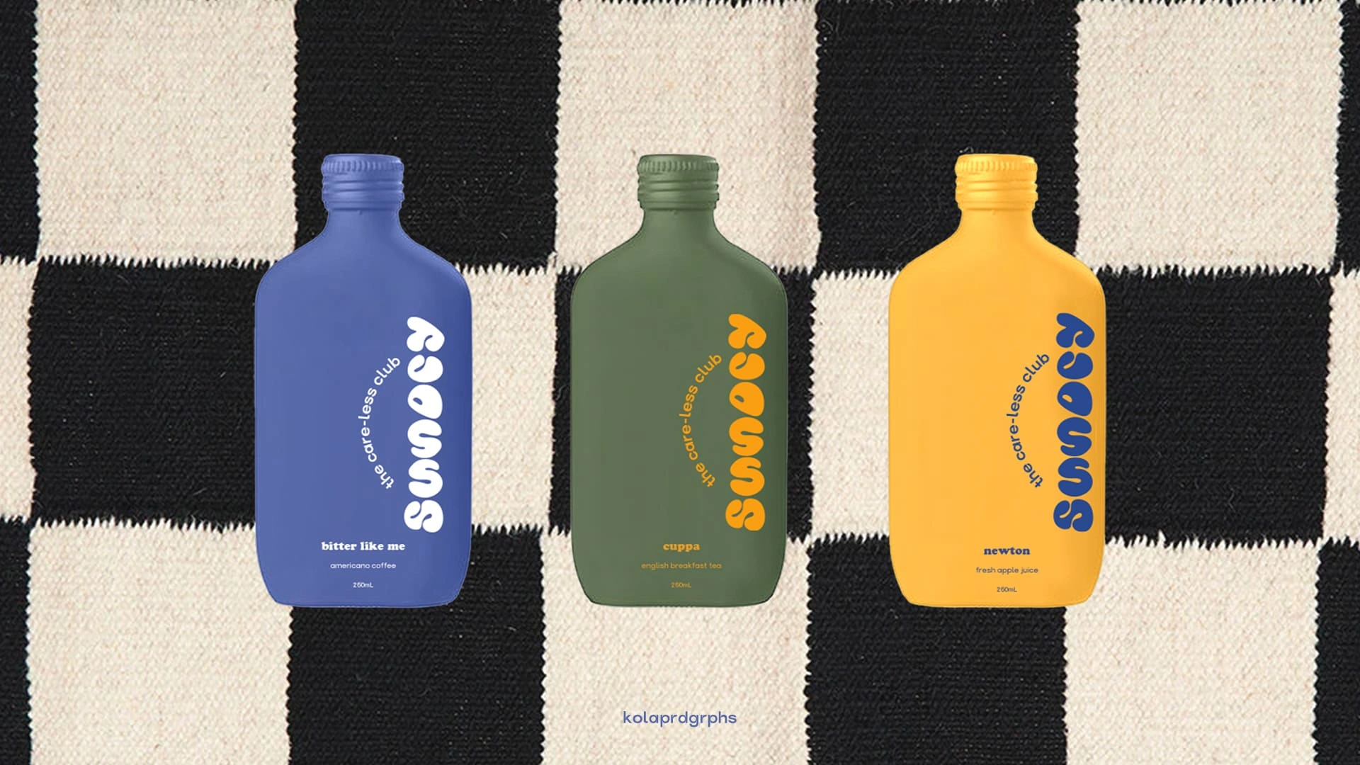
SUNDRY beverages packaging (L) Bitter Like Me (Americano); (M) Cuppa (English Breakfast Tea); (R) Newton (Fresh Apple Juice)
📁 Snippet of project:
Introducing SUNDRY, a café brand identity that says “f social standards” as we are not defined by what the world says we should and shouldn’t be doing but we make our own ideals. It creates a safe space for people of different backgrounds and interest to just co-exist without discriminations.
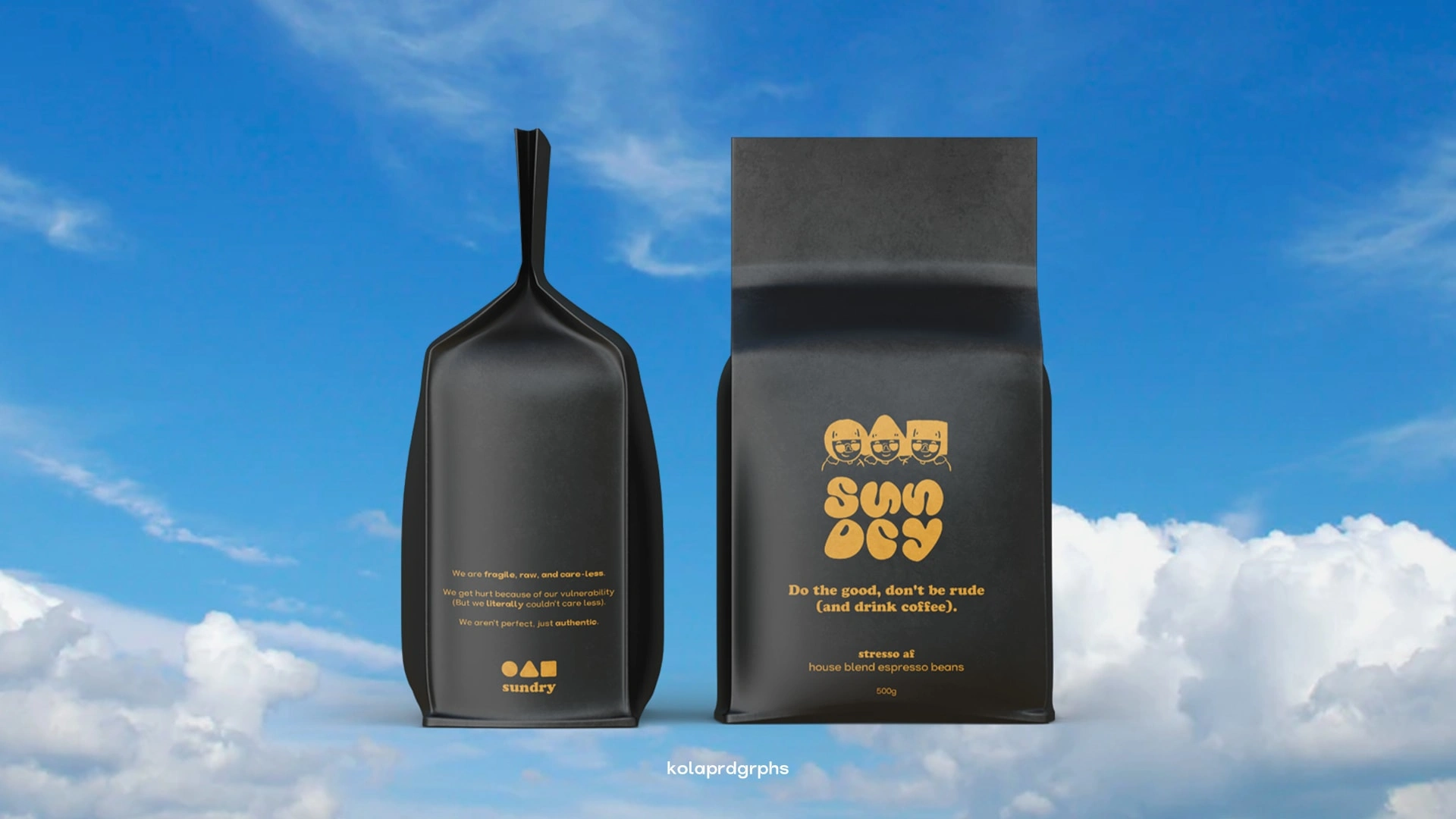
SUNDRY house blend coffee bean
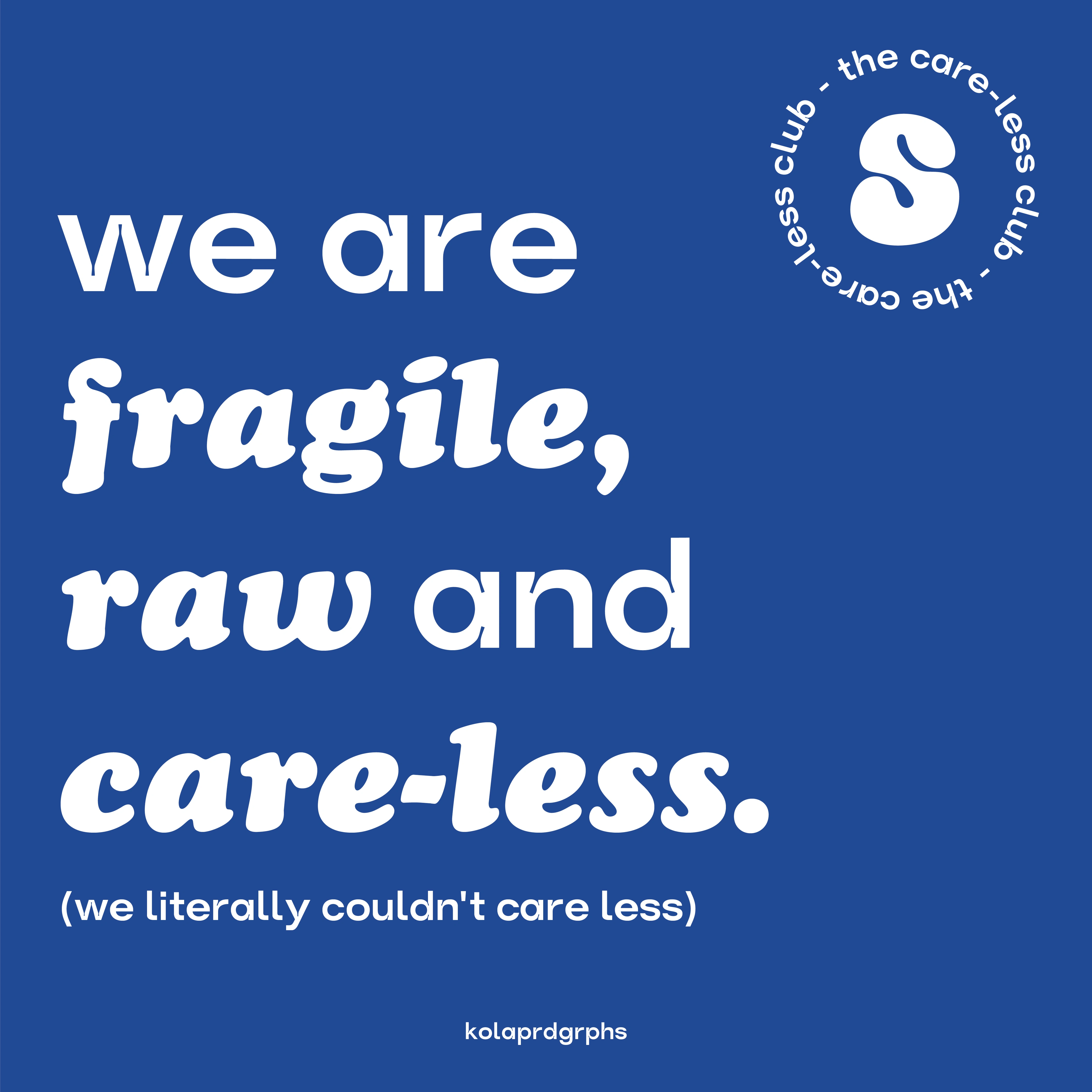
The 6-letter word, SUNDRY means “miscellaneous items not readily fit into standard categories” - here we are, standing strong as a community and go against the world, despite being “fragile, raw” and sometimes “careless” - because we literally couldn’t care less.
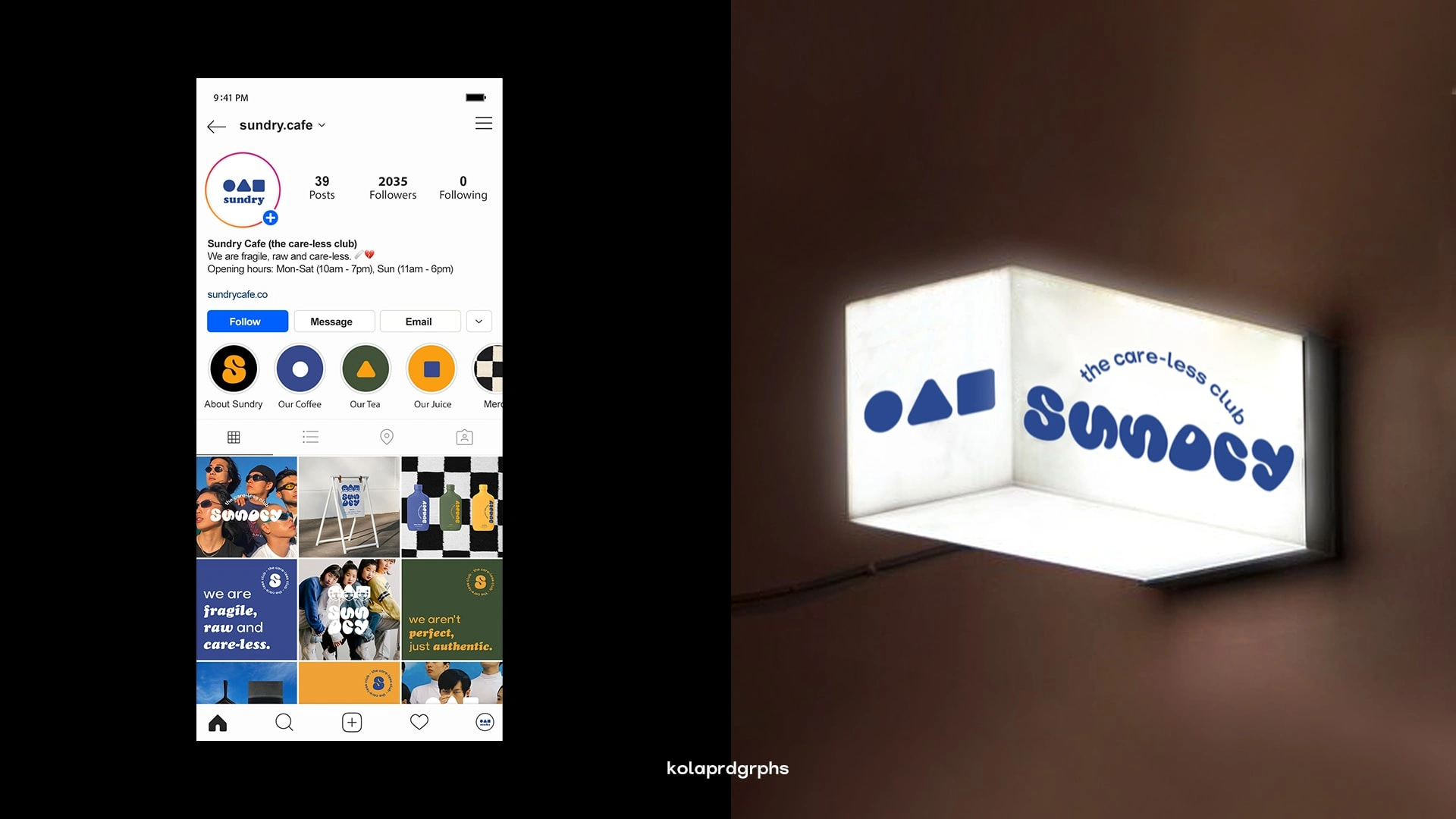
(L) SUNDRY social feed design (R) lightbox on the exterior of SUNDRY café
💭 Problem(s) encountered:
1) How to represent the idea of "too bold to fit the mould" using typography?
2) Should any illustrative elements be included in the identity design (how to convey the idea of community visually right away when they see the logo? Especially when capturing the attention of the Gen-Z audience where they have a short attention span)
📍 Solution(s):
1) To better represent SUNDRY as an identity that shouts "f social standards", customised word mark is created where the typeface is dynamic and chunky. The letterforms are on the other hand, arranged and stacked as triplets, for "two is a couple and three is a crowd", showing the café to be the perfect spot for hangouts.
2) The use of circle, triangle and square as a trio represents shapes that are "mismatched" and "uncategorised". Just like when customers with different qualities come together regardless of their differences and build their ideals as a diverse community.
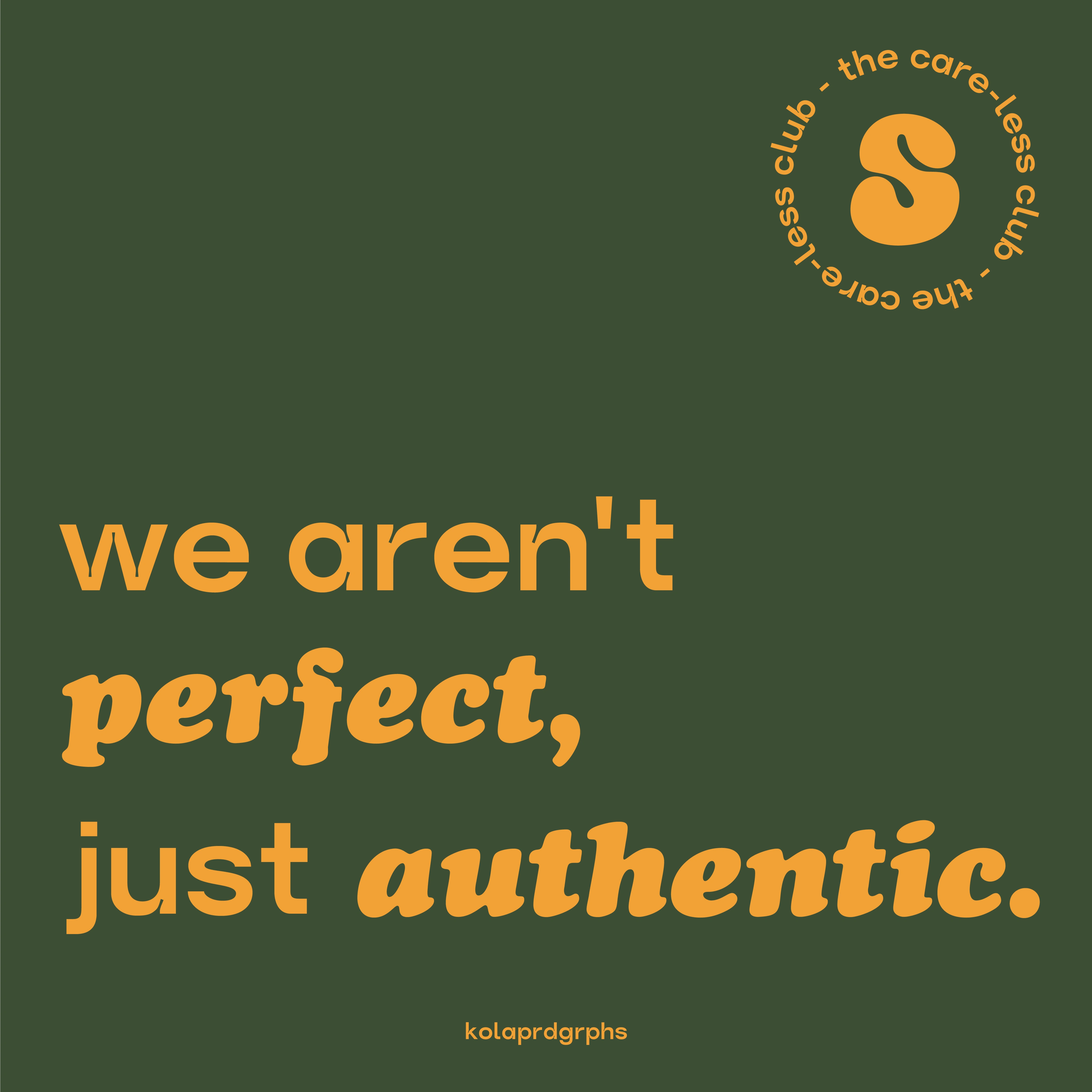
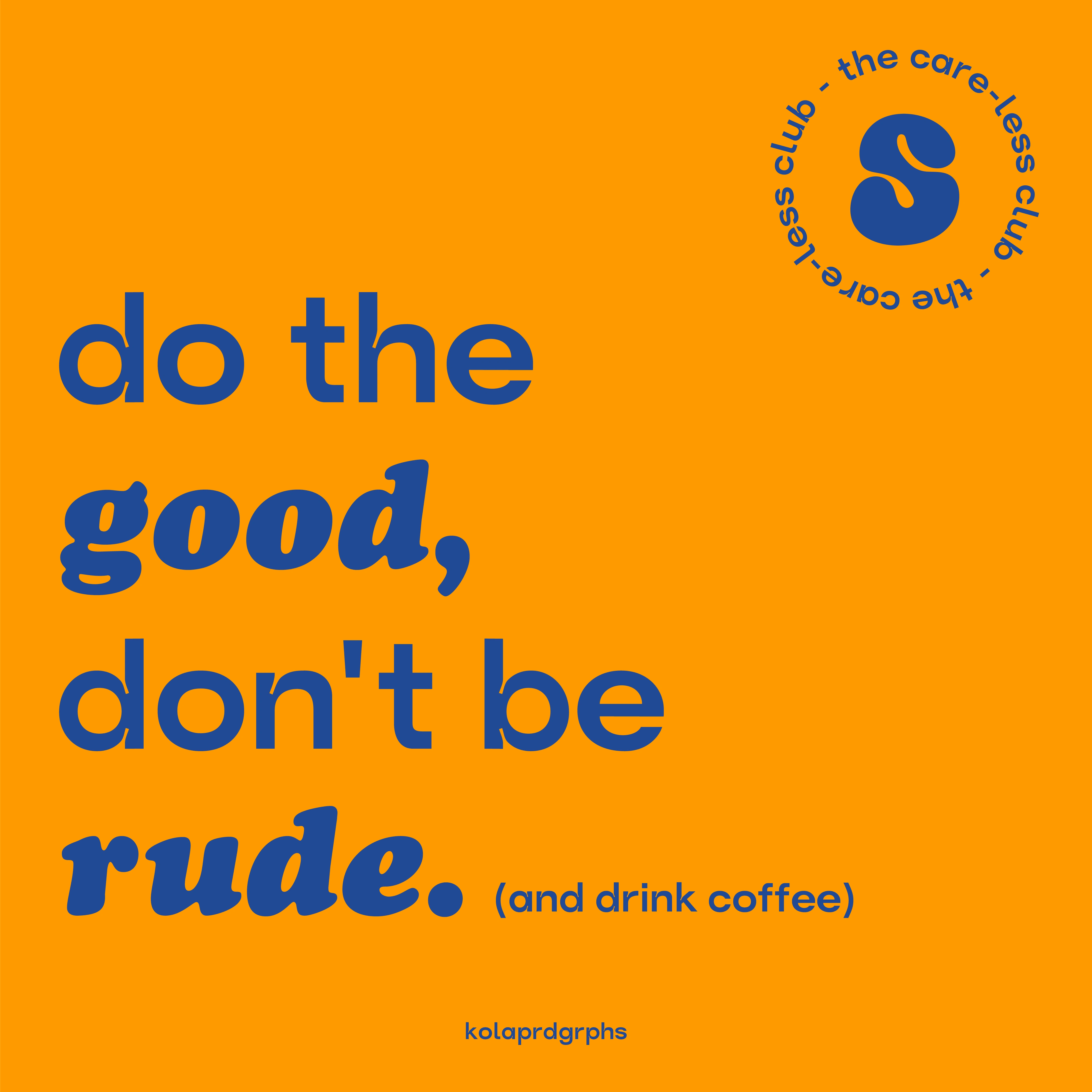
🏁 Highlights / taglines:
Like this project
Posted Nov 6, 2021
Likes
0
Views
25
Clients
kolaprdgrphs


