Gloscent | Gender Neutral Perfume Fragrance Brand
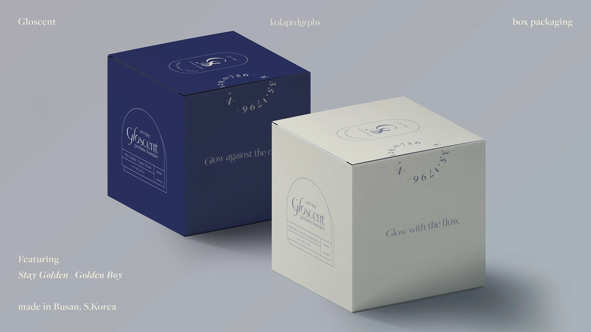
Gloscent (L) Stay Golden (R) Golden Boy box packaging
🕵🏻♀️ Target audience:
Gen-Z men between age 18-24 - those who are labelled as "too feminine for a man"
📁 Snippet of project:
Introducing GLOSCENT - a perfume foundry inspired by Golden Closet, made in Busan, S.Korea. Available in "Stay Golden" version and "Golden Boy" version, where one can celebrate their differences and be proud of their golden identities.
"Stay Golden" celebrates the hidden side of every individual, radiating depths of intricacy with the scent of gaiac wood - where one can glow against the current and stay different amongst the crowd, even behind the spotlight.
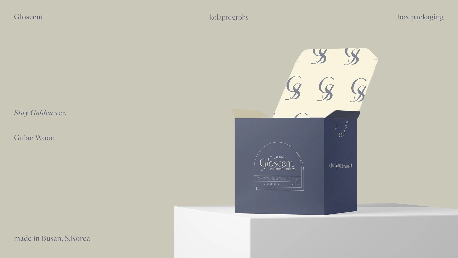
Stay Golden ver. box packaging
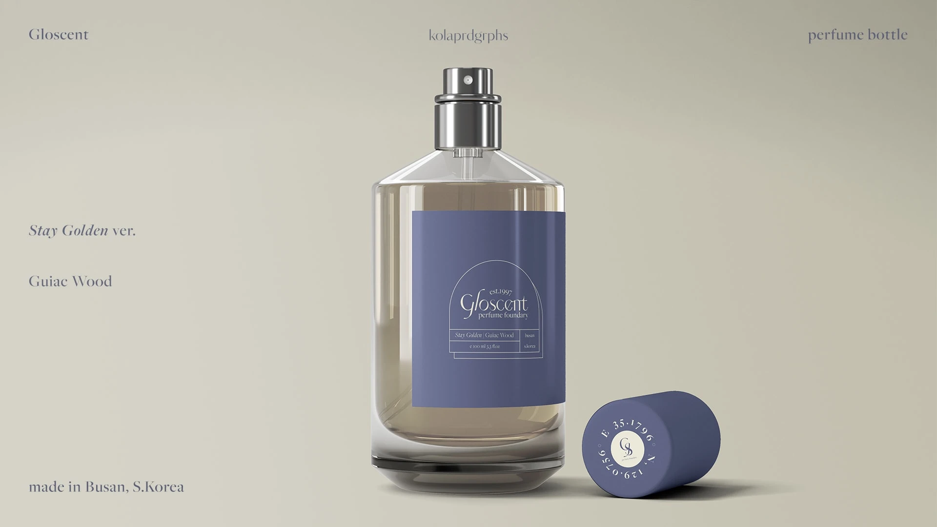
Stay Golden ver. perfume bottle design
"Golden Boy" embraces tenderness of every being, bringing together a fresh blend of jasmine and hyacinth with the scent of narcissus white flower. Stay free-spirited, wander to your heart’s content and glow with the flow.
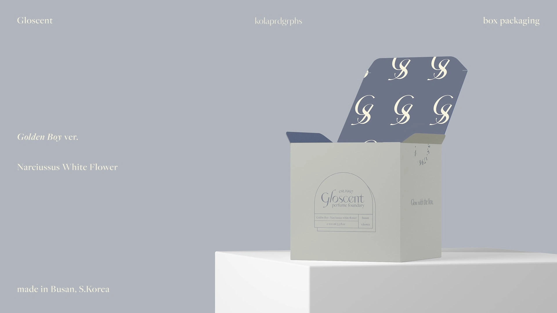
Golden Boy ver. box packaging
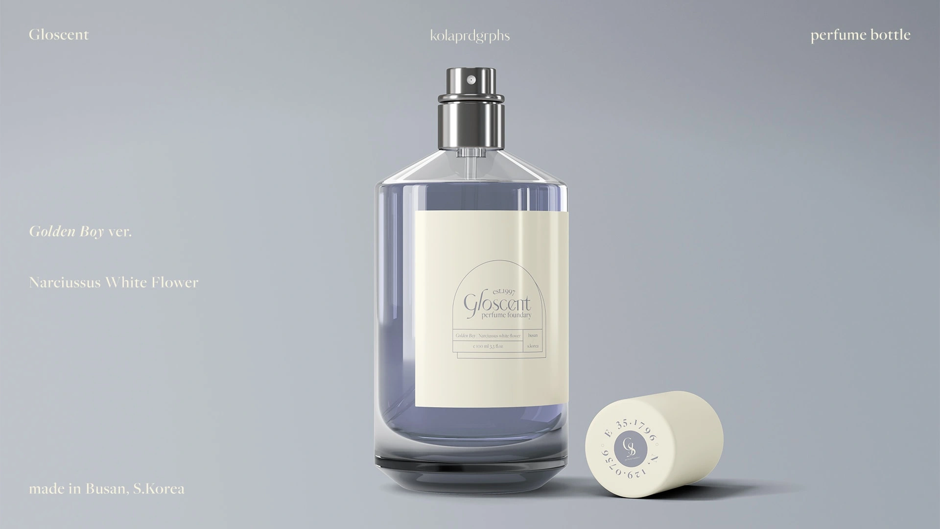
Golden Boy ver. perfume bottle design
💭 Problem(s) encountered:
How to avoid being too masculine in the colour representation / font choice (as seen in many common perfume campaigns targeted mainly to men)
2) How to balance between appealing to a male audience, while leaving some gentle touches towards the packaging
📍 Solution(s):
1a) softening the colour palette of navy with a shade of cream and deep lilac as the complementary tones
1b) customised serif type with curvatures in the strokes
2) leading towards a neutral direction using simple geometries. This gives an overall cleaner look without creating an aesthetic that could be biased towards any of the genders
🏁 Highlights / taglines:
"Glow against the current"
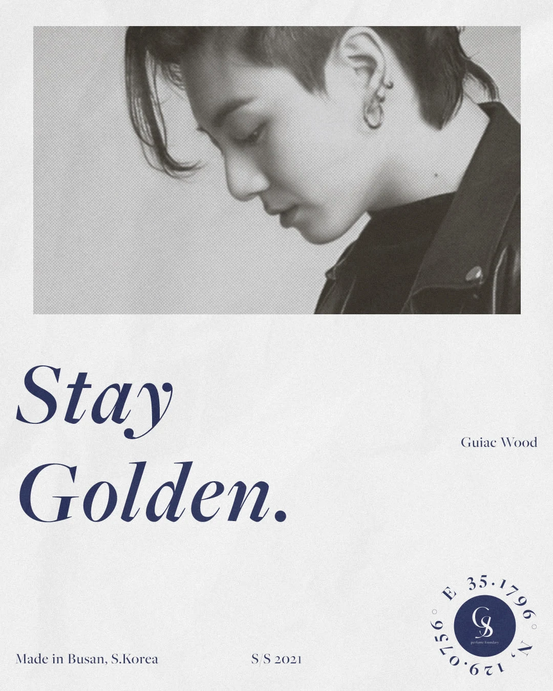
Stay Golden ver. promotional poster
"Glow with the flow"
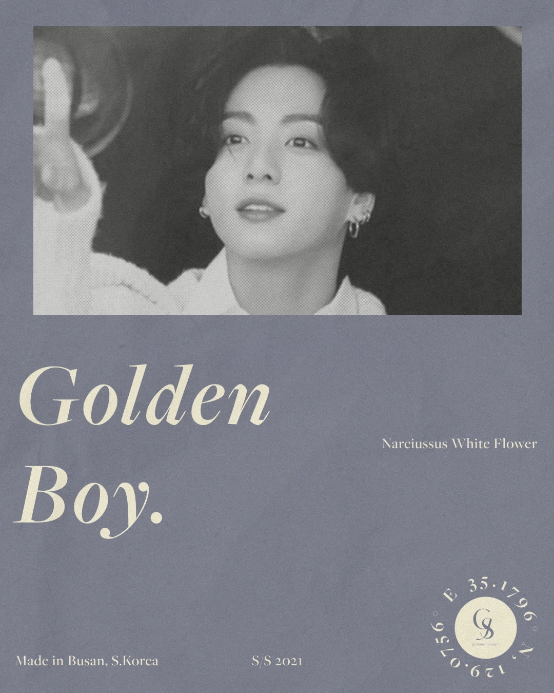
Golden Boy ver. promotional poster
Like this project
Posted Nov 6, 2021
Likes
0
Views
21
Clients
kolaprdgrphs


