Music Academy Website Redesign
Ramesh Reddy
This is self curious project I have taken up to enhance the web experience of a Music Academy website!
Below are the current website shots!
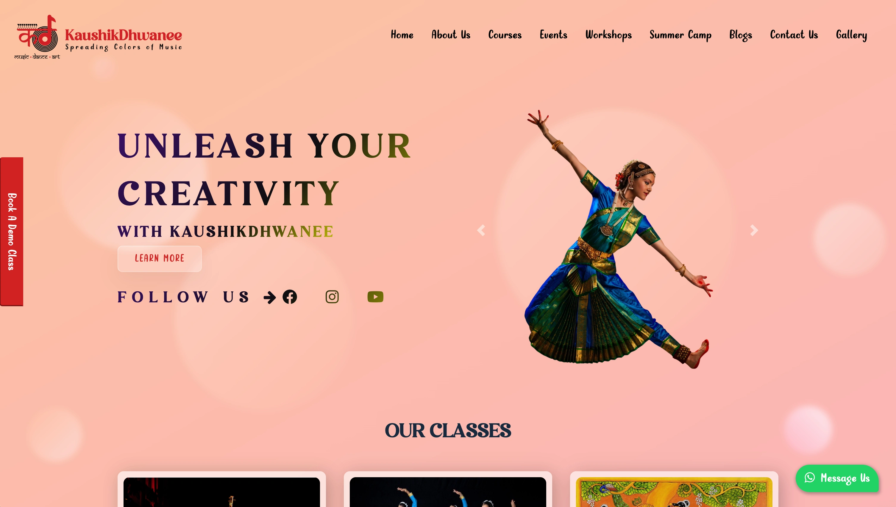
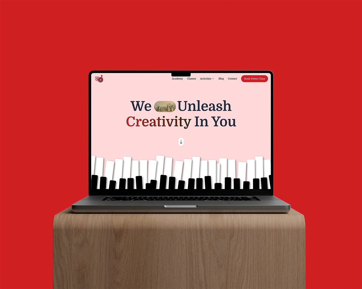
Current Hero Section & Navigation
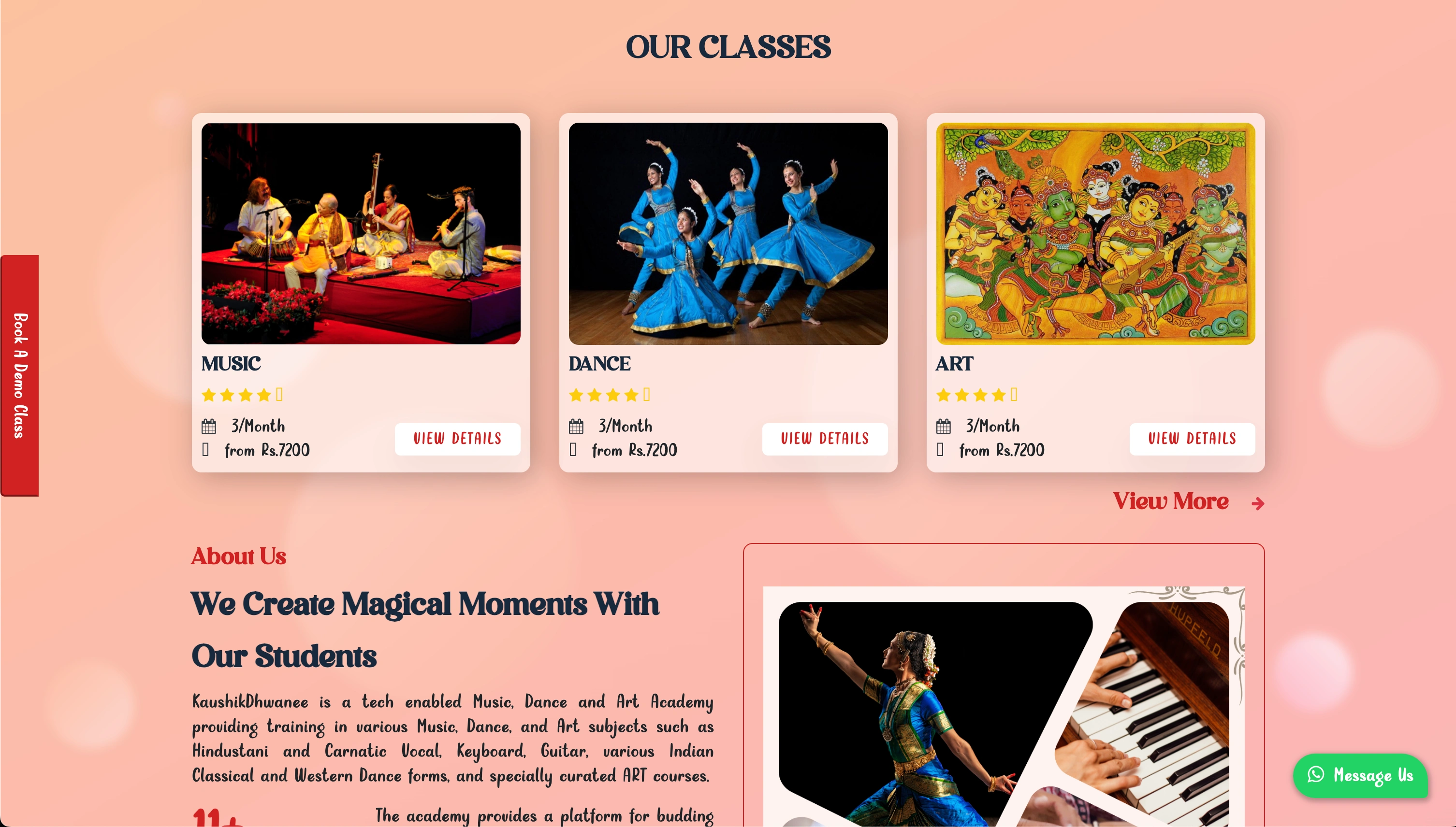
Current Classes Section
Problems Solved With Re-Design
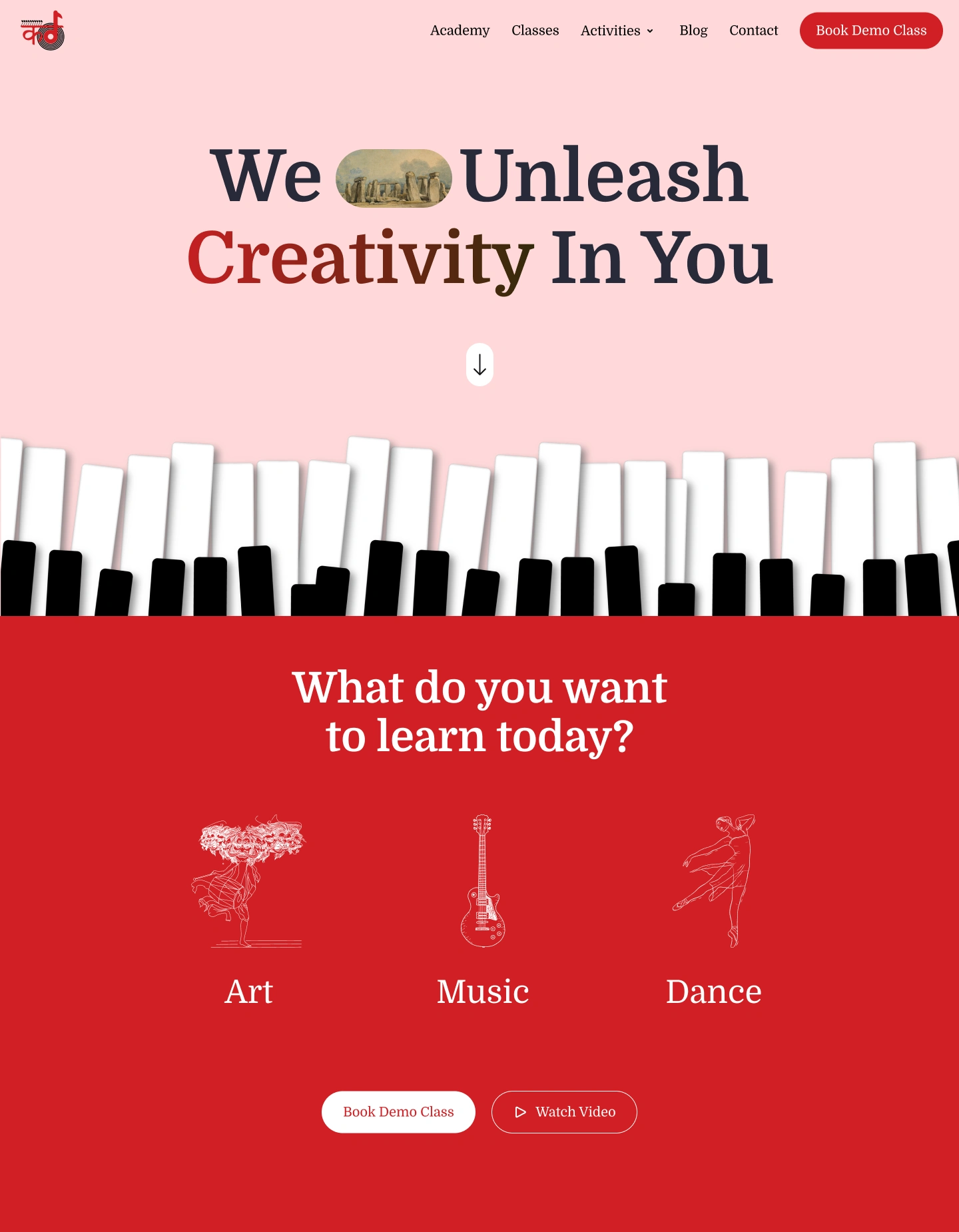
1. Hero Section Readability
Earlier: “Unleash Your Creativity” text had gradient + background dancer, which made it hard to read.
Now: Clean typography with high contrast, consistent black/red accent. Much easier to scan.
2. Clutter Reduction
Earlier: Overlapping visuals (gradient, dancer, CTA buttons, busy imagery).
Now: Simple, bold hero with piano key motif — gives focus and reduces noise.
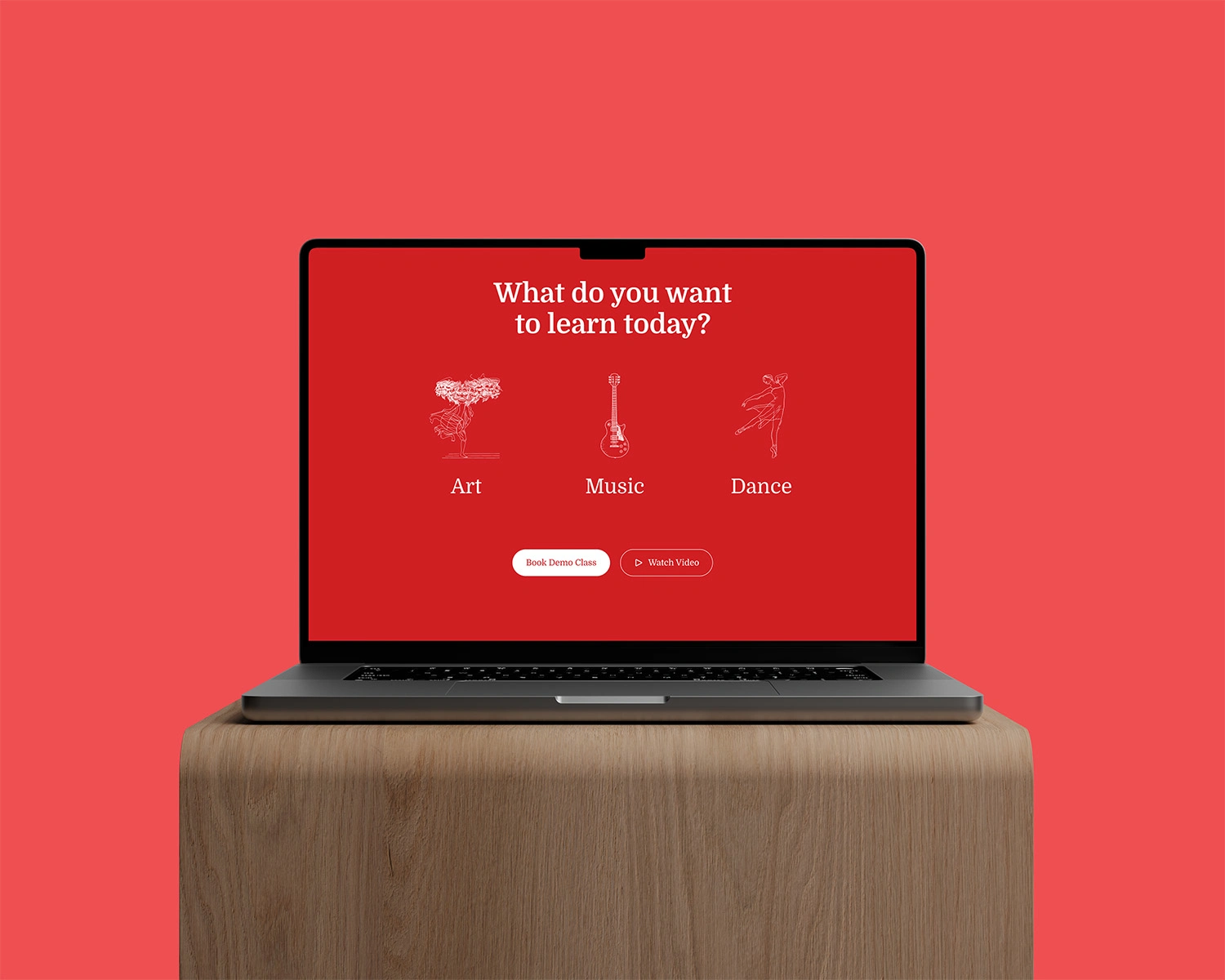
3. Stronger CTA Hierarchy
Earlier: Multiple CTAs (“Learn More,” “Follow Us,” “Book a Dance Class,” WhatsApp button) competing.
Now: One clear action in header (“Book Demo Class”) + reinforced again below with “Book Demo Class” + “Watch Video.”
4. Better Navigation Structure
Earlier: Many nav items (Academy, Classes, Events, Workshops, Summer Camp, Blogs, Gallery) overwhelming.
Now: Cleaner nav with Academy, Classes, Activities (dropdown), Blog, Contact → simplifies decision-making.
5. More Intuitive Learning Paths
Earlier: “Our Classes” cards looked a bit generic, crowded with shadows and buttons.
Now: “What do you want to learn today?” with clean illustrations → communicates choices (Art, Music, Dance) in a direct, engaging way.
6. Cohesive Visual Identity
Earlier: Mix of gradients, shadows, and decorative fonts that felt dated.
Now: Consistent red/white/black theme, flat minimal icons, clean font pairing → more modern and professional.
7. Emotional Resonance
Earlier: Hero dancer image was expressive but distracted from the message.
Now: Simpler design with piano keys + bold typography feels more confident, brand-led, and timeless.
Re-designed Classes Section With Clear CTA's Hierarchy
Overall Impact
Easier to read.
Clearer focus on booking a class.
More structured navigation.
Stronger first impression for credibility.
Better emotional engagement with clean metaphors (piano keys, sketches).
Hero Section & Our Classes Section Re-Design
Need help with your existing website or mobile app redesign? Let's collaborate & transform the user experience.! DM Now!
Like this project
Posted Aug 29, 2025
Redesigned a music academy's website for better readability and user engagement.
Likes
1
Views
3