User.com Redesign
About the client
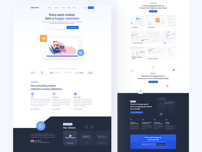
User.com is an all-in-one marketing automation platform aimed at boosting engagement and improving conversion. How? By using a single data source for your customers and reaching them through a wide range of communication channels: email, live chat, chatbot, push notifications, dynamic page content, and many more. And they are all available in one place!
The problem
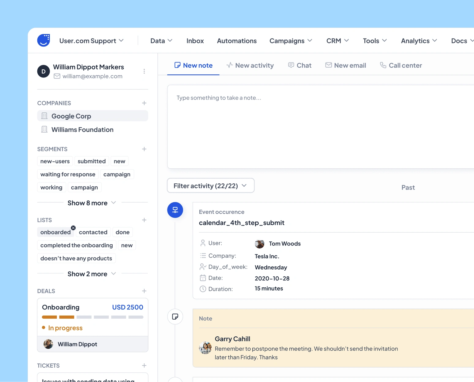
The current implementation is inconsistent and not up-to-date with the latest trends. Some modules have a different look and style, even though they use the same template. Additionally, some interactions are not intuitive.
Goals:
Establish a consistent design system based on an atomic approach
Stay current with the latest UI trends
Address any accessibility issues, particularly with regard to colors
Consistency between modules that use the same templates
Improve readability
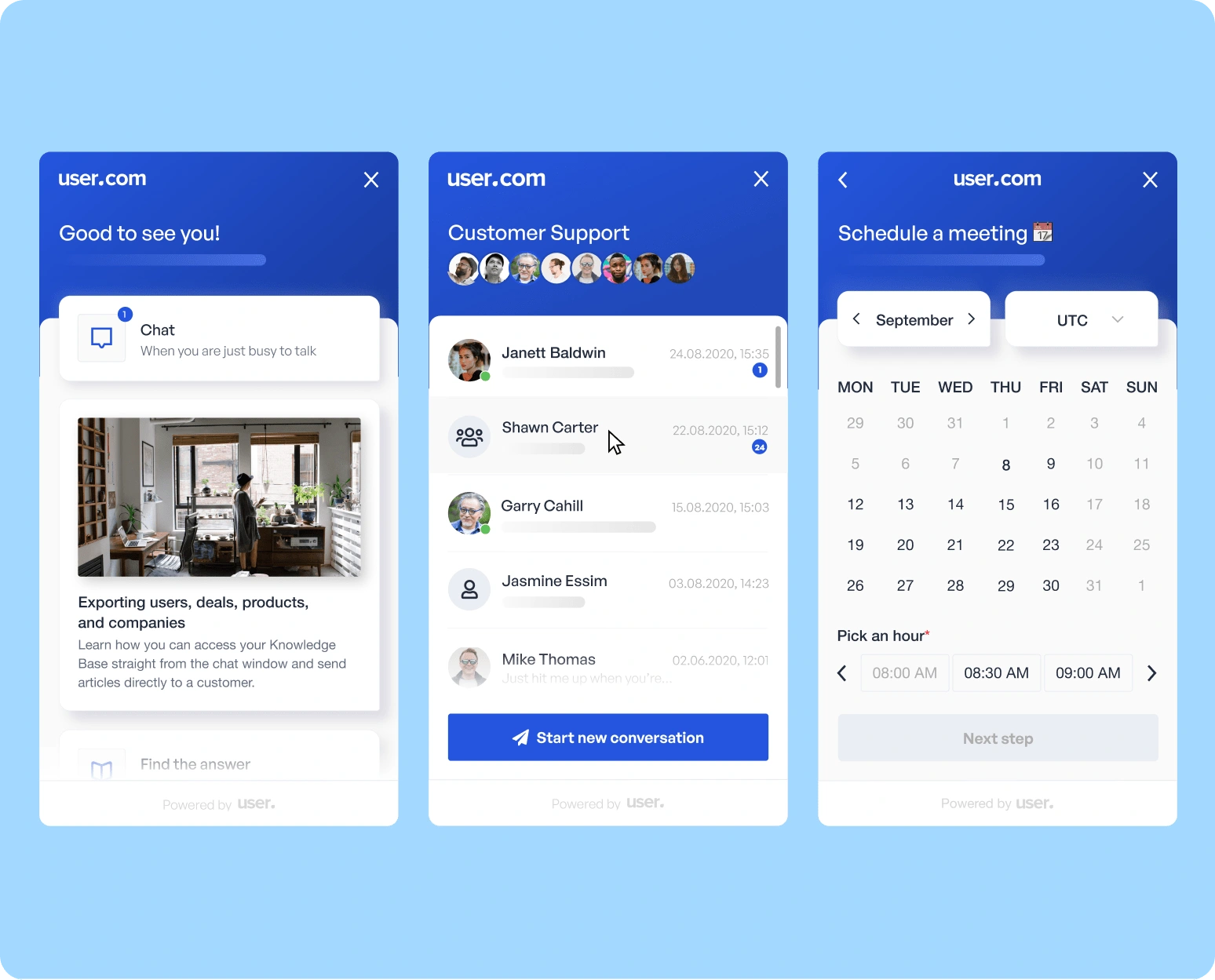
The process
Kick off call
As we had worked together before, I was already familiar with the background and all tech-related details related to the app's functionalities. We began with a kick-off call to establish the approach for redesigning the entire app. We divided all app modules into separate tasks and decided to meet weekly or bi-weekly, depending on our needs.
Also, since it was my freelance work we made some decision regarding the availability. I was able to spend 20-30hrs per month on this project.
Environment setup
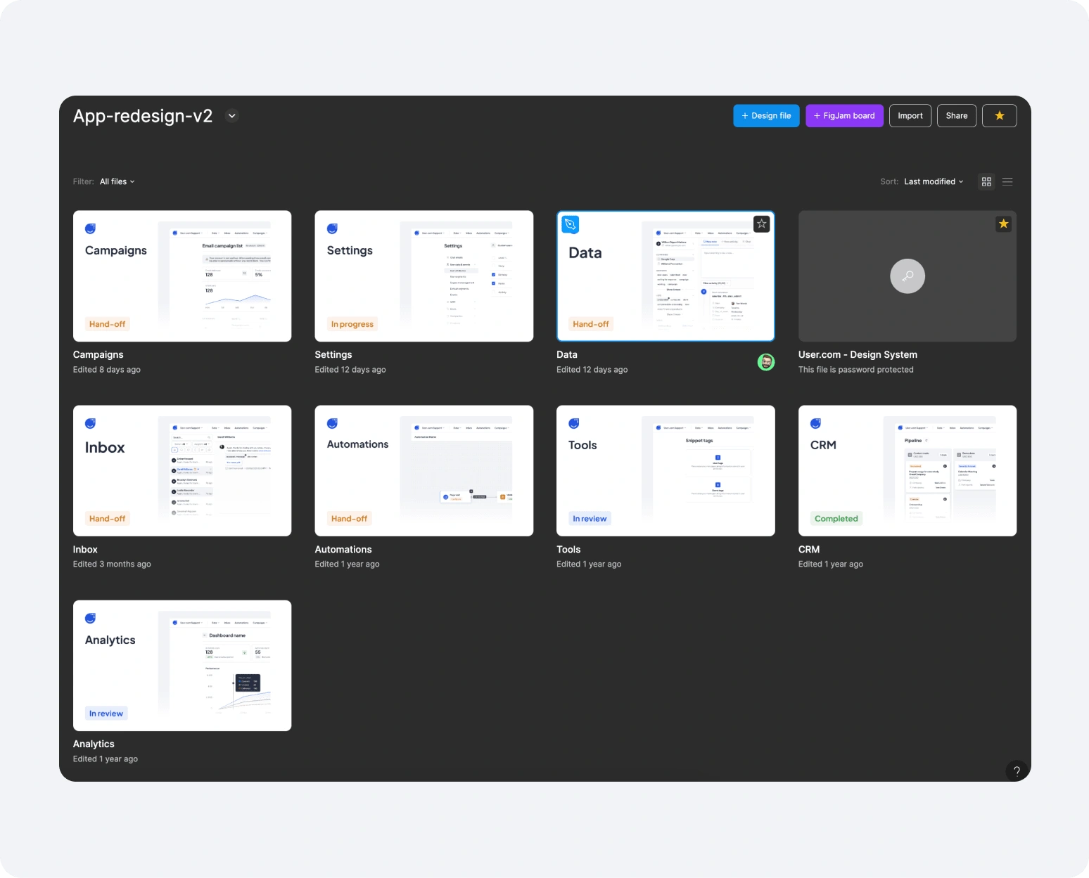
I began my design work by setting up the Figma environment. As the app comprises many modules, I decided to create a dedicated file for the core design system. Additionally, I created separate files for each module, such as Conversations, Automations, Settings, and Tools.
In addition, I have planned a strategy for creating components in the future. I will keep all repeatable components under the core design system file. However, when it comes to modules, each one will have a separate page for module-related components (such as the composer for conversations). This is because these components are only used within their respective modules.
Moodboarding & UI direction
To establish the UI direction, we created one screen with different UI approaches.
To start, I created a moodboard with screenshots from different apps. Here is a list of resources I used:
Each approach used different fonts, colors, and other stylistic elements.
Once we chose a direction, I created components based on the UI direction screen to use in future modules.
Modules design
Development phase start
Handoff & Documentation
Like this project
Posted Apr 17, 2024
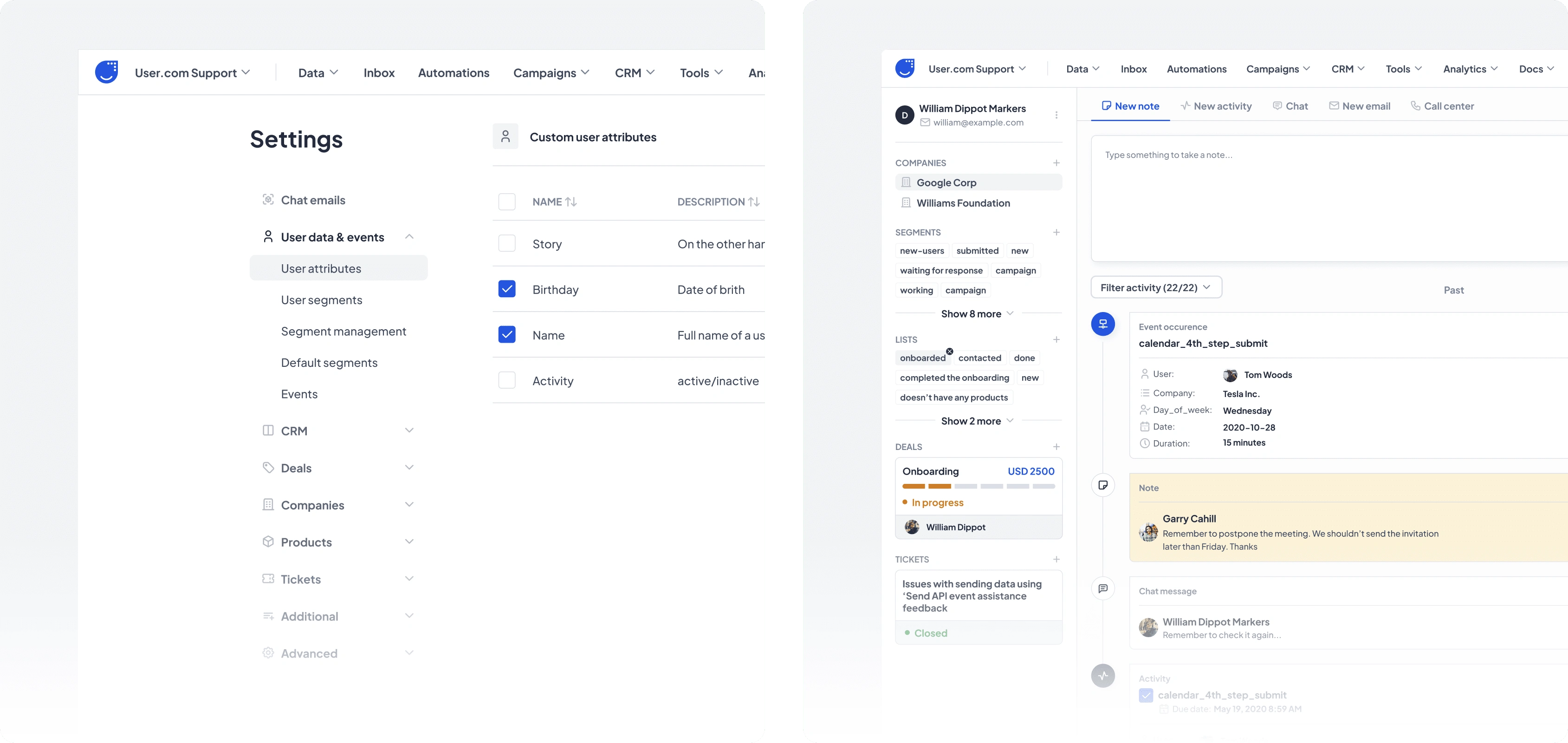
Complete redesign of marketing automation platform. Product Design, Design Systems, Documentation and Hand-Off.
