Cocoa Bliss – Packaging & Visual Identity
Overview
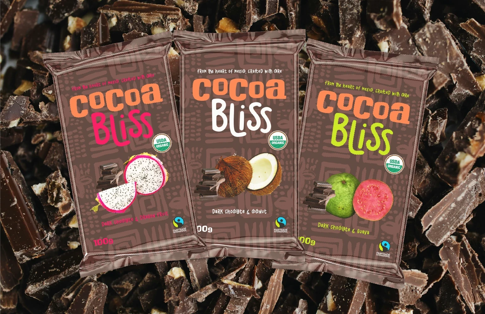
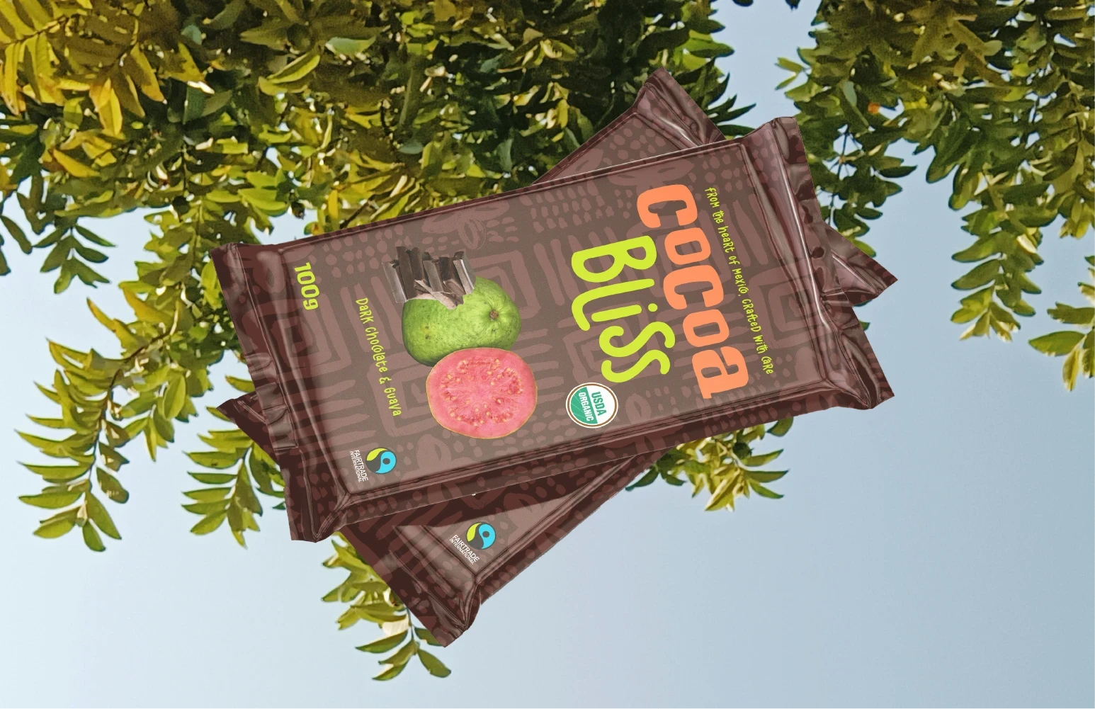
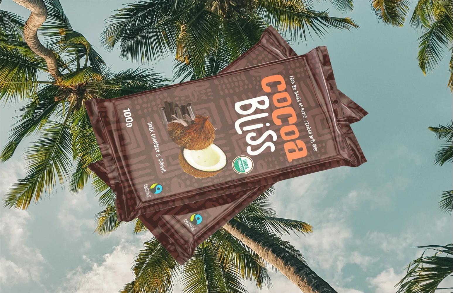
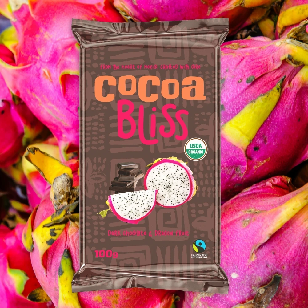
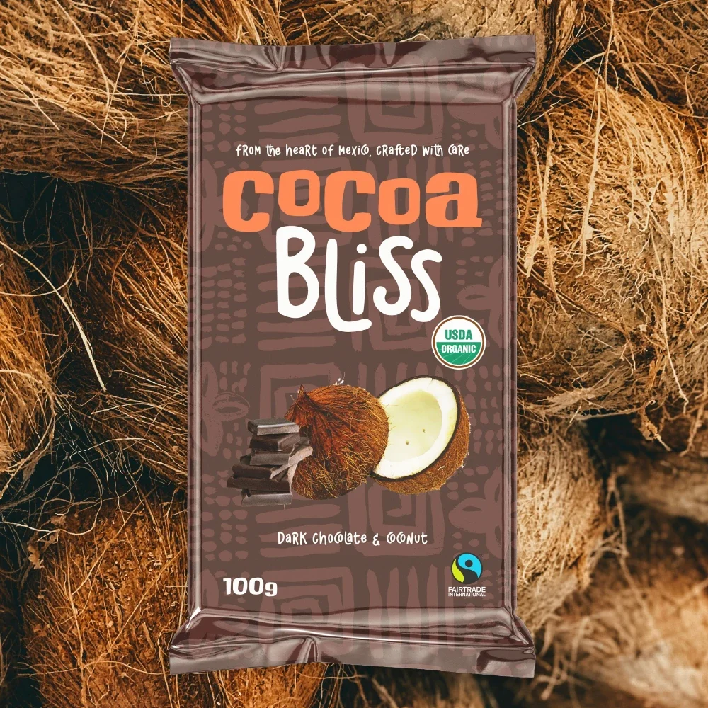
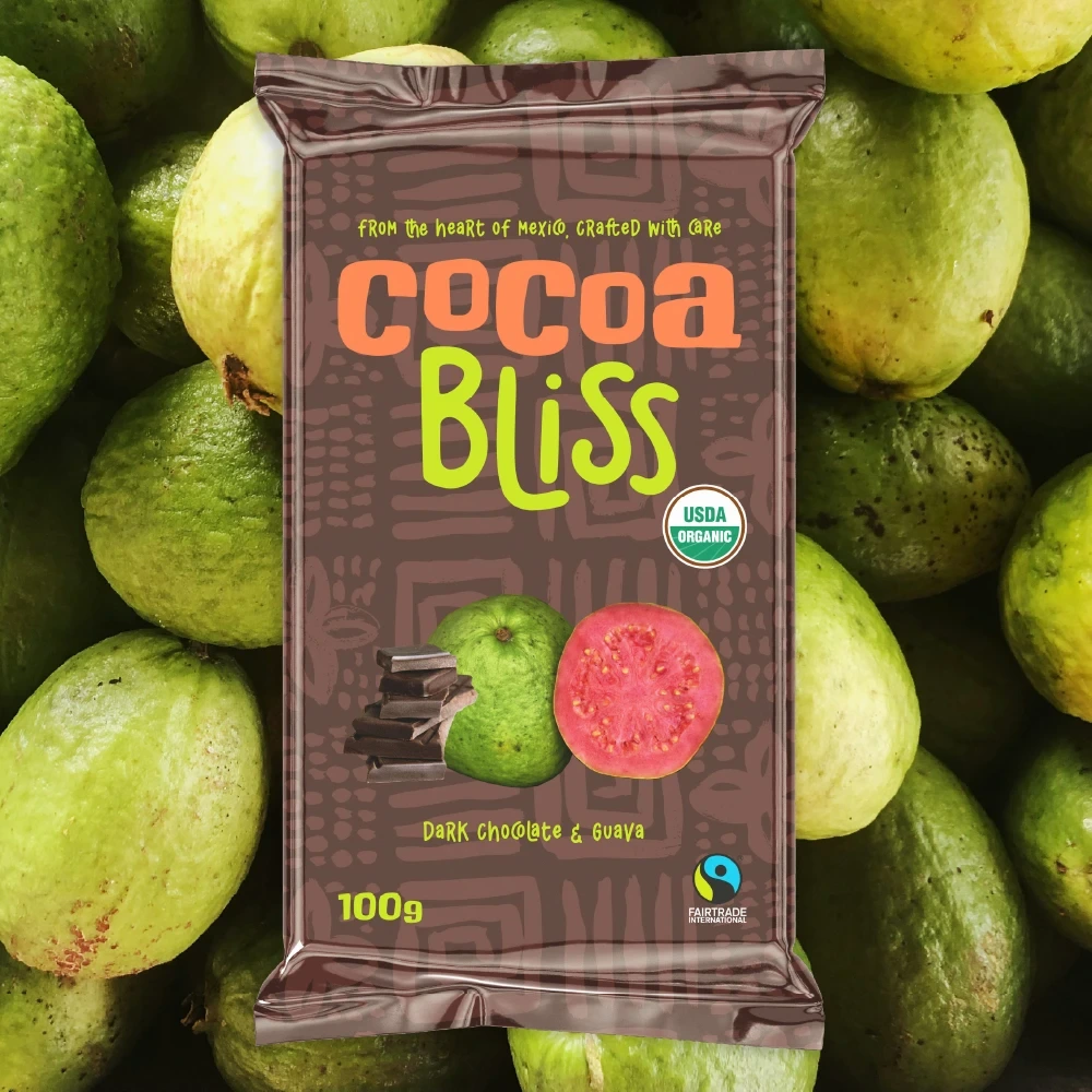
Cocoa Bliss is a Mexican-American chocolate brand bringing organic, ethically sourced cacao from southern Mexico to the U.S. market. With bold flavours and rich cultural roots, Cocoa Bliss introduces a vibrant collection of dark chocolate bars infused with Mexican-grown fruits: Guava, Coconut, and Dragon Fruit.
Objective
Create a fun, vibrant, and culturally resonant brand identity and packaging design that communicates quality, authenticity, and ethical sourcing—while appealing to both adults and children in the U.S. chocolate market.
My Role
Brand identity designer
Logo design
Packaging design (3 product variants)
Visual storytelling rooted in Mexican culture
The Design Concept
Logo Design
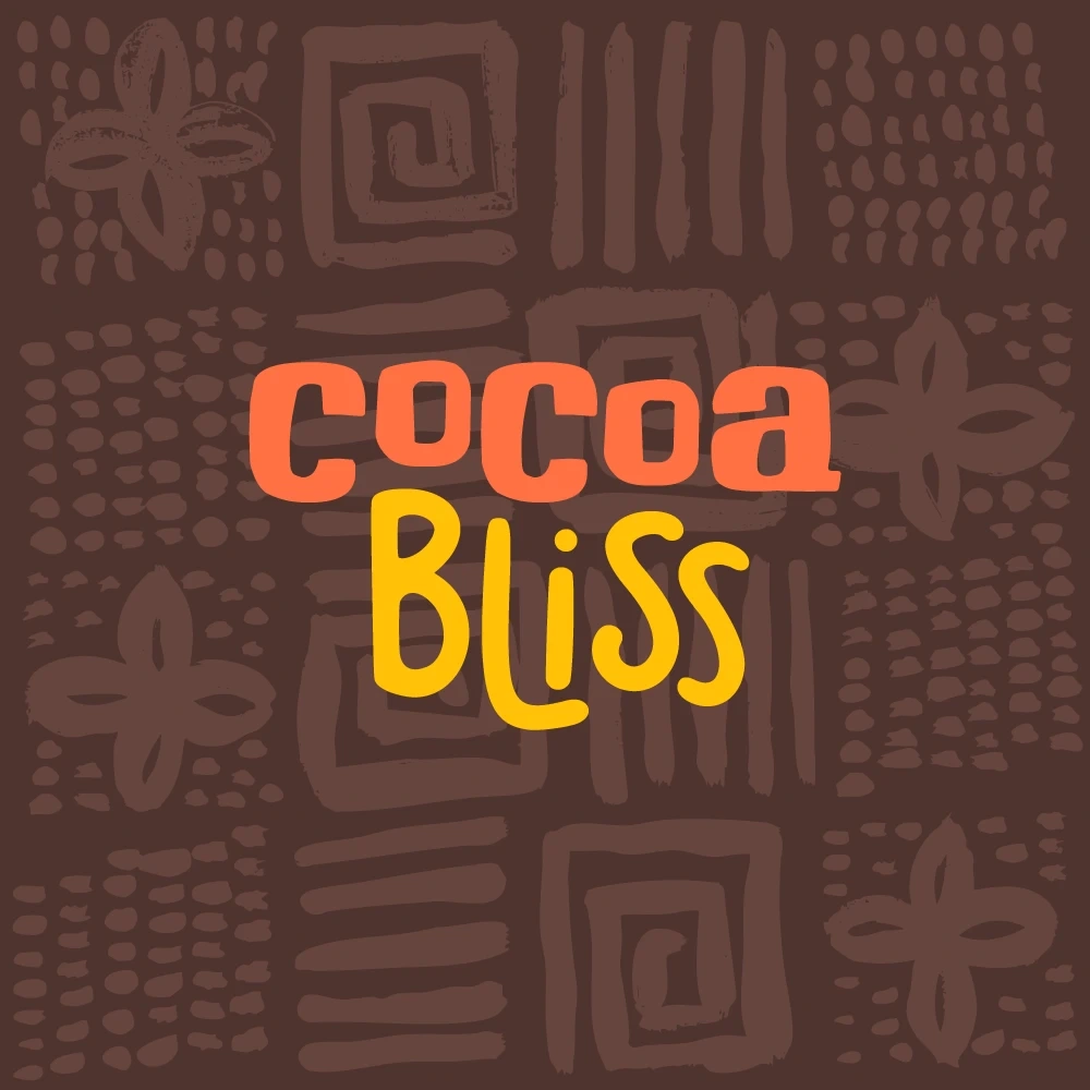
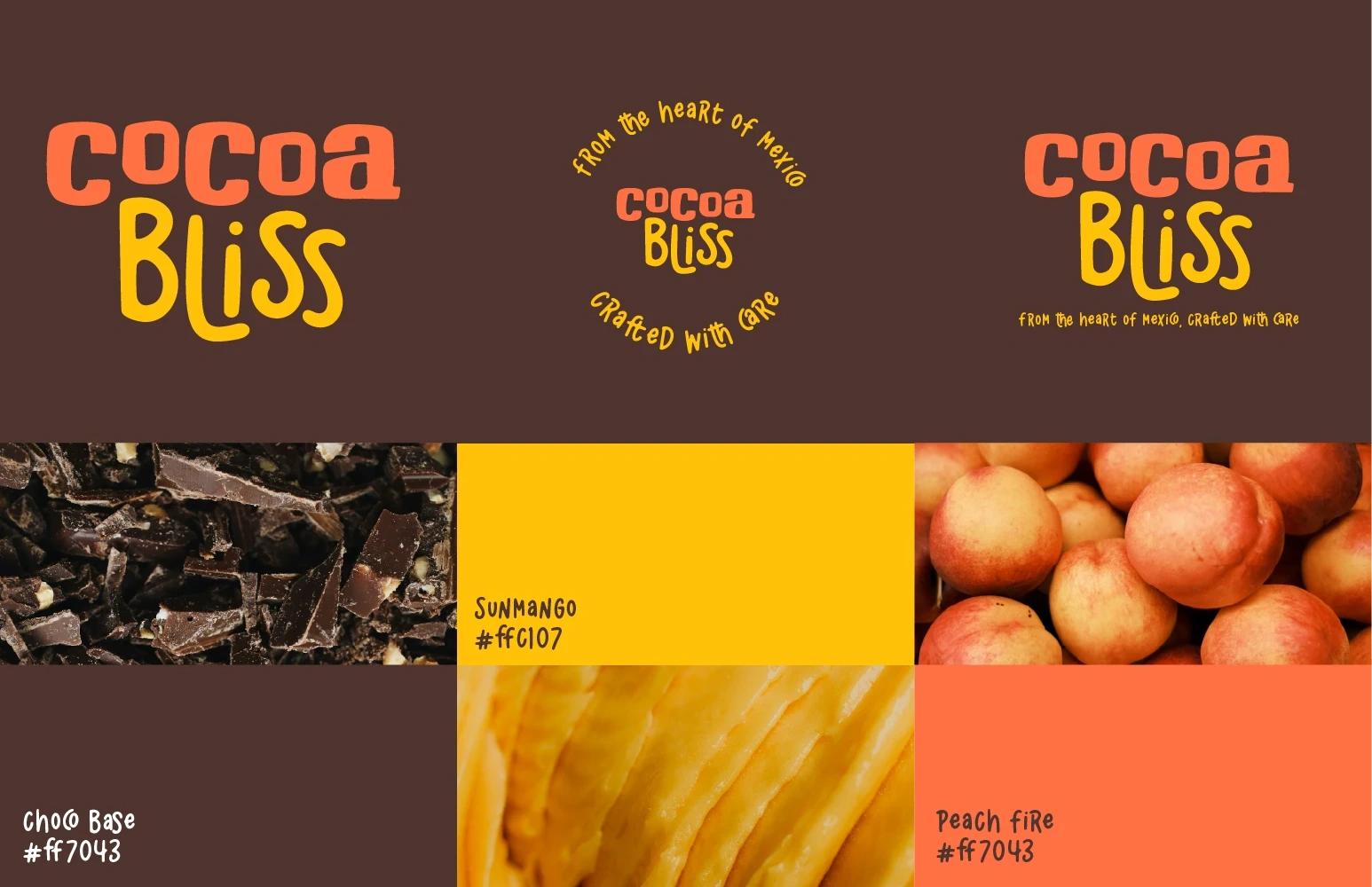
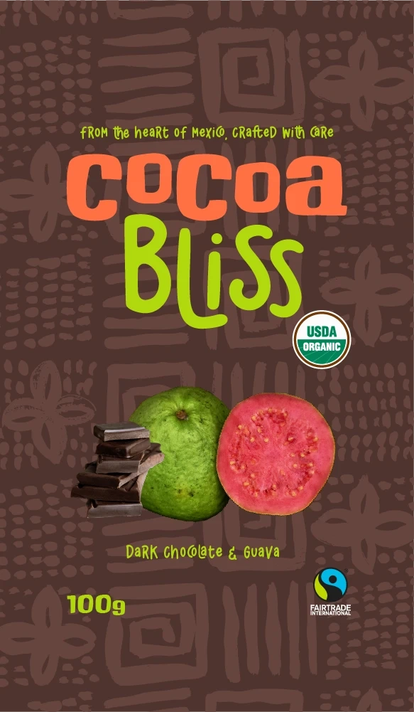
The Cocoa Bliss logo evokes warmth and bold flavour through expressive typography and a tropical-inspired colour palette. The word “Cocoa” is set in the typeface Chunk, using the colour Peach Fire (#FF7043), inspired by ripe peaches and chocolatey warmth. The word “Bliss” is set in California Bites, using the colour SunMango (#FFC107), which draws inspiration from ripe mango pulp and the tropical Mexican sun.
The background of the packaging and some accent elements use the deep cacao tone ChocoPace (#4E342E), a rich earthy brown inspired by raw cacao beans.
These colours—ChocoPace (#4E342E) for the base, Peach Fire (#FF7043) for the word “Cocoa”, and SunMango (#FFC107) for the word “Bliss”—were chosen to reflect the product’s natural ingredients and tropical flavour roots.
Packaging Design
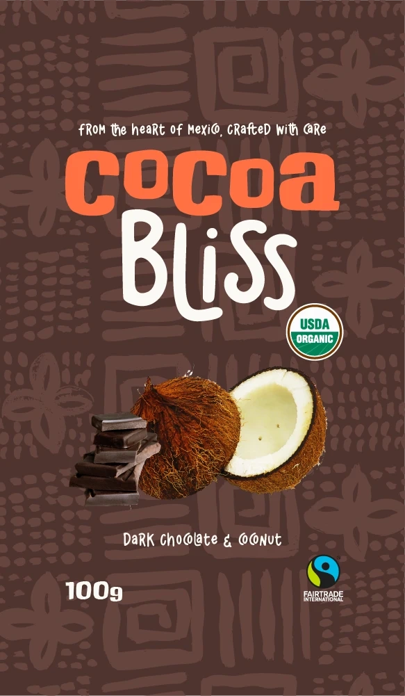
Each chocolate bar features:
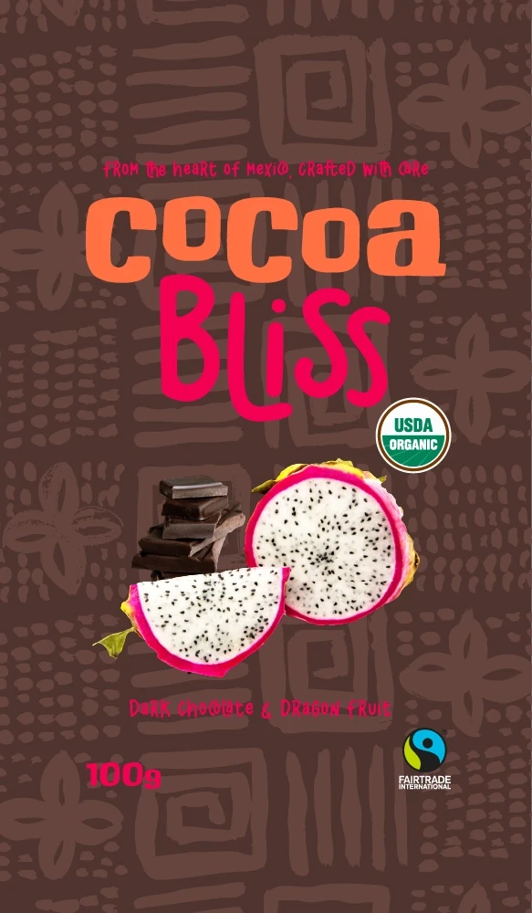
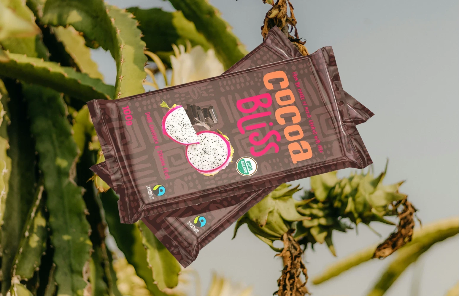
Illustrated fruits to clearly represent each flavour: guava, coconut, and dragon fruit
Organic and ethically sourced labels to communicate the brand’s values
Cultural background patterns, inspired by traditional handcrafted symbols from southern Mexico (especially regions like Oaxaca and Chiapas, where cacao is commonly grown)
A vibrant, colourful aesthetic, reflective of Mexico’s artisanal markets and festive design culture
The goal was to make the packaging feel joyful, premium, and culturally authentic—something that could proudly stand out on a U.S. shelf while honouring its Mexican roots.
The Process
Discovery & Research
I researched competitors in both the Mexican and U.S. markets, studied storytelling strategies in ethical brands, and reviewed visual elements tied to Mexican culture and cacao farming.
Like this project
Posted Jun 3, 2025
Graphic Design, Illustration, Photography, Adobe Photoshop, Adobe Illustrator, Adobe Photoshop Lightroom
Likes
0
Views
12
Timeline
May 6, 2025 - Jun 1, 2025


