Greenette Garden CentreGreenette celebrates the beauty of plants

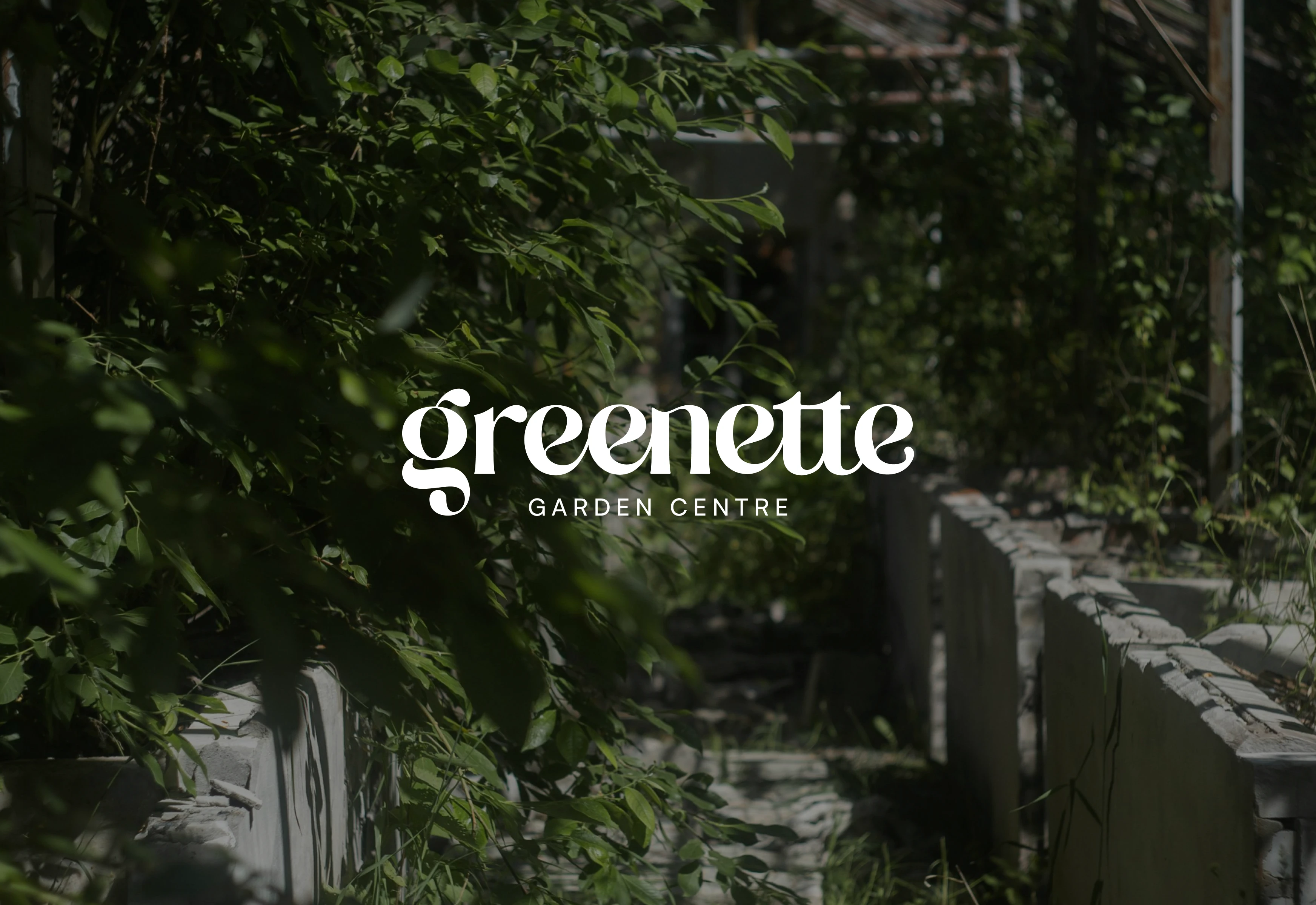
Greenette celebrates the beauty of plants and their ability to bring life into spaces. This branding project blends soft, natural tones with a clean, elegant typography style, reflecting the brand’s mission to inspire plant lovers. The visuals combine lush greenery with a calm yet inviting aesthetic, creating a serene connection between people and nature.
Through a harmonious palette of green hues and earthy accents, Greenette’s identity captures its essence: a haven where plant lovers bloom. From a minimalist logotype to a modern, leafy atmosphere, this design tells the story of Greenette as more than a garden centre—it's a lifestyle.
Branding specifications
The typography for Greenette plays a pivotal role in establishing its brand personality. The custom logotype features an elegant serif typeface with playful curves and unique details, such as the extended flourishes on certain letters, giving it an organic, nature-inspired feel. The font choice evokes sophistication and warmth, perfectly aligning with the brand's focus on nature and nurturing growth.
The color palette is a well-thought-out combination of muted greens, soft mint tones, and earthy browns, which resonate with the brand's garden theme. These hues convey a sense of freshness, calmness, and connection to nature. The dark green used as a primary background color contrasts beautifully with lighter shades, ensuring clarity and elegance in every design application.
The layout incorporates plenty of white space, allowing the elements—such as typography, images, and colors—to breathe. This clean approach emphasizes the lush greenery showcased in the photographs, making plants the focal point of the design. The combination of imagery with textural backgrounds adds depth and visual interest, creating a balanced and aesthetically pleasing composition.
The visuals feature plants in natural, cozy settings, often paired with soft lighting and warm textures. This choice adds an approachable, relatable aspect to the brand, inviting plant lovers to envision these greens in their own homes. The imagery also includes subtle lifestyle elements, like a cat sitting among the plants, fostering a personal and welcoming vibe.
Want to collaborate with me? Drop me a message here: https://contra.com/antomarino or @bloomthebrand_co at instagram https://www.instagram.com/bloomthebrand_co/
Like this project
Posted Nov 19, 2024
Greenette celebrates the beauty of plants and their ability to bring life into spaces. This branding project blends soft, natural and clean tones.


