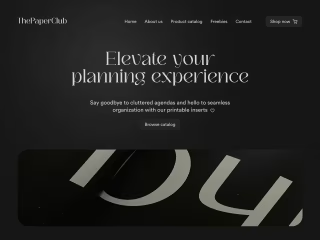
Byte Repair
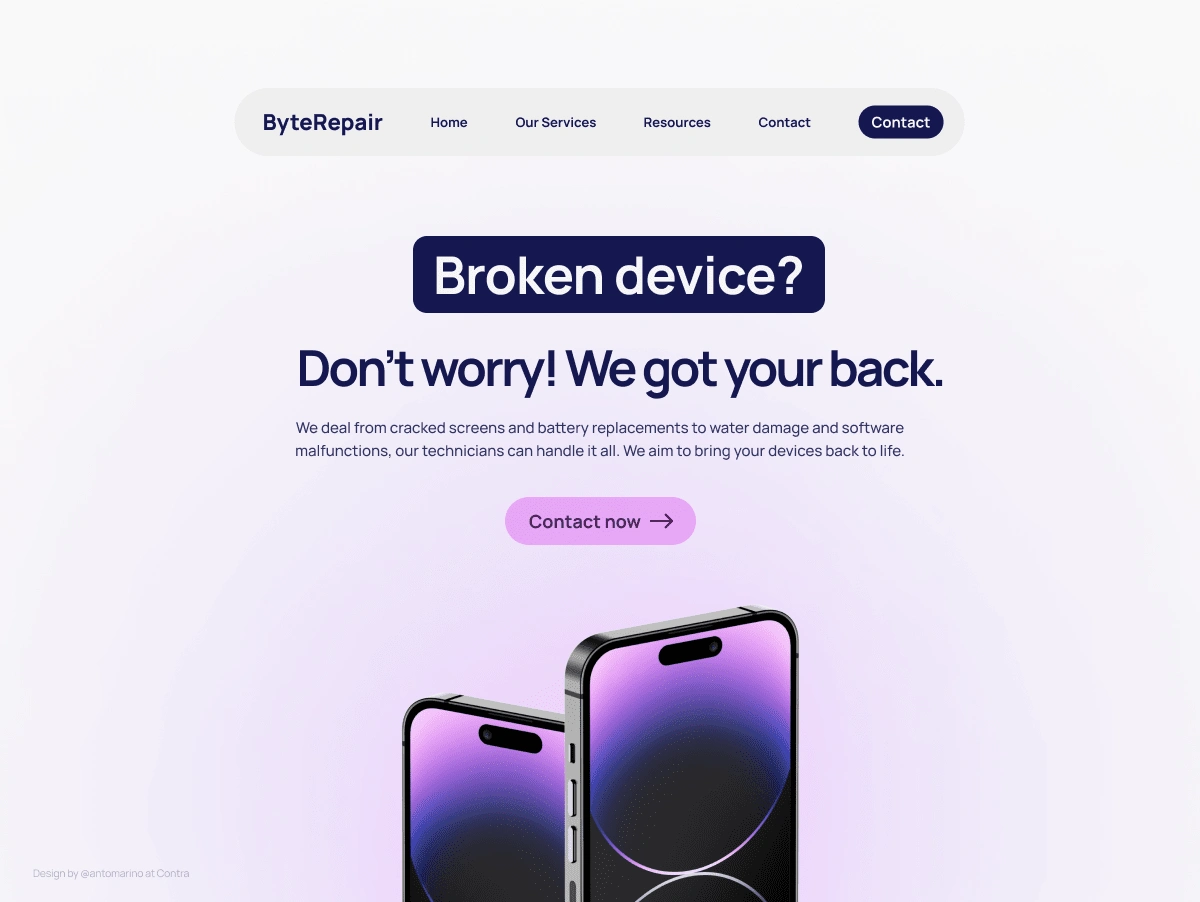
Typography: The landing page uses a sans-serif font for the headlines and body copy. This font is clear and easy to read, and it matches the modern and minimalist style of the landing page.
Color: The landing page uses a limited color palette of black, white, and blue. This color palette is calming and professional, and it helps to focus the visitor's attention on the content of the landing page.
Images: The landing page uses a large hero image of a broken device to grab the visitor's attention. The image is also used to illustrate the services that ByteRepair offers.
Layout: The landing page has a clear and concise layout. The content is organized in a way that is easy to read and understand.
Call to action: The landing page features a clear and prominent call to action button that encourages the visitor to contact ByteRepair.
(Passion project, not real)
Like this project
Posted Aug 15, 2023
The landing page for ByteRepair is designed to be clear, concise, and easy to use. It uses a modern and minimalist style with a limited color palette.
Likes
0
Views
66


