
Contact Page – Conversion-Focused & User-Centered
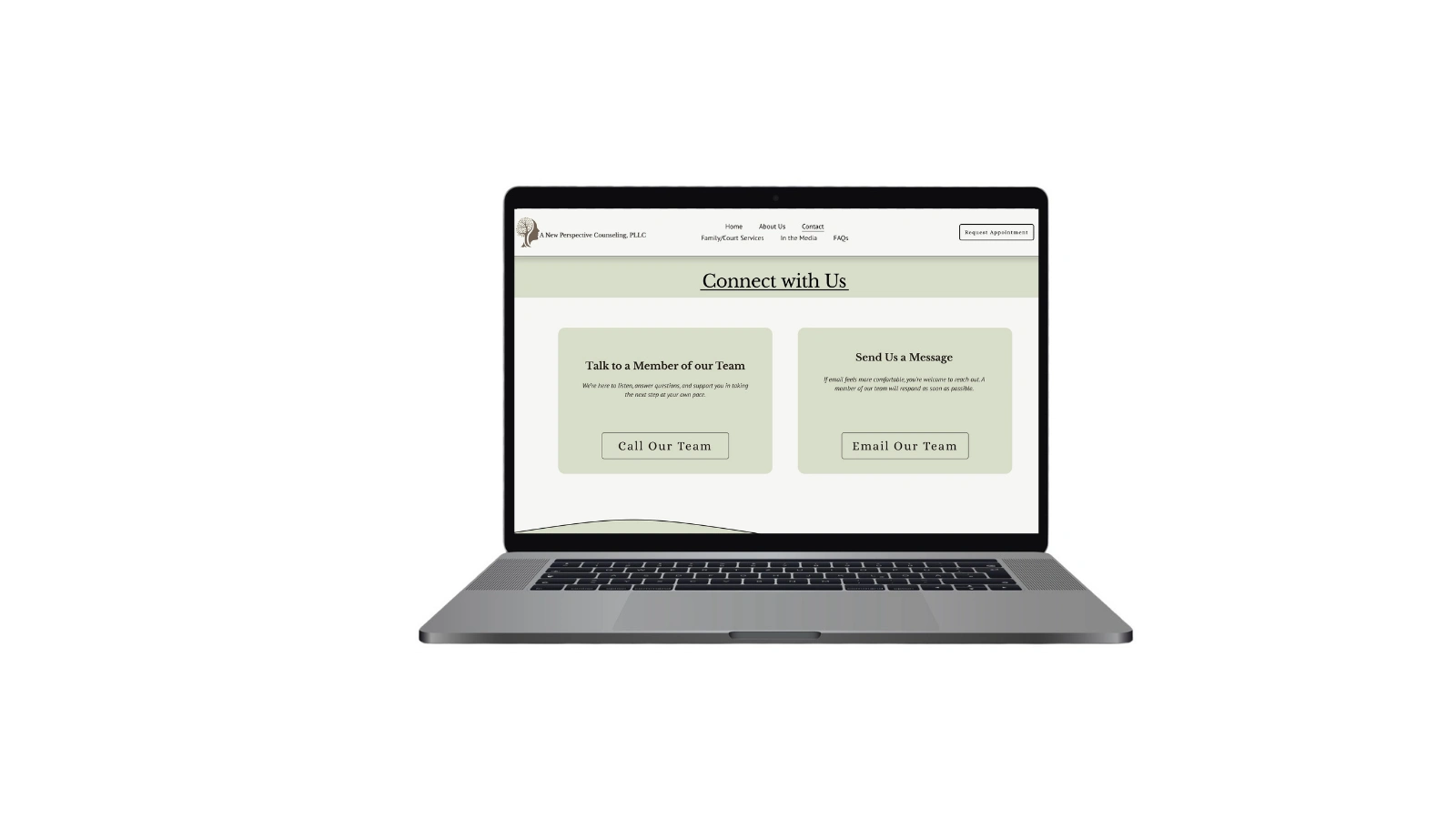
This contact page was designed with clarity and ease of action in mind. The goal was to reduce friction and make it simple for users to reach out in the way that feels most comfortable to them.
The layout prioritizes two clear options: calling directly or sending a message. By presenting both paths prominently, users can quickly choose their preferred method without navigating away or searching for contact information.
Key considerations:
• Clear call-to-action hierarchy
• Minimal cognitive load
• Mobile-responsive structure
• Warm, trust-building visual design
• Accessibility and readability focus
The result is a streamlined contact experience that supports higher engagement and smoother client conversion.
0 likes · 0 views · Feb 28, 2026
Contact Page – Conversion-Focused & User-Centered This contact page was designed with clarity and ease of action in mind. The goal was to reduce friction and...


