Applytrack Website: Inspired by Huly
Abdulsamad Oseni
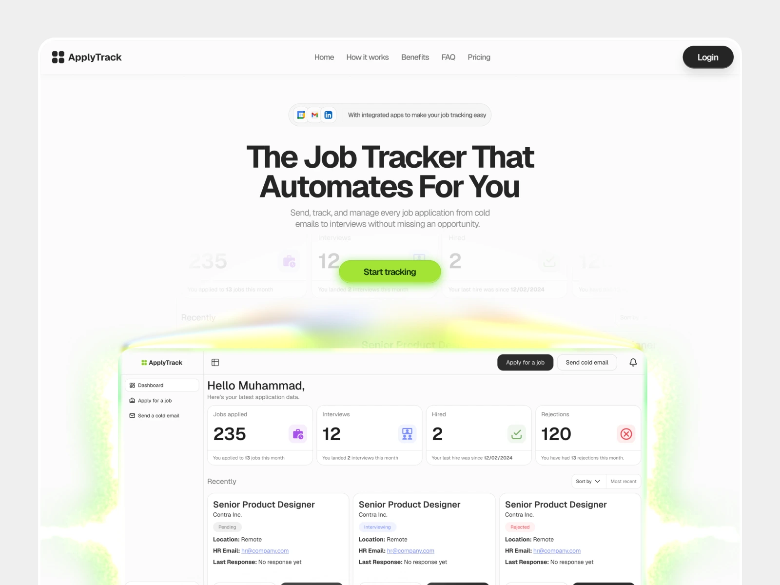
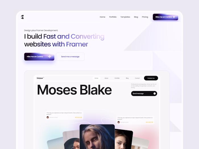
Applytrack Hero Section
Overview
Applytrack was born from a personal pain point: the chaos of managing hundreds of job applications across multiple platforms, losing track of follow-ups, and wondering which companies actually opened your emails.
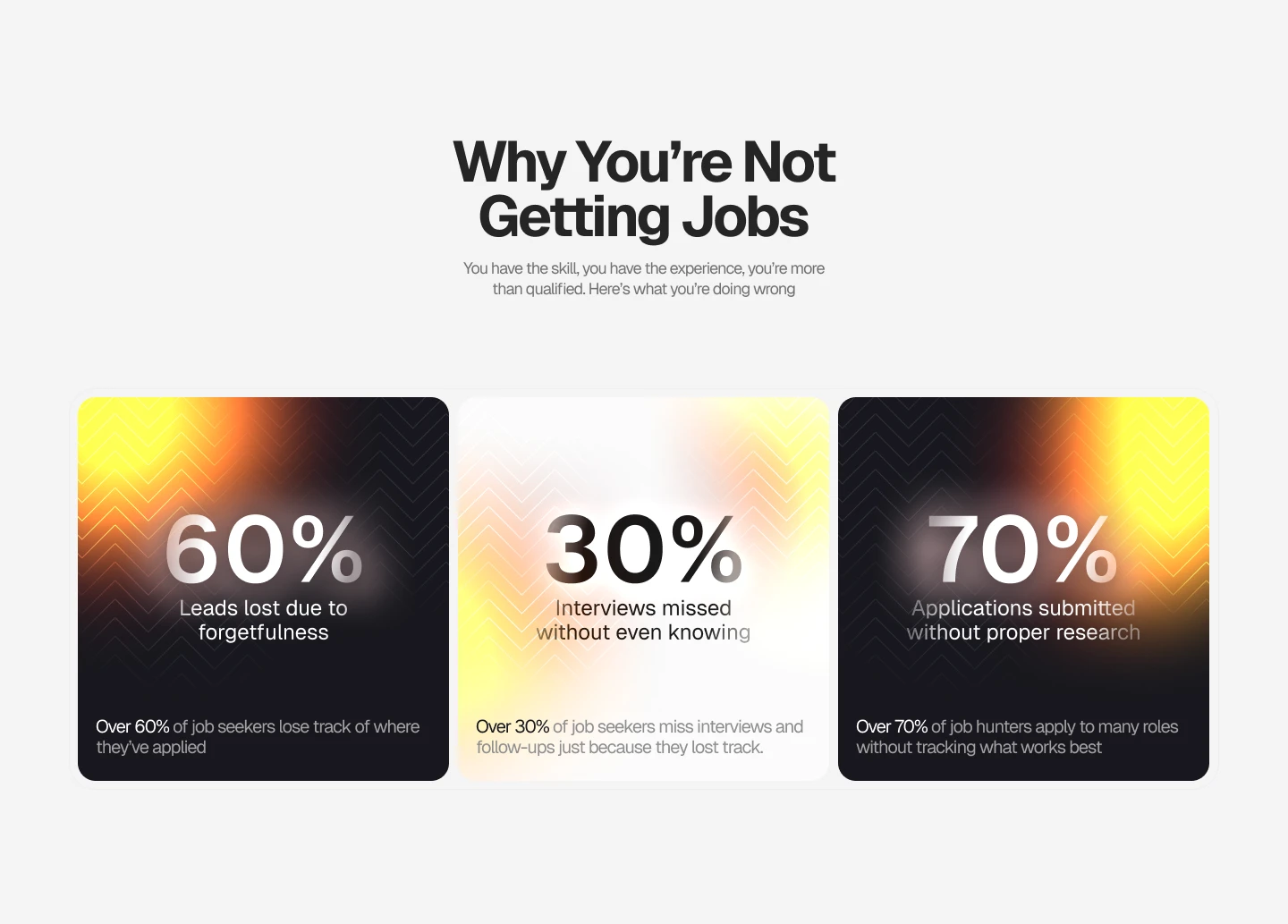
Problem Statement section to capture the targets' attention
Inspired by Huly
The design and user experience philosophy drew heavy inspiration from Huly, the all-in-one project management platform.
Huly's elegant approach to complex workflows, combining tasks, documents, and communication in a unified interface showed me how powerful simplicity could be.
Their Kanban-style boards, real-time collaboration features, and clean information architecture became the foundation for how Applytrack would handle the equally complex world of job applications.
Like Huly transforms team collaboration, Applytrack transforms job hunting into a manageable, strategic process.
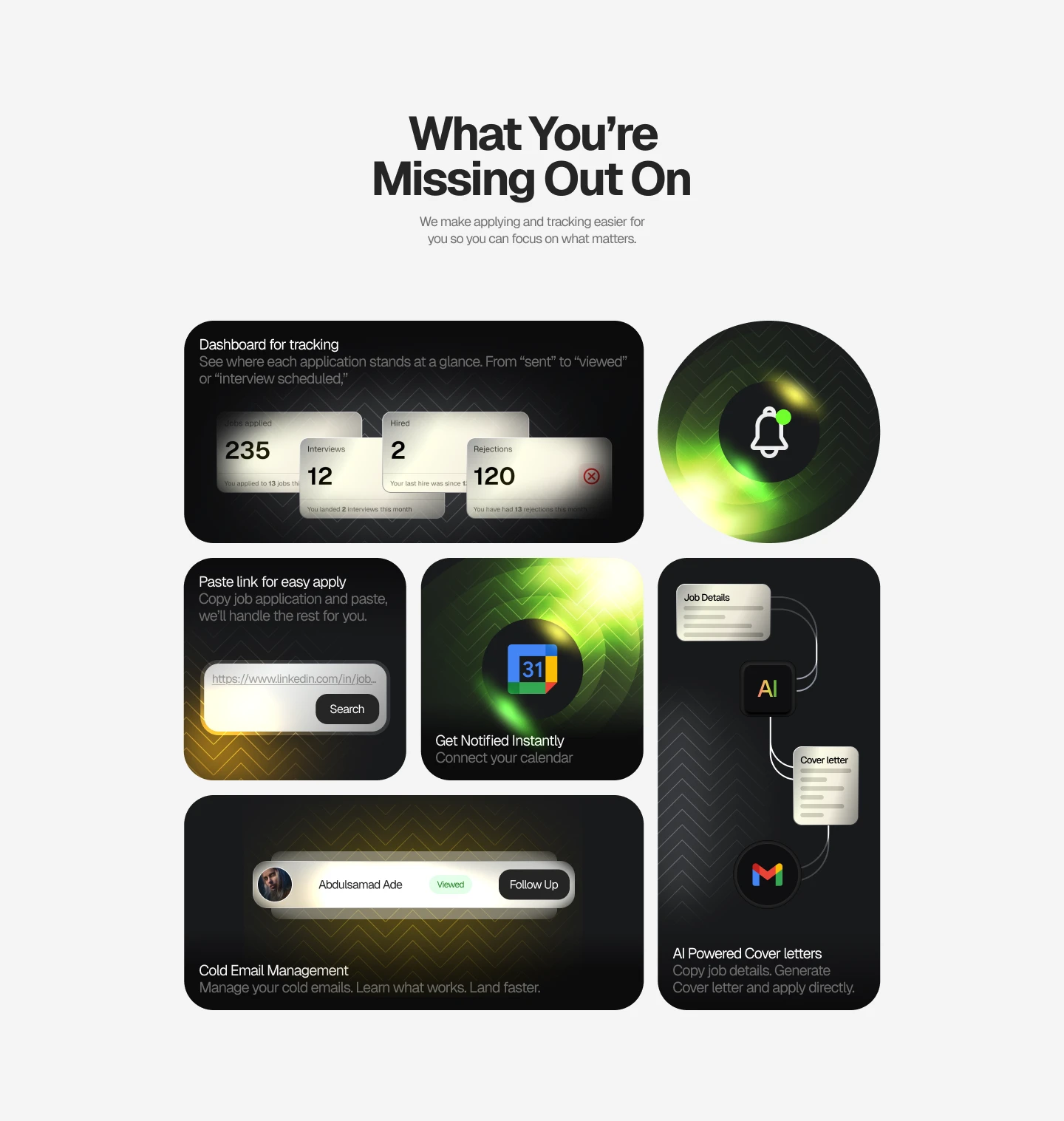
Bento (Light)
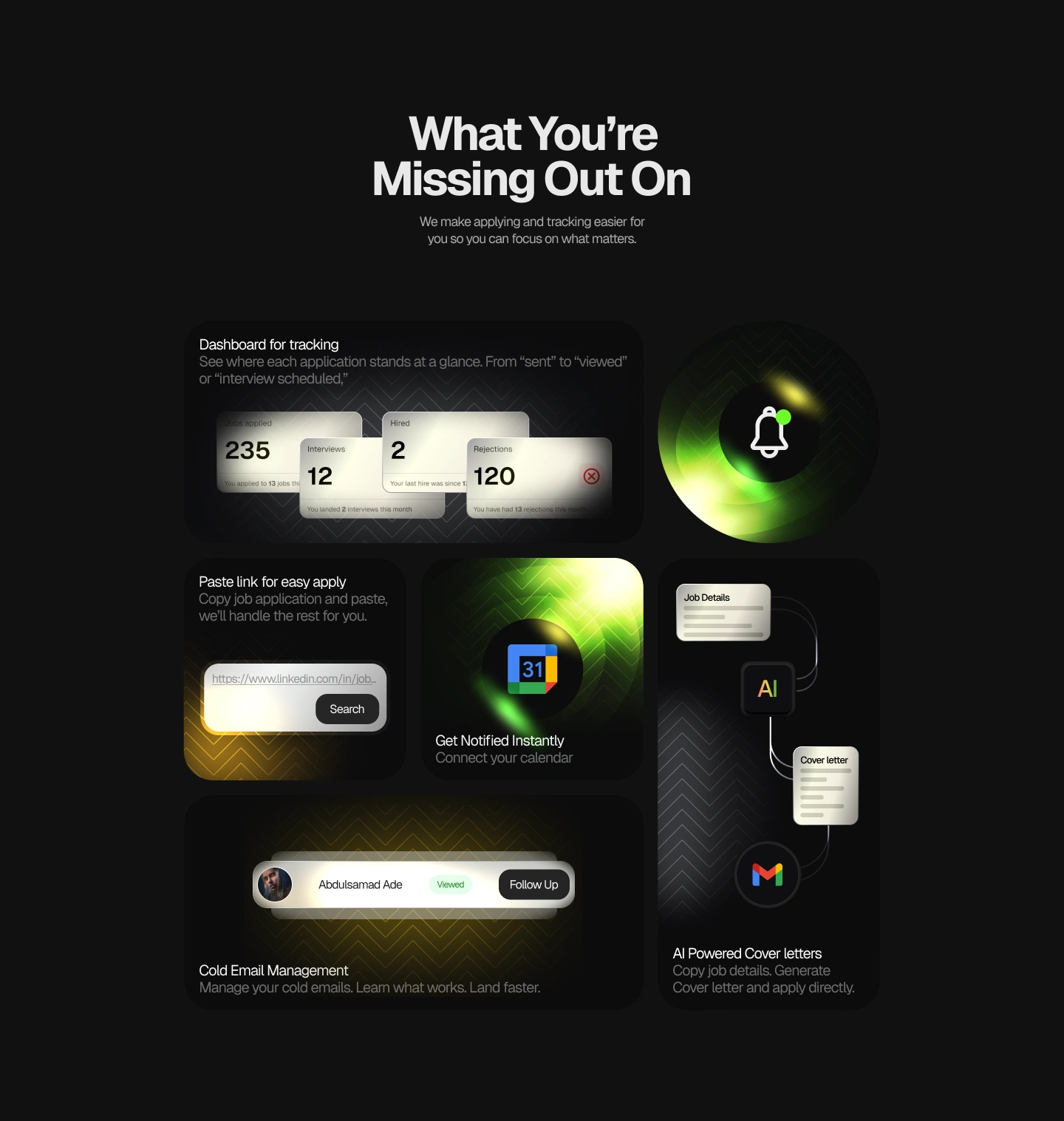
Bento (Dark)
Choosing the Hero Section
The hero section carried the weight of first impressions, it needed to immediately communicate control and clarity to stressed job seekers.
I explored two distinct directions: a dark mode interface that felt focused and distraction-free, perfect for late-night application sessions, and a light mode that projected optimism and energy during what can be a discouraging process.
Each told a completely different emotional story, and choosing between empowerment through calm versus empowerment through brightness took more iterations than expected.
Oh, and I settled for the light mode just because it looks most professional and related to the brand generally.
Hero Section (Light)
Hero Section (Dark)
Result
After countless tweaks, Applytrack website emerged as a premium looking site, that targets users actual problems, displays how it's a solution, and keeps information accessible and easily readable by all.
A potential lead generation machine.
Applytrack Hero Section
Currently under development.
The devs are doing what they do best 🙂
Like this project
Posted Nov 9, 2025
Designed Applytrack website inspired by Huly, focusing on user experience for job application management.
Likes
5
Views
17