Nought: Transforming Urban Mobility
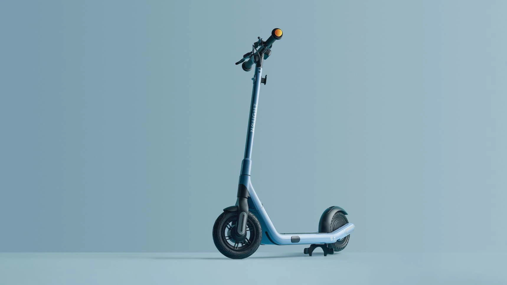
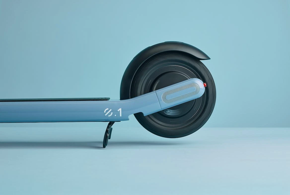
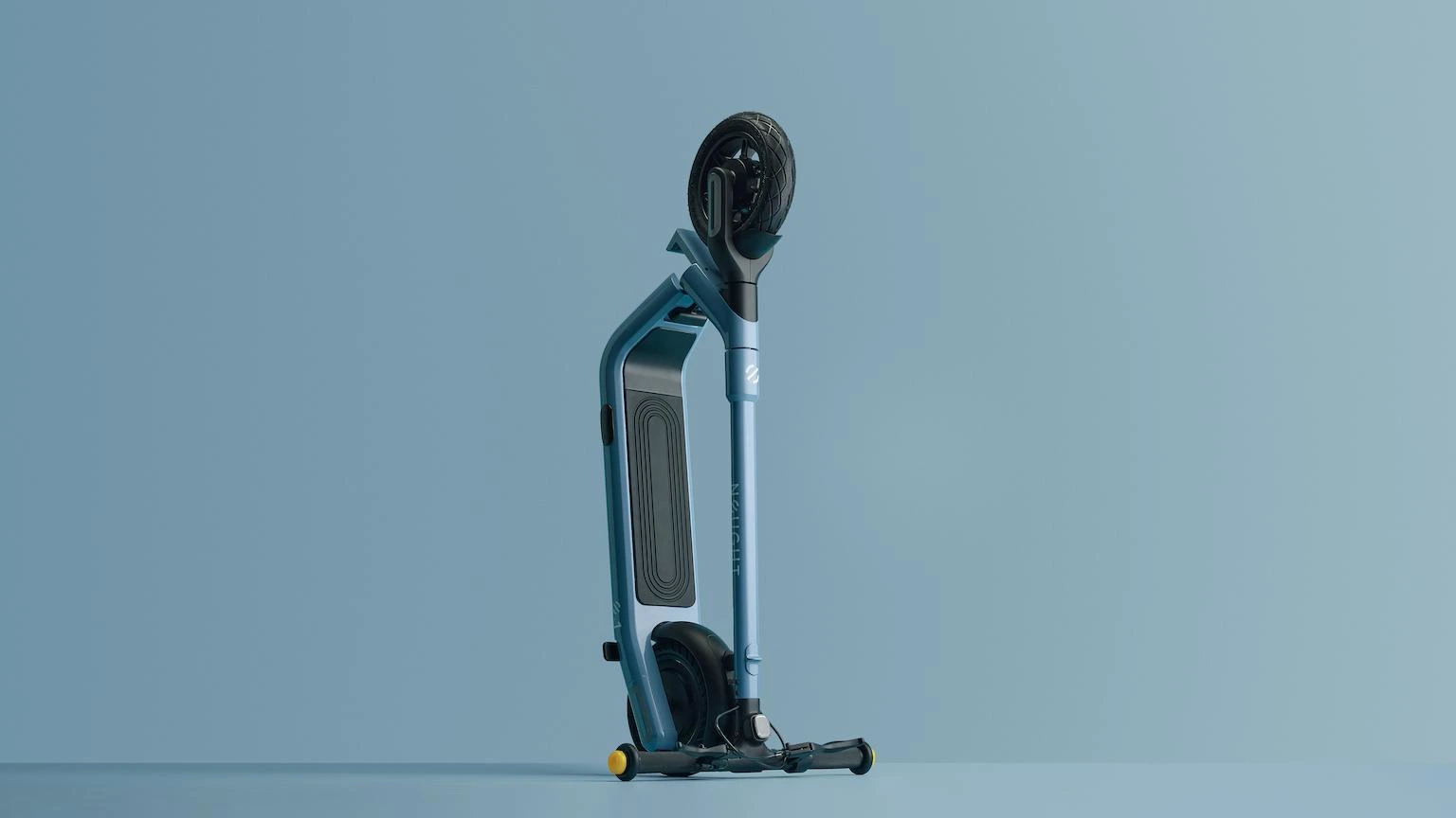
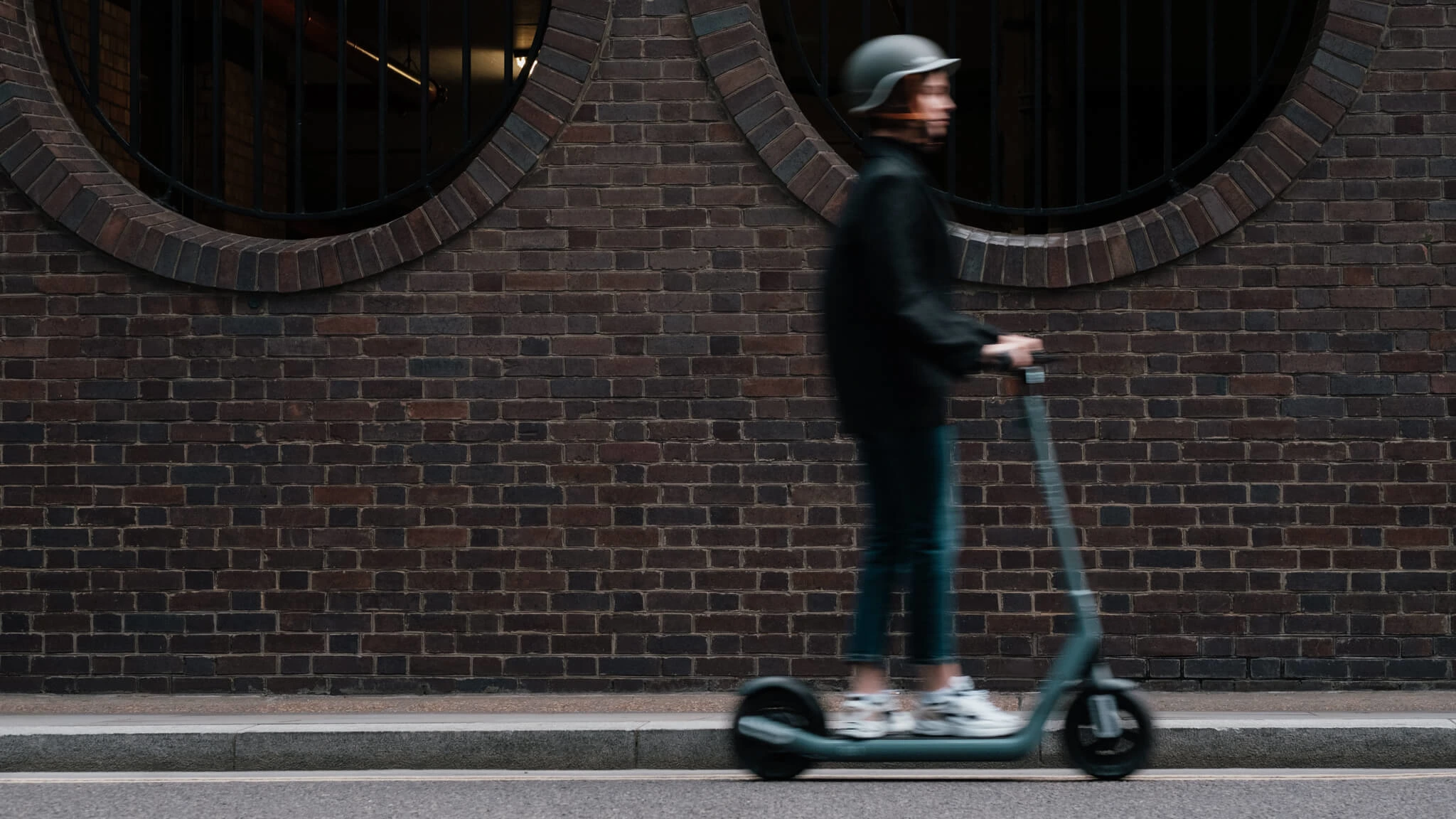
As cities grow, so do carbon emissions. But getting from A to B doesn’t have to harm you or the environment. The Nought.One is change in motion: a zero-emissions ride for sustainable journeys through the urban environment. We partnered with Nought to transform them from a startup with a great product into an industry-defining brand.
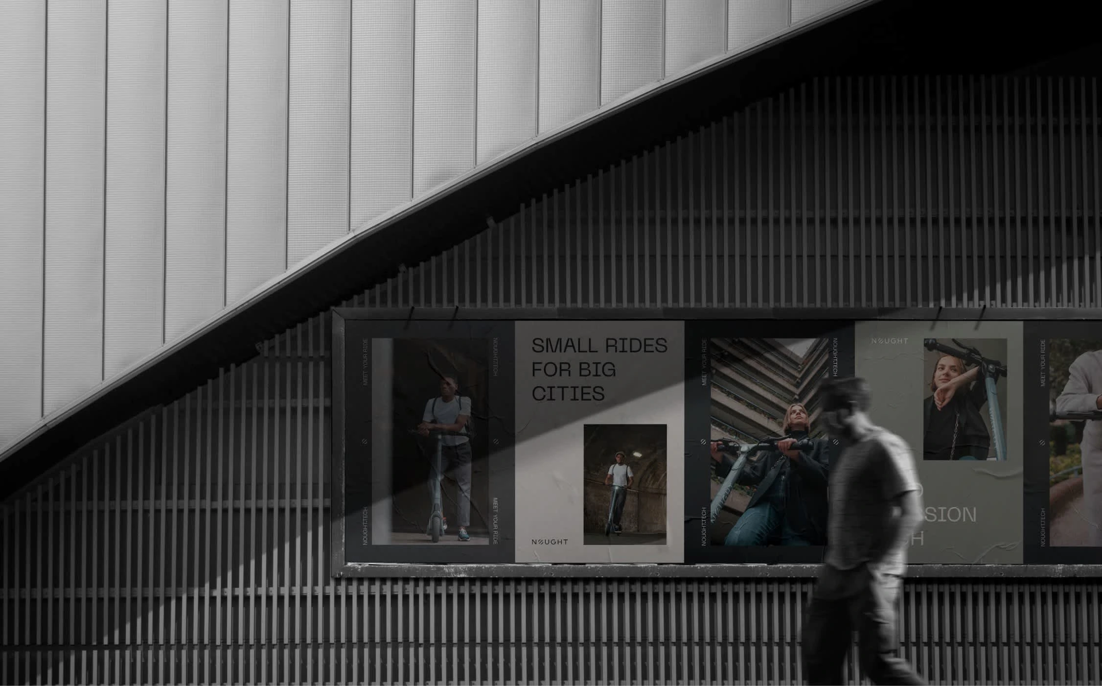
Project Intro: Small Rides for Big Cities
Nought is a British micro-mobility brand pioneering the future of sustainable travel. An intelligent solution to traditional travel woes (say goodbye to gridlock), Nought is the next-generation answer to urban movement.
In the words of Nought’s Founder, Ollie:
“Having been in the e-scooter business for some time, we have seen the vast majority of scooters out there. We always felt the consumer deserves a better, more refined alternative.”
So, he set out to create a better ride, and a brand that inspires a better riding environment. Smarter, faster, cheaper and kinder, Nought produces experience-led e-vehicles, coupled with a full service-support ecosystem.
Building the Brand: Change in Motion
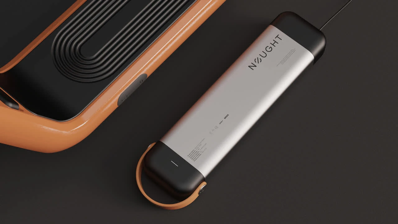
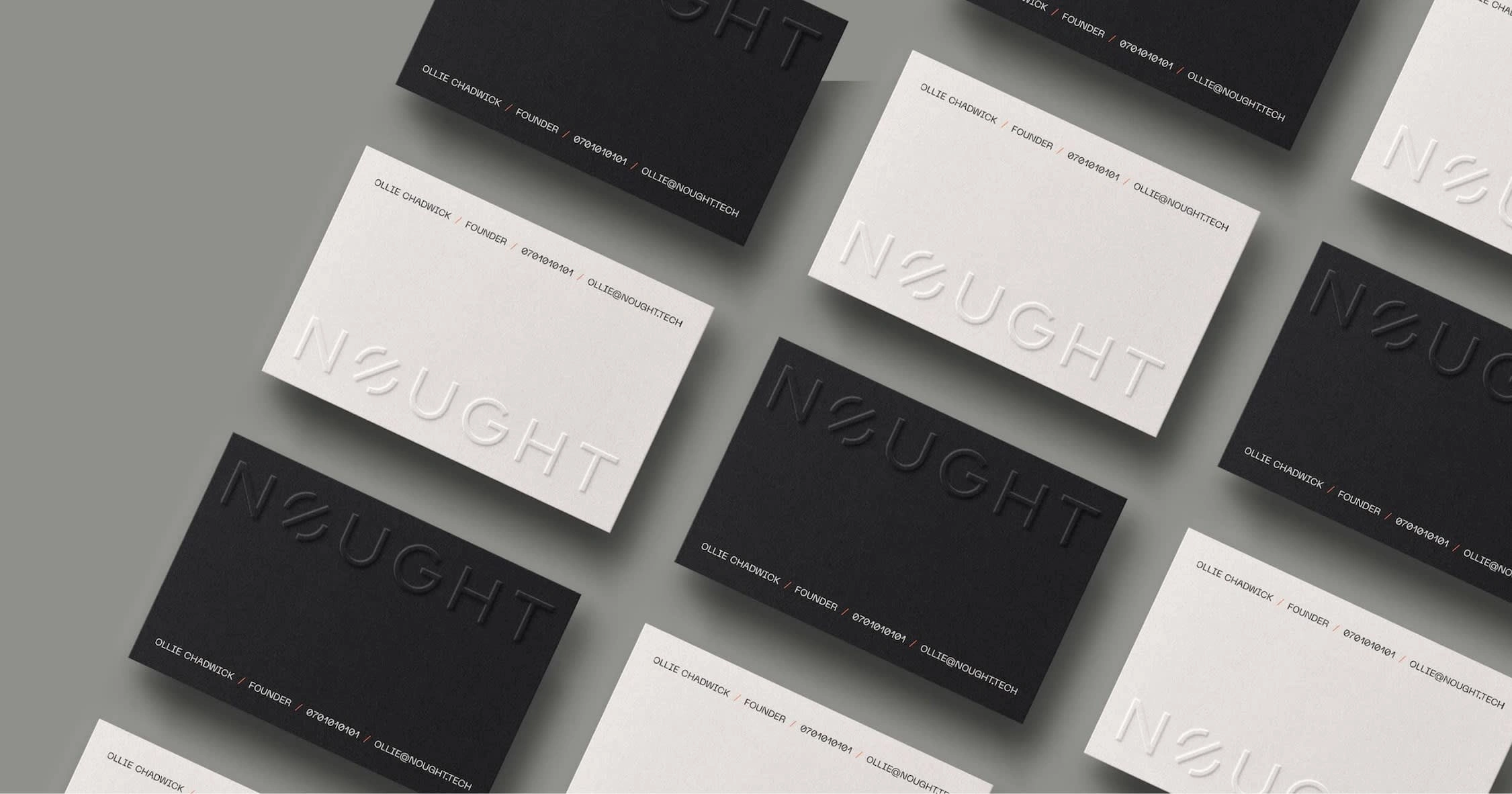
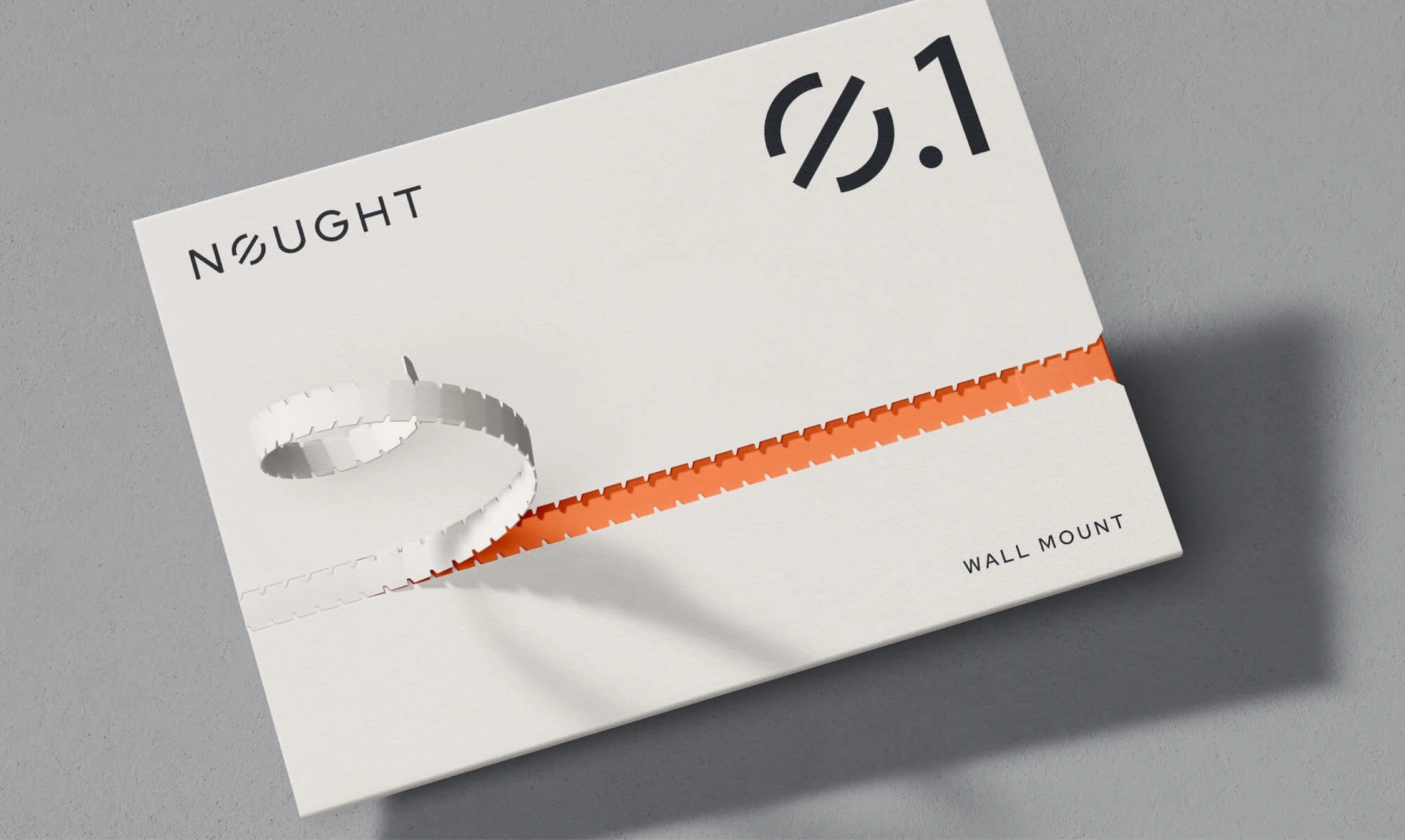
Nought’s mission is to encourage adventures through urban environments while minimising the impact its riders have on the world around them. The brand needed to reflect that. We built out a comprehensive brand strategy and came up with the name Nought. No emissions. No traffic. No bullshit. Experience life close up as you see your city in a new light. Now you don't have to stop to smell the roses. The brand identity is minimal, transparent, future-forward and zero-bullshit. It is deliberately simple and prioritises functionality, whilst being fun and engaging. Nought’s logo is powerful and designed with bold and sleek shapes that speak to the transport industry. The chosen font is ‘Neue Machina’ by Pangram Pangram Foundry, a versatile, grotesk font with massive personality, inspired by the aesthetics of robotics and suited for brands at the forefront of technology. Nought’s brand identity is intended to be visually striking but minimalistic, designed to leave a lasting impression.
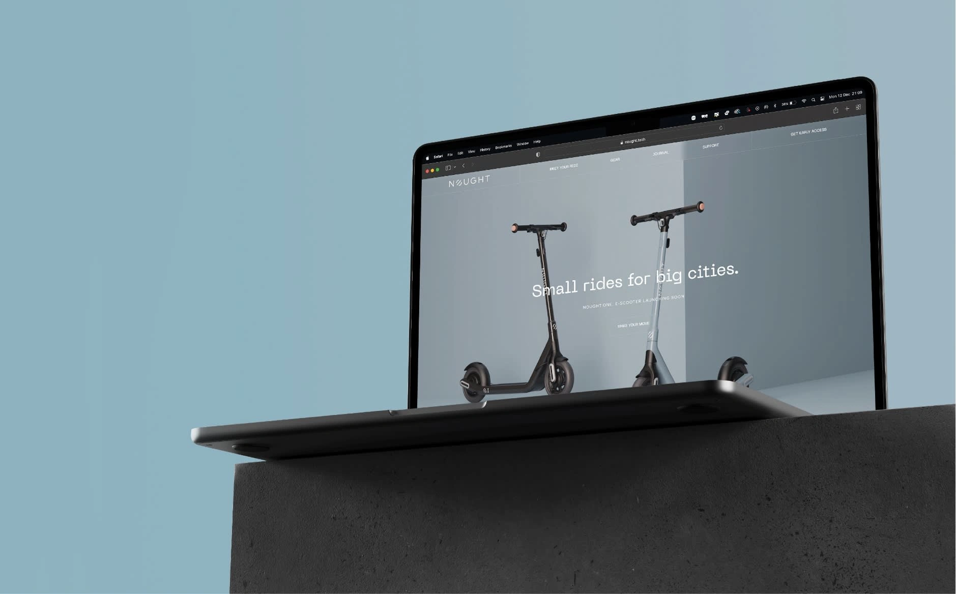
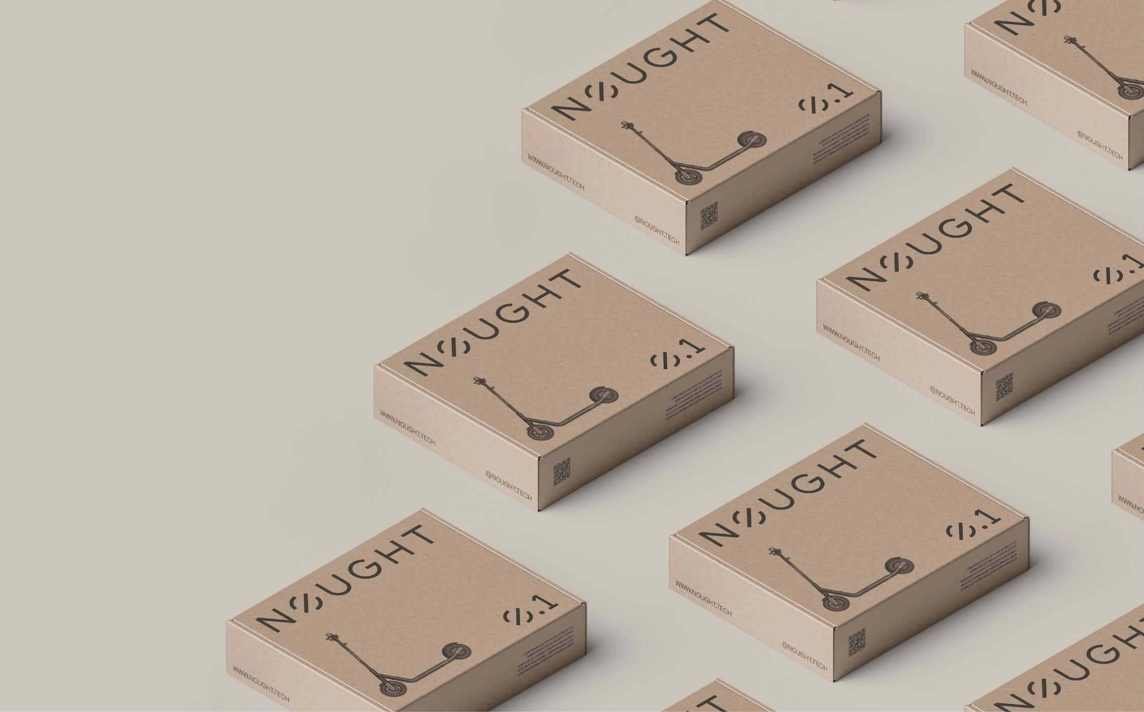
Connecting with the First Movers
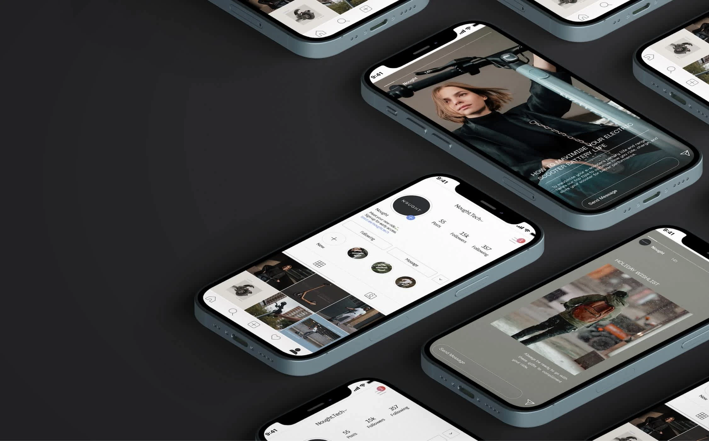
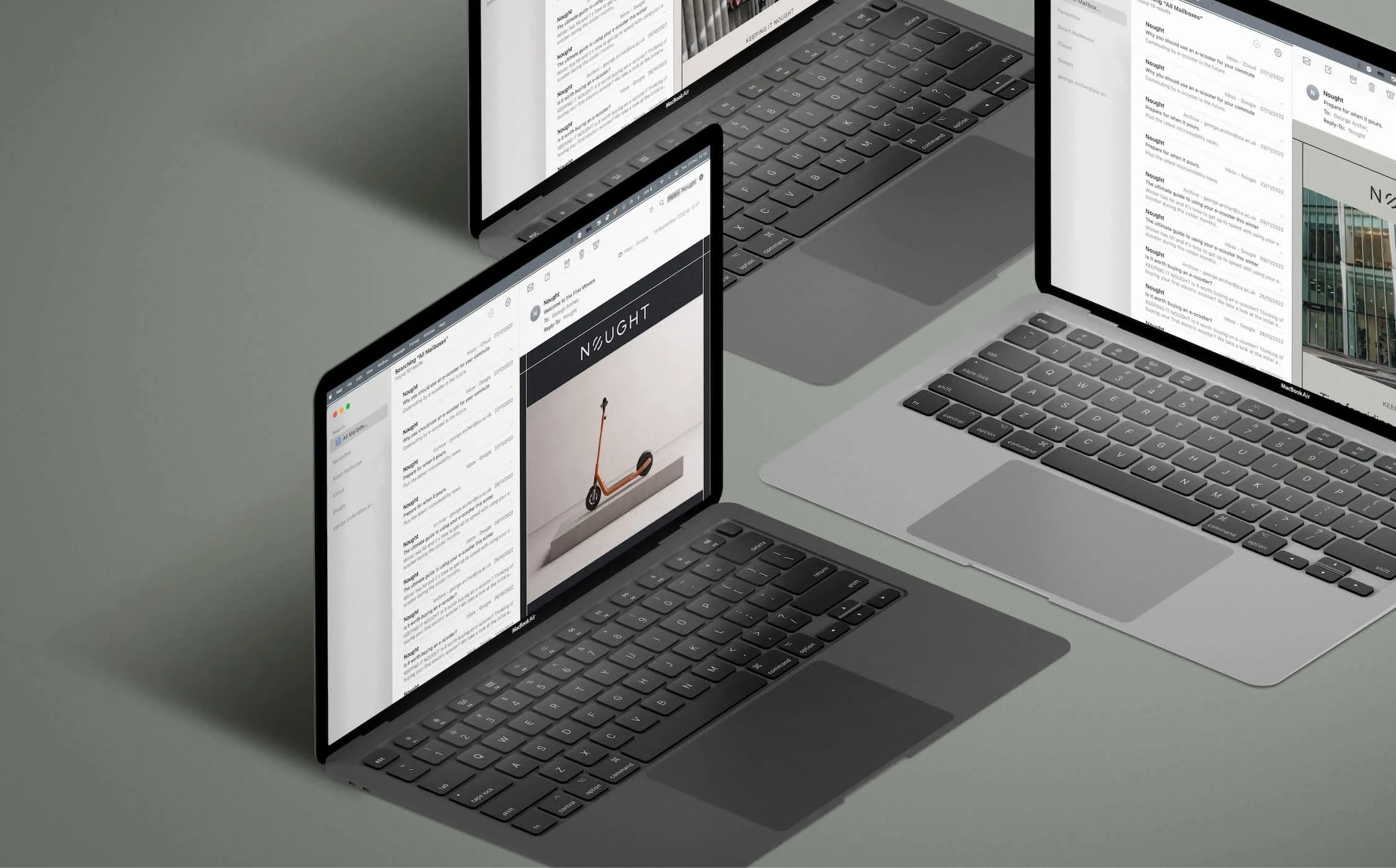
After successfully building out the website and packaging for Nought, the company encountered manufacturing challenges in the post-COVID landscape. We seized this opportunity to get a head start on early sales by introducing a unique campaign featuring a limited edition (1/1) orange scooter as a prize for the first movers who signed up for our mailing list. This strategy generated significant anticipation and excitement, creating a dedicated community of eager riders ready to engage with our brand. We nurtured this interest with a targeted email marketing strategy, delivering valuable content on a weekly basis. Simultaneously, we amplified our efforts through social media and SEO-rich content, ensuring 10s of thousands of users were engaging with the brand each month.
View full cast study at opulo.com
Like this project
Posted Sep 19, 2024
The Nought.One is change in motion: a zero-emissions ride for sustainable journeys through the urban environment. Through a comprehensive brand strategy and inn


