Redesigning FDA Drug Pages for Better User Experience
Shane Jeffers
Beyond PDFs: Rethinking the FDA Drug’s Page
Creating a scalable, structured, and accessible experience for patients and clinicians.
OVERVIEW
Designing for clarity in a world of PDFs
he FDA drug pages are cluttered, inconsistent, and built around static PDFs. Patients and clinicians struggle to find answers fast. I redesigned the drug profile layout to prioritize clarity, accessibility, and role-specific information, using Regeneron’s Eylea HD as a pilot example.
✅ Created role-based views for patients and clinicians to surface relevant info faster
✅ Surfaced key drug facts to reduce PDFs overload and improve find-ability
✅ Designed a repeatable layout for all FDA drug pages
PROBLEM
A system built for compliance, not for people
FDA.gov plays a critical role in delivering official drug information, but its current drug profile pages are fragmented, PDF-heavy, and difficult to navigate. The layout is compliance-first, not user-first leading to delays, confusion, and potential risks for both patients and professionals.
To validate these challenges, I conducted a heuristic evaluation, competitive analysis, and secondary research, leveraging ChatGPT to speed up synthesis and uncover deeper patterns. Here is what I found:
No role-based guidance → Patients and Clinicians all encounter the same cluttered view
PDF overload → Users are forced to open multiple documents to answer simple questions
High cognitive load → Acronyms, dense formatting, and poor navigation create friction
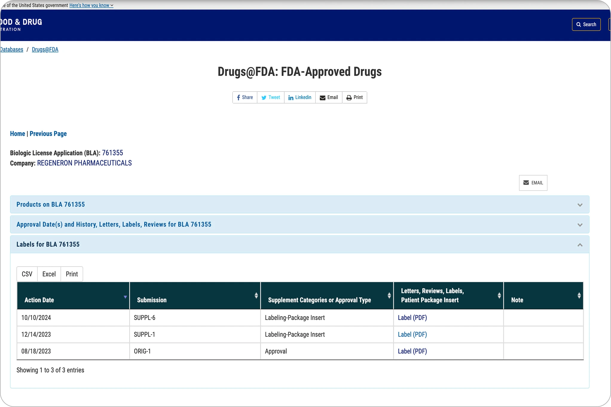
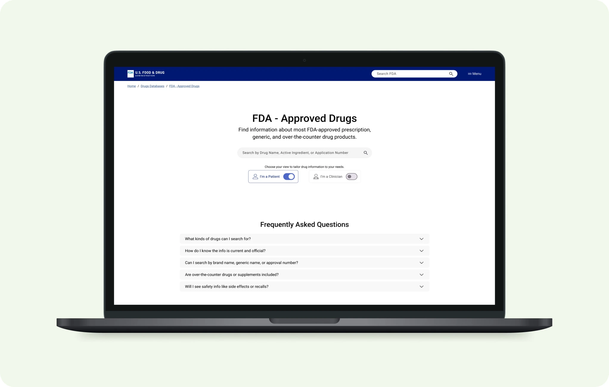
The original Eylea HD page lists PDFs with regulatory terms, offering little guidance for patients on where to start.
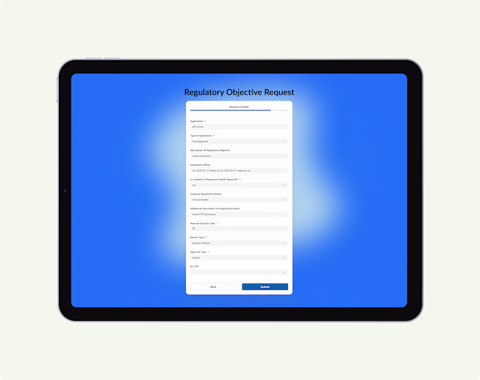
SOLUTION
From document dump to structured design
The redesign focused on one clear goal: help each type of user find what they need faster, with less cognitive effort, and without guessing. Instead of forcing people to interpret legal PDFs, I structured content to be scannable, audience-specific, and visually prioritized.
Role-Based Views
Designed distinct entry points for Patients and Clinicians, allowing each group to immediately access what’s most relevant to them.
Priority-First Content Layout
Surfaced critical patient info before any links to full documents:
Drug purpose and treatment area
How it’s taken and dosage frequency
Key safety warnings in plain language
Recent changes to labeling or side effects
Transparency and Trust Signals
Added a visible “Last Reviewed by FDA” date and a “What Changed Recently” section to show recency and updates at a glance.
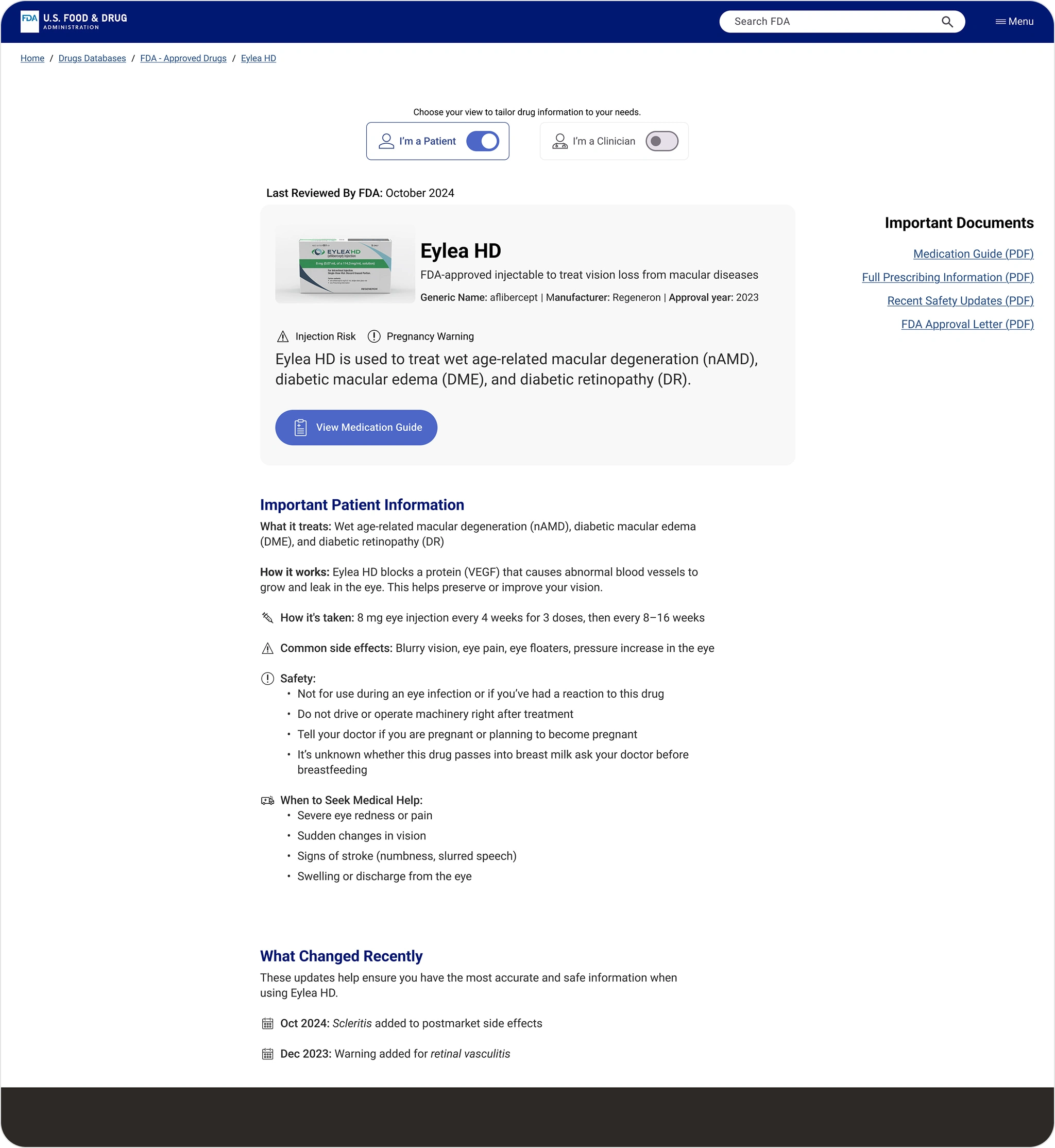
The redesigned patient view surfaces key drug info purpose, dosage, and safety before linking to PDFs, making it faster to understand and act.
RESULTS
What this redesign aimed to improve
While this was a self-initiated redesign, every decision was made with clear goals in mind. I defined success not just by what was designed, but by what it has the potential to improve for real users.
✅ Reduce cognitive load by surfacing the important drug information up front
✅ Improve find-ability with role-based navigation and simplified language
✅ Increase user trust through transparency, clear update dates and change logs
✅ Shorten decision time by reducing the need to open and compare multiple documents
Like this project
Posted Jul 20, 2025
Redesigned FDA drug pages for clarity, accessibility, and trust—reducing PDF overload and surfacing key info faster for patients and clinicians.
Likes
0
Views
7