Built with Framer
Rentspot - B2B SaaS Brand & Web design
Miru H.
Overview:
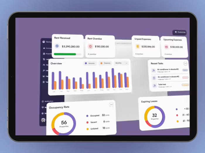
Rentspot is a B2B SaaS platform designed to simplify the process of finding and renting properties. This multipage website project aimed to create an intuitive, user-friendly interface that drives business growth by attracting and retaining users. Website is designed and developed with Framer and 3D Spline elements.
Explore the demo site Here
My Role:
• Brand Design: Consistent, high-quality brand identity to reinforce RentSpot’s brand, building trust and credibility with potential customers.
• Copywriting: Developed compelling, business-oriented copy that aligns with RentSpot's brand voice, effectively communicates value propositions, and drives user action.
• Framer Design: Led the entire UI/UX design process, creating a visually appealing and intuitive layout that enhances user experience and maximizes engagement.
• Framer Development: Translated the design into a fully functional, high-performance website using Framer's development capabilities.
• Spline 3D Design: Integrated 3D graphic to increase user engagement and dwell time, contributing to higher conversion rates.
Brand Design
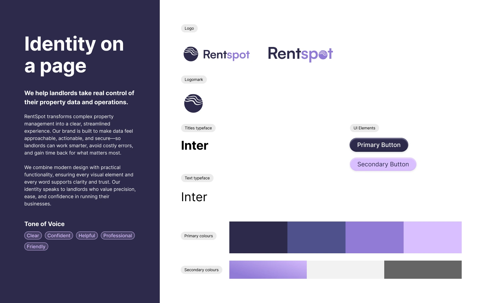
Logo and Branding: Designed a professional logo and cohesive branding styles that establish a strong, recognizable brand identity.
Logotypes
The RentSpot logo is designed to convey clarity, reliability, and a sense of control—core values that matter to busy landlords managing multiple properties.
The logotype pairs a bold, modern sans-serif typeface with soft, rounded edges to balance professionalism with approachability. The letterforms are clean and grounded, reflecting the platform’s promise of structure and ease without overwhelming complexity.
The logomark introduces a wave-inspired symbol that hints at fluidity and movement. It is an abstract nod to dynamic property data and the ever-shifting nature of real estate. By containing the wave within a stable circle, it reinforces the idea of control within constant change.
Together, the logotype and logomark form a visual identity that feels modern, trustworthy, and designed for forward-thinking landlords who want a better way to manage their world.
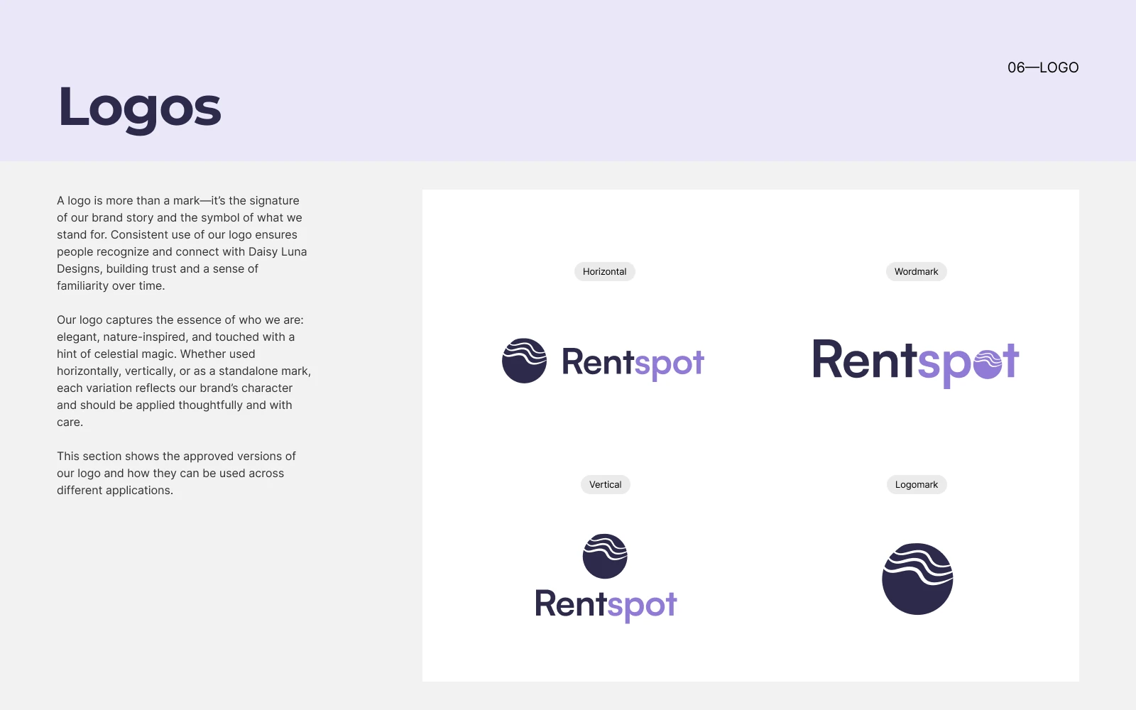
Logo Variations
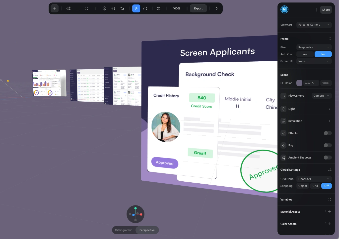
3D elements built in Spline
Outcome
After
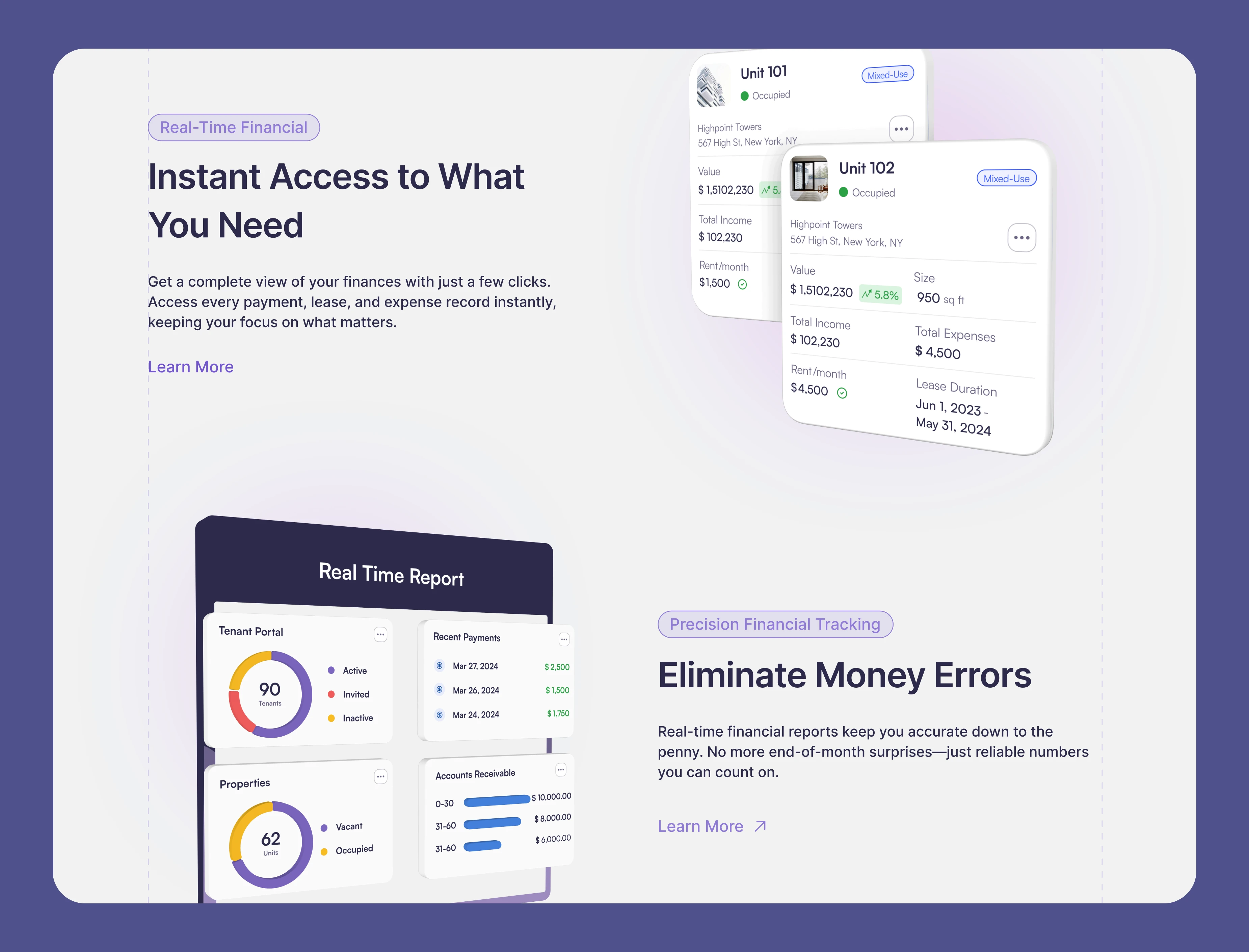
• Each core feature has a dedicated page, allowing potential clients to explore specific solutions that matter to them.
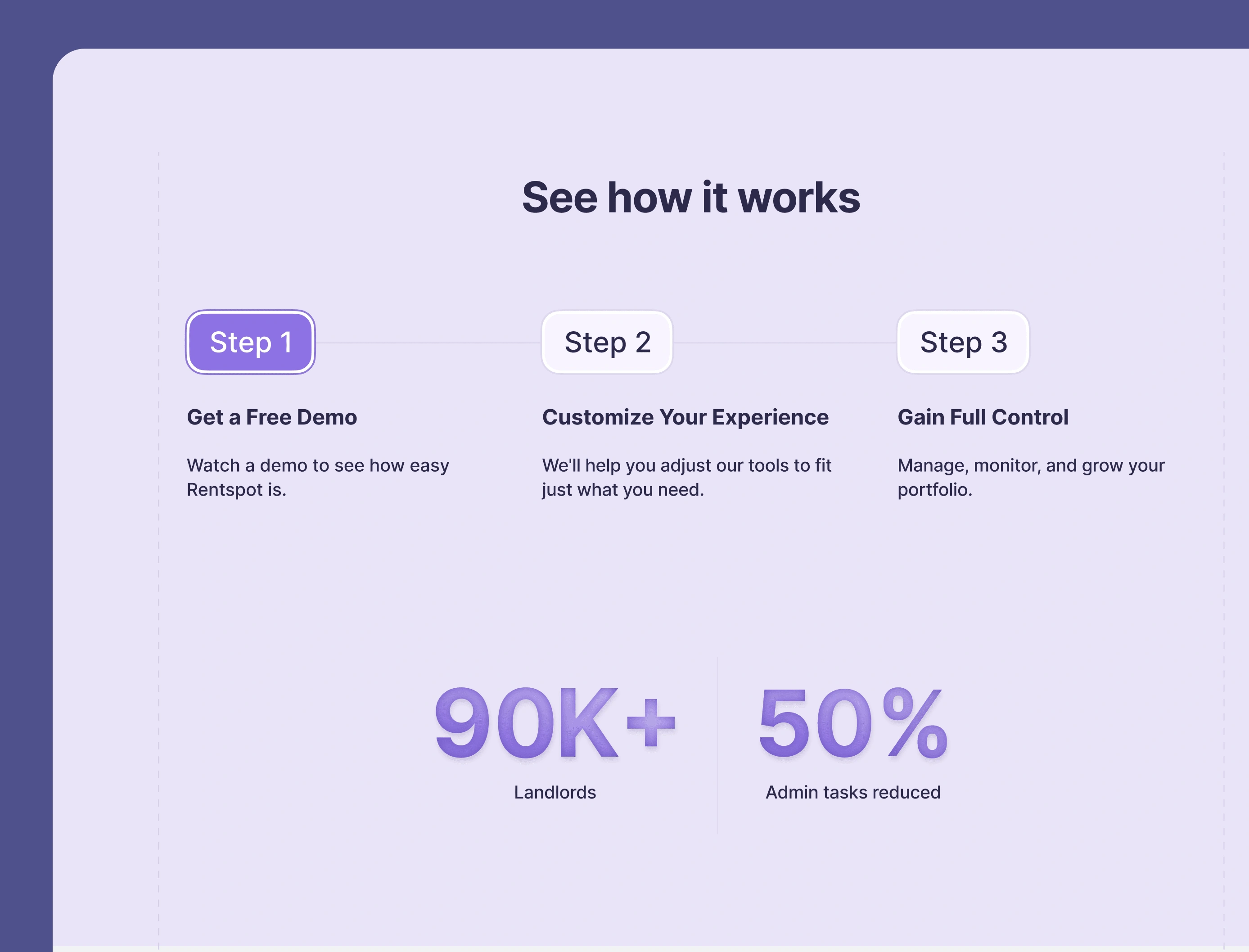
• Instead of flashy animations, we focused on guiding visitors through a smooth, logical journey.
• It positioned the product as the one for their clients ready to streamline their operations.

After
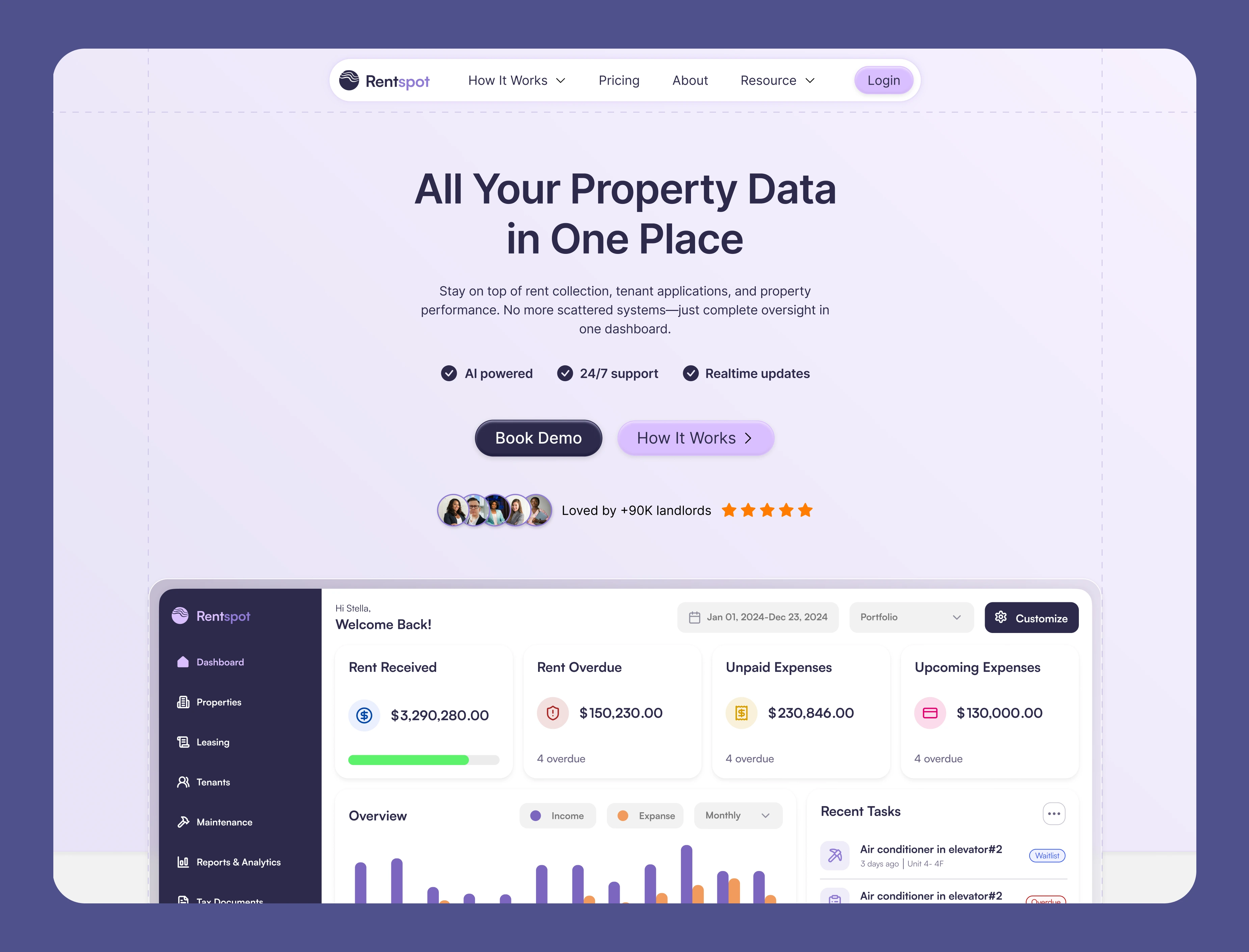
Home-After
Features-After
steps-After
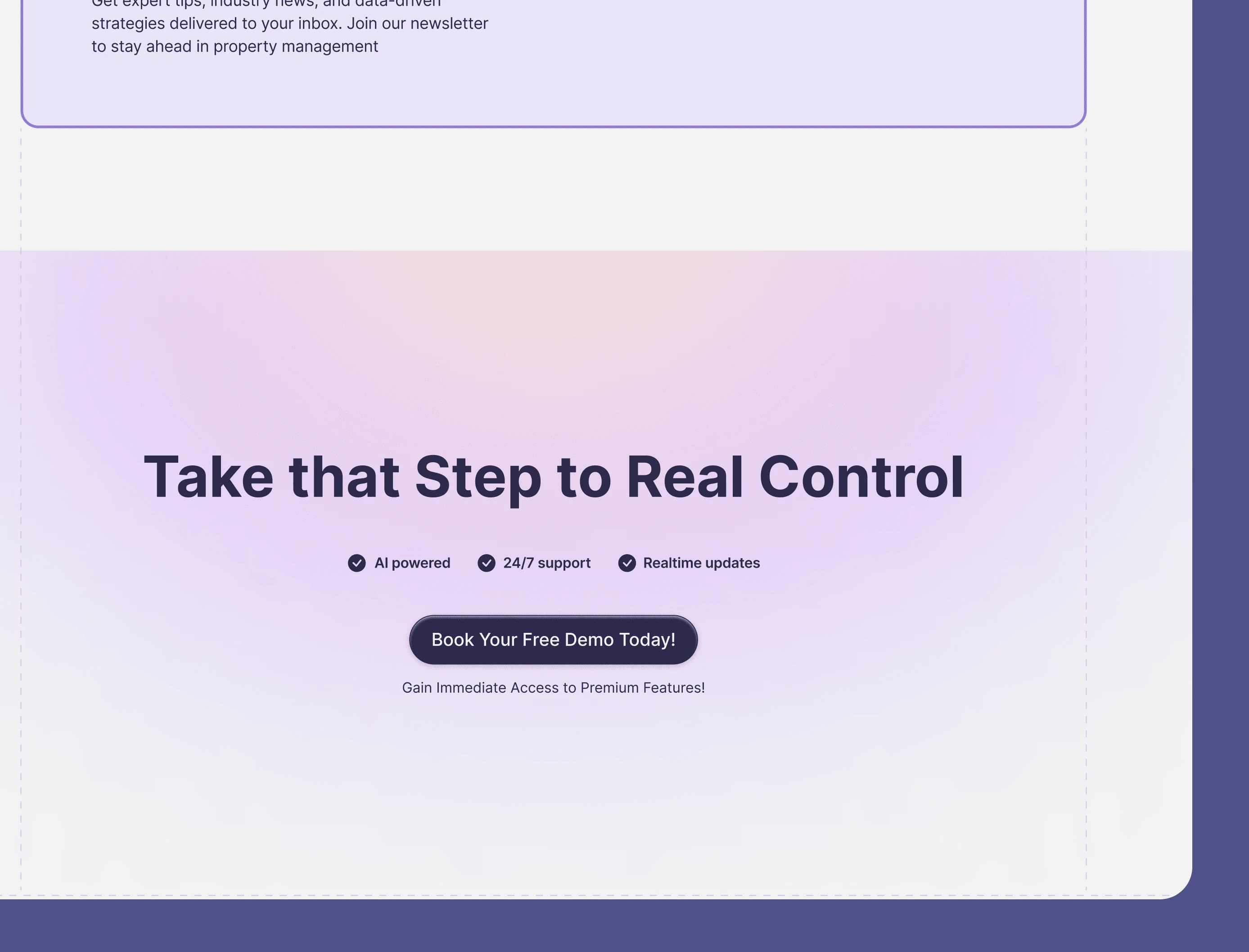
Final CTA-After
Like this project
Posted May 29, 2024
This project aimed to create an intuitive, user-friendly interface that attracts and retains users. Developed using Framer with additional 3D Spline elements.
Likes
0
Views
64
Timeline
Jun 3, 2024 - Jul 1, 2024