Web Development: Material Tailwind
Material Tailwind is an open-source library that uses the power of Tailwind CSS and React to help you build unique web projects faster and easier. Material Tailwind features ready-to-use Tailwind CSS components, like buttons, inputs, cards, tables, and more, that help you create visually appealing web pages for your project in a fraction of the time.
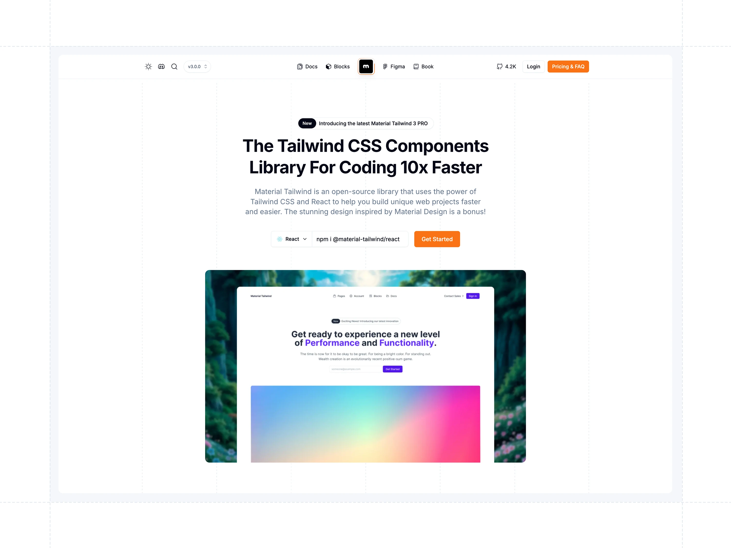
Features
Material Tailwind contains multiple features:
Framework Compatibility
Material Tailwind works effortlessly with: React, Next.js, Astro, Vite, Remix, Gatsby, Create React App, and HTML.
Tailwind CSS Integration
Material Tailwind is built to extend Tailwind’s utility-first framework with fully customizable components. It allows you to leverage Tailwind’s powerful design system while integrating seamless Material Design elements, empowering you to create unique, visually consistent user interfaces without compromising development speed or flexibility.
Pre-built Components
Save time and effort with an extensive library of pre-designed UI components. Material Tailwind offers buttons, cards, modals, forms, alerts, navigation elements, and more, each crafted with Material Design principles. These ready-to-use components are easy to integrate, look stunning out of the box, and can be quickly adapted to meet project-specific needs.
Dark Mode Support
Effortlessly design modern interfaces with built-in dark mode compatibility. Every component supports both dark and light themes, enabling you to provide users with a seamless experience across different viewing preferences. Toggle between themes easily and ensure visual harmony with Tailwind’s dark mode utilities.
Responsive and Accessible
Material Tailwind components are designed with responsiveness and accessibility at their core. Each component adapts perfectly to screens of all sizes, from mobile devices to large desktops, ensuring a consistent user experience. Accessibility is a top priority, with features like ARIA attributes and keyboard navigation included to support users with diverse needs.
Customizable
Personalize your components effortlessly to align with your brand and design requirements. Material Tailwind allows you to tweak colors, typography, spacing, and layouts with Tailwind’s configuration options. Whether you need to adjust small details or overhaul the entire theme, the library is flexible enough to bring your creative vision to life.
Design Specifications
Tools: Figma
Typography: Inter
Colors: #6028FF, #E5E7EB, #0062FF, #00bF6B, #FCA327, #EF4444, #374151, #030712, #FFFFFF
Icons: Iconoir (https://iconoir.com/)
Tech Stack
React.js, TailwindCSS, TypeScript, Next.js
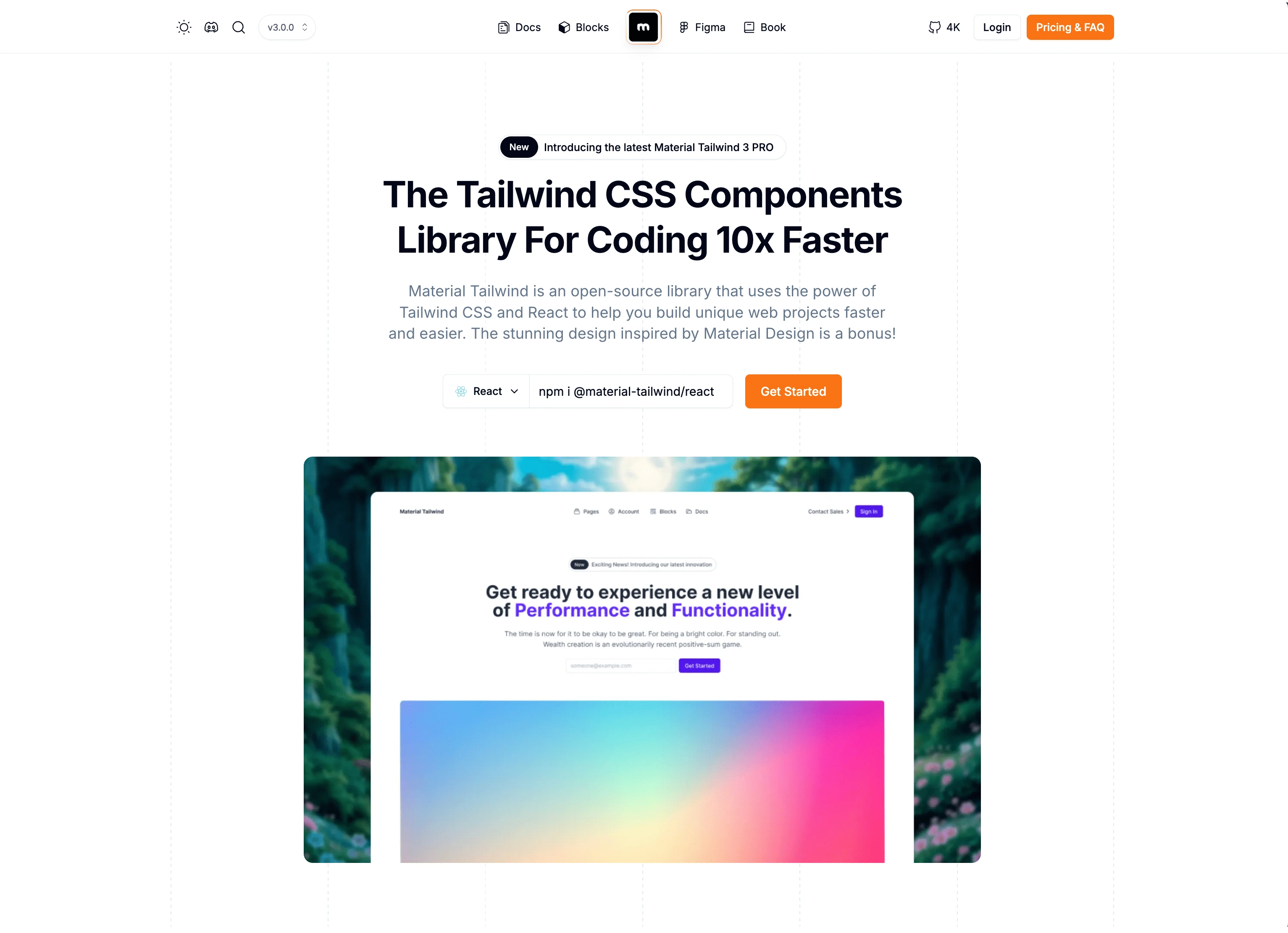
Material Tailwind Homepage
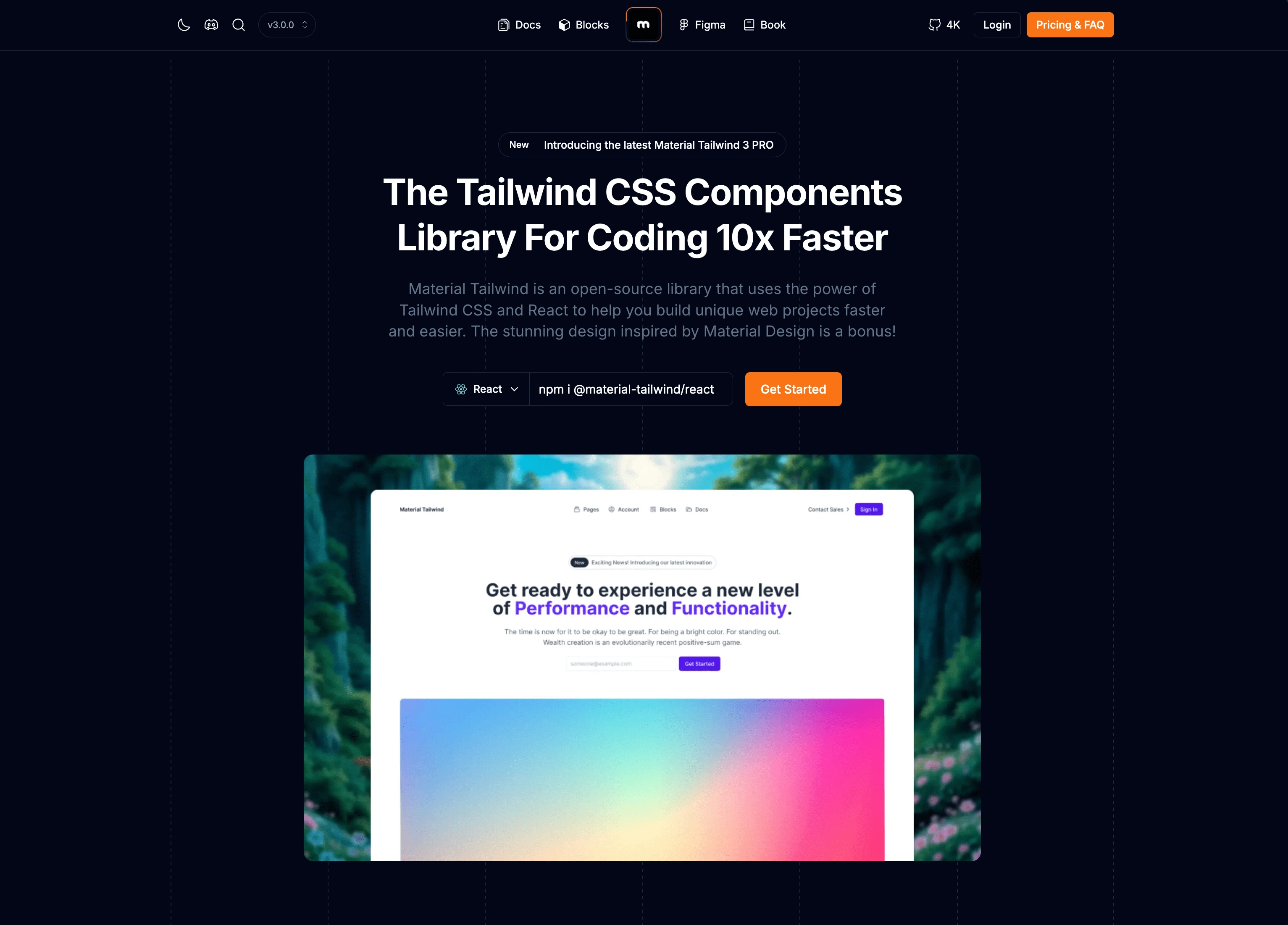
Material Tailwind Homepage (Dark Mode)
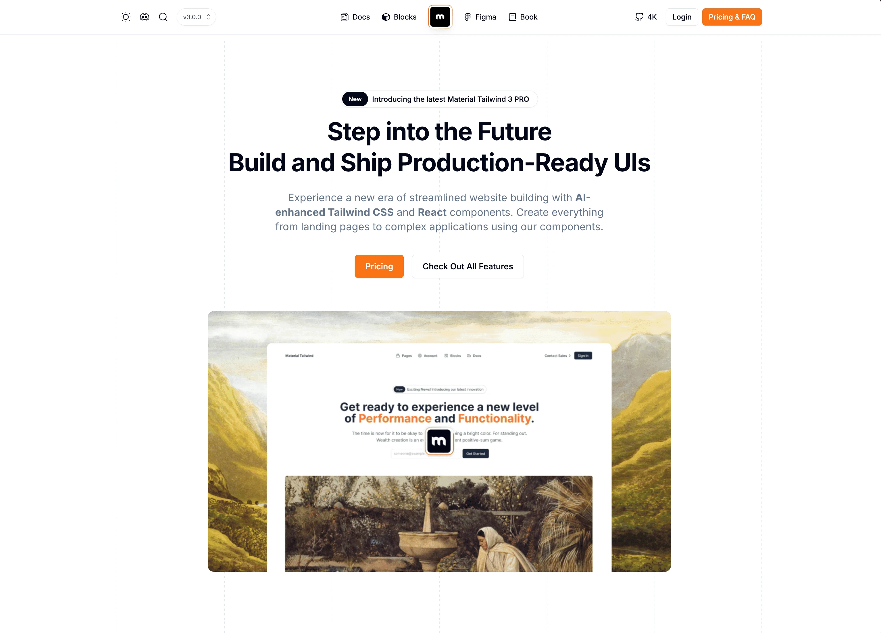
Material Tailwind PRO
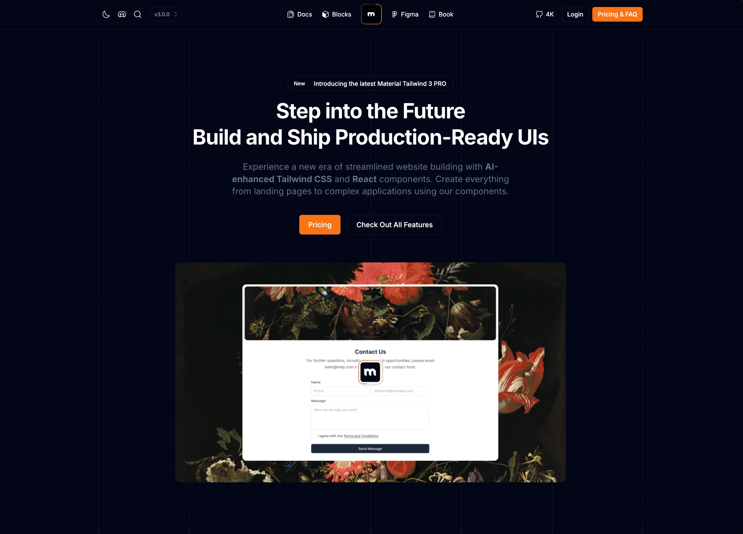
Material Tailwind PRO (Dark Mode)
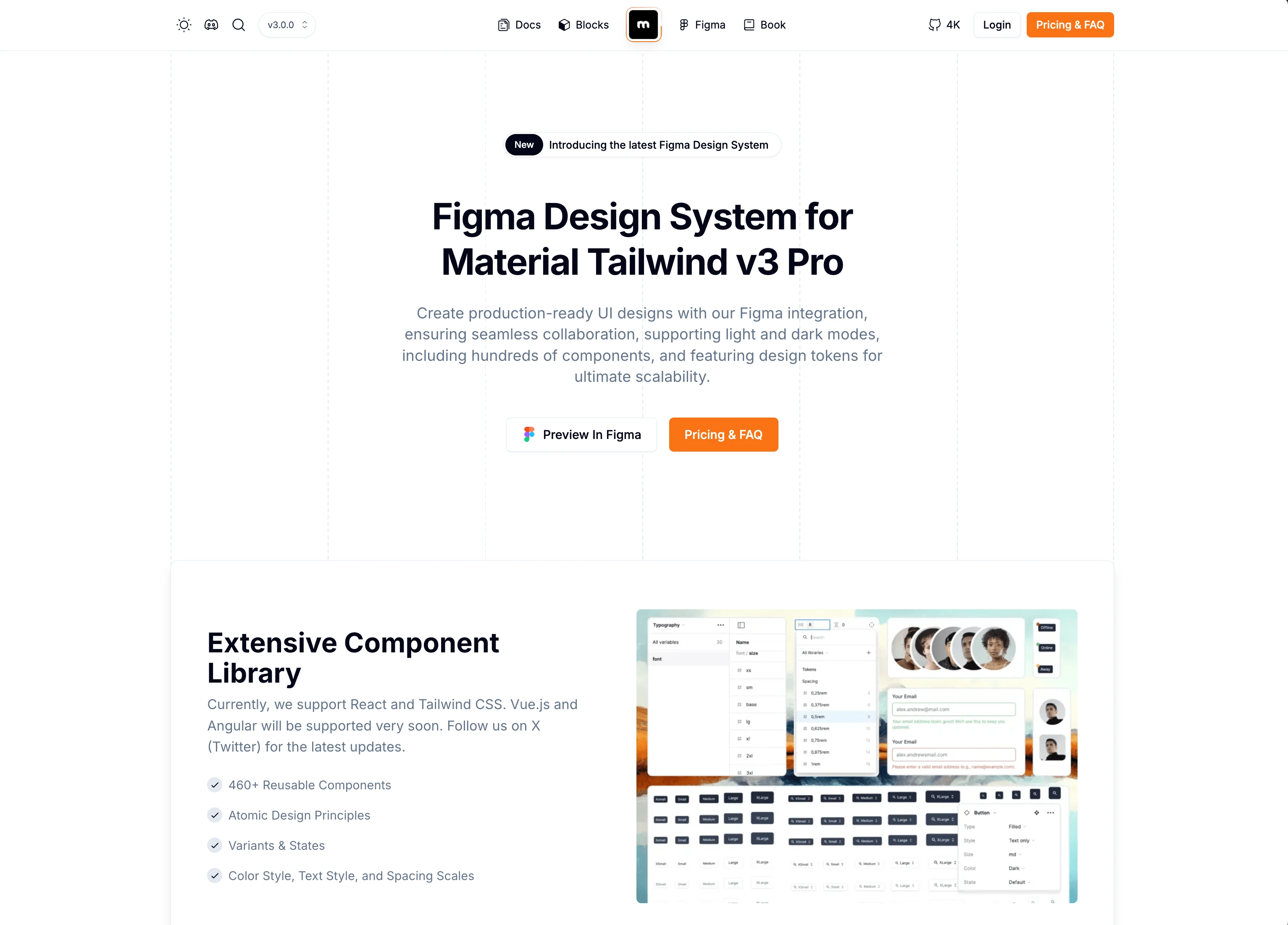
Material Tailiwnd Figma
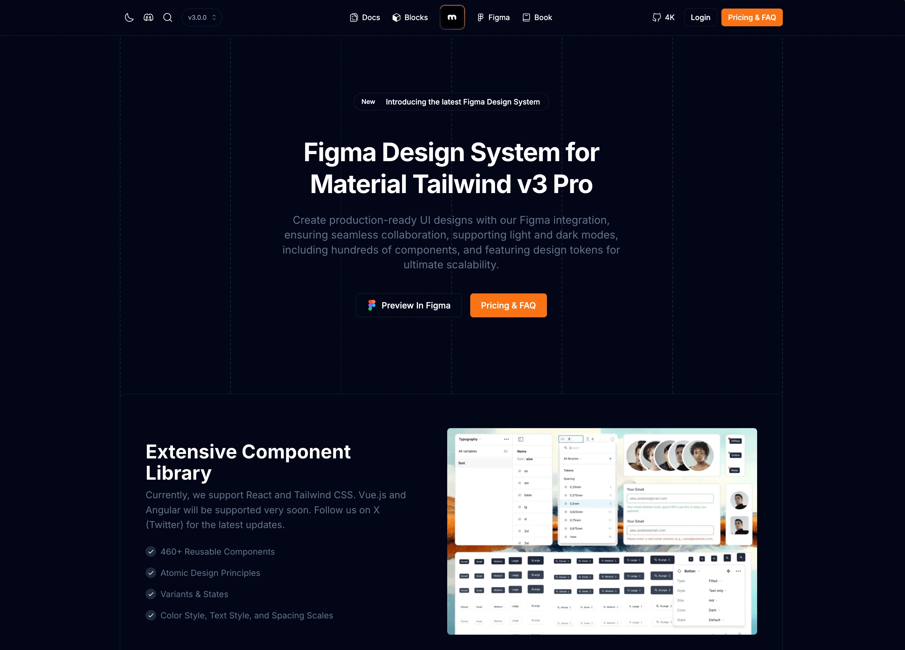
Material Tailiwnd Figma (Dark Mode)
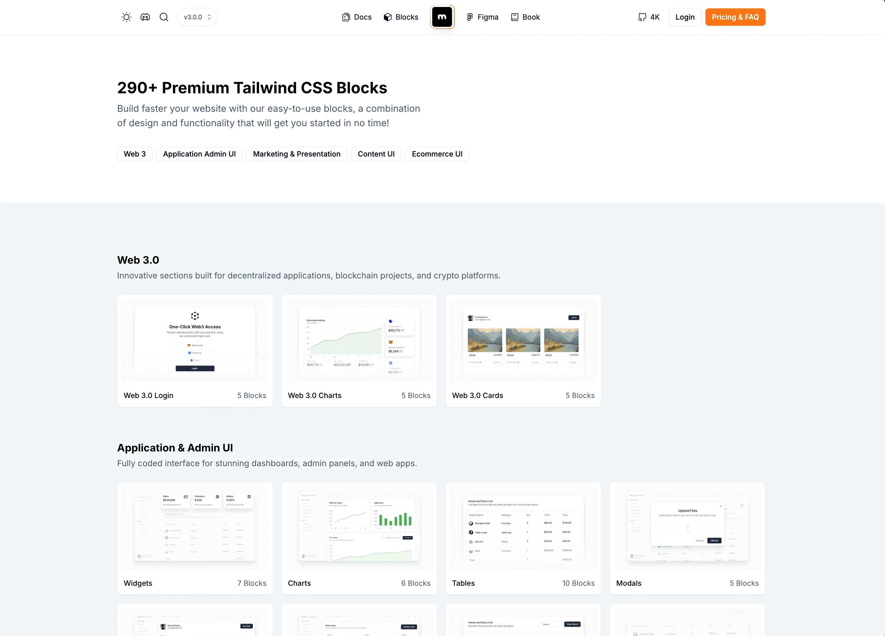
Material Tailwind PRO - Blocks
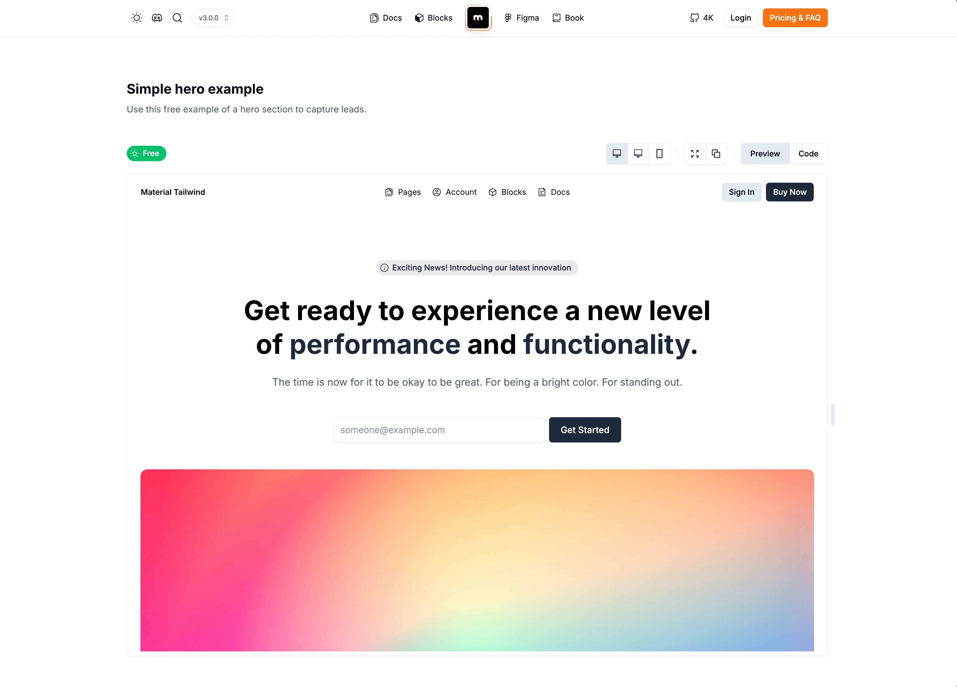
Material Tailwind PRO - Block Preview
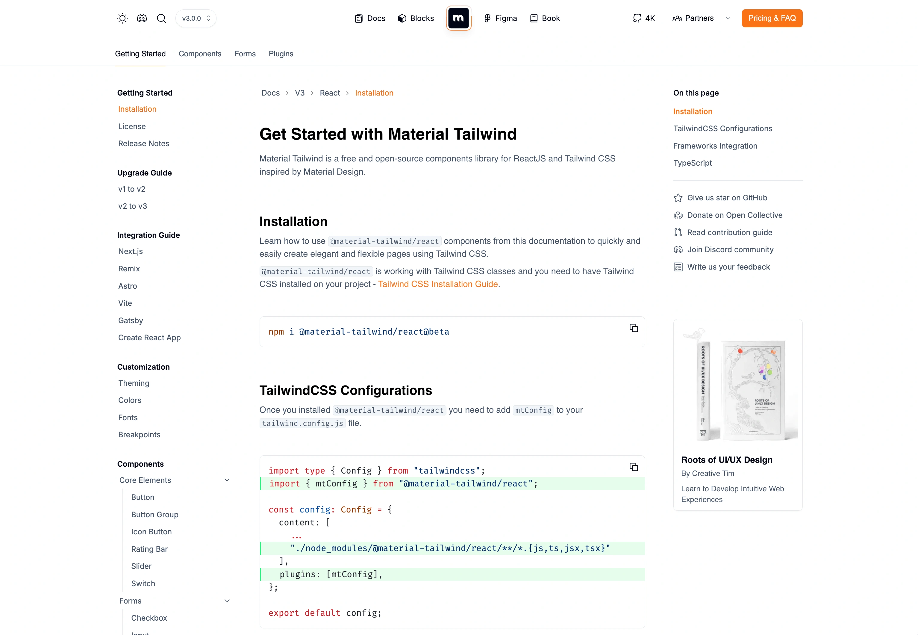
Material Tailwind Documentation
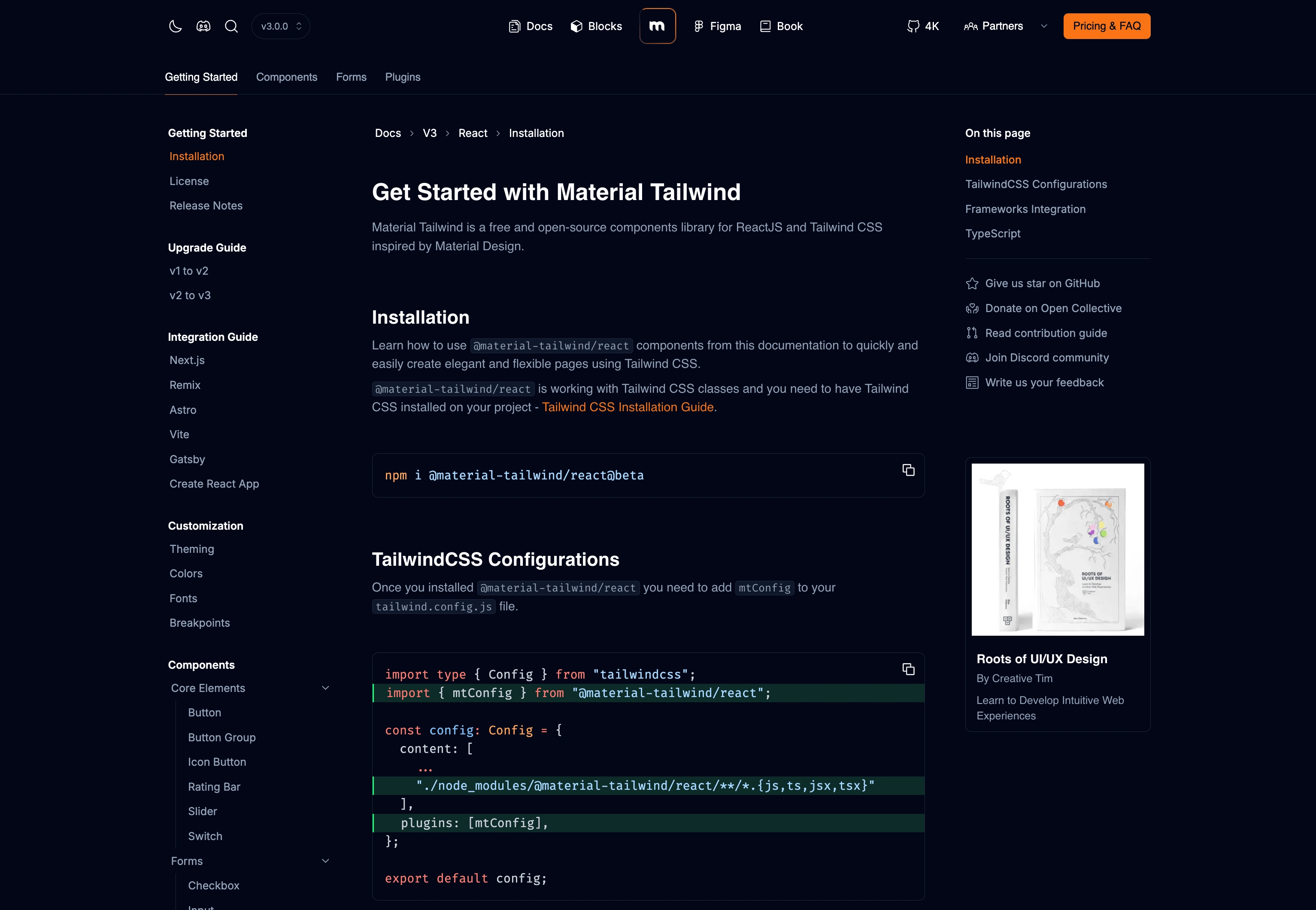
Material Tailwind Documentation (Dark Mode)
Like this project
Posted Jan 12, 2025
Material Tailwind is an open-source library that uses the power of Tailwind CSS and React to help you build unique web projects faster and easier.
Likes
1
Views
16
Timeline
Sep 1, 2024 - Ongoing
Clients
Creative Tim

