Designing Prism Icons (V1.1) for the Gravity Design System
Designed 28 icons, defined their negation states, finalized stroke width & corner radius, & meticulously tested the icons with overall UI style & typeface for seamless integration & consistency.
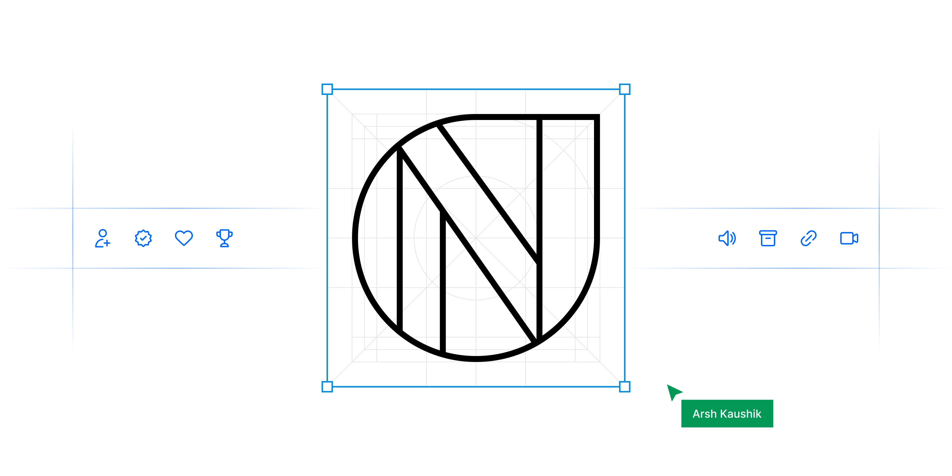
We at Newton School, have created a custom icon set to cater to specific company’s needs. Designing a library of icons requires a set of rules. These rules or icon design principles will help you maintain a consistent style across all icons. They will prove particularly useful if you’re part of a team that collaborates on creating an icon family.
These are not hard rules to follow but a direction for your creativity to design a cohesive icon set in the future.
Icon sizes
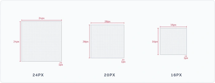
We have 3 different sizes of icons i.e. 24 px, 20 px, & 16 px. Icons are displayed as 24x24 px. Create icons for viewing at 100%.
Stroke size
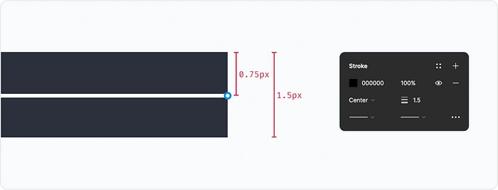
We follow a 1.5 px stroke width to make prism icons.
Grids & basic shapes
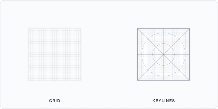
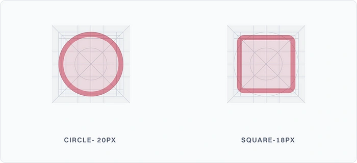
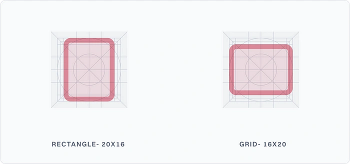
The icon grid establishes clear rules for the consistent & flexible positioning of graphic elements. Keyline shapes are the foundation of the grid. By using these core shapes as guidelines, you can maintain consistent visual proportions across system icons.
Joins & caps
We have caps with a width of 0.75px. We have joins of 0.75px for the acute joint, and 1.5px for the right joints.
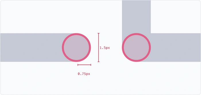
Angles
We follow an angle system where angles are multiples of 15. for example 15°, 30°, 45°, 90° etc.
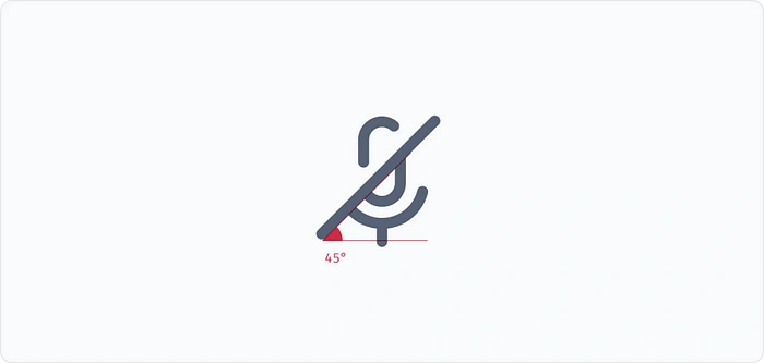
Alignment
We follow the out-alignment model for designing icons. This means that the outer edges of the icons should be aligned with the grid.
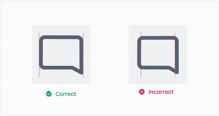
Naming layers
When designing icons, we have 3 layers for each icon:
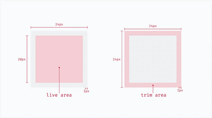
Icon Frame -24×24px
Wrapper framer- 20x20px
Vector
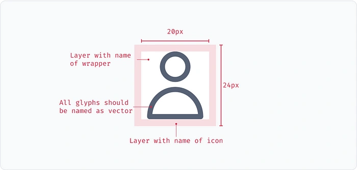
Icon content should remain inside of the live area (named as a wrapper in our case). If additional visual weight is needed, content may extend into the padding between the live area and the trim area (the complete size of a graphic). No parts of the icon should extend outside of the trim area.
Icon nomenclature
Naming icons in the correct manner will help developers manage the icons in their repository & helps designers are able to find the icons easily in the search bar. In prism icons, we follow the following nomenclature:

Here, we see that we have the category name first in camel case followed by an underscore, icon name in lowercase, feature name, and fill. At every breakpoint or space between words needs to be replaced with a hyphen ( - ) symbol. Let’s try to understand it with an example.

Mention multiple keywords for the icon in the component description, that can serve multiple use cases. This will facilitate a better search experience for the designer. For example:


Like this project
Posted Aug 13, 2023
We at Newton School, have created a custom icon set to cater to specific company’s needs. Designing a library of icons requires a set of rules. These rules or …
Likes
0
Views
27

