Enhancing experiences to reduce drop-off rates and benefit the …
Redesigning slot booking & onboarding+login experiences to retrieve back users from high drop-off rates.
Overview
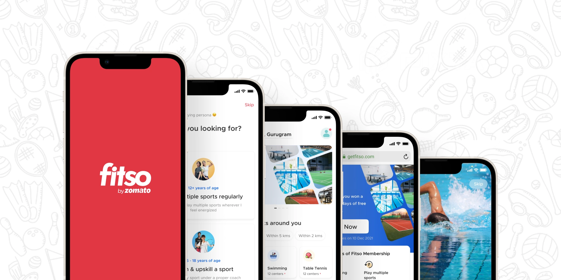
This case study shows the work done by AK during his four months internship at Zomato in Fitso’s product team.
‘AK’ was my nickname at Fitso 😎
What if Fitso?
Fitso was earlier a startup that was acquired by Zomato in January 2021. On the Fitso app, you can book a slot to play your favorite sports at your nearest Fitso center. Think of it as a Zomato for sports. In November 2021, Zomato sold Fitso to Cult.fit.
During my initial days at Fitso, I designed some icons, designed some basic visual layouts, experimented with Adobe After Effects, and learned Lottie animation. Then I got to work on two main problem statements and I had full ownership to design a solution for them.
Problem statement — I
The slot booking process, as per data recorded, has seen an average 40% drop in trial users booking and 10–15% drop in members booking a slot which includes users who exits the slot booking process in the middle and doesn’t go ahead or sometimes doesn’t even come back again to book.
Identified: Booking flow experience needs to be rectified for trial and membership users both.
Challenge
Figure out the flaws in the existing slot booking experience for trial users and members both to maintain user retention to reduce such a high drop-off rate and clearly communicate the booking flow information to the users.
Understanding the existing booking flow structure
Began with understanding the existing flow in order to get some insights on possible improvements.
The structure has two flows which further has different entry points to book the slot:
Trial booking flow
The trial booking flow has three entry points from the home page.

Member booking flow
The member booking flow has two entry points from the home page.

In the above flows ‘Through sports’, the third step ‘Select a sport’ is repeated intentionally & made tappable in order to collect data, to know how many users actually tap on the sports again even after already selecting a sport. This was to study users’ behavior for sports booking.
Possible assumptions
After analyzing the booking flow structure, seven assumptions were derived based on end-experience, visual elements, & how quick the flow is to finish.
Visual separation — Confusion between available and unavailable slots. Thus, users take time to identify both and then select their desired slot.

Undesired timings — The user exits the flow because he/she didn’t find his/her desired slot timings at a particular center for a particular sport.
Information retain — App doesn’t indicate for which sport & center the user is looking for (in trial booking flow).

Improper information — ‘Trial available indicator’ & ‘booking progress bar’ doesn’t indicate that they’re two separate indicators visually due to color applied and almost no information shown.

Frequent movements — The user has to move often backward and forwards in case their desired slot is unavailable.
Unknown center selection — User doesn’t have any idea about the center while selecting another venue for their desired slot/timing which could potentially raise a trust issue (just rating & distance not enough) for the center & just to check out that center, the user has to exit the whole flow. A high possibility is that the user won’t be returning to go through the flow.
Improper ‘no trials left’ notify — If the user’s trial flow ends and the user didn’t pay attention to it, the user will get the error pop-up that the ‘no trials left’ at the end of the flow after selecting the sport, slot, & center. Thus, resulting in a bad end experience.
Discussion on possible solutions
Based upon the assumptions, an initial discussion was done to know what possible solutions can be designed.

The above sets were discussed just to check to what extent they’re valid to implement. Still, the idea wasn’t clearing up to the mark and seemed to be a bit lost for the scope of solution on the context of the problem and its solution so I decided to do a user interview to get more clear vision towards the solution. After all, it’s better to talk to those users who are going to actually use the product.
User interviews
Even after deriving the assumptions, conversation with some users was required in order to validate the derived assumptions and to check what more valuable critiques I can get.
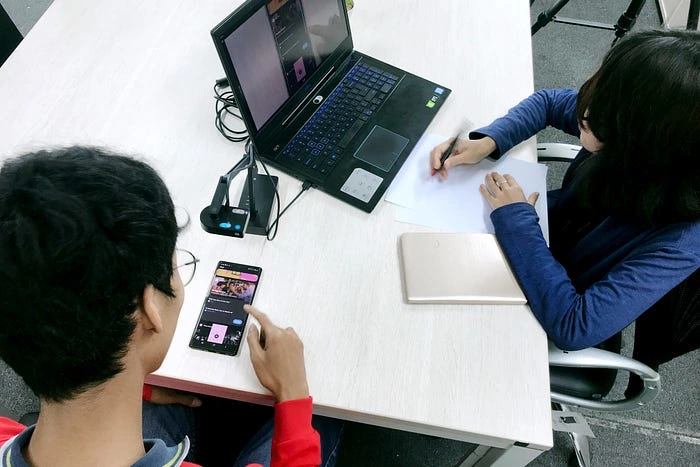
Photo by
I talked to two people and ran the interview in two parts:
First: I asked users to go through the app as a whole, right from installing it and checking out every section so that I can know what information/features they’re able to understand without letting them know the specific flow I want them to inspect. This part will help me to improve the product as a whole.
Second: I asked users to specifically go through the slot booking flow and let me know what do you feel is right and wrong. This part will help me to know the exact parts of the flow that need to be improved.
Here, I decided to talk to the users (20–22 years of age) who are totally new to the Fitso app, using it for the first time. The reason, earlier experience redesign processes have seen that the majority of users are working professional and they’re used to the flow that it is hard to gather insights from them during the interview.
Insights
Meta title on play store and app store doesn’t communicate what the Fitso is actually about.
Current: Fitso: Badminton, Swimming, Gym
Suggested: Fitso: Book your sport and play
Plus, the app category on the play store was ‘Sports’ whereas on the app store was ‘Health & Fitness’.
This issue was reported to the branding and marketing team.
OTP incoming during the login wasn’t working properly. OTP was coming in the second and third run.
This issue was reported to the tech team.
No onboarding — Users were not familiar with what Fitso as a product actually is and how they can get the benefit of Fitso. Also because of the absence of onboarding, users were not ready to give their phone no. and log in using it and end up hitting ‘skip’ often. Even the data recorded that 60% of the users don’t login in at the beginning and in the later stage when they have to book a slot, they’re forced to provide their no. and login which doesn’t result in a smooth and happy experience.
Decided to work on this in the upcoming product sprint.
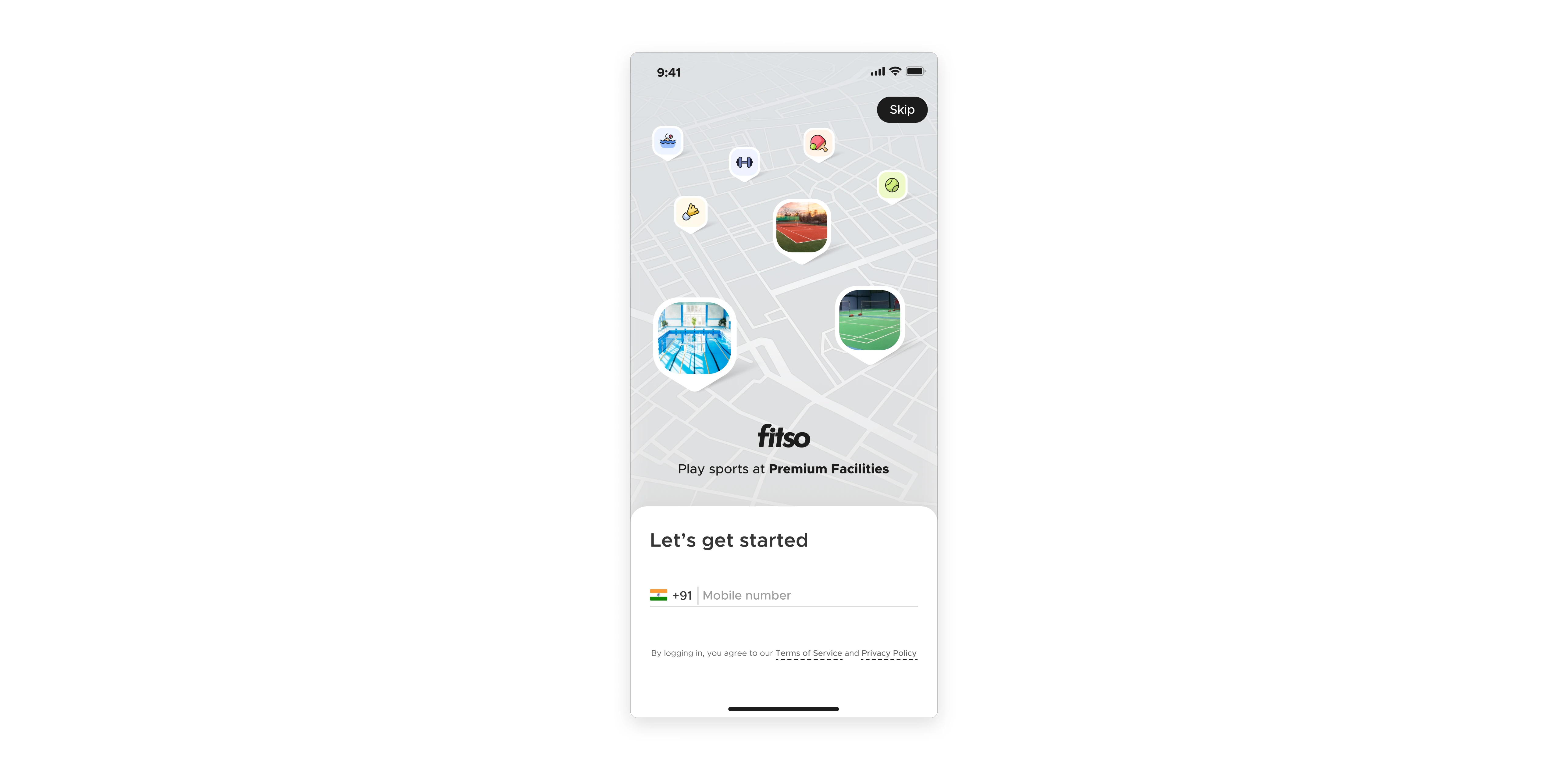
Previous login screen (no onboarding)
No booking confirmation — Users were not able to track the booking flow and end up booking a trial but they were just exploring the app. Thus, resulting in minus one trial which they don’t want to.
Assumptions validated
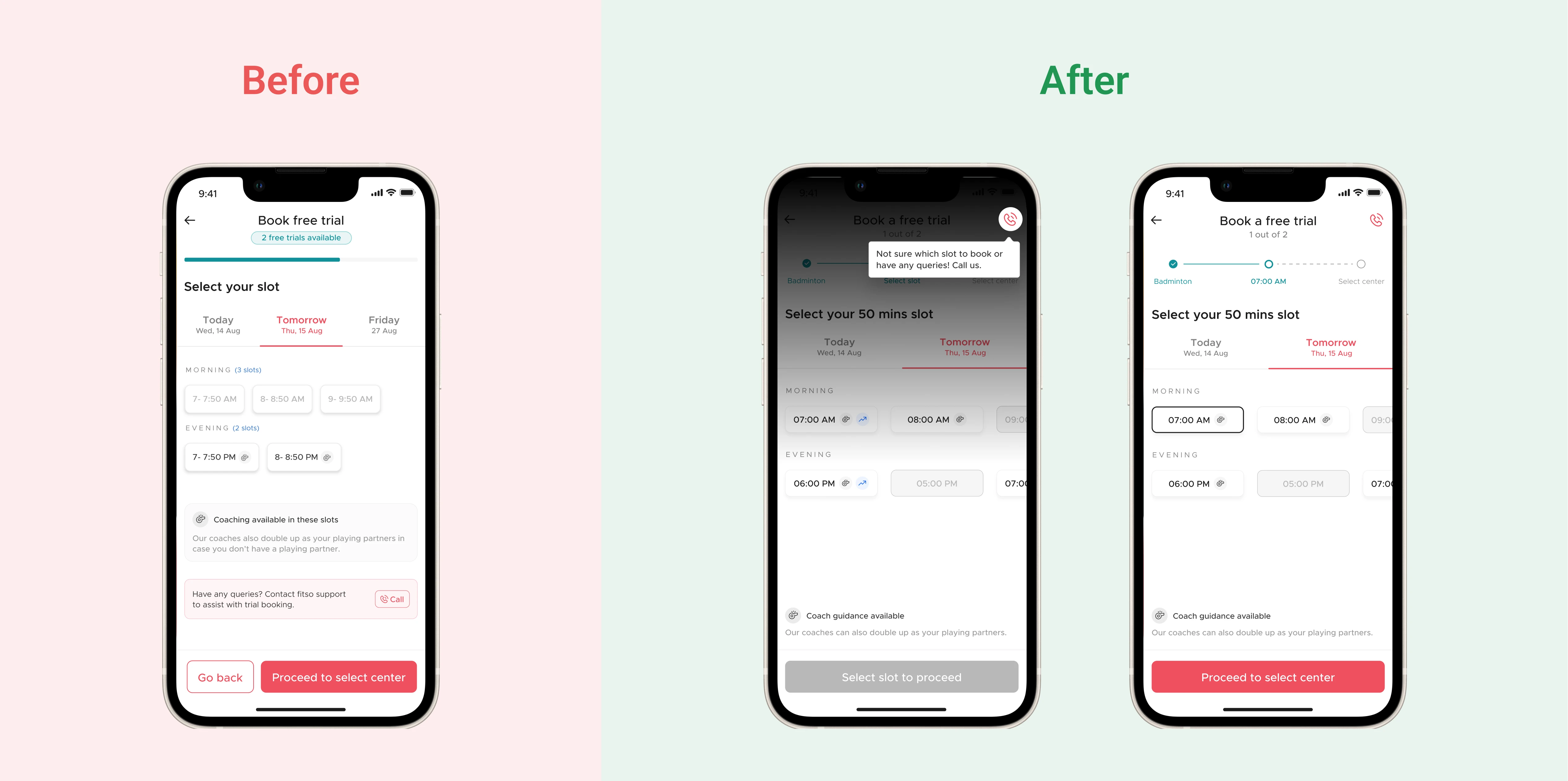
Visual separation — Users unable to visually differentiate between available and unavailable slots.
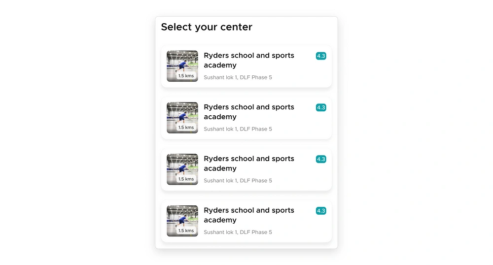
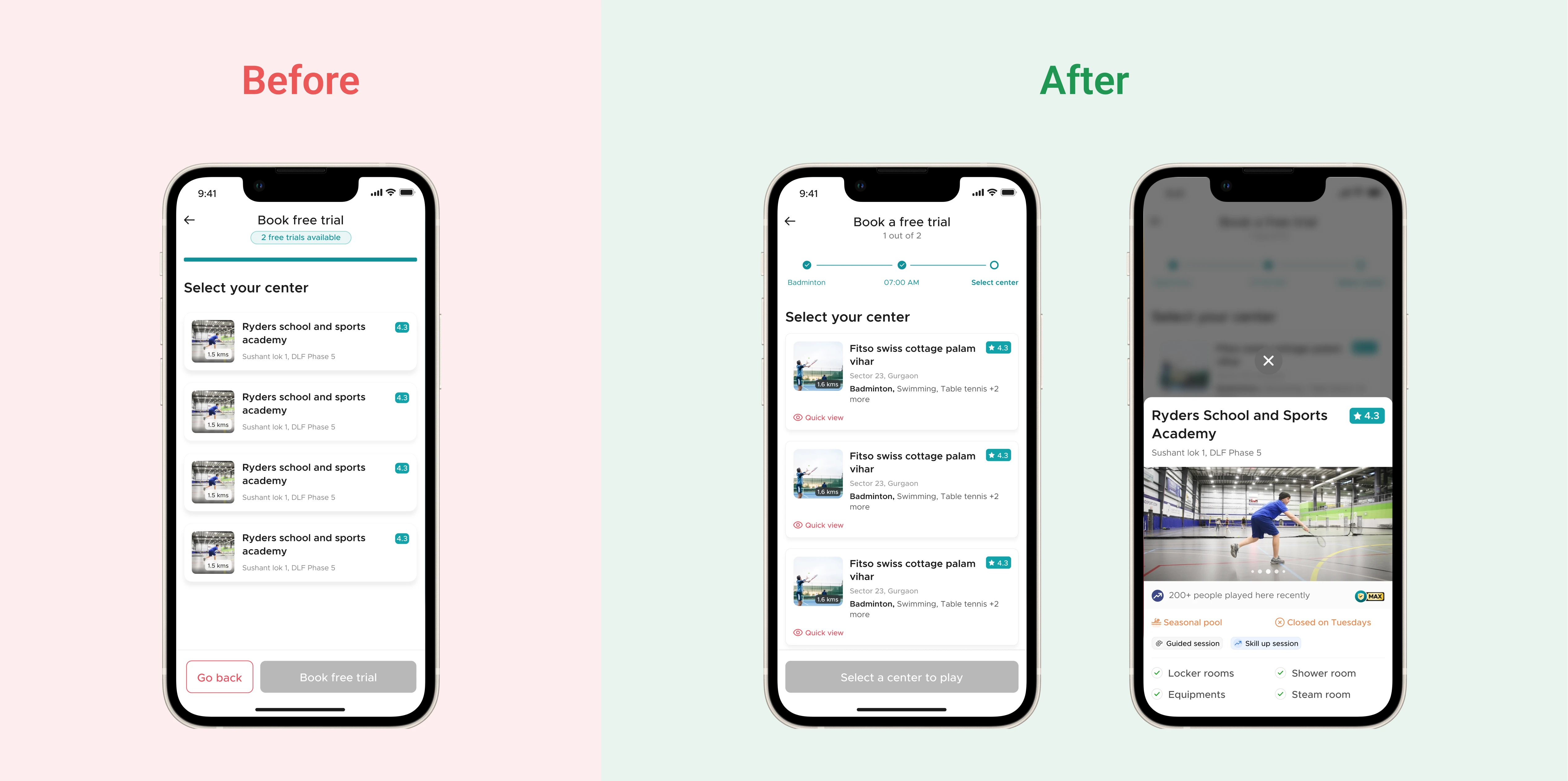
Unknown center selection — Users hesitated to select a different venue for their desired slot because less information was provided for the centers & the pictures were too small to have a look at the center and even that picture contained a person playing. Users asked to provide them with a proper picture of the center. They’re not interested in pictures of a person playing.
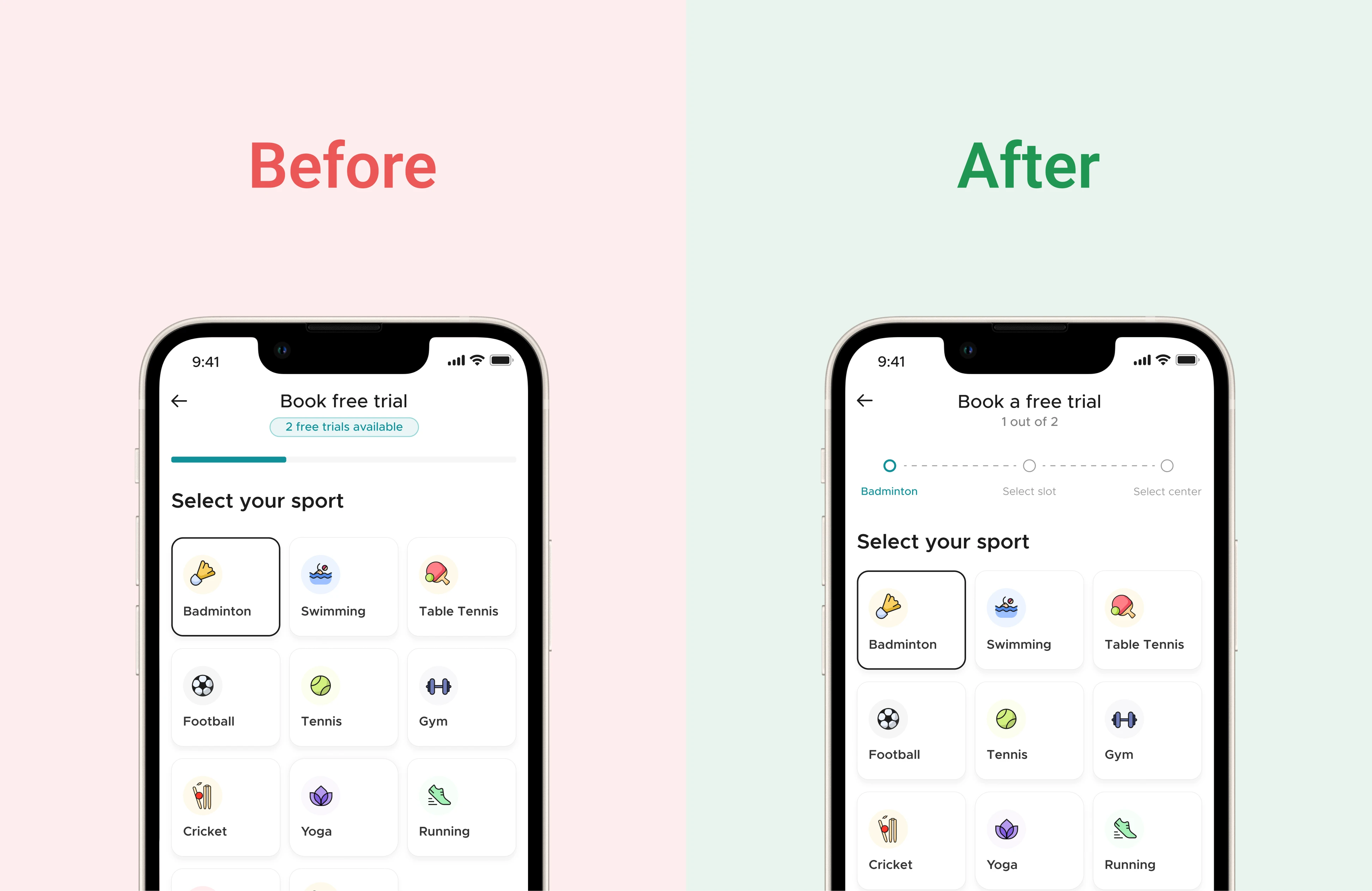
Improper information — User wasn’t able to relate to the booking progress bar and no. of trial left because trial left indicator and progress were of the same color thus progress bar seems to indicate no. of trials left.
Discussion on interview insights and assumption to dive into solutions stage
Interview insights and validated assumptions were discussed with the product team. Finally, it was decided that all the assumptions will be taken into consideration because even though four assumptions out of seven weren’t validated by user interview, they are still valid to address and will end up enhancing experience only, not degrading.
The onboarding problem was decided to consider in the upcoming sprint because it came in the quadrant of important but not urgent and already there were a couple of tasks already in the product and development pipelines due to which onboarding problem could be taken at that moment.
Booking confirmation
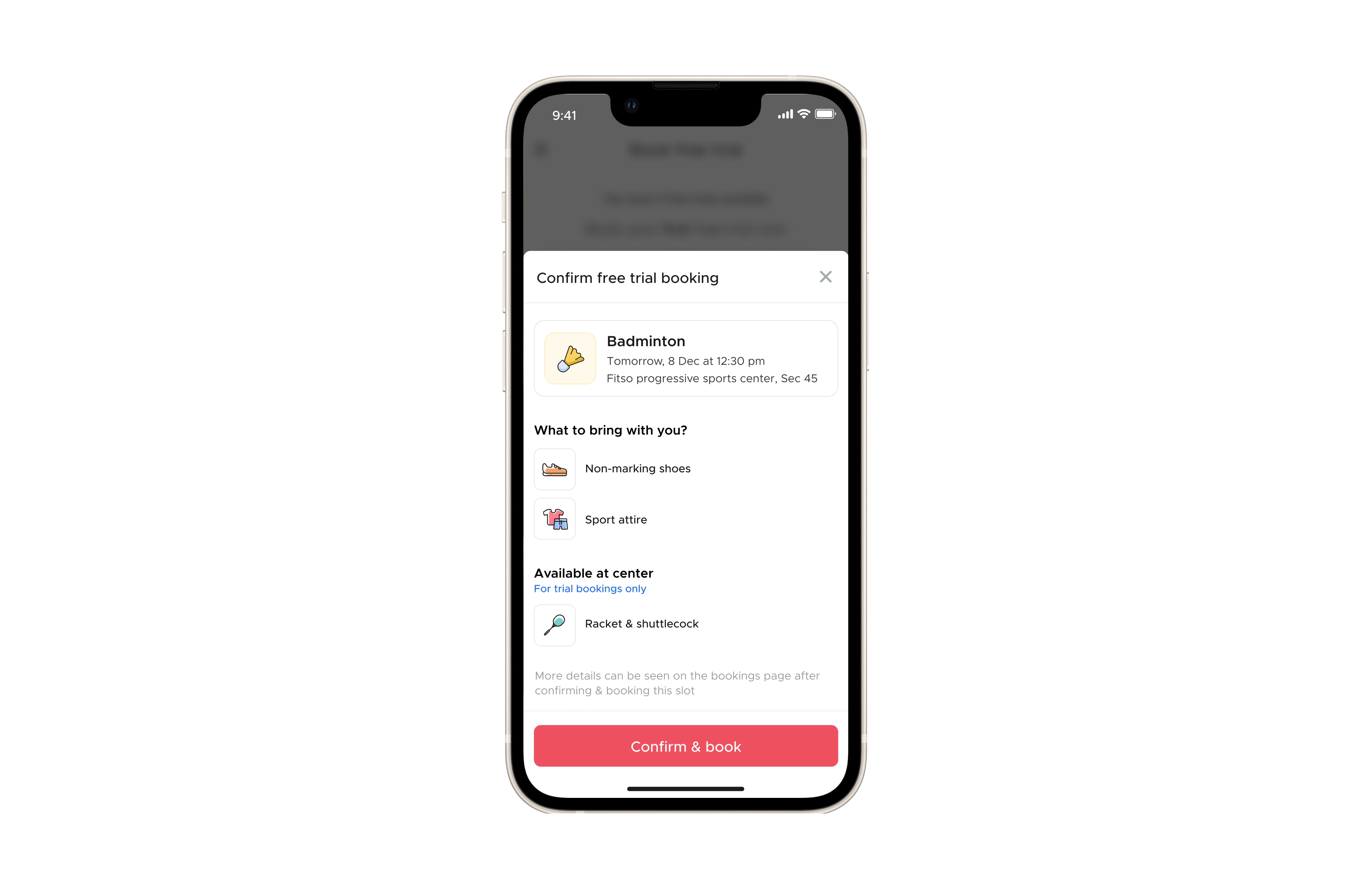
Booking confirmation was discussed earlier by the product team and now it got raised gain so we decided to consider it in the current sprint. From the CX team and some user feedback, our team got to know that the current booking information screen shows the items which are required to bring by the user with them during their slot but the users get to know this in the last when booking is done and now either they’ve to cancel the booking or purchase the item mentioned and often times the user doesn’t have those items, for example, non-marking shoes to play badminton. Due to this, the user ends up complaining to the customer support team or to the coach at the center and this even resulted in more booking cancellations.
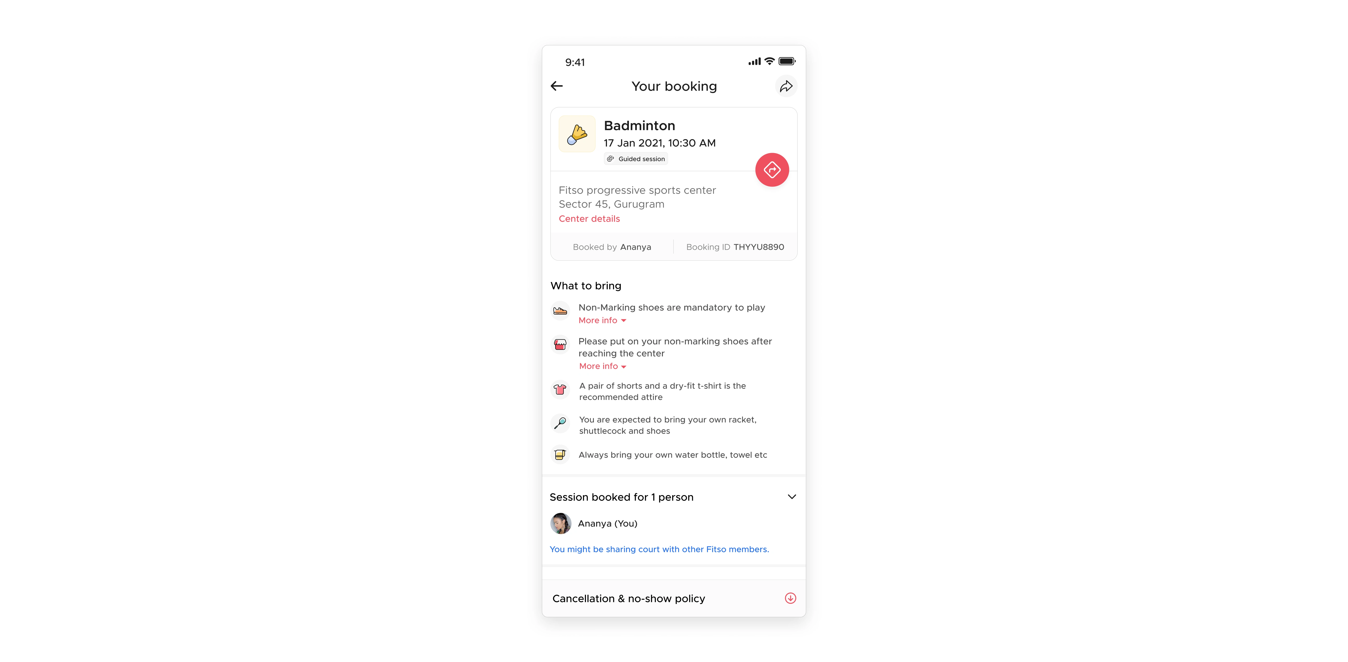
Post booking screen
In the end, it was decided to mention ‘What to bring?’ items in the confirmation screen which will result in fewer booking cancellations and fewer customer complaints on customer support and even on the center to the coach.
Solutions designed
Checkpoint structure
To solve incorrect information issues for confusion between the no. of trials left and the progress bar, a checkpoint-like structure was designed so that users can easily check what they’ve selected and how long the process/flow is.
Slot differentiation
To solve the issue of visual separation between available and unavailable slots along with proving a much cleaner screen to the user.
Center quick view
To give the user an option to see the center he’s going to book in case he hasn’t checked the center before.
Booking confirmation & ‘What to bring’
To inform the user that after this last step, your booking will be done. Also, post-booking information is added to this bottom sheet so that users already know what need to bring with them in order to enjoy their sport.
Prototypes
Trial booking flows
Member booking flows
New product sprint, a new problem to solve
on
Problem statement-II
Fitso app doesn’t have a user onboarding process and has a simple login screen which doesn’t give users an idea of what the Fitso app is for, what a user can get, & how the app can benefit users. Hence, this results in increasing user drop-off rates right in the beginning.
Challenge
Design a user onboarding and login screens to familiarize the user with what Fitso as a brand is actually about and what does it offer to them. Thus, I need to design totally new smooth & friendly onboarding & login experience.
Objective: To create a wonderful first impression (presenting the product in an easily acceptable way), providing all essential information in almost no time. Such efficiency will convince users to spend more time on the app and to explore whatever is offered to their attention.
Gathering knowledge
I read some articles in order to gather knowledge about onboarding and log in. What are they exactly, what is their significance, and why are they designed?
Onboarding
They are welcome pages/screens which teach users about the product and compel them to take action in order to drive deeper engagement.

I came to know that there use to be two types of onboardings:
Outside-product onboarding
This type of onboarding usually happens long before using the product itself — on social media, the product’s website, via third-party vouchers, or in the app/play store. During these first encounters, the user establishes their expectations about the product and jumps inside the first phase of the product’s conversion flow.
Inside-product onboarding
This type of onboarding is the user onboarding which we generally see inside the app to guide the user towards the core value propositions of the app.
These screens basically tell users about the primary features of the app, present best practices within the app, collect basic user account information in order to set up the app for the user using it, upsell the app’s capabilities to the users and offer a glimpse of what more it could do with just a little financial support on their behalf.
Login
A login experience is generally an entryway into an app, website, or service which helps users establish their identity. Login intent is the user’s willingness to go through with the login flow.
Key guideline while designing login flow is to design login focused screen with a familiar experience due to which users will spend lesser time on the login page along with a helping hand for error prevention. Also, give multiple login methods (2–3 additions only) to provide flexibility with clearly segregating the primary and secondary login options
Defining entering users on Fitso

Primary (First time)
Users coming for the first time on the Fitso app via an ad, third-party voucher scheme, friend’s suggestion, word-of-mouth, etc. They don’t have any or very little sense of what Fitso is about.
Secondary (Existing)
Users returning back to the Fitso. Possible reasons could be; reinstalling the app, no more wanted Fitso but now they want.
Tertiary (Invited or tagged along)
Users who were invited to book their slot or their slot was already booked by their family members or friends
Understanding user, data, & business needs
User behavior
Observed how different apps do their onboarding and specifically how sports apps do their onboarding to cater to their different categories of users including new & existing ones, plus if there is any third category specific to their audience base. Plus, after talking to a couple of users, irrespective of what kind of app they are using, it came to know the users generally have a habit of seeing of 3–4 onboarding screens making them familiar with the app (considering the users totally unaware the product has to offer to them), plus, fastest login without any friction to continue using the app.
Business need
From a business standpoint, our primary focus was on user acquisition and the user should enter the app as fast as possible via login because the existing user is already familiar with the app and is highly likely to dive into the app via a login.
Data
Understanding users as per data, it was found a high percentage of users are not going ahead of login and further goes on decreasing the percentage till the users land on the home page.


Android (left) & iOS (right)
Outside-product onboarding
We called it a third-party voucher redeem flow because our primary users in this will be coming from other apps such as Cred, Paytm, etc. when they receive a redeem voucher, and at that time they get to know about the Fitso as a product.
Considering a case, some users might come from desktops, a flow was designed to serve those users as well.
Inside-product onboarding
Discussion
My initial idea was to show Fitso’s USPs on the onboarding screens with illustrations.
After a discussion with the Head of Product, I came to know about three key parameters which a user would like to know about a product at the beginning. Those parameters were later rephrased after discussion with the
What does Fitso have to offer? → Emphasize Fitso’s value proposition
What are the prices for the user? → Highlight Membership plans/offerings
Explore the offerings i.e. sports and centers in our case → Explain Core features
Finalizing onboarding screen content
A final discussion was done on the content for the onboarding screens.
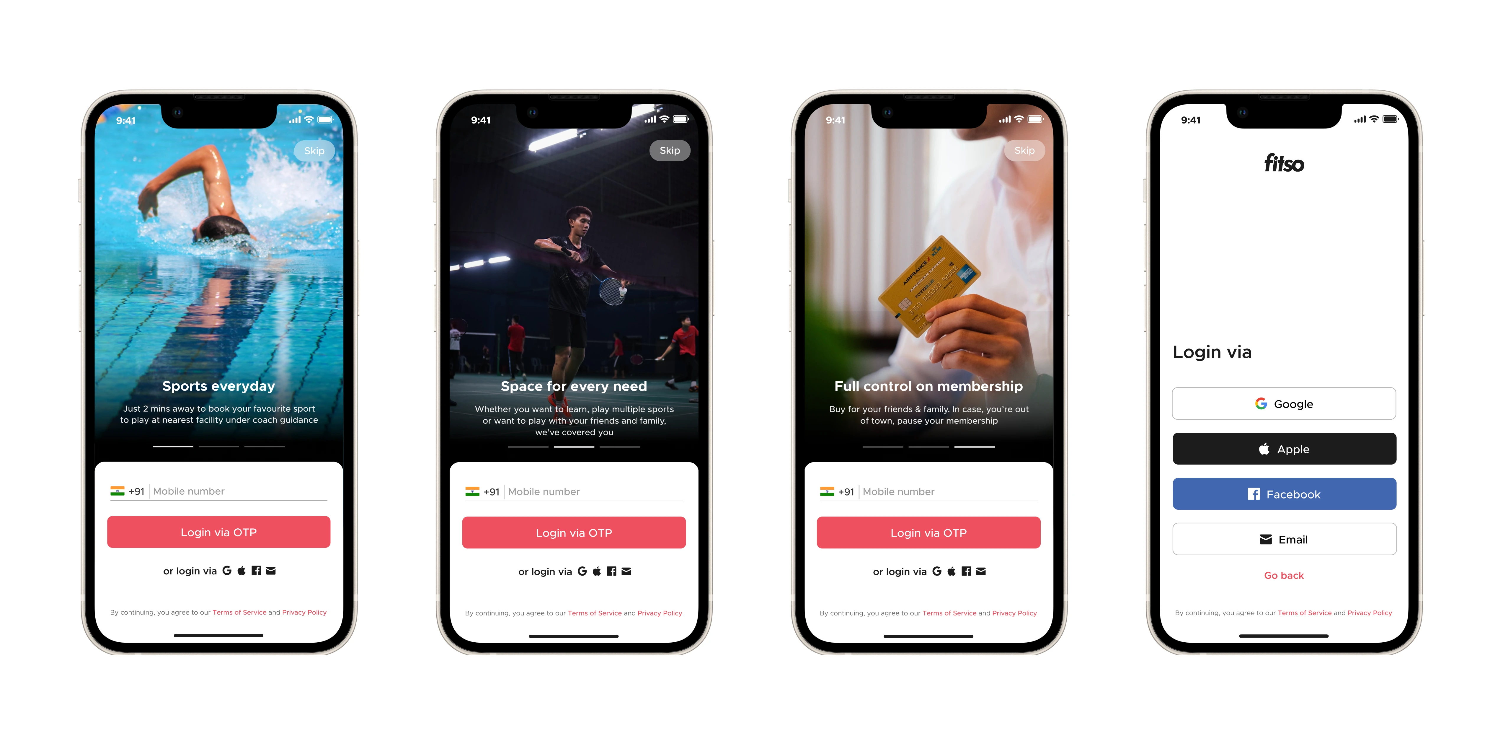
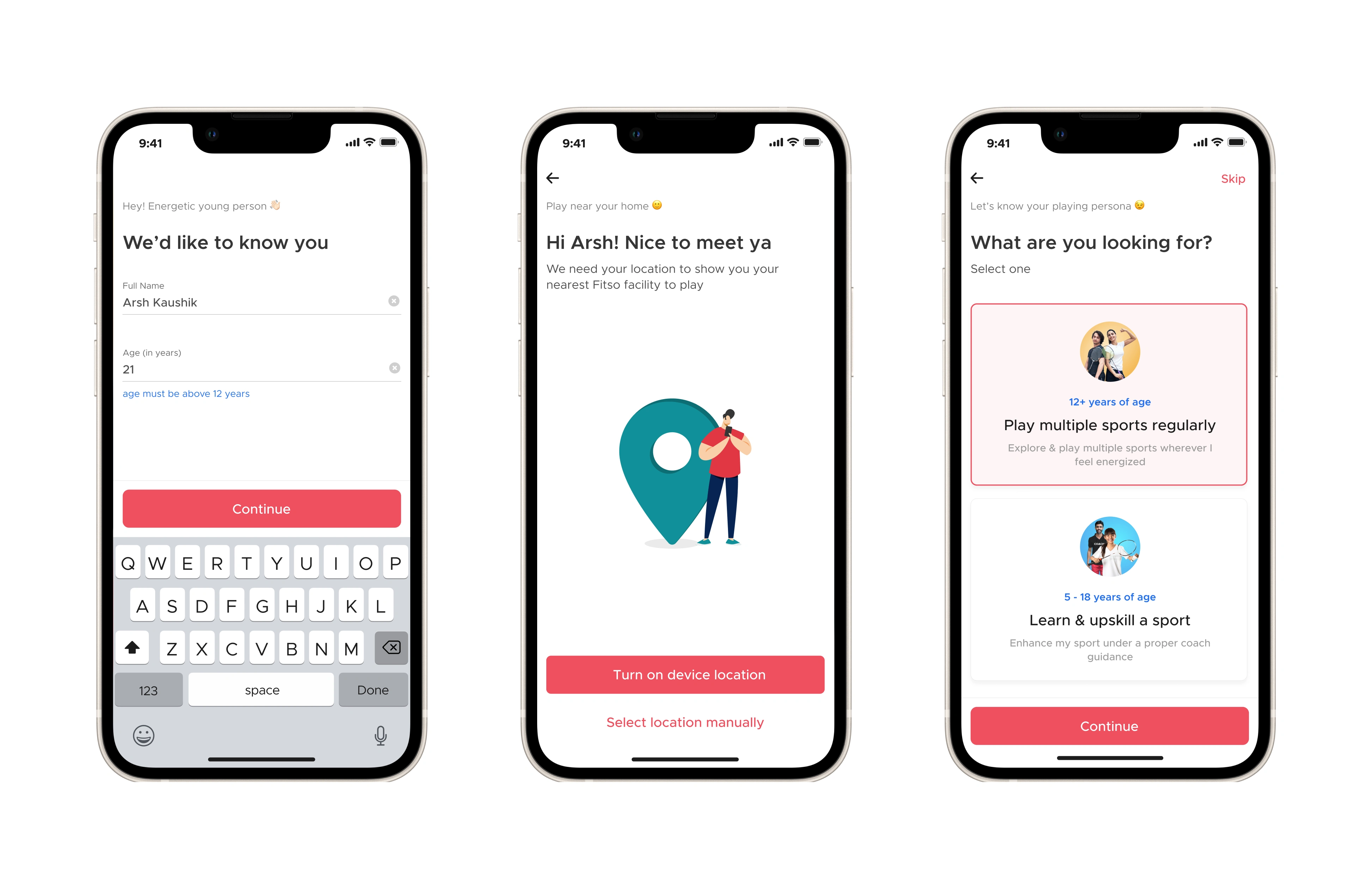
For the onboarding experience, the team decided to provide users flexibility in login by providing social logins which are not present in the current version. In addition to this, the overall onboarding + login experience was designed in a way by greeting & asking users their info and what they are looking for so that the users feel that the app is having a conversation with them in order to give users a personalized feel. Also, the location requirement screen was redesigned and made part of the onboarding flow with consistent design.
Prototype
Learnings from the internship
Working in a team and that too with professionals having 6–10 years of experience was totally a new experience for me and it gave me very good exposure to the industry as an intern.
Came to know how data plays a crucial role for the product and helps in acknowledging the scope of improvements and designing experiences for them.
Used a design system for the first time to make designs faster with consistent UI throughout the product.
Learned how to validate a design in order to check whether it is solving the problem or not along with conducting usability testing.
Like this project
Posted Aug 13, 2023
Redesigning onboarding + login and slot booking experiences to retrieve back users from high drop-off rates.
Likes
0
Views
161

