Built with Replo
Kura Post-Purchase Experience Redesign

Ridwan Adekunle


Kura - Post-Purchase Experience Redesign
Turning the order-confirmation screen from a dead end into the store's highest-margin moment.
Snapshot
Project: Post-purchase flow, order confirmation, one-click upsell, onboarding, social proof, retention
My role: Strategy, UX, copywriting, visual design, build direction (end to end)
Type: Concept / portfolio piece
Tools: Figma → Shopify / Replo, mobile-first
Deliverable: Full post-purchase page (mobile + desktop)
The Challenge
For most Shopify brands, the thank-you page is the single most neglected screen in the funnel. The customer has just done the hardest thing they'll ever do for you, handed over their card, and the reward is a grey system receipt with an order number and nothing else.
I set out to redesign Kura's post-purchase experience around one question: what should happen in the sixty seconds after someone buys? The goal wasn't to bolt on a pushy upsell. It was to design a moment that raises average order value, lowers "where's my order?" support tickets, and makes a first-time buyer feel like they joined something, all without adding a single step to checkout.
The Solution
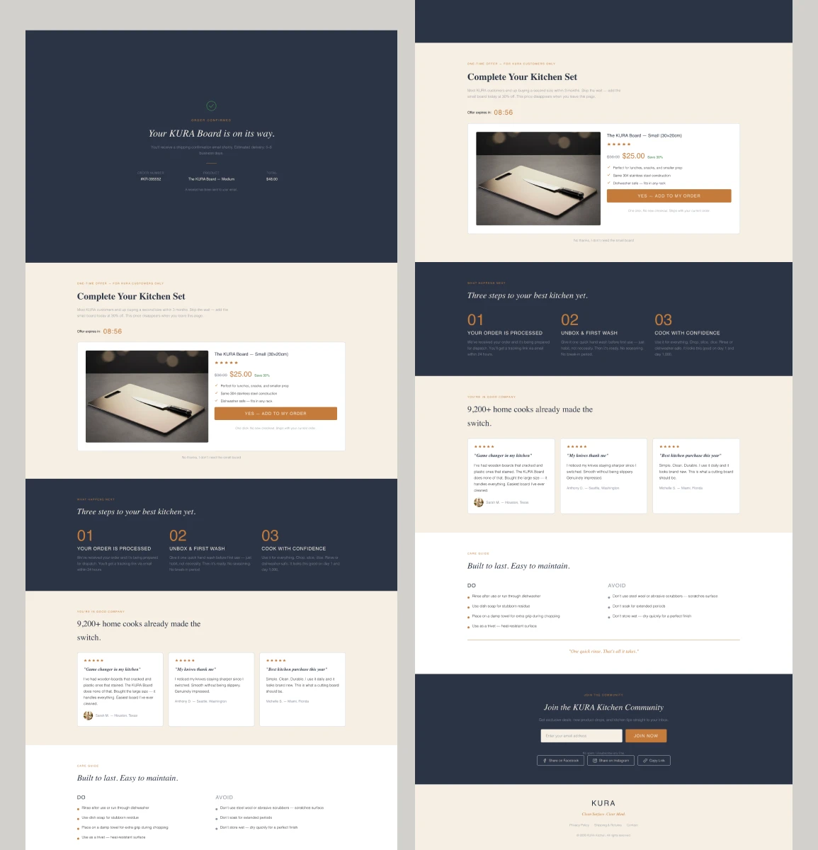
I structured the page as a short, deliberate sequence, each section doing one job before handing off to the next.
1. A confirmation that actually reassures
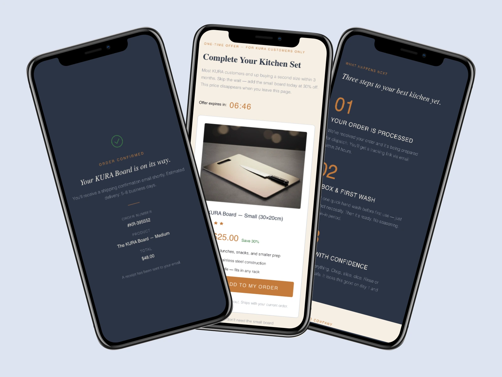
Instead of a bare order number, the top of the page leads with a calm green checkmark, "Your KURA Board is on its way," and the three facts anxious buyers actually want: estimated delivery (5–8 business days), the order number, and confirmation that a receipt is already in their inbox. It sets a premium, in-control tone before anything is asked of them.
2. A one-click upsell that reads as a favour
This is the revenue engine, and it's built to respect the buyer.
Relevance: "Complete Your Kitchen Set" offers the small board to someone who just bought the medium, a natural companion, not a random add-on.
A reason to believe: the copy leads with a real insight, "Most KURA customers end up buying a second size within 3 months. Skip the wait." It reframes the upsell as saving the customer a future hassle.
Honest urgency: a 30%-off, one-time price ($36 → $25) that genuinely only exists on this screen, backed by a countdown. Scarcity that's true, not manufactured.
Zero friction: "YES, ADD TO MY ORDER one click, no new checkout, ships with your current order." No re-entering card details, no second shipping fee.
A graceful exit: a plain-text "No thanks, I don't need the small board." Making the decline easy is what keeps the offer from feeling like a trap, and, counterintuitively, protects conversion.
Like this project
Posted Jul 13, 2026
Redesigned Kura's post-purchase flow to enhance user experience and boost average order value.